10 Embraceable Graphic Design Trends That Are All the Rage Right Now!
2018 is long gone and so are the design trends that came with it. You’ll realize the lightening-quick pace of time when you compare the designs of your site, refreshed last year, to what the trends are right now. Yes, gone are the days of the Stranger Things-esque neon tones and retro colors. This season, it’s all about being bold and colorful and yet sophisticated and fluid at the same time!
Graphic design elements that instantly attract and enrapture your audience is what you need to take your UX/UI game up a notch. Luckily, creating designs that enthrall your audience is not that difficult. The major graphic design trends of the current season are highly doable in my opinion. And the result is almost always jaw-droppingly stunning!
Without further ado, allow me to enlighten you on the graphic design elements of the season that are currently trending-
Contents
1. 3D – Bring alive the world around you
With VR and AR dominating the marketing landscape, the effect of it is bound to trickle into the graphic designs department as well. And it does so in the form of 3D elements! If you ask me, it is a welcome change. 3D renders and fonts help you add so much depth to your content. Besides, they are instant attention-grabbers! Can you stop yourself from staring at this beautiful 3D logo? I know I can’t!
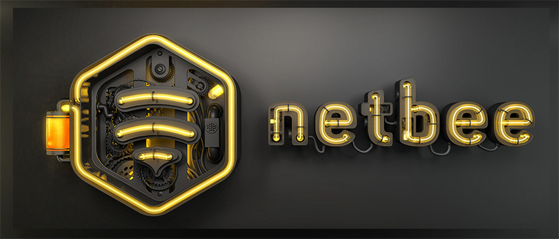
Image courtesy: https://bit.ly/2WM4dcO
Pro tip: While 3D renders can bring flat designs to life, it’s important to use them sparingly. Too much of them on a page can create a jarring effect.
2. Gradient – Fluid movements of color
You can say that gradients have been around for a long time, but they’ve never caught on as widely as they have now. You can’t help but feel that there is something about gradients that is almost infectious. They present smooth transitions that are easy on the eyes and add greatly to a design’s dynamism. You know they are the right way to go when you see big brands such as Apple and Spotify using gradients to no end! If you want to add a bit of youthfulness and zing to your designs, gradients should be on the top of your list.
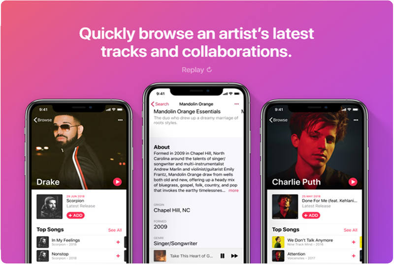
Image courtesy: https://apple.co/2u3Dw4n
Pro tip: When using gradients, make sure the colors you use for the text and the background contrast each other well. It’ll help in the legibility of the text.
3. Duotone – The yin and yang of design
Not to be confused with dual toned gradients, duotones are the easiest and simplest way to make your graphic designs stand out in a crowd. Plus, they are colorful and sophisticated – two things that designs are inherently supposed to be this season! I like duotones because of how adaptable they are. No matter what your company branding is, you can expect them to match well with its spirit.
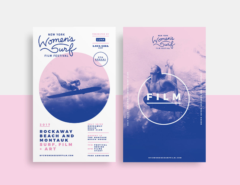
Image courtesy: https://bit.ly/2Q9G4dI
Pro tip: Using highly contrasting colors will help you create a stunning visual effect against monotone backgrounds.
4. Bold fonts – Bigger is better
When there’s design, there’s typography. They’re feathers of the same bird after all! This season, it’s all about the bolder, the better. Plump fonts help you create a strong impression. Big fonts, in my opinion, have a strong personality – varying from quirky and cute to assertive and smart. They provide an easy read and can grab your reader’s attention in a matter of seconds. Take a cue from Samsung-
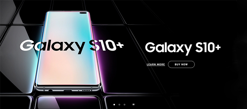
Image courtesy: https://bit.ly/2Hyidk0
Pro tip: Make generous use of colors in your fonts. That’s one way to make them stand out!
5. Vivid colors – Hues that go pop
Move over subtle pastels. This season, it’s all about colors that go pop! Even Apple (the brand that always keeps it minimalistic) has embraced vivid hues in its iPad promo designs to create a lasting impression in the minds of its audience. I think it’s brilliant as bright colors are a welcome break from the bland minimalism that used to dominate before. The plus side of using vivid colors is that they look great on today’s bright OLED screens.
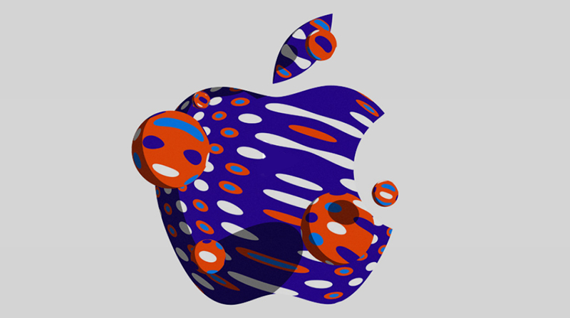
Image courtesy: https://apple.co/2YwjK0I
Pro tip: If vivid colors are too bold for you, you can always try mixing and matching a vibrant shade with a lighter one.
6. Art Deco – Elements from times past
Art Deco designs of the 1920s have made a comeback this season and how! You can see the influence of this art movement in the logos and typographies of brands. The thing about Art Deco designs is that they’re highly symmetrical and intricate, which makes them perfect for brands that exude opulence and luxury. If you work for a brand like that, give it a shot. Trust me; your bosses will love it!
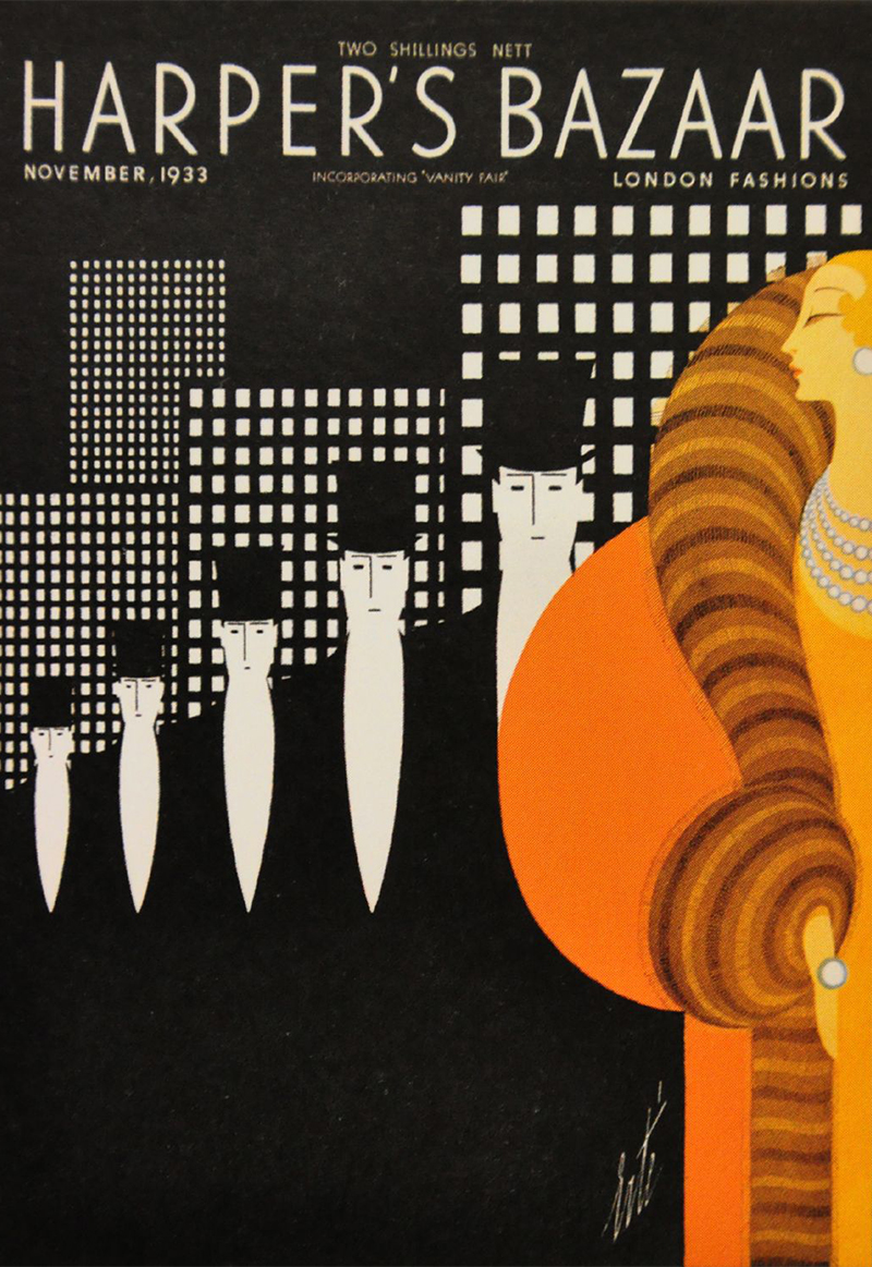
Image courtesy: https://bit.ly/2LRc6g1
Pro tip: Use bold, metallic colors to lend that spirit of opulence to your designs.
7. Open creations – Leave it to the imagination
Remember the time when you had to cram your designs within a specified space? Yes well, those days are gone. Open compositions are very in right now. You have the freedom to utilize every single space of your canvas and even go beyond its edge to leave things to your audience’s imagination! I think the effect of open compositions is quite spectacular once you start scrolling and can leave your audience spellbound.
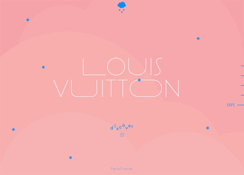
Image courtesy: https://bit.ly/2LTfWVV
Pro tip: You can try adding a zoom effect when designing an open composition. It’ll lend spaciousness to your design if you do it right.
8. Moody photography – Reflect the reality
Photography might’ve been about bold colors before, but now it’s about muted colors. I can tell you that moody, warm colors bring out a relatively realistic vibe that people find very easy to relate to. Moreover, another trend in this regard is shunning carefully structured photographs in favor of ones that look like they could’ve been captured by everyday people instead of professionals.
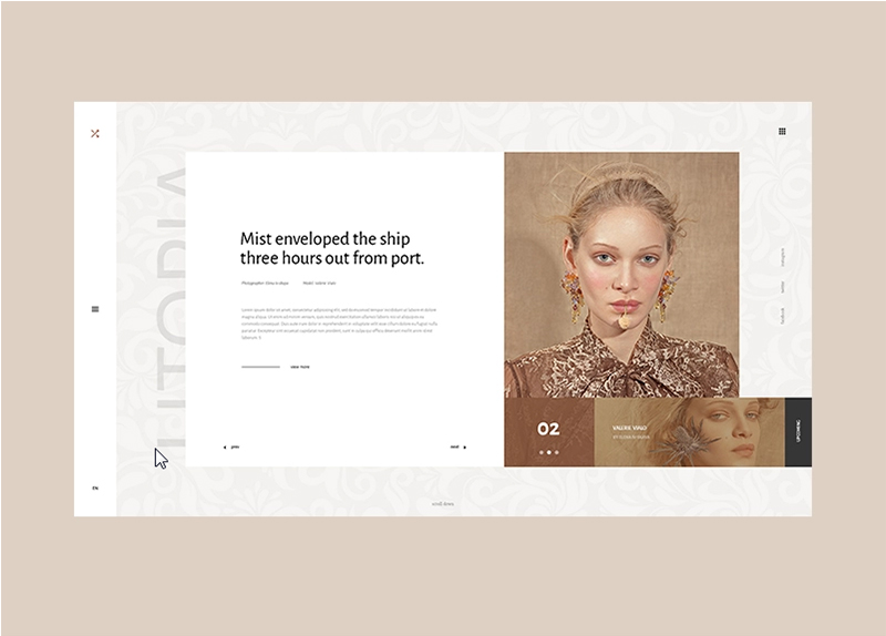
Image courtesy: https://bit.ly/2QbQz01
Pro tip: The concept of ‘reality’ is very important in photos these days. Stock photographs you use should look authentic as well so be careful about the pictures you choose.
9. Futuristic patterns – Abstract at its finest
If you look back at the sci-fi movies of the 80s, you’ll see that most of the predictions they made have come true! So why shouldn’t that reflect in your designs as well? Futuristic patterns and colors are here to stay for this season and seasons to come! I’m a big fan of them as they give you a chance to create visually unique content that’s truly one of a kind. You can let your creativity run wild with futuristic designs!
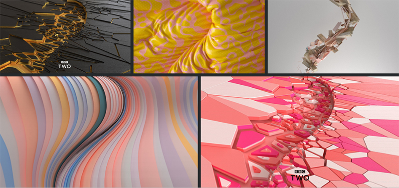
Image courtesy: https://bit.ly/2WMoMpG
Pro tip: Futuristic design elements go perfectly well with vivid colors, making for a match made in heaven.
10. Metallic effect – A touch of refinement
Yes metallic effects had fallen out of favor but they’ve regained a large part of their lost glory, thanks to their big comeback! Beauty and fashion brands use metallic accents in their design quite effectively and so have notable brands such as Samsung and Apple. I find them quite classy and if done right, they can make your designs look rich and grand.
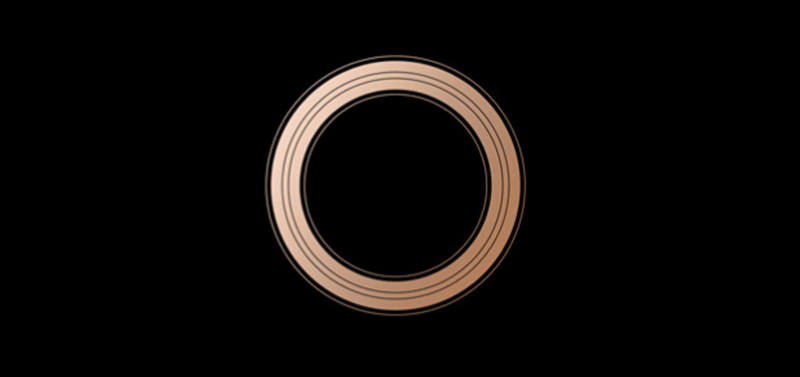
Image courtesy: https://apple.co/2YwjK0I
Pro tip: Always know when to stop when toying with metallic effects in your design. Overdoing them can make your designs look crass instead of classy.
Choose and use these graphics design elements smartly!
Though these graphic design trends are big this season, that doesn’t mean you use all of them. In my experience, it’s always wise to use your discretion and see if these trends match your brand’s identity, vision and values. If they benefit your brand and its campaigns, it’s a green signal to go ahead and have fun with these trends!
