15 Ways Business Catalogues Can Skyrocket Your Sales – Digital Polo Inc
Many of you who own a coffee shop or an automobile shop might be raising your eyebrows right after reading the headline! “How can a business catalog help me to increase sales?”
Worry not. I’ll explain how every business can benefit from using a custom catalog design. Irrespective of the kind or form of your business, having a business catalog can amp up your sales.
Catalog marketing – while a group of marketers believe this to be an effective sales tool, some marketers are uncertain about its importance. No matter what you think, there’s no doubt that business catalog, if used properly, can boost your sales.
When you want to inform and entice the customers by showing them the products you own, one of the best ways to do that is through catalog marketing. There are different types of catalogs that you can make use of.
Print catalogs contain the images and descriptions of the products that you want to sell. Your customers can browse through the items and place an order with you through a phone call or return envelopes.

The print catalogs have always been a cult favorite among both the marketers and the customers. The glossy pages and those irresistible photographs do have a weight that compels the consumers to make a purchase.
Online catalogs are for those who want to save those extra bucks that go into printing the brochure and mailing those to the customers. You can still group your products and let the customers browse through them. The difference is that your customers will be able to add the products of their choice in the virtual cart and place an order immediately. They can even pay through electronic payment method.
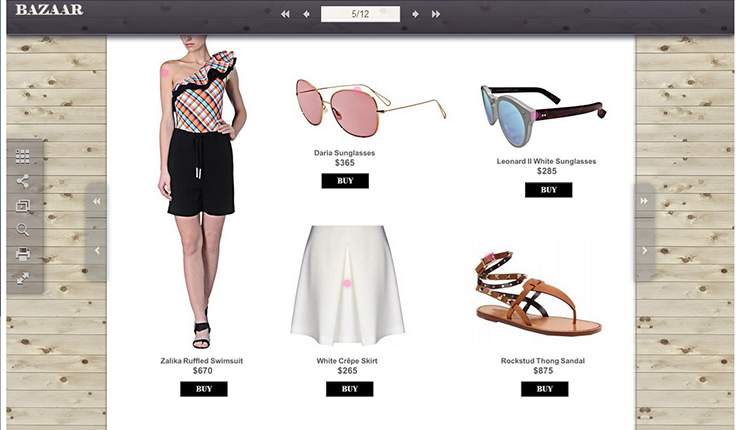
Online catalogs offer ease of browsing. If your target audience is the group of Millennials, an online catalog is a good choice for you.
Now that we’re done with information sharing, let’s proceed to the next step, which is to explore the ways that will skyrocket your sales.
But before starting, I’d like to say that custom catalog is one of my favorite promotional tools. You can get as creative as you wish and play with the design of your catalog to make it more impressive.
Contents
I. Design according to your target audience
If you want to create a lasting impact on your target audience, you must first understand what they are looking for. Unless you have a specific goal and concept for your business catalog, no matter how well you design, it won’t reap success. On one hand, the products you are offering should be useful to your target audience. On the other, your products should be marketed as valuable so that your customers feel the need to buy items that are popular in the market.
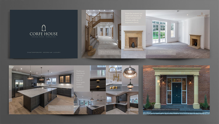
Image courtesy: https://bit.ly/305QD5Y
As you can understand, the image above is a business catalog of a real estate company. Check out how the properties for sale are photographed. If you too own a real estate business, you can include some engaging description to make it even more stunning.
If you want to maintain the industry standard and yet want to stand out, gaining some insight about your target market will prove to be fruitful. The better you know your audience, the more customized business catalog you can offer to them.
Hence, perform market research and find out which aspect of your business is most liked by your target market. If you offer products, find out the most promising products of yours and include them in your business catalog. If you offer a service, you should do a market survey to discover why your customers prefer your service. This will allow you to include some promotions and discounts that your customers won’t be able to bypass.
II. Easily comprehensible information
Suppose you’ve gained a clear perception about your target market and with your sleeves rolled up, you’re all prepared for creating a great catalog. However, when it comes to describing your products, you are not really sure how to handle this.
If images are important for your brochure, descriptions are the next vital thing to be kept in mind. As we know, pictures take up a lot of space in the catalog. Hence, you are left with small space to enter the content. And that’s why it’s so important to make the description crisp and engaging.

Image courtesy: https://bit.ly/2J6g8iB
The description should be at par with the images that you’re using. So, avoid writing a novel on the description and focus on sharing information that is absolutely necessary. Instead of using jargons, use simple words that will appeal to your customers. The easier your text is, the more people will read it. As your target audience will increase, it will reflect on your ROI.
III. Pay attention to the key items
When your target is to skyrocket your sales, paying attention to details should be your primary focus. Let’s assume that you have an assortment of products to offer. It’s not possible that each of your products has an equal market response, right?
So, what do you do?
If you’re thinking that you should concentrate more on the bestselling items, you’re absolutely correct.

Image courtesy: https://bit.ly/2WwB9WO
Even the best of the brands exhibit their bestselling items in their business catalogs. Actually, the focus here is to grab the attention of your customers as well as your prospects. Create an interest in your products among your target audience so that they feel the desire to own similar products. And as soon as you’re able to spark the desire in them, it will call for action. They will either place an order or make an appointment in case it’s a service that you’re offering.
IV. List the benefits you offer
“What? Do I need to make a list of benefits of EVERY product I’m selling?”
Ummm…YES.
If you want to create a lasting impression on your customers, you need to invest time to list the benefits that your products offer.
Why? Let me explain it in a different way.
Do you own a smartphone? Do you use it only as a device to make calls? I guess no. At least I don’t use mine just to make calls. It is a device that helps me to click pictures on the go; it has the details of my clients; I can regularly check out my social media platforms; I can listen to music or read my favorite books. I can go on and on about the device. But my point here is not to describe how I use a smartphone! I just want to point out that the advancement of technology has changed how the smartphone companies present their devices to us. None of the smartphone companies market their products saying that it is the best phone to make calls. Rather, the other features (most of which are not even related to calling) are highlighted by them. And people buy phones based on those additional features.
Don’t get me wrong. I’m not here to sell my smartphone! But my point is to make you realize that people are only concerned with what helps them. Your customers won’t have anything to do with your service or product unless it offers them something that they need.

As you can see from the image above, the company offers health products. And it has created the content in such a way that people will feel the necessity of incorporating the products in their daily lives. When you list a number of benefits that your products offer, it becomes easier for your customers to skim through the catalog. And as I always say, the easier the better.
Don’t just pen down the features of the products though. Make sure to understand what your customers think about the items that you sell. Having an understanding of their point of view will help you in describing the usefulness of the items. Listing the benefits will allow you to make your business catalog more customer-centric. So, word of advice, don’t confuse between FEATURES and BENEFITS.
V. Maintain consistency throughout the brochure
First, you have to understand what I mean by maintaining consistency. The aim of your brochure is to grab the attention of your customers in such a way that they feel tempted to try out what you are offering. And in order to engage your customers, your catalog should have a visual theme. If your catalog doesn’t follow a theme, it may look like you’ve just stuffed some images together.
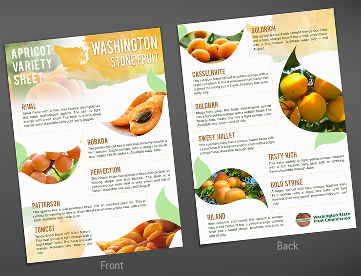
Image courtesy: https://bit.ly/2H5J2Nr
Do you see how the company has used the images and the descriptions in a consistent way? Here’s another such example:
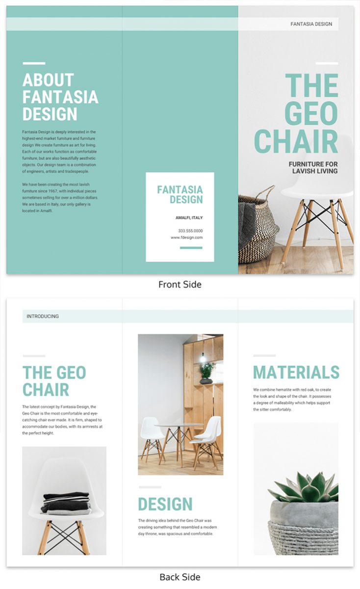
Image courtesy: https://bit.ly/2YcIV8q
The chair is the product that is being sold. Notice how the chair has been shown in different images followed by the short, yet necessary description. This is what consistency is. It’s not necessary that you’re selling one particular product. But no matter how many products or whatever service you’re selling, ensure that there’s a theme that you’re following throughout the catalog.
What do you need to do? Make sure to choose either icons or photographs for your catalog. Once you’ve decided what you want, plan the placement of the images along with the descriptions. Even though the descriptions are vital, photos play the most important role in catalog marketing. Hence, avoid making any design faux pas and pay attention to maintaining consistency.
VI. Color coding the information
There are many of you who offer a service and not a product. In that case, coming up with relevant images for each of the brochures can be a tricky task. Therefore, the brochure may appear dull! However, you can avoid getting into such problems pretty easily. Choose to offer information in a color-coded format. Take a look below:
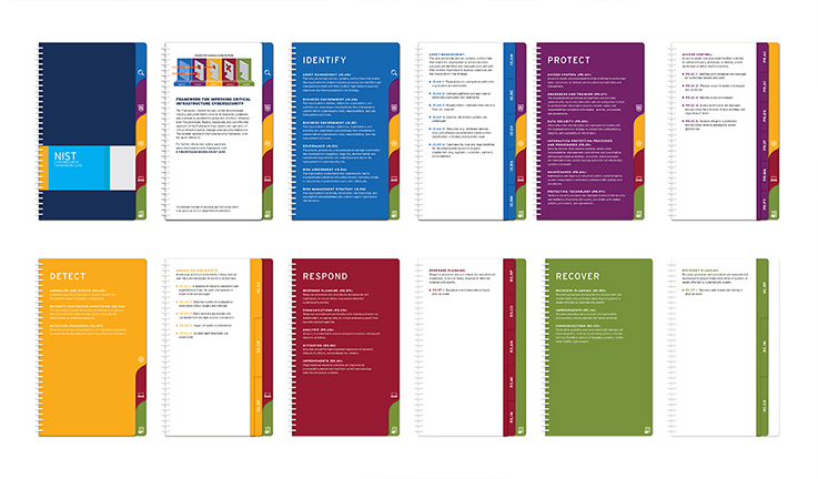
As you can see, the company offers several pieces of information. But the use of different colors to differentiate the information breaks the monotony of the brochure. Apparently, sharing information without images may seem boring. But you can make it look interesting through color coding. This is a useful method for you if your business catalog targets to share a lot of information.
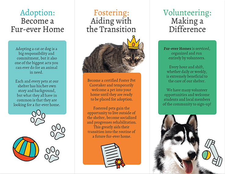
Even if you have some interesting images to share along with the information, color coding will make it way too easier to read the description without getting bored. You can either use color-blocks to put the information within as shown in the image above or you can choose different colored backgrounds as shown in the previous picture.
VII. Interesting headlines and catchy graphics
Catalog marketing is all about visual marketing. There’s nothing as satisfying as touching and feeling a product before buying it. However, the next best thing is to at least know how the products look before making a purchase decision. And that’s what we are leveraging in our business catalog design.
Whether to go through a catalog or not is generally decided within the first 5-10 seconds of looking at it. Now, do you realize how important the front page of your business catalog is? And that’s why you need to make it as interesting as possible.
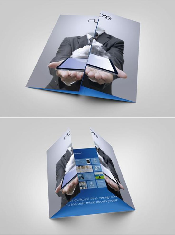
Image courtesy: https://bit.ly/2vIrsIX
Take the image above for an example. Do you see how clever designing technique has been used to grab the attention of the readers?
If you want that your customers take a look at your business catalog, you must make sure that the graphics used right up front is eye-catching. Now, the engaging design doesn’t mean that the image needs to be too dramatic. If you want to maintain gravity, yet make it interesting, you can do that too.

Image courtesy: https://bit.ly/2YcXjOc
The image above reflects professionalism. At the same time, you can understand that the brochure will focuses on sales growth techniques. If you are someone who is looking to increase your sales, you’ll definitely take a look at the catalog.
Similar to the graphics, the headlines should also be enticing enough to spark curiosity among your customers. You can use inspiring texts or quotes that suit your business catalog. Suppose you own a software firm. You can use text such as “Optimizing your supply chain management through [software name]” for your catalog. Now, people who are interested in optimizing their supply chain management will go through your brochure.
VIII. Using bold fonts
I know what you’re thinking now. “Why use bold fonts when I’m using interesting graphics and headlines?”
The answer is simple. While the interesting graphics and headlines can be used on the front page, you want to keep your customers engaged throughout the catalog.
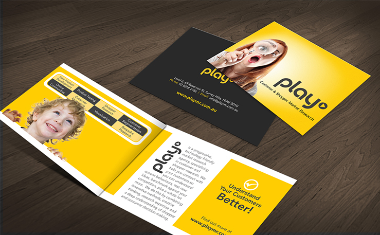
I recommend using bold fonts in the headers that will appear inside your brochure. Our eyes can easily scan the bolder fonts. And they stand out in the crowd of product description and respective images. Use of bolder fonts allows your target audience to skim through the necessary information quickly. It saves their time, which makes them happy. And as we all know, a happy customer always spends more.
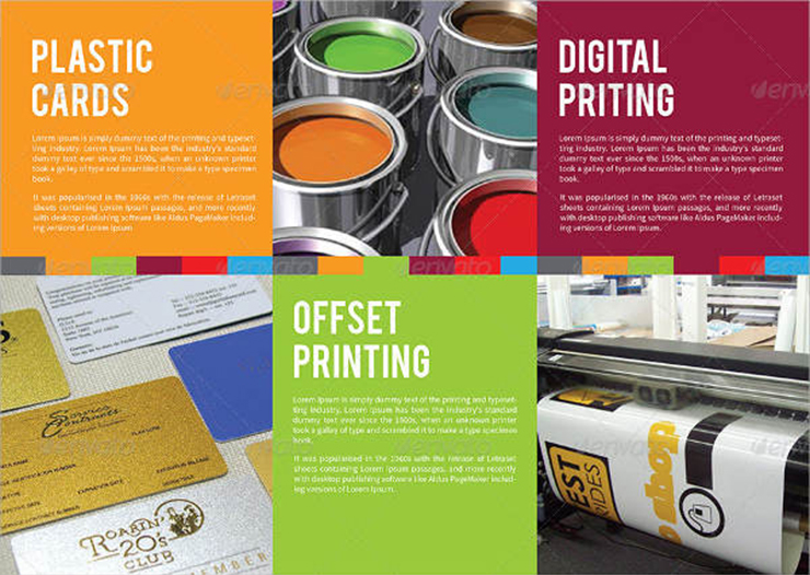
Do you notice how bold fonts engage your attention at once? And that’s what we are targeting as well.
IX. Pay attention to readability
Let’s assume that you have created some killer content for your business catalog that can surely retain your existing customers and even generate some new leads. However, when your target audiences see the catalog, they find it difficult to read. No, I’m not saying that the content is hard to digest. Rather the text is simply not readable.

Image courtesy: https://bit.ly/2WuNZoa
Do you think that the text offers legibility in contrast with the background?
Absolutely not.
Such text can cause confusion among the readers. Here’s another example for you:
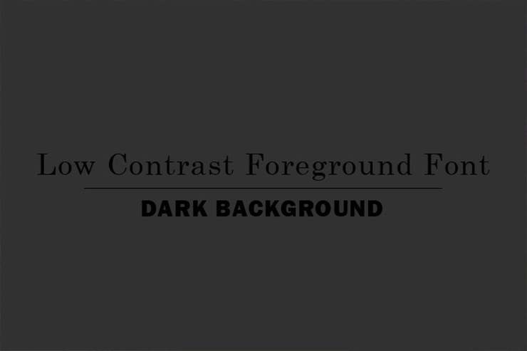
Image courtesy: https://bit.ly/2VOW8a4
At first, it took me some time to realize that something is written on the black background. The dark background and the low contrast of the text make it too difficult to read.
So, when you’re creating your own business catalog, make sure to keep an eye on the readability of the texts. I’d suggest you avoid dark backgrounds. If you don’t want to use a white background, you can choose pastel shades such as beige, Champaign pink, pale purple etc.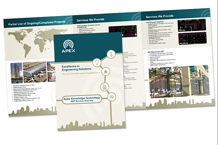
You can see in the image above that the background is not plain white. Besides, as the brochure is content heavy, the text has been broken into different small sections. Use of bullets makes it easier to read.
X. Focus on statistics
There are many people who like to measure success through numbers. Even though I believe success is something beyond numbers, I know that focusing on hardcore facts does pay well at times. Take a look at the brochure of WunderPass below:
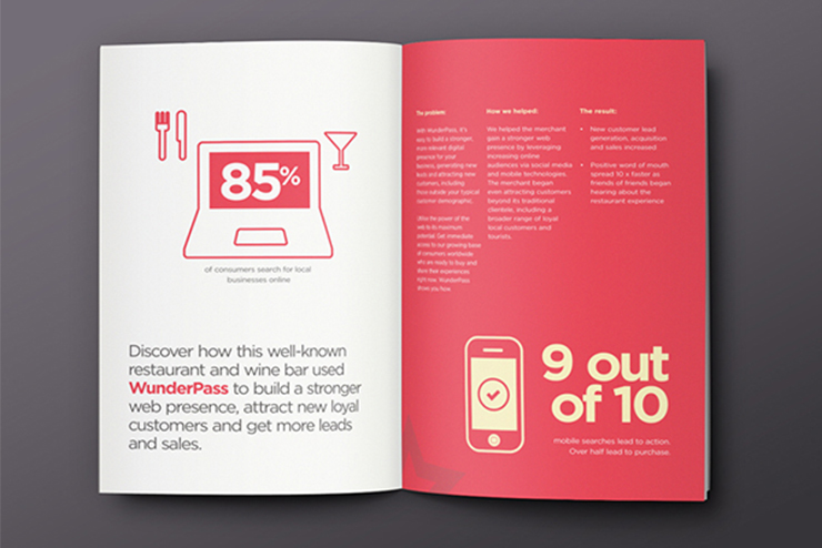
Image courtesy: https://bit.ly/2Yb3XnV
Do you see how the company has focused on the statistics in bold font? Using the bold font and a contrasting color grabs the attention effortlessly. Once you’re attracted towards the large numbers, you’ll automatically read on to know more.
Similarly, if you have business statistics that can excite your customers, do include those in your business catalog.
XI. Using contrasting colors
Black looks more intense against a crisp white background, isn’t it? You need to incorporate this theory into your brochure design as well. Using contrasting colors not only makes the text readable but it also makes the catalog look more vibrant.
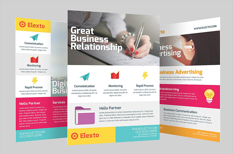
Do you see the image above? The brochure is so colorful and yet it doesn’t look clustered. On top of it, the company has used different font sizes and colors to make the necessary information pop-up.
You can also choose complementary colors according to the color wheel to make the content stand out. Even if you want to highlight some information, use of contrasting color to point that out will prove useful.

Image courtesy: https://bit.ly/2DQTqGQ
Check out the use of colors in the image above. While white has been used to share general information, the green font is used to emphasize or highlight information.
XII. Include offers and promotions
If you’ve seen business brochures, you’d know that sometimes the companies come up with promotions and offers. Words like ‘sale’, ‘free’, ‘save money’, ‘promotional offer’ etc. are used to attract the target audience. And personally, I like the idea because it’s quite effective.
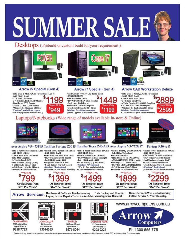
You don’t want your business catalog to be thrown in the bin, do you? The aim of your brochure is not only to make your customers aware of your products but also to increase your sales. If you don’t come up with appealing offers, chances are that your customers will soon forget about the catalog.
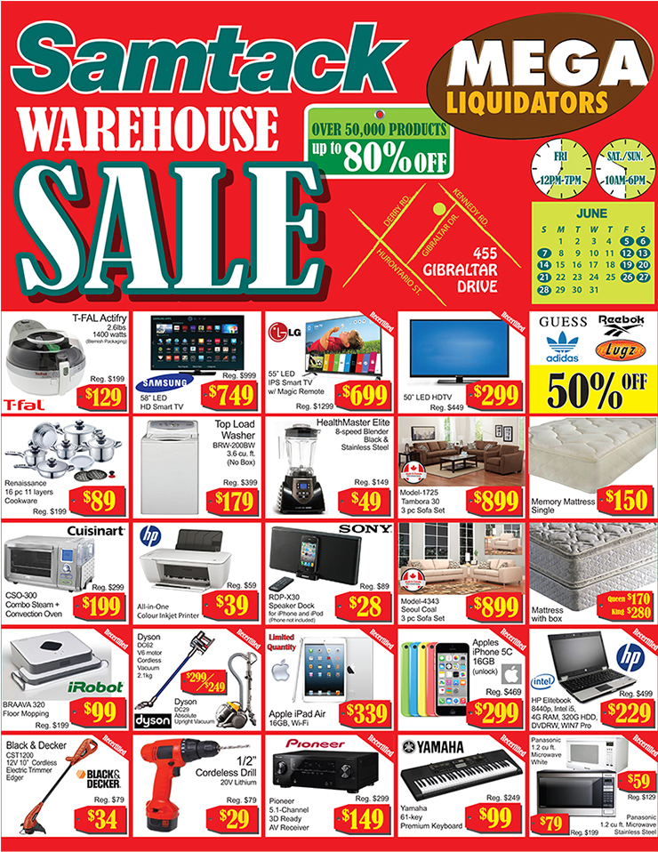
If you notice the images above, you’ll see that in each case, the word ‘sale’ is written in bold capital letters. Besides, the reduced prices of the products are also highlighted to grab the attention of the readers.
Even if you don’t want to offer any discounts, you can still create a need for urgency. Let your target audience know that some of the products are available only if ordered within a limited timeframe. The aim here is to persuade the customers in a way that they feel the immediate need for purchasing your product or service.
XIII. Call to action is a must
Let’s assume that you’ve informed your target audience about your product or service. You have even managed to offer some lucrative discounts. Now what? What is the next step?
The answer is obvious. You want the readers to make a purchase.
What did you say? Do you think that your customers will automatically place an order after seeing your brochure?
I wish you were correct. But the truth is that your customers need a little nudge. Hence, the necessity of call to action is undeniable. Using promotional words is not enough to drive readers to buy a product.

Unless you tell your audience what to do next, they won’t do it. Therefore, make sure to have a dedicated page on your business catalog that will display your contact details along with a call to action message.
As you can see in the image above, the phone number of the company is displayed with an image of a ringing phone. The ringing phone definitely encourages the readers to make a call. The company has also used stimulating words such as “Act now. Before your competitor does!”
In order to make it more effective, pay attention to making your contact details visible enough. You can include the name of your business, your contact number, email address and even your social media channels depending on the type of audience you’re targeting.
XIV. An Omni-channel marketing effort
Your business catalog is a marketing tool and it alone may not help you in the long run. So, what should you do? Simple!
Apart from generating a sales lead, you should utilize your catalog to drive the traffic towards your website and social media platforms as well. After you acquire a number of prospects, you can continue to engage them through email campaigns. Let your customers know about the sales or events regularly to keep them informed about your business. The Omni-channel marketing effort should allow your customers to have a seamless experience as they can make use of different purchase channels.
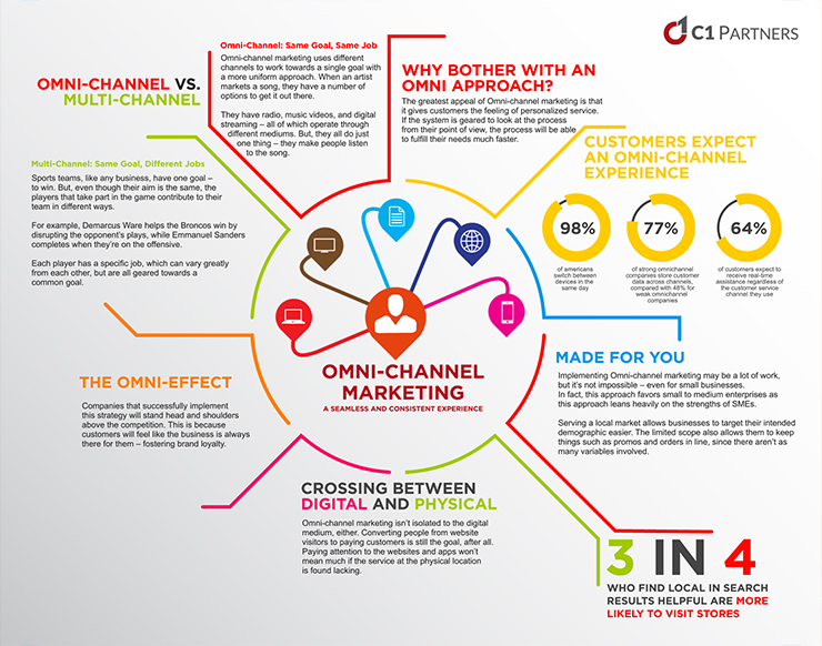
Image courtesy: https://bit.ly/2J6dAky
XV. Take professional help
I know what you might be thinking now. The article is on how to make more money and not on how to spend more!
When I say take professional help, you may think that you’ll end up spending more than what you earn. But that’s not the case at all. Let me explain it to you.
The idea of hiring a professional design agency may not be a welcome thought for you. Especially for those of you who own a small or medium enterprise. However, no matter how alluring the idea of cost-cutting seems, a small mistake while creating your business catalog can lead to catastrophic failure. Each and every method that I’ve mentioned above needs extreme focus. If you don’t have clear knowledge on creating business brochures, you may miss a step or two in the process.
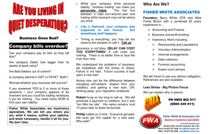
Image courtesy: https://bit.ly/2H2Nz1X
Can you see how awful the design of the business brochure looks? Even though there might be credible information in the catalog, I don’t even feel like going through it. The design looks cluttered and I find it difficult to skim through the important information. To me, it looks like someone has misused the features in MS Word!
The image above proves that even if you know the ABC of how to design your catalog, lack of expertise and experience may lead to a bad design. Hence, it is always good to hire a graphic designing company.
Such companies have professional designers who conduct thorough research before creating your catalog. They also have access to the updated tools that are often required for creating a top-notch design. Moreover, hiring a design company ensures that you get high-quality catalog designs, each time.
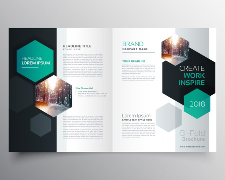
On the contrary to the catalog design you checked before, this design looks much more appealing to me. The use of colors, fonts, and pictures show what you can expect from a company that has trained designers.
However, I recommend you to check out the sample works before hiring a company. You can also check out the testimonials shared by the satisfied customers.
Conclusion
If you really want to skyrocket your sales with the help of custom business catalog, you must consider analyzing the performance. Analyzing the catalog will allow you to understand its effect on your ROI.
Besides, I believe that success is a journey and not a destination. If you’re looking for success, you’ve to maintain consistency. The best way to maintain consistency is to review the performance of your business brochure.
On one hand, performance analysis will tell you which product is preferred by your customers. On the other, you can also measure the changing demand of your target audience. Little tuning and tweaking in the design of your catalog will reflect in better result every time.
Do you have a business brochure? What tactics do you use to increase your sales with the help of custom business catalog design?
