21 Superb Design Ideas to Make Your Catalogue Stand Out – Digital Polo Inc
You were searching for a catalogue idea and that’s how you stumbled upon this article. You are almost sure about getting a catalogue and you need the final confirming push. Say no more, this article shall be the guide in your catalogue designing journey.
There are companies that put up huge advertisements and banners about their products or upcoming launch. The message from it reaches thousands of people and daily another thousand come across it. While it is an effective way of announcing yourself, a person might not think about being your customer only by seeing that advertisement. But that person would definitely think about buying it after he or she has seen that same thing in a catalogue.

The simple reason behind the change in behaviour is the feeling of personalization. When the person sees a banner, he gets to know about the existence of the product/service. Having a catalogue about the same right in front of them, makes them realize that they can have it too. And thus, most of the purchases are done after viewing a catalogue rather than an advertisement.
Also, an advertisement is targeted towards a mass audience and thus has no personal touch. But a catalogue makes the reader feel like it is specially and only made for them.
What is a Business Catalogue and Why You Should Care?
A Catalogue or a brochure is the business equivalent of a resume and Curriculum vitae. A catalogue contains all the essential information about the company product and all the details they want to convey to their buyers/customers.
Companies believe that having a catalogue reduces the stress of sales by almost 80%. For some of the companies, their catalogue is the core sales strategy itself. No matter how hard we try, we can never deny the fact that sales catalogues are still one of the most crucial driving forces in business.
How a Catalogue Helps in Marketing
It is very easy to scroll past a certain advertisement when browsing through social media. Everything happens at lightning speed on the world wide web. But for the same advertisement to pop up in real life, is very difficult to ignore. Studies show that almost 40% of the companies feel catalogues are very helpful in building customer trust.
Almost 60% of the direct sales are connected to the catalogues that were distributed across. It is also been seen that almost 30 % growth in web sales were directly related to cataloguing distribution.
55% of companies have had their catalogues made for over 10 years and they are really happy with the gifts it has proven to give. A catalogue is one of the central marketing strategies that have stuck around for decades.
Now, it is not necessary that your business catalogue/ brochure levitates, performs tricks or breathes fire. But it is important to make it interesting enough so that people will WANT TO read it. If your catalogue is boring and bland, there is a 90% chance that it will remain nothing more than a piece of untouched paper.
The following article contains 21 innovative things you can do with your catalogue that makes it stand out from the rest as well as attract more customers.
Read on to know more.
Top 21 Catalogue Design Ideas
Ideas are inconsistent and in a world filled with gazillions of ideas, it is surprisingly very easy to run out of them. These are 21 of the best and innovative design ideas to help you if you are all out of them and need something new to brush up those grey cells.
21. Geometric Shapes to the Rescue
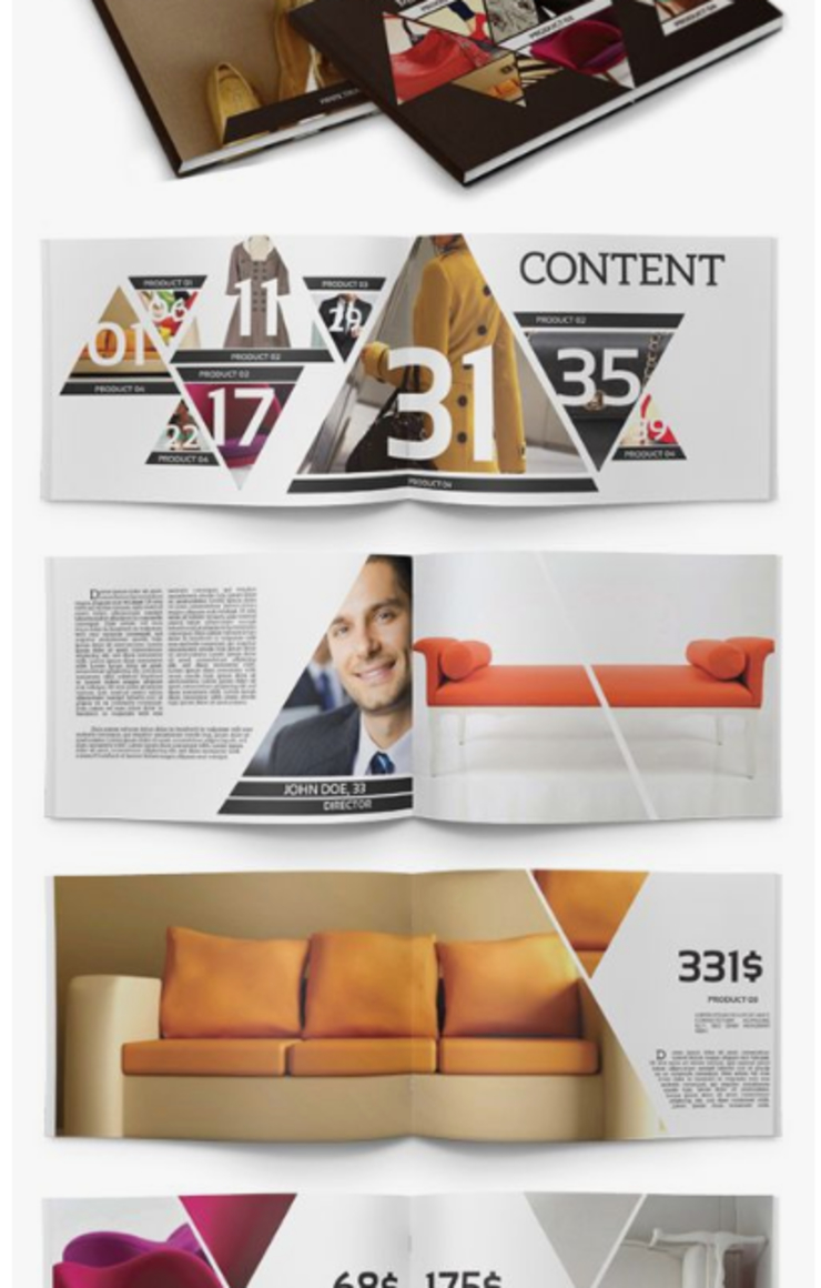
There is something very soothing and fulfilling about geometry as well as the symmetry that enriches human existence. When we look at an intricate geometrical shape or design, we automatically try to relate it to abstract art and creativity.
And there is also a part of us that sees geometrical shapes as a way to convey professional edge. And this is why it seems like the perfect tool to merge the two. When professional design meets creativity, magic happens. And geometry can bring the same magic to your catalogue through the designs and shapes.
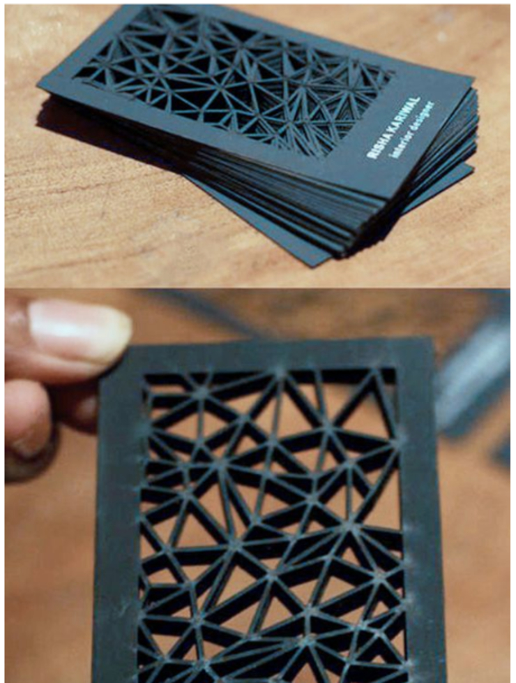
People have used geometry in business almost exclusively. Starting from business brochures to magazines and to business cards as well, the rampage of intricate geometric designs is all over it.
20. Simple and Minimal Designs Never Fail
Minimal means to convey an ocean’s worth of thoughts in a drop. This is perhaps the most difficult job in this entire world. But making a catalogue, however, isn’t.
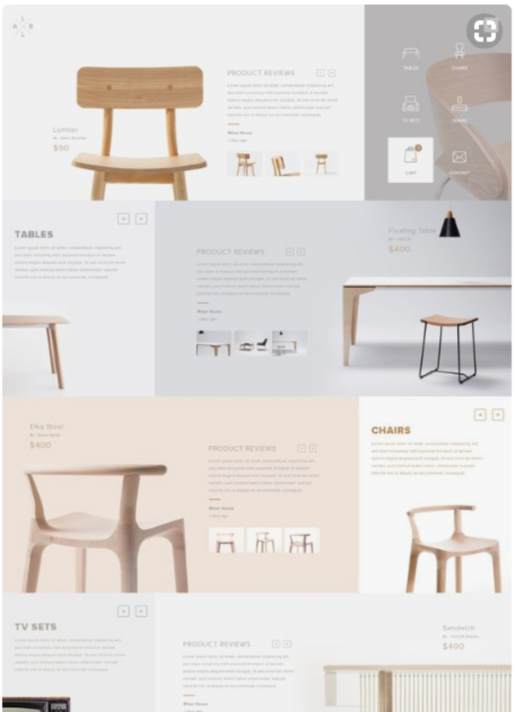
There are tons of minimal designs to choose from. There are also millions of fonts especially made for minimalistic designs and similar purposes. The core thought is to keep it brief and enriching.
Some of the most popular minimal fonts that are used in designs are –
- Quicksand
- Dense Regular
- Raleway
- QG
- Fox and Cat
- Break
You can find thousands of similar fonts on the internet for your minimal designs. Minimal designs and fonts go well with faded colours and evoke the feeling of calmness and simplicity.
If you run a spa or even a restaurant, using minimal designs and fonts in your catalogue will give out a relaxing vibe to the readers and they will definitely visit.
19. A Little Bit of Texture Never Hurt Anybody
As catalogues are physical things that people can touch and read, making then physically and visually soothing might serve your purpose better. We like the feel of a glossy magazine than an old and flaky page.
It is not about the age but the texture of the page that makes the difference. Some people really love the smell of old books and also the texture of it.
The same mentality goes into the designing of a catalogue. If it feels good to touch and see, the person will at least think about opening and reading it.
If your audience even thinks about reading your catalogue, your job as a catalogue designer there is done.
Adding texture can mean a lot of things. And it is also not necessary that all the pages in the catalogue have the same texture or visual.
There are more than 10 types and finishes of a paper. Starting from simple printing paper to parchment paper, everyone feels a different way.
Depending upon the texture, a paper is classified into types. Here is the complete list –
- Wove
- Smooth
- Vellum
- Linen
- Laid
- Pinstripe
- Parchment
- Cockle
- Foil or metallic
- Stardream
- Glossy
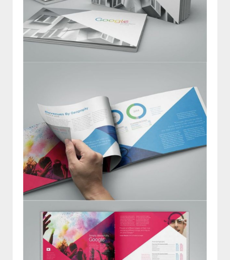
Design the catalogue in such a way that it is easier to handle and feels good to touch. Matte, glossy, rough, smooth, embossed … there are so many ways one can express the feeling of a paper. If required, you can also use materials that are not paper to bring out the true essence of texture. To know about this more exclusively, see point number 17.
18. Toying with All the 3 Dimensions
The world has moved on to concepts about 5 dimensions (thanks to Interstellar), then why must your catalogue be limited to 2 dimensions only? The following design shows a 3-dimensional design which is made out of a 2-dimensional paper.
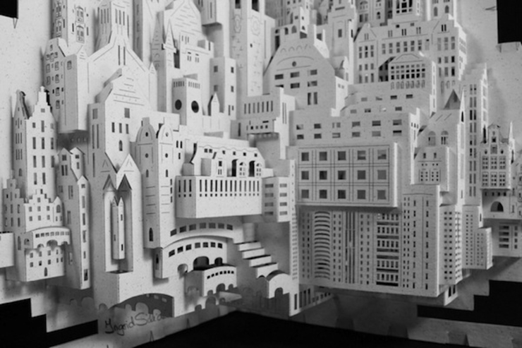
If you are an architecture firm, this could be a gamechanger for your business. Having a catalogue that accurately depicts your product and business is all you should look forward to.
Alternatively, if your business is a restaurant or bank, your catalogue can have the 3D cutout model of your restaurant building OR bank building respectively. The sky is the limit and there are endless possibilities with this certain design idea. You can make the design as easy as you want or as intricate and complex as your heart desires. The brush is yours to paint the empty canvas.
17. Chuck the Paper, Grab Something New
There are millions and billions of catalogues in this world right now. So, what can you do to stand out in this crowd? The answer is very easy but easier said than done.
Replace the paper with anything else such as pieces of cloth and have the print to be in it.This could be a really bold move as well as a costly one but might become your business trademark. Alternatively, you can also print brief version of your catalogue in your merchandise. If your merchandise contains bags and similar stuff, it will be very innovative to print the catalogue in that.
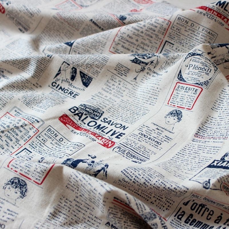
Not only will it serve as an interesting design but will be very good for additional promotion of the company. People have been known to print their business cards on wooden sheets.
Using metallic plates to print advertisements is also not a foreign concept. Printing a whole catalogue in a sheet of wood seems like a bit of a stretch. But hey, there are some materials which are perfect for a catalogue. Fabric seems to be the perfect substitute. Use as many kinds of fabric as needed and make your design stand out. The market is filled with all the options.
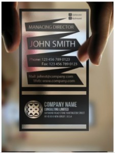
Sometimes using transparent base is also suggested.
Example – Suppose you have a restaurant that is medieval themed. Your catalogue can resemble scriptures or invitations/ messages which were sent between kingdoms in that era. There is nothing more beautiful than building up to the theme of your business and this tool could be brilliant in this case.
16. Colour Palette is the King
A human being can differentiate and perceive to more or less 10 million colours. Out of these many, which ones will make your catalogue stand out?
There is no rule of thumb or a written and proven formula of one particular colour bringing out the best in a catalogue but we all know that it helps.
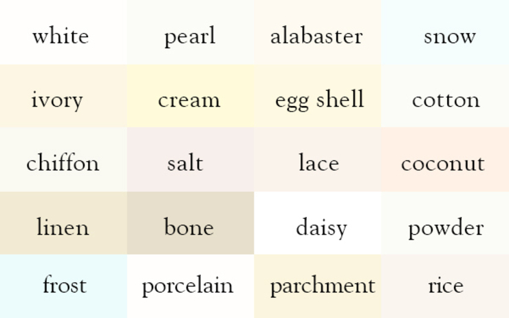
The colour palette that you choose is going to be the first thing the customer notices. Architecture firms use mild and neutral colours to maintain the classy feeling while media and entertainment firms use bright yellows and reds to drive attention to their vibrant content.
If your business requires your catalogue to be colourless or white, go ahead do some research and you will be shocked to find out how many shades of WHITE there are.
15. Ditch the Pages
People are tired of flipping through the pages and it is the era of scrolling through your browser. In this era, you can not engage a nonreader to take interest in your work. To make that happen you have to let go of the pages and replace it with something else.
If you still want to keep pages, keep them in an innovative way. In this following example, we can see that this company has manipulated its catalogue in such a way that it has pages but they are not quite conventional. Neither is the pages ‘page-shaped’ and nor are they made for flipping through like people usually do.
Ditching the pages can be a clever way of marketing because if the catalogue doesn’t look anything like a catalogue, then people will be curious to know more about the ‘ newest’ thing they saw.
14. Additional Gifts Inside Catalogue
Isn’t it great when you open an invitation and find a gift inside it? It may be some exotic chocolates or may even be a letter.
To make a catalogue stand out, you can insert an additional gift inside it for your customers. If your product is digital and service based, you can insert a CD inside the catalogue that has information to your services.
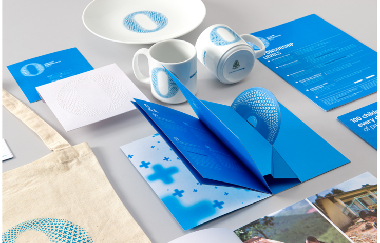
UNICEF Zero Awards went all in for the promotion and made all types of merchandise/gifts with their personalized design. Their catalogue has a special fold, inside which was a CD, gracefully peeking through.
You can also gift a CD with your catalogue even if you are not a digital service based company. A CD can be a digital way of promoting your business along with the physical form that is the catalogue. So, it is a power package in one.
13. Destroy the Idea of Conventional Shapes and Sizes
It is not mandatory that the catalogue has rectangular pages or even pages at all. The ‘pages’ can be of any shape and size and can start and end anywhere they want. If that makes your catalogue stand out, why wouldn’t you do it?
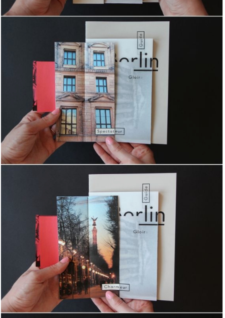
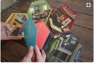
People are tired of picking up the same ‘booklet’ themed catalogues and want something else and something new. The catalogue here shows all kinds of ‘pages’ in a single catalogue. Imagine the same catalogue but with uniform pages. We all can clearly see that the former looks more interesting and people would most probably pick it up rather than the uniform page one.
12. Go Small or Go Home
Often, big and heavy catalogues are unaccepted by the customers. If your catalogue is light and to the point, the customer might as well think about taking it with him or her. By making it elaborate and longer than 8 pages and thus difficult for them to carry it with them, you will only lose business.

Imagine how something as big and elaborate as a Bible can be made into a pocket-sized one. Yes, it undergoes a lot of translation and elimination but it is still portable unlike the original one and thus more people have access to it.
Had it been a heavy book of over 1000 pages, people wouldn’t have been brave enough to carry it with them on their go. It would just have been sitting there idly, completely defying its purpose.
The idea is to keep the catalogue small in size as well as efficient. Remember, never mistake it to be a magazine.
An example of a thick catalogue can be seen here. It almost looks like a book.
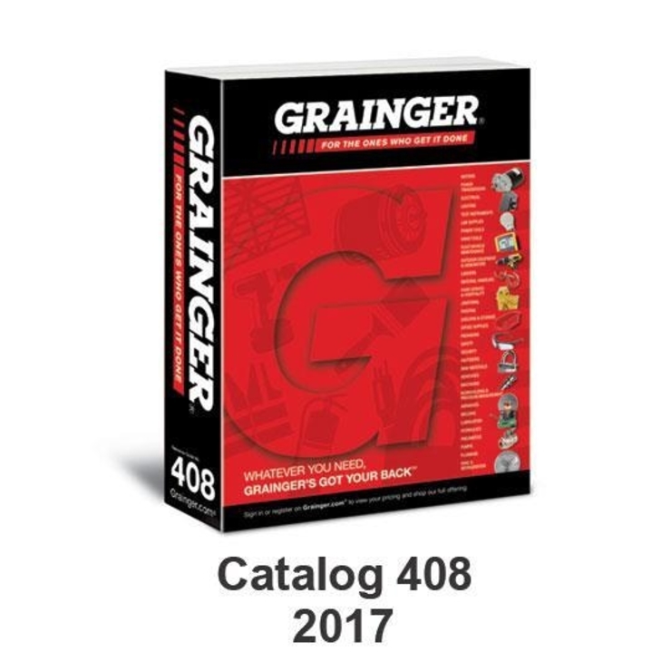
11. Give Another Purpose to Your Catalogue
Things could be great if your catalogue doesn’t only serve as a catalogue. The concept is similar to what I mentioned in point 17, that is using the merchandise to print in the catalogue. A brilliant example of using a catalogue and giving it a purpose is here.
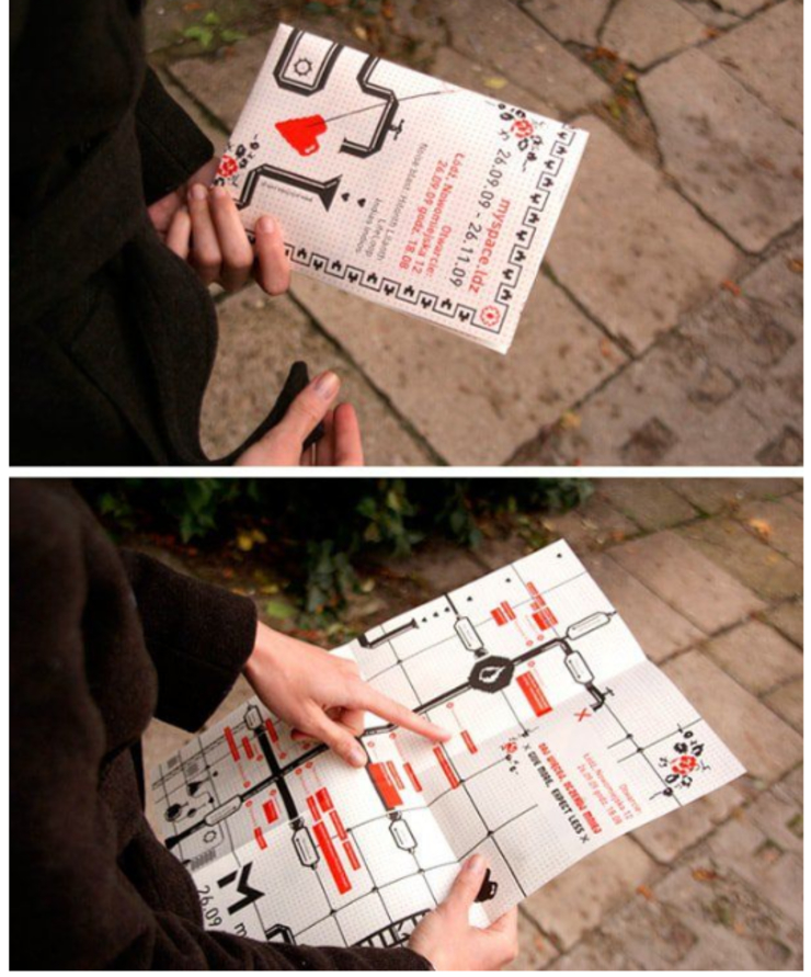
This company has kept a map on the back of their catalogue so that when people are done reading it, they still keep it with them for future use. Also when other people start noticing the map, they grow interested in the catalogue and hence the company.
10. Accordion Fold – With a Twist
The realm of corporate brochures and catalogues is ruled by accordion folds. Almost 100% of the catalogues have accordion folds.
It is more common than using pictures in a catalogue, which to an extent is funny. It is a common misconception that the accordion fold is the official folding technique for business-related documents. If you want to stand out from the crowd, you have to think outside the box. In this case, the box is the accordion fold.
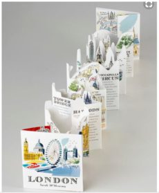
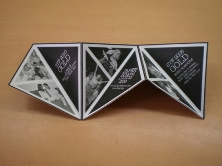
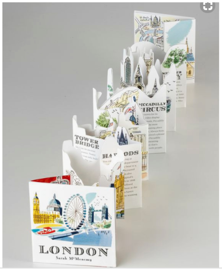
The fold is just fine, add a little twist to it. There are various ways you can manipulate that fold and make cuts to make the accordion look cool. In this image, we can see how cool the same accordion fold looks after using a design that has ‘cuts’ in the upper side. These kinds of designs bring out the best in the catalogue.
9. Fonts and Illustrations Must Relate
If you design is minimal, it is never a good idea to go for big and funky looking font. Similarly, if your catalogue has multiple colourful and cartoon-ish designs, then a minimal and simple looking text just wouldn’t look good.
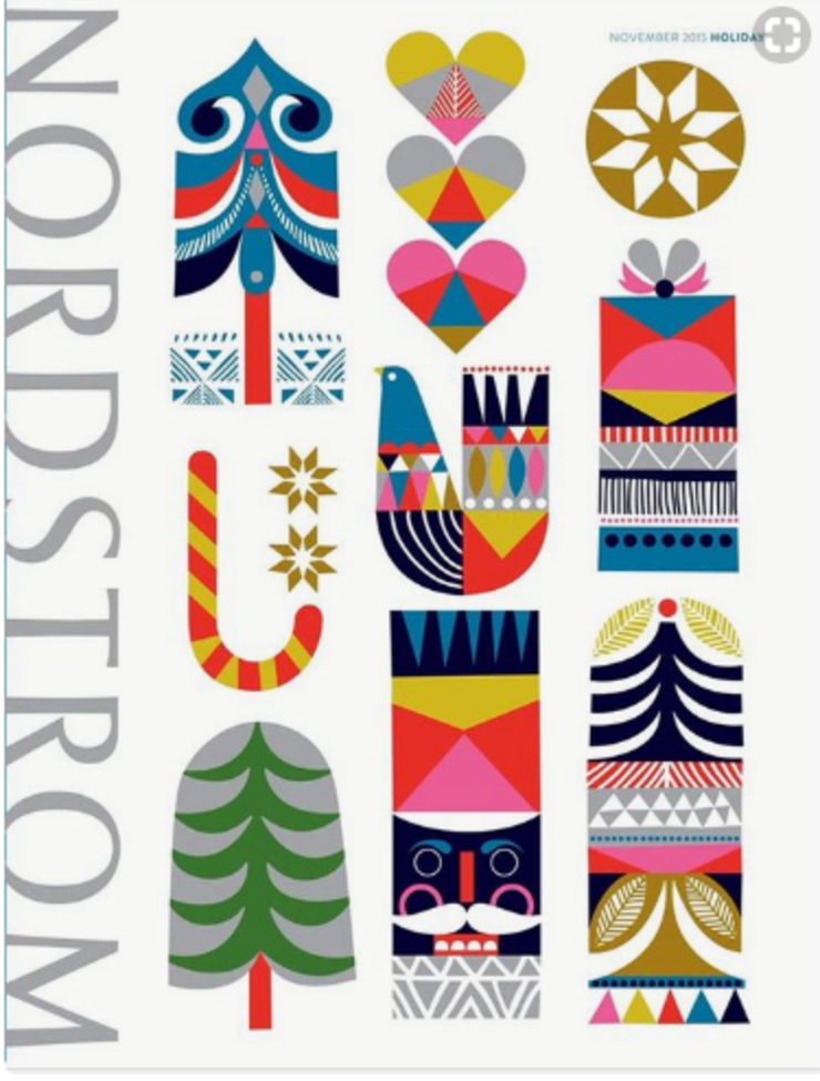
Text and image must make sense when put together. The font could be the best font in this entire world and the illustration can be the made by the best designers worldwide. But if they do not go with each other, the whole project could be a massive fail.
Fonts convey a lot of thoughts about a certain sentence. Sleek, straight and tall fonts usually mean business while wide, wobbly and circular fonts express creativity. To choose the correct font for your catalogue, just give a good look at your illustration and design. Understand how it unfolds and uses a font that has the same theme.
8. Make Online Pop-up Texts a Reality
Remember those pop-up greeting cards you used to get on birthdays? Well, have you ever thought of using the same technique in a catalogue?
If you loved seeing it, then isn’t it obvious that it is visually appealing to everyone else as well?
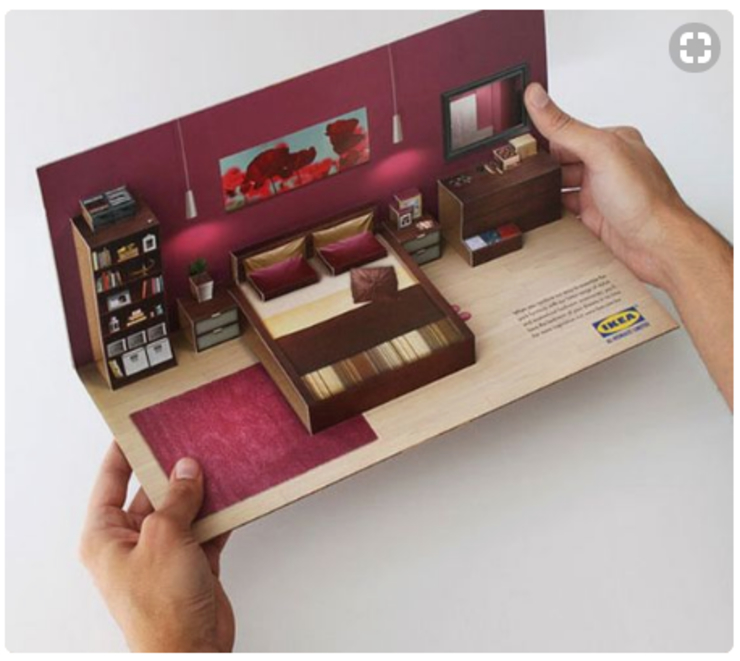
It would be a feather in your cap if your catalogue contains a pop-up text or a folded art piece inside. A 3D popup will not only be attractive enough the engage the reader but can also be used as a tool to emphasize on a certain part of the text or design.
If you add too many pop-up ads on your website, it might look spammy and people will stop visiting the website. But think about this, a pop-up inside a catalogue works completely in reverse. It increases the person’s interest in your work and makes it easier for you to convey them your message.
7. Fewer Words, More Design
The phrase ‘ a photograph is worth a thousand words’ fits perfectly here. You can not expect a person to pick up your catalogue and within seconds be interested in reading your 10-page long description. It is just not the way humans work. But instead of words, if you add some pictures and designs (or better, keep the catalogue image-centric), users will find it interesting to approach.
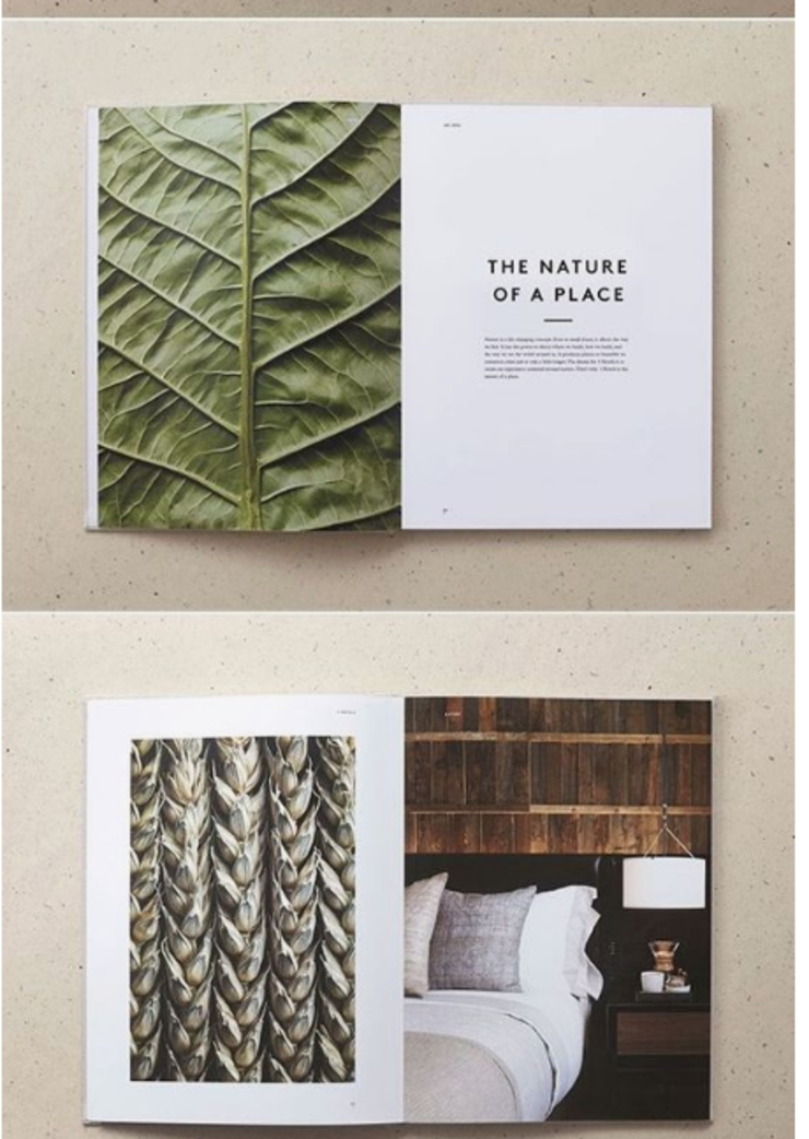
Images are 100 times better in conveying messages than words. And it is also true that a human brain processes an image faster than it does with words.
By adding more design and fewer words, your catalogue will not come off as generic and boring. Keep your designs fresh and bold and keep the font size of your text on the larger side of the spectrum.
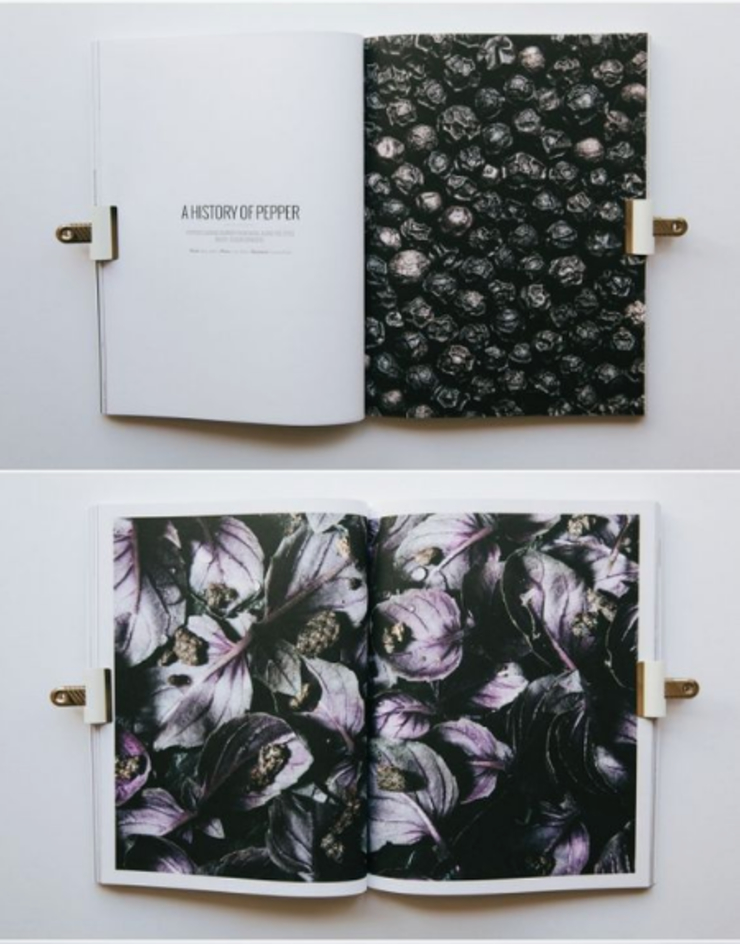
In the previous image, the subject is ‘History of Pepper’. A person who has no interest in cooking and spices will not go for such a book/magazine. But look how beautifully the pages are filled with big photographs and images.
Even if a person has no interest in ‘pepper’, he will stop by to browse through the designs and images if it looks good enough.
Image-centric catalogue doesn’t mean something that will be filled with infographics and pictures. Maintain a balance between the text images and infographics, and you will be the owner of an amazing catalogue design.
6. Substitute Alphabets with Braille
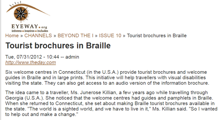
Among the population of 7 billion people, almost 40 million are completely blind and almost 250 million people have a vision impairment (partial). Is it fair that this large part of the population is completely ignored?
Do not limit your audience to people who can see. One amazing and caring thing you can do to increase your business is by adding braille text to your catalogue. Do not see this as a business opportunity but see this as a way to do something new and different.
There are not many business owners who target visually impaired customers but you can start by making this change. If it is a perfume catalogue, keep the names and brands of the perfume in braille. Not only will this come off as a brilliant help for people who cannot see, but also will increase your audience demographic.
Alternatively, if yours is a food catalogue or a clothing brand catalogue…you can easily use this technique to keep your special audience informed about your food, fabric and more.
5. Reverse the Formal Colours
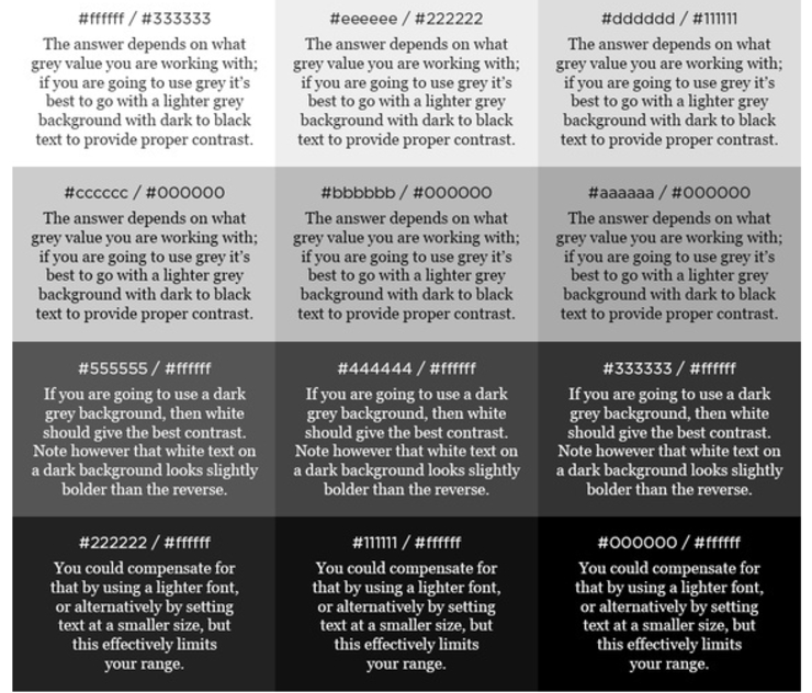
Almost 97% of what we read consists of a white or a light colored background and dark text for contrast. Wouldn’t it be interesting if their roles are reversed and the white text is put in front of a dark background?
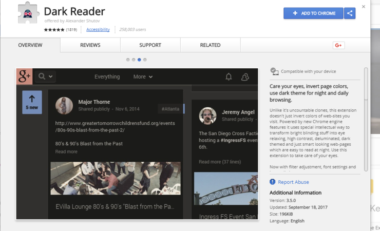
Almost 40% of the readers agree that reading from white background tires the eye faster than reading from dark colors and although people do not ‘PREFER’ black backgrounds, somewhat darker shades are quite soothing to view.
Even Google has extentions that enable reading in a dark background. Similar features can be found on number of other websites such as GoMovies as well as Twitter.
Popular colours, that readers chose were off-white and dark shades of blue. Another very interesting and yet very popular choice was a grey background with black text. Seems like people are avoiding the bright and contrasting texts. Go figure.
The trend of seeing black text in white has become so general that if a black piece of paper contains white text or design, we are almost dragged towards it. This rule does not only apply to catalogues or brochures. White over black or light over dark is used on many websites as well as magazines and logo designs.
Use dark backgrounds against light text as well as designs. That way, your catalogue will look ‘refreshing’ in a pile of catalogues that have the light background and dark text.
While reversing the colors is a great idea, to begin with, using something like red color on green or yellow colour on a white background will be a disaster.
4. Bend the Angles
Attempting to create new and innovative folds is very good in terms of creativity. You do not have to be a master at origami to do this thing. But having your catalogue fold a certain way that is unique and different will catch your customer’s eye. The below picture depicts a graphic design magazine that was designed in such a way that it has an additional fold on the top.
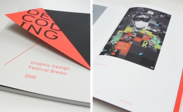
Angular folds and unconventional folds are very easy to make but yet uncommon as most corporate and business agencies stick to the trifold.
It just takes some thought and time to make the catalogue folded a different way. In this following example, the invitation has been designed cleverly and when folded gives the illusion of the lid being closed.
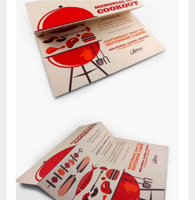
This kind of clever and witty design sticks out from the usual stuff and people remember them more vividly than plain folded paper.
You can also present your catalogue without any folds i.e in a rolled-up form. Although that is not very common, it could make it easier to carry for the customers.
3. Die Cuts are to Die for
Die cuts are windows that are carved onto a paper and their purpose is to reveal some part of the next or upcoming page underneath it. There more than thousand creative ways one can incorporate this technique into their catalogues.
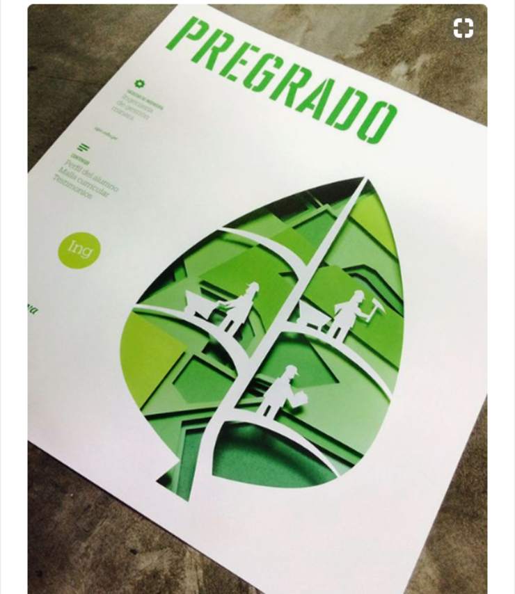
Die cuts create the sense of mystery and make the reader curious to turn the page in order to reveal what is partially hidden. In the previous picture, die cuts have been used for illustrating a leaf and a surreal situation. This exaggeration of creativity could have only been possible with Die cuts.
Some of the designers have brilliantly used die cuts to emphasize on the 3-dimensional design of papers that are stacked together. They have shown depth by creating concentric artworks and using die cuts on them to reveal the one underneath.
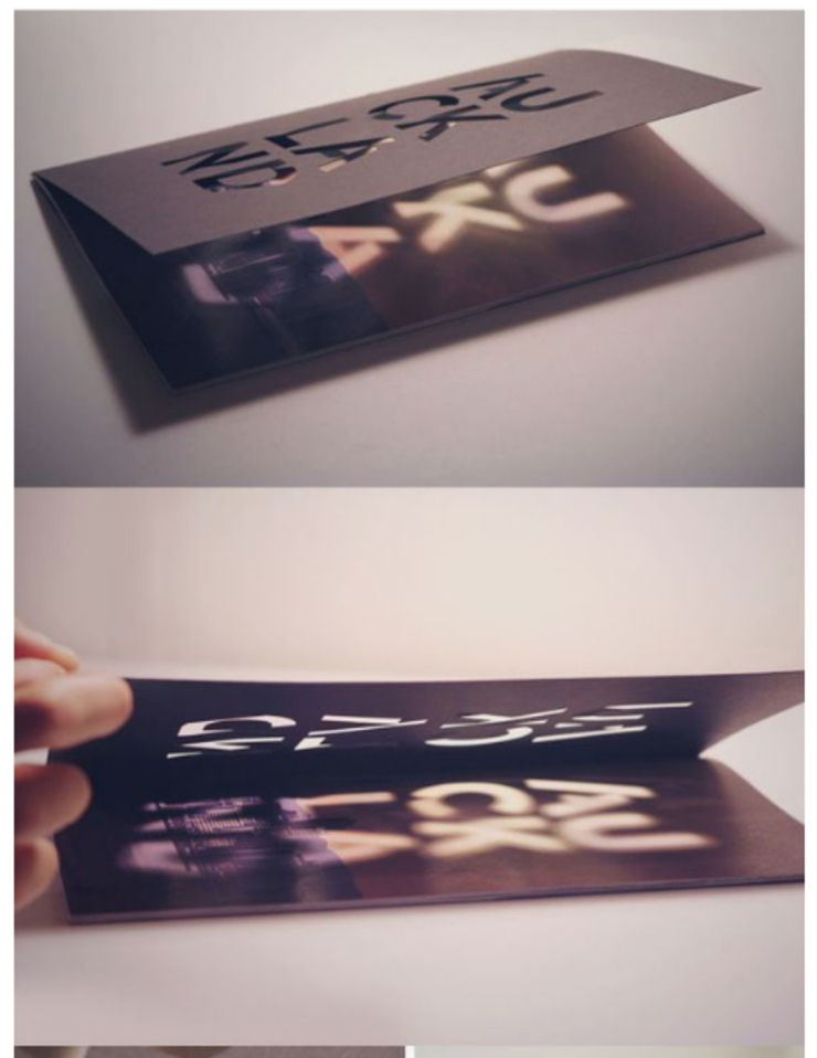
Not only this creates an interesting design but also removes some additional weight from the catalogue. This is a neat trick to spice up your catalogue without having to add into it. Instead, subtraction is the key here.
2. One Word – Typography
Typography doesn’t essentially translate to fonts. Instead, it has more to do with design than text. Use Big and Bold typography in your catalogue. Even better, if you use a text-based design and make it look extraordinary.
The power of visual content is huge and typography is the amalgamation of text and design. This is the best way to showcase your text inside your image in a creative way.
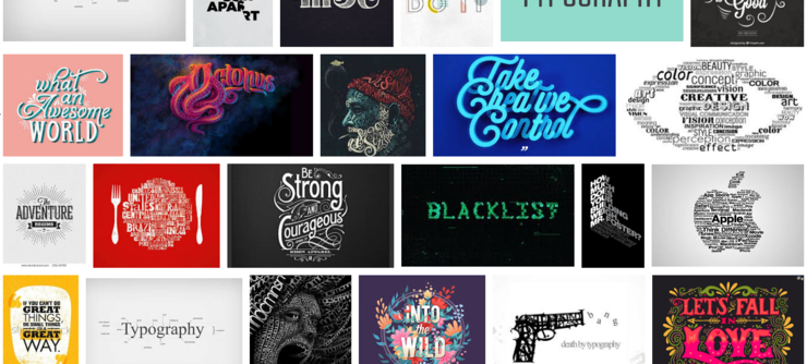
Using out of proportionate letters and number is the key here. There is a whole lot you can do with typography as it is an entire subject in itself.
Typography is something that is the culmination of text and image. Or to put is simply – text manipulated to look like images. An amazing example of typography can be seen below. The artist Biksence Nguyen (Vietnam based) has used the word ‘octopus’ to draw a real octopus. He has created a whole series on this exact theme.

1. WORD!
The best way to engage your audience is to intrigue them with your words.
Imagine two scenarios. There is a red button on the left and there is another red button on the right. And above the right one, there is a sign that says ‘DO NOT PRESS’. How difficult will it be for you to resist yourself? Also which one of the buttons will you be more intrigued about? The obvious answer is the ‘right’ one.
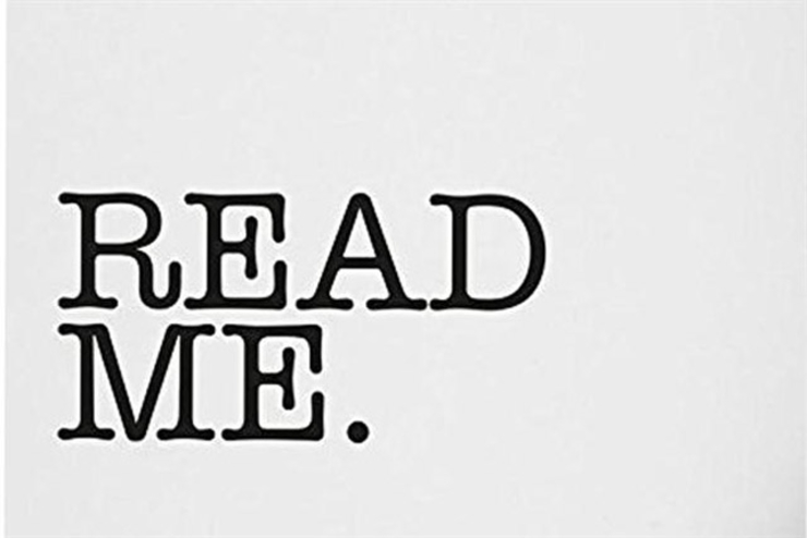
That is how powerful a word or a phrase can be. Using words like ‘read me’ or ‘open’ will create the curiosity of seeing what the fuss is all about. This has been a very clever technique to be used in marketing and business. I have ended up reading entire novels in one sitting because of this technique. If a ‘read me’ can manipulate someone to read a novel, it can surely make your catalogue stand out.
Conclusion
We are in a whirlwind of ideas and sometimes smallest of them make the biggest changes. It is your talent to identify the good ones and implement them.
Business catalogues, brochures or even business cards are the way to showcase your products and services to common people. No matter what one might think, they really do make a difference in thought.
Advertisements in huge banners cannot be compared with catalogues and brochures because most of the audience that a banner gets is ‘ road traffic’. And the traffic does not have time to carefully read and notice your details while on the go. But catalogues, on the other hand, are more reliable sources of information than banners with more details.
Catalogues show that you care and want to reach out to your customers personally. It helps in bringing your company closer to the people and makes sure that more people can access you. Make the wise choice of designing a catalogue that will be nothing like people have ever seen.

