14 Graphic Design Trends of 2019 Every Marketer Must Know About
The year 2019 has been a very exciting one for the graphic design industry! We’ve long bid adieu to the neon colors and black and white minimalism of 2018 and embraced the new with full gusto.
2019 is poised to be the most creative and so far, it hasn’t disappointed one bit. Loads of new graphic design trends have emerged this year and taken the world by storm! You can see them being used everywhere – from Facebook posts to website design and beyond.
This year is all about oppositions – strongly contrasting trends are supposed co-exist at the same time, bringing a fresh, new spin to the old designs. So if you’re planning a refresh of your site or social media materials, you’ll have to take it up a notch or two and get in with the new!
If you don’t know where to start or which trend to implement, we’ve curated a list of the latest graphic design trends for you! You’ll get a lowdown on all the hottest trends of year here – from the bizarre to the sophisticated and more.
Check out our consolidated list of the major graphic design trends of 2019 to stay ahead of the curve!
Contents
Trends in Fonts
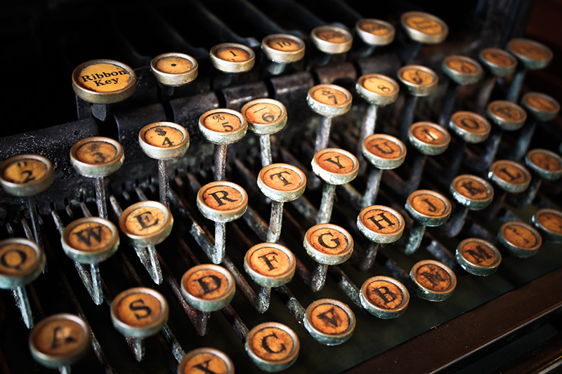
Fonts are one of the most crucial elements of graphic designs. Hence, it’s no surprise that each year witnesses a refresh in terms of the fonts used for websites and promo materials. Let’s take a look at the latest design trends in fonts-
Bold, thick fonts
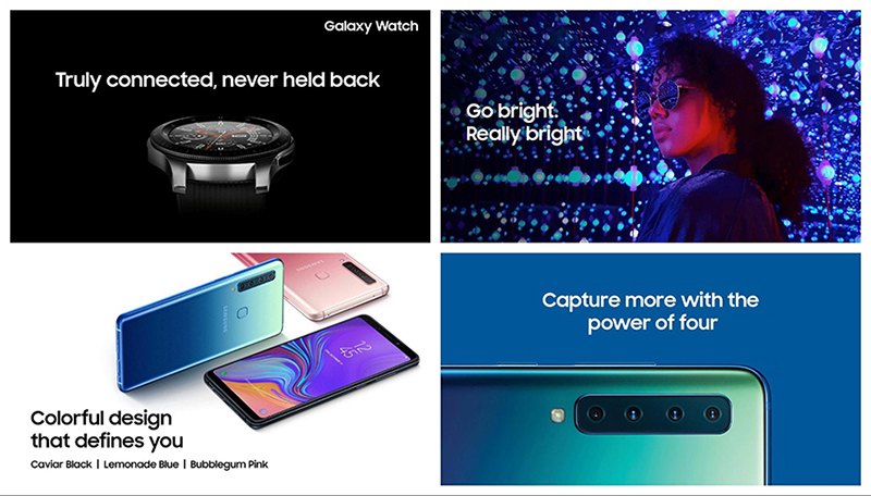
Buxom fonts are in. And skinny fonts are out. For good! Beefy fonts are the norm in 2019. So you can expect to see a lot of them in the promo materials of big brands. Like the use of this chunky font from Samsung for the promotion of its latest lineup of smartphones and accessories-
Or Adidas’ use of them in most of their marketing campaigns-
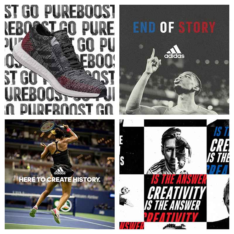
Why are bold, thick fonts trending? It’s simple, really. Large fonts are quite easy to read! This makes them perfect for social media feeds and promo materials viewed on mobile devices.
Besides, large fonts are viewed as strong and innovative with a distinct personality. Sample this font from Nike’s marketing campaign and you’ll know what we’re talking about-
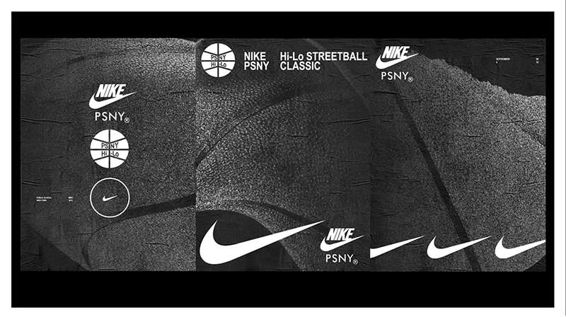
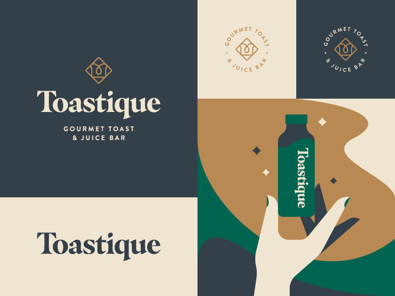
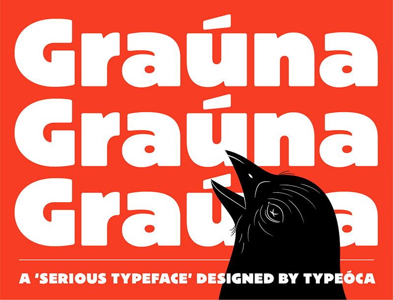
Plump fonts, serifs or sans-serifs, will continue to be highly visible through the remaining half of the year as well. Call them fonts with a soul and character that are just bursting forth with a quirky, cutesy and strong personality!
Variable fonts
We live in a world of variety, don’t we? The more options we have, the better we feel as we get so much to choose from!
Well, so why not get the same freedom in your fonts? According to the graphic design predictions for the year, variable fonts will rule the design space as much as buxom fonts. Like so-
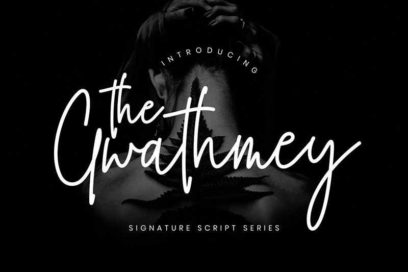
You can combine a large number of fonts to come up with interesting visuals for your brand. Take a cue from the one below. Doesn’t it look impressive?
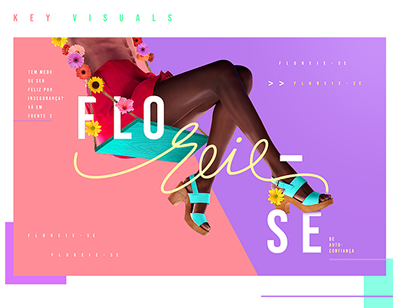
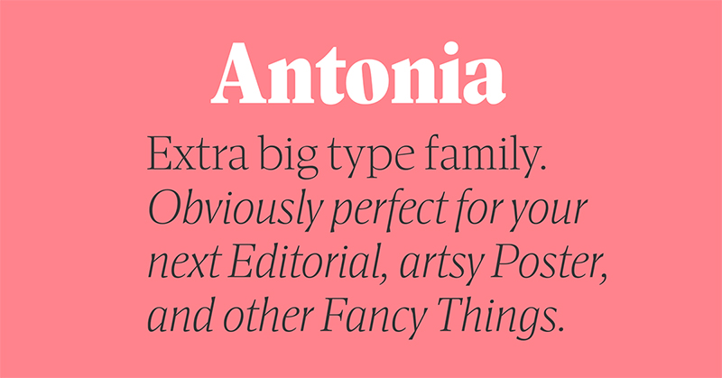
The advantage of variable fonts doesn’t stop at the way they look. The key benefit with fonts that vary is that you don’t need several bulky files. Why? Because with generative fonts, you get the infinite adjustments in terms of letter width and weight. By the year end we’ll know just how effective and useful variable fonts can be!
Oldstyle serifs
So far we’ve seen the bold and the variable. It’s now time to see the Oldstyle!
Okay, bad jokes apart, both Oldstyle and Bookman serifs are making a comeback and how! Just look at the fonts on the cans of this soft drink below to know how good these serifs can look-
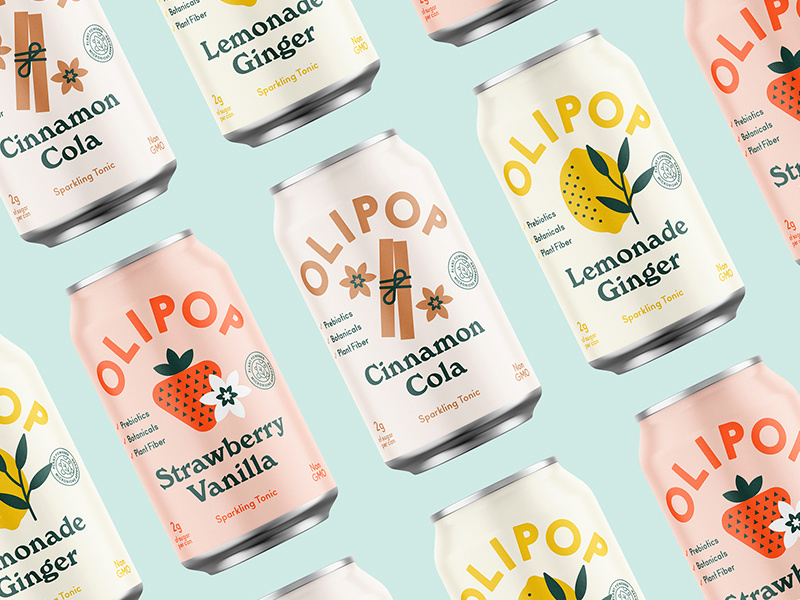
Oldstyle and Bookman serifs are a way of breaking away from generic serifs, which have ruled the covers of several brands for ages now! Both these styles add some emotion to the otherwise bland fonts, giving them a relatable personality.
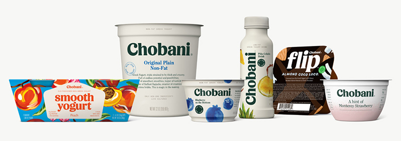
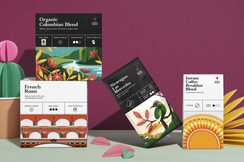
Oldstyle and Bookman serifs are fonts to watch out for 2019. We predict we’ll see them on a lot of product covers throughout the year and maybe even beyond!
Custom typography
Bored of the same old fonts on your website and marketing campaigns? 2019 is the year to spice it up!
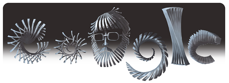
One of the coolest design trends of the year is custom typefaces. If you want to give your site a refresh, fill it with customized fonts that scream your brand’s personality in the best way possible!
Yet again, loads of brands are welcoming custom typefaces with open arms. Look at Google’s customized typeface for one of its Google Doodles. It’s fun, it’s quirky and it goes perfectly well with the theme of the doodle-
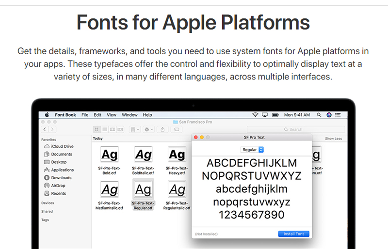
Even Apple’s done it-
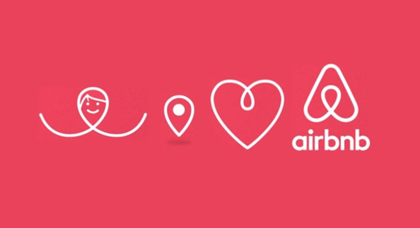
So has AirBnb-
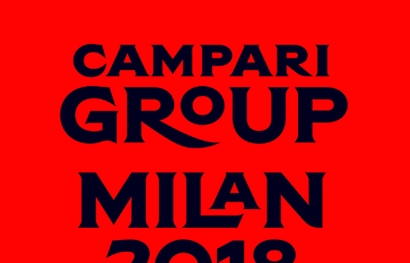
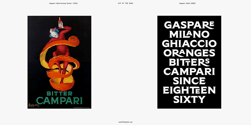
But the thing about custom typefaces is that they are expensive. Which means not everybody can afford them. So if you’re a part of the rest of the 99% of us who can’t get custom typefaces, try using alternative fonts instead of the usual ones. Ditch Gotham, use an alternative and get cracking on that enticing design!
Text with background
Your beautiful fonts need beautiful backgrounds! At least that’s what the mantra is in 2019. Retro inspired, you might call this a risky prediction we’re making in the realm of creative design, but we have a feeling that this trend is here to stay.
If it wasn’t, why else would you be scrolling down to see this example and then go like ‘Whoa! That looks nice’-
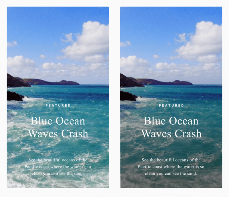
Texts with background can lend edginess to your overall design, making it stand out in a good way-
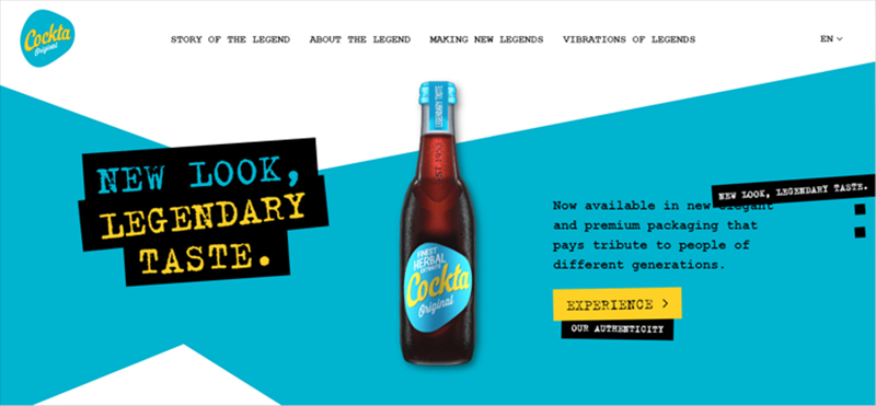
And the good thing about text with background is that it certainly looks good with the other trends that are currently making some noise-
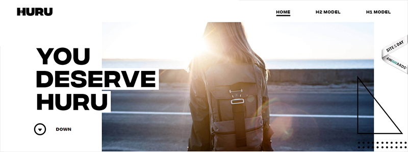
If you ask us, text on different kinds of backgrounds makes a statement – a youthful and rebellious one that’s bound to connect with a younger audience in a major way!
Outline text
Who said text was supposed to fit into the confined, boxy space of banners and ads? Whoever did, ignore them as this year you are going to see texts spilling out of here, there and everywhere!
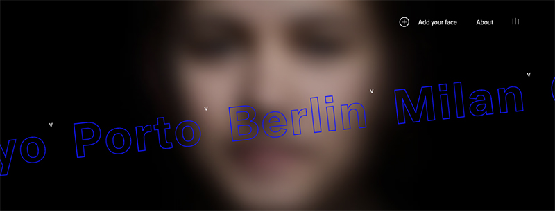
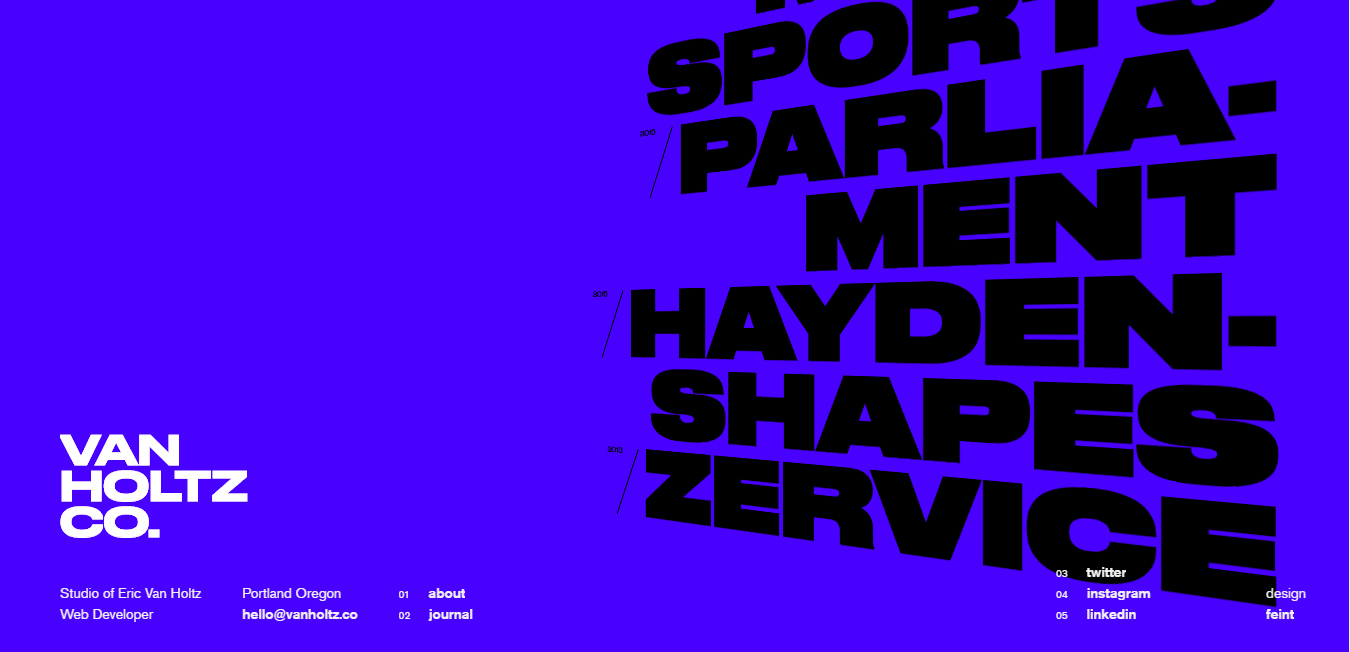
Fillings are strictly not allowed if you design to impress. The best part about outline text is that it goes pretty well with the other design elements in open composition. This creates for an illusion that there’s always more to explore beyond the confined boundaries of the screen.
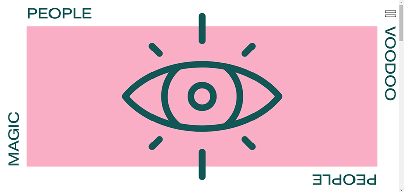
Just like open compositions, we expect outline texts to be one of the major design hits of this year!
Trends in Colors
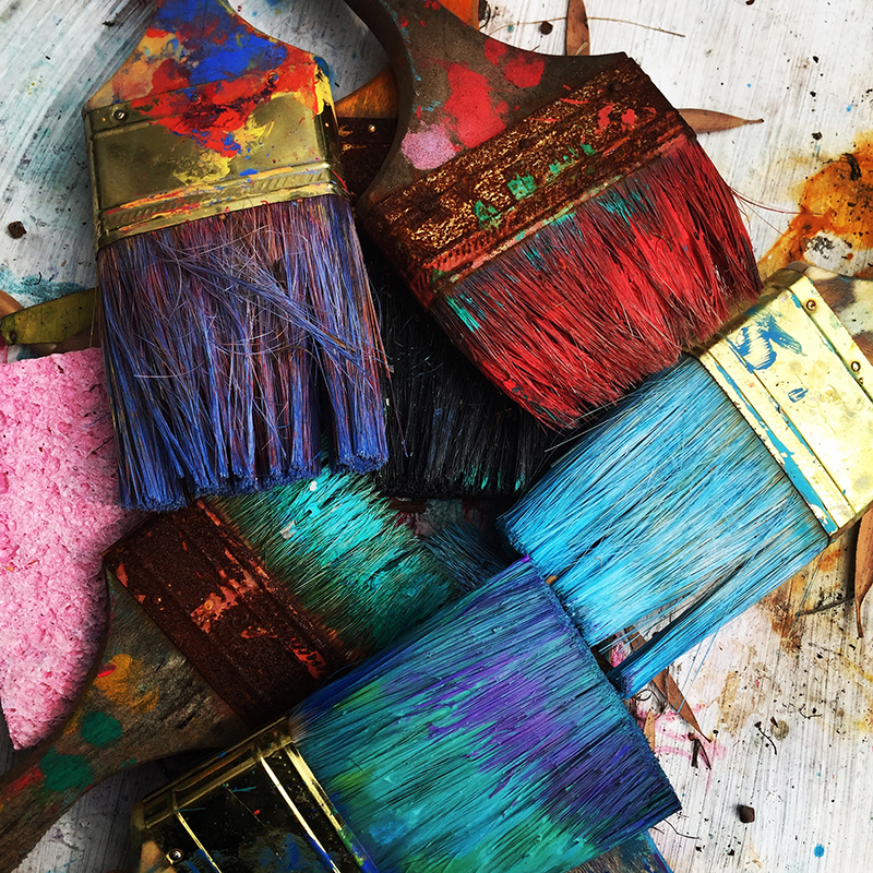
Bold, bright and beautiful – these are the 3 words that adequately sum up the graphic design trends you’ll see prevail in terms of color. Expect a lot of splashes, pops and strokes as the digital world is painted in vivid, eye-catching hues!
If you want to know more about how to pick the right colors for your branding material, click here.
Colorful minimalism
Thinking that minimalism is out? Well, not quite. Yes bland, black and white minimalism has been shown the door by most graphic design companies and services, but only to be replaced with colorful minimalism!
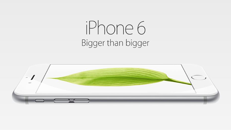
Less is more. Even in 2019! Clean, uncluttered visuals are in demand as they provide optimum viewing experience on smaller screens such as smartphones or mini tabs. Take a look at this poster from Nike to know what we’re talking about-
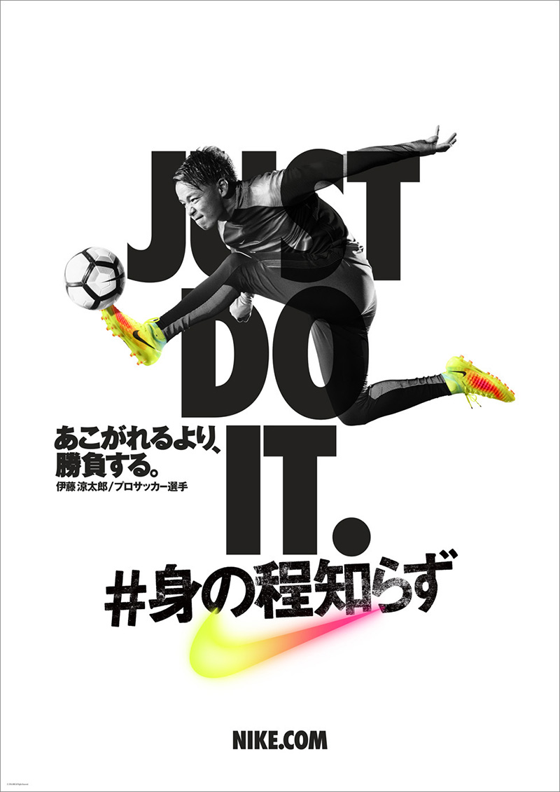
Notice something different? It’s the pop of color! Gone are the pure blacks and whites. Shades that go pop are still very much in, making for an elegant yet eye-catchy combination with minimalism. This year’s colorful minimalism designs will be inspired by the color palettes of the 70s. Which means loads of bright colors and neon!
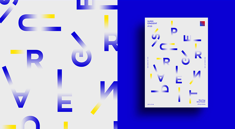
Duotones
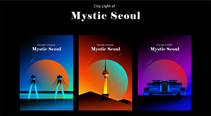
Ever seen a yin and yang? Of course you have. Its dualism is its outstanding feature. The balance of black and white shades in equal proportions is just one of the things that make the symbol so iconic! Well, that dualism of color is pretty much in trend in design and is going by the name of duotones.
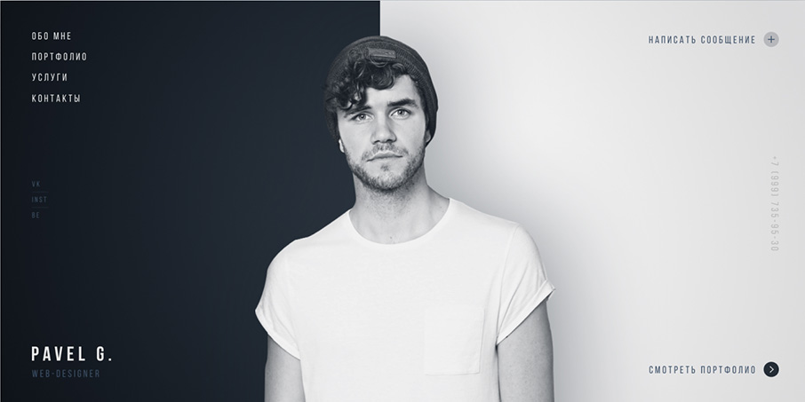
This design tactic goes extremely well with other trends of the season – be it bold fonts or mood pictures or even gradients for that matter. There’s something futuristic and simplistic about duotones. They almost create a mesmerizing effect if you look at them!
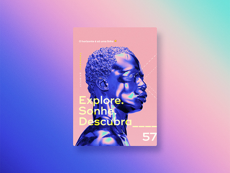
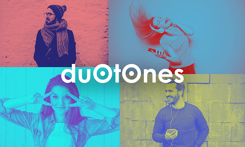
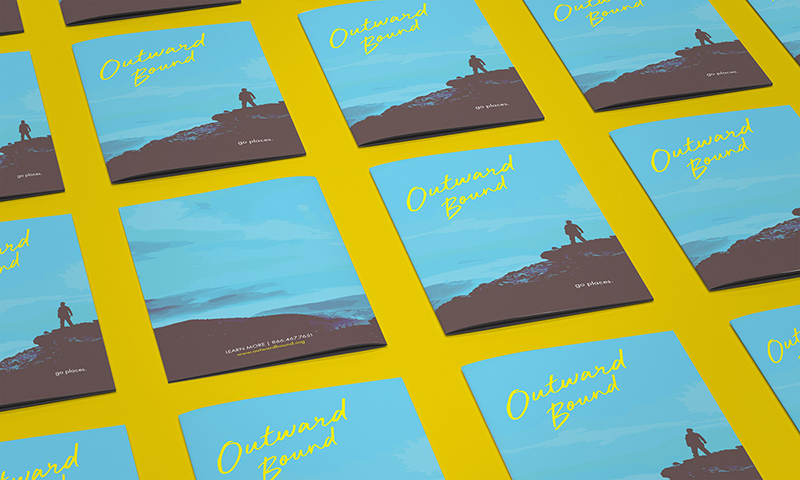
So what duotones do is replace the black and white of any image or text with two different yet complementary colors so the visual creates a pleasing effect. Like how TQ does it for its homepage-
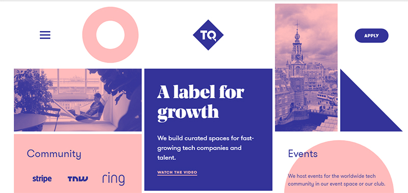
Duotones are a favorite of ours for the simple reason that they can be used to match just about any company’s branding. Since consistency is very important for any brand, duotones can help achieve that consistency with minimal effort.
Gradients
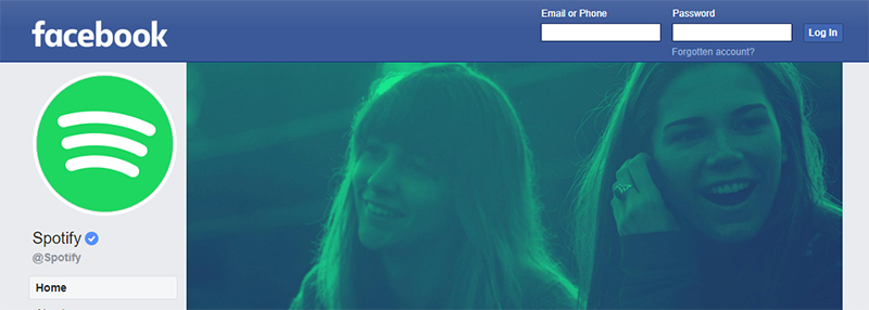
Spotify’s been doing it for years. Microsoft’s done it. Apple’s caught on. And many more famous brands are set to follow!
What exactly? Why the latest design trend of gradients of course! Gradients look incredible on mobile devices. So that’s always a plus.
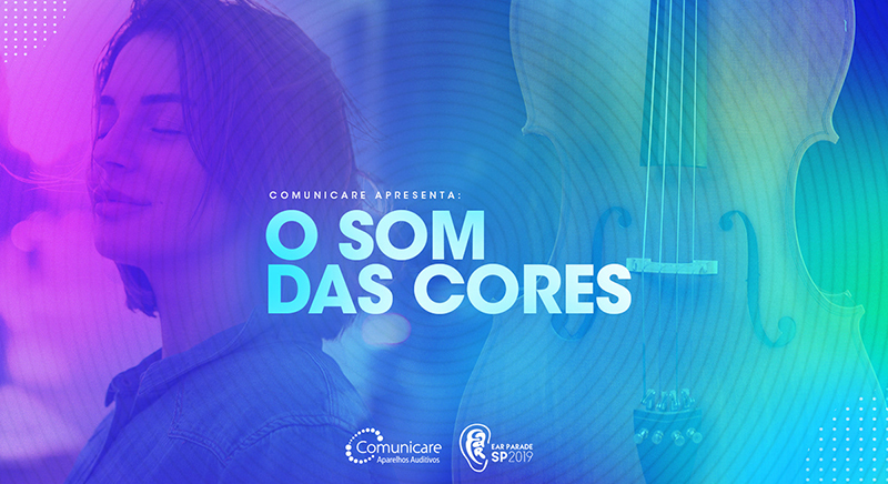
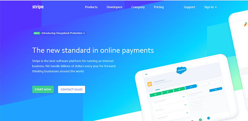
We know you’re craving for examples, so take a look at this one from payment company, Stripe-
Or this one from Apple Music-
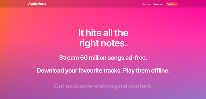
Gradients are not simply used for texts and backgrounds. You can even use them to spice up bland stock photos. And once you make gradients a part of your branding (like Spotify has), you can use the theme for all your marketing materials, making it easy for your audience to recognize your content.
You can make use of complex gradients too, like Adobe did, if simple is not to your liking-
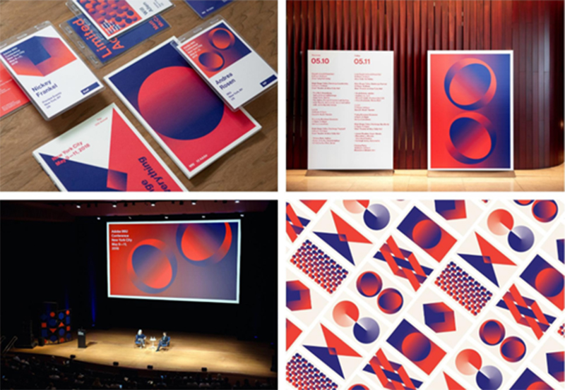
Obviously, this is harder to do but if you manage to get complex gradients right, the result will be simply outstanding!
Vivid colors
Since we’re talking so much about colors, you must’ve noticed one thing – the design world has gotten a lot brighter and colorful right? Well, that’s because this season is all about vivid colors!
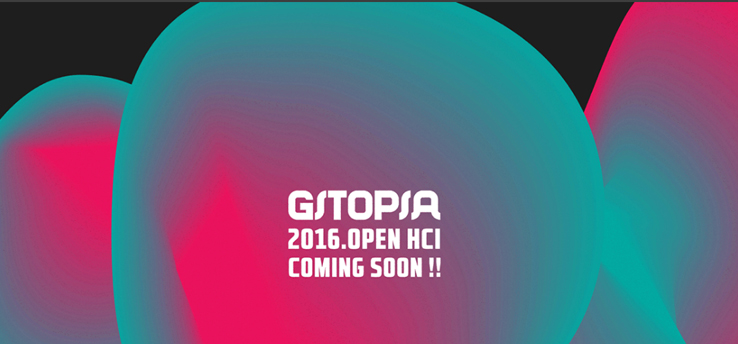
Neon yellows, electric blues and pretty corals have been dominating the scene. More and more designers are now willing to move past the pastels and make their designs more vivid and attractive.
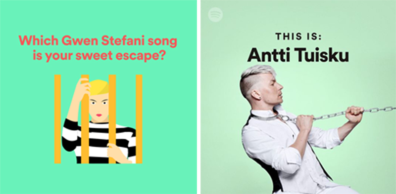
We at, Digital Polo, love it!
And what we love the most is that vivid colors in 2019 are not restricted to darker shades only. Even lighter hues can be used in contrasting colors to create a bright, bold and cheery effect. So you could combine blues and pinks like so and have something that’s vivid and muted at the same time-
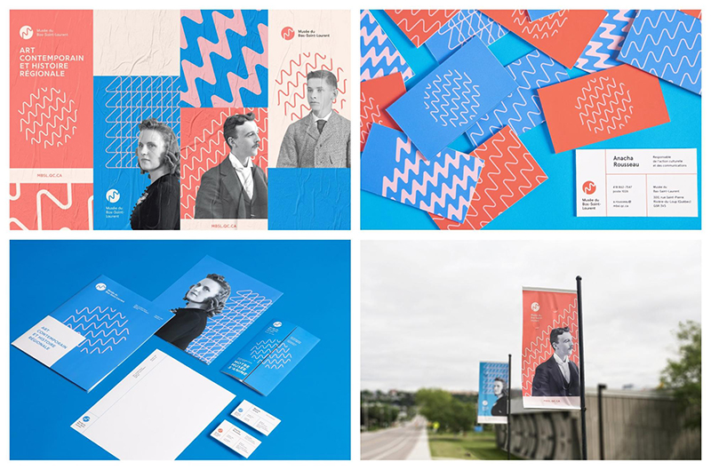
The shift to vivid colors seems to be a direct rejection of the bland minimalism, which was the norm since the early 2010s. We say take the risk and include brighter colors in your palette if you want to get noticed this year.
Even Apple’s done it as you can see-
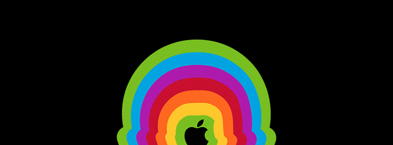
The benefit of using so many colors is that they create a very impressive effect when viewed on today’s super high quality, HD screens.
Spotify has embraced the trend too, making the move to bolder shades in their promo materials-

Don’t think that you can only use the combination of vivid colors. You can even combine flat and bright colors to achieve brilliant results!
Color of the year: Coral
The Pantone color of the year is none other than coral this year. Having stirred the fashion and beauty industry for quite a while now, coral has finally made its way to graphic design. Living Coral is what Pantone is calling it.
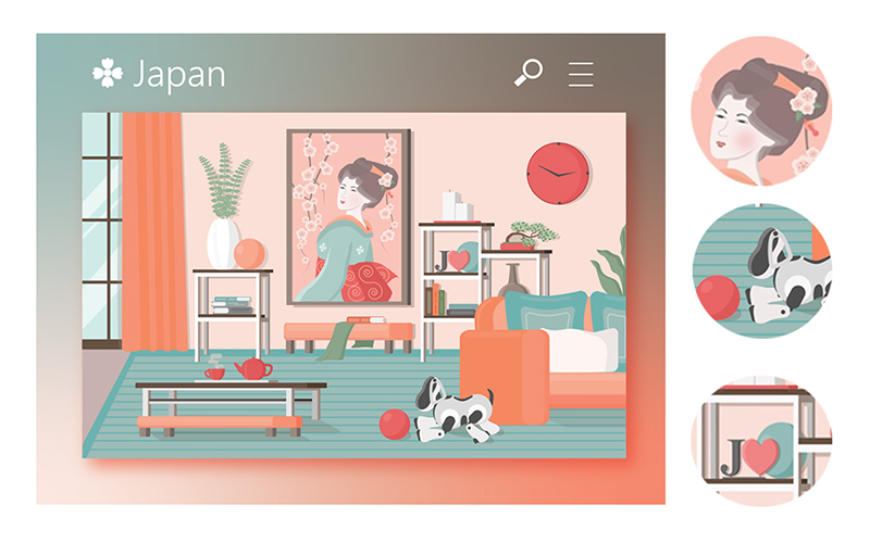
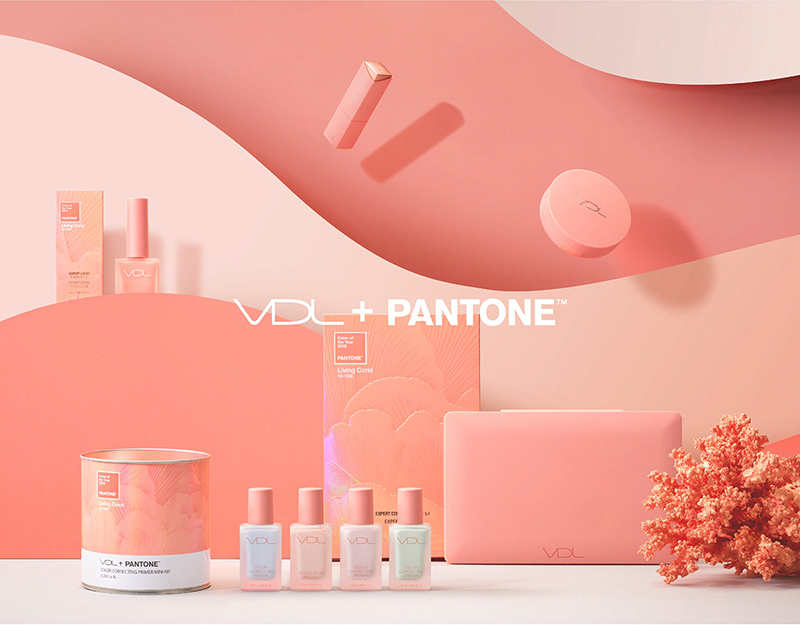
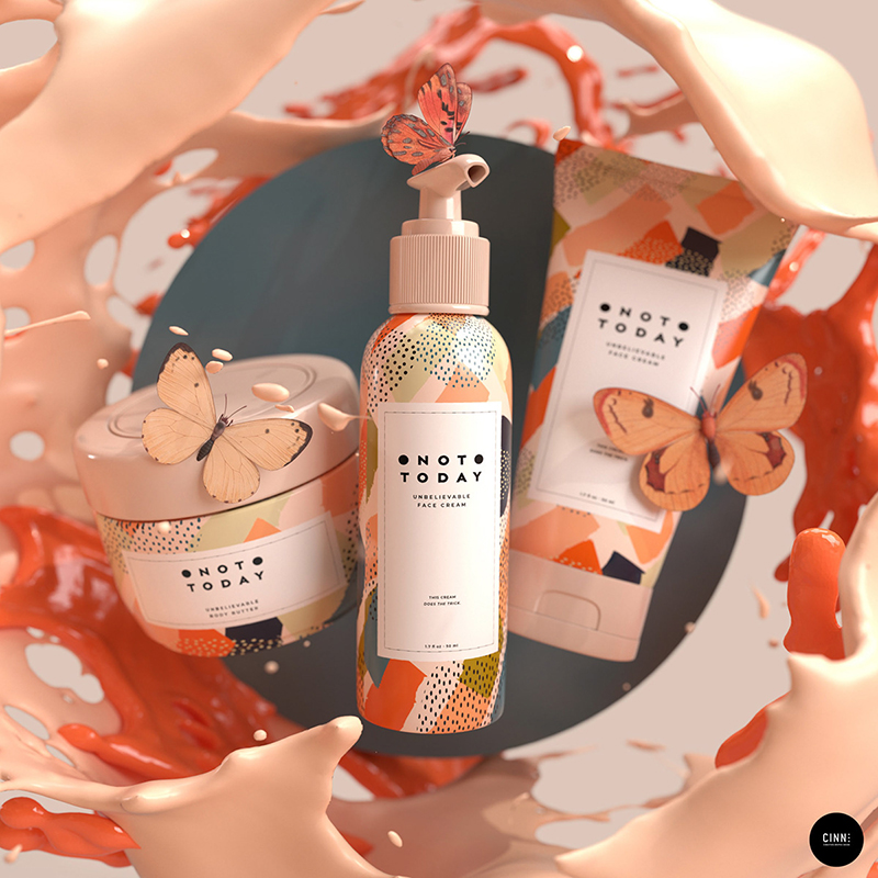
Pantone chose Coral as its color of the year because the hue has been used almost everywhere – from clothes to even, well, phones (here’s looking at you iPhone XR)! The color coral strikes a responsive chord, according to Pantone.
Considering how warm and appealing the color coral is, we actually look forward to seeing it used in the second half of 2019 as much as it has been used in the first half. The luscious, fresh, summer color is quite the stunner in our opinion. Perfectly suitable for most brands, whether they’re classy or fun.
Trends in Illustrations
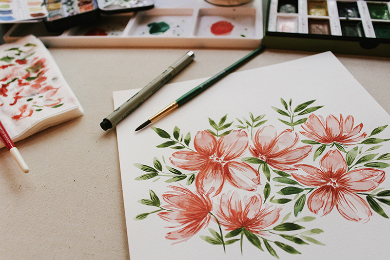
We cannot talk of the latest graphic design trends without talking about illustrations. Illustrations form the backbone of graphic design. This year brings some new changes in illustrations, which we’ll see being used by brands (both famous and not so much). Let’s find them out-
3D
After eons of flat designs and illustrations, we have a new kid on the block – 3D! Infuse life into your designs by going the 3D route. You can make almost anything 3D and watch it come to life right in front of you, like it has never before!
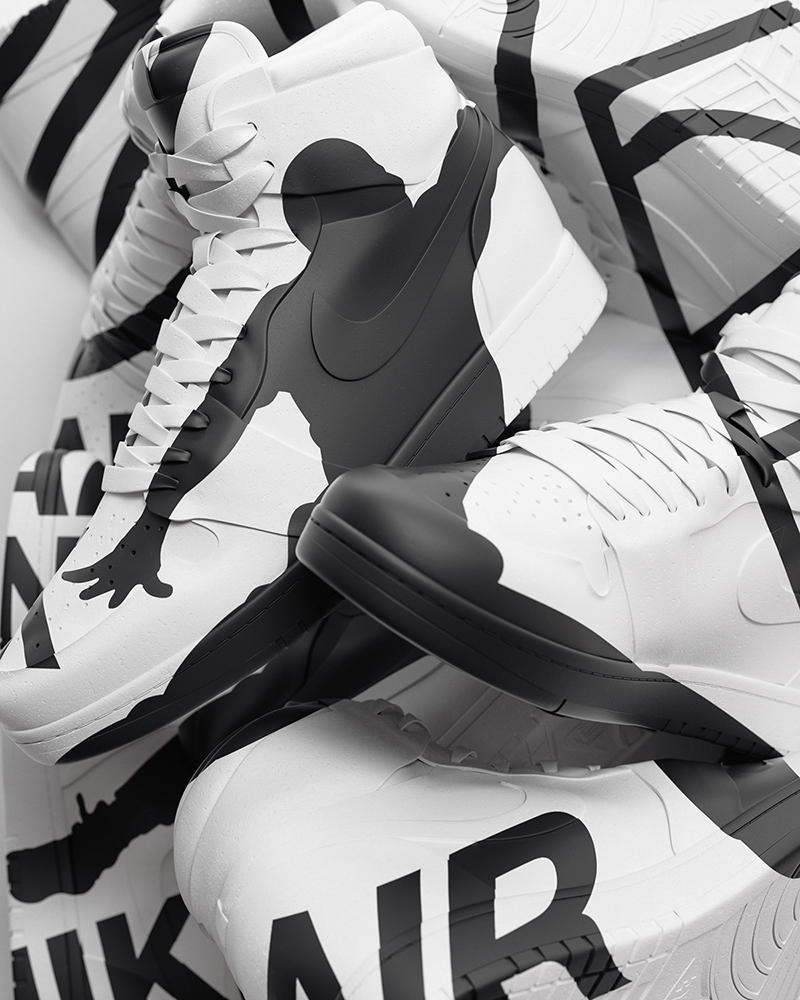
3D compositions have so much depth in them that you’ll be tempted to reach out and touch the elements on your screen! That’s a crazy positive impact to have on your audience too. So say you want to portray a figure, element or an animal, you don’t do it flat, you do it 3D. And just look at the difference it makes-
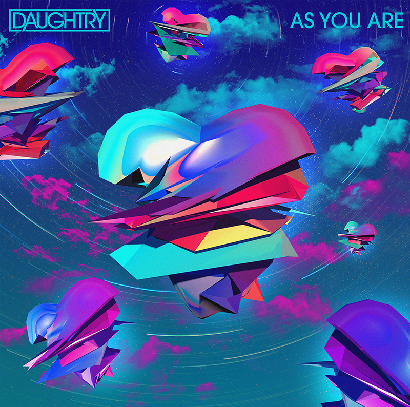
This year though, 3D is not going to be restricted to design and illustrations. It’s going to make its impact felt in typography as well. You’ll see lots of 3D fonts floating about on your screen – both in their beefy and skinny avatars-
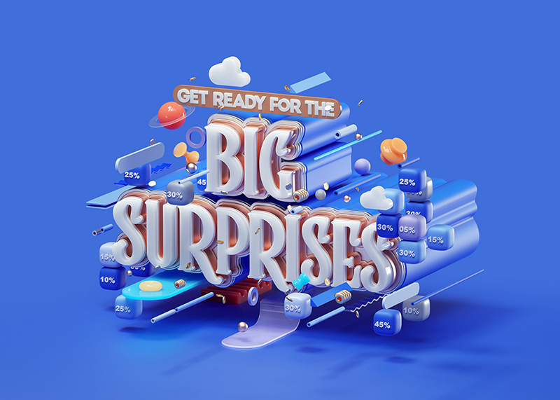
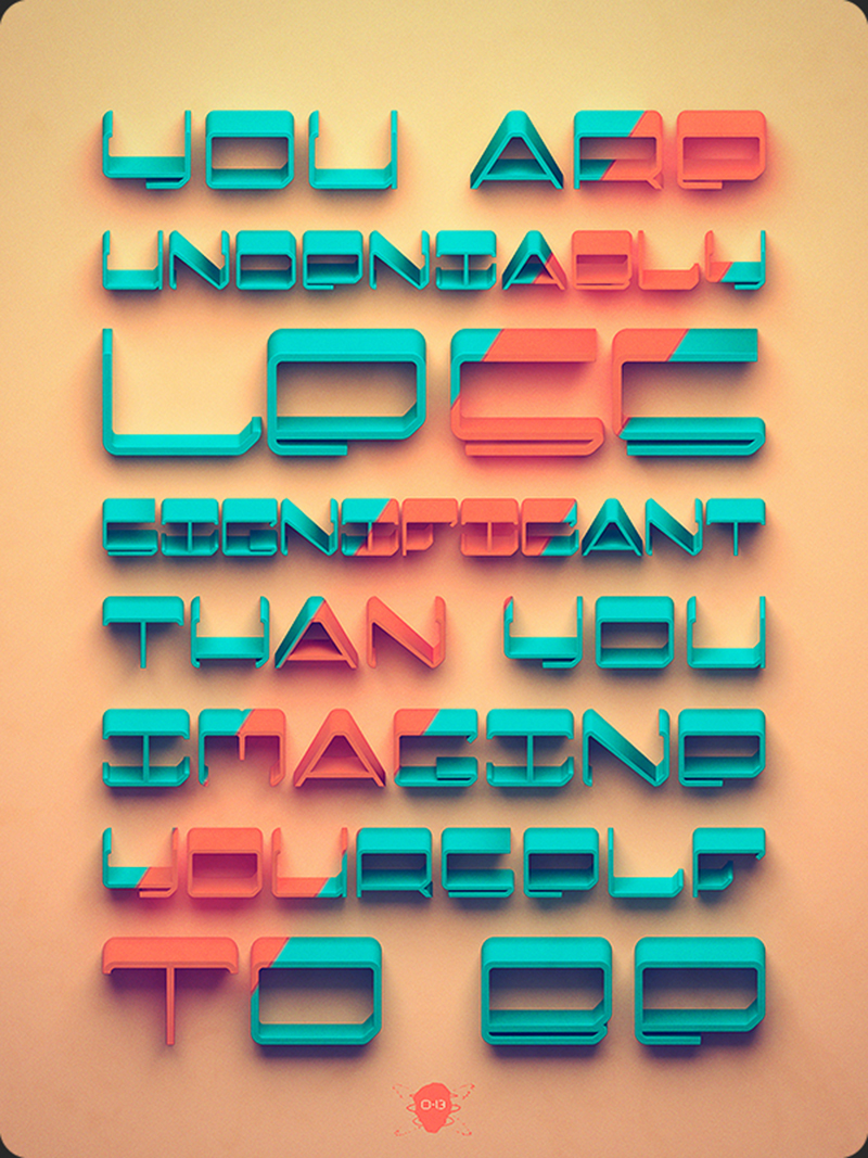
Basically, 3D graphics are going to be everywhere!
Check out the ultimate 3D graphic design guide here to know everything about this design element!
Isometrics
Lots of graphic design services are offering their clients isometric designs and illustrations these days. You might be wondering why that is. Because it’s one of the red, hot trends of this year!
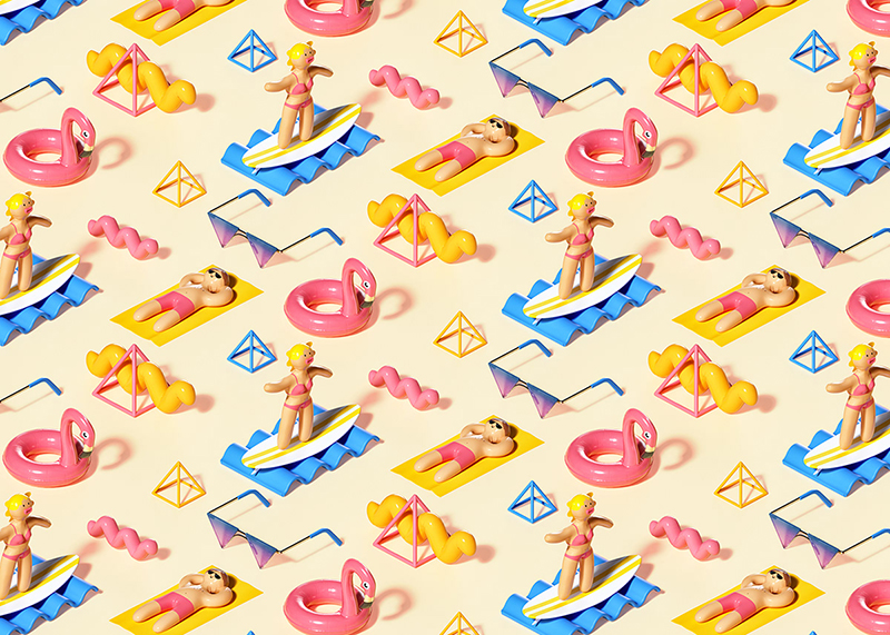
Isometrics are the complete opposite of open compositions (which we’ll get to later in the blog). While open compositions expand on an element and leave it incomplete and open to the imagination, isometrics are all about confining an entire universe in a single space! Like so-
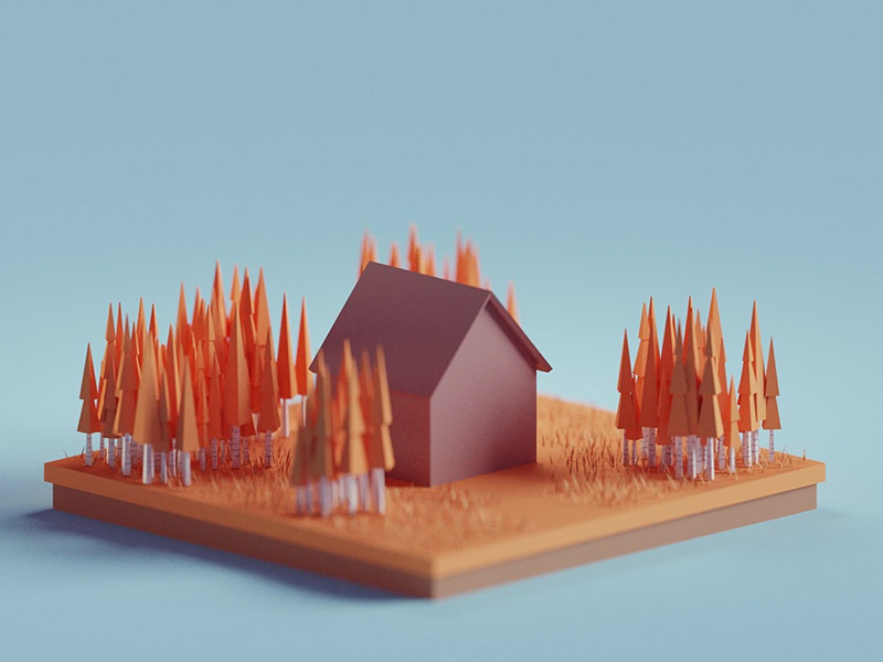
You might view isometrics as extremely complex designs due to their intricacy, but they’re not. Take a 3D world and present it in 2D and voila! You’ve got yourself beautiful isometrics that are bound to make your content look richer.
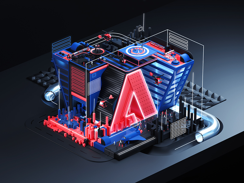
Isometrics illustrations and designs have a much smaller file size as compared to 3D graphics. So there’s no fear of lags!
Custom, hand-drawn illustrations
We can all agree that this year some very contrasting trends have come up. In keeping with that theme, we have custom, hand-drawn illustrations in light shades and tones. A very different approach compared to the bold hues we were talking about before!
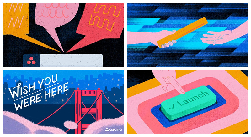
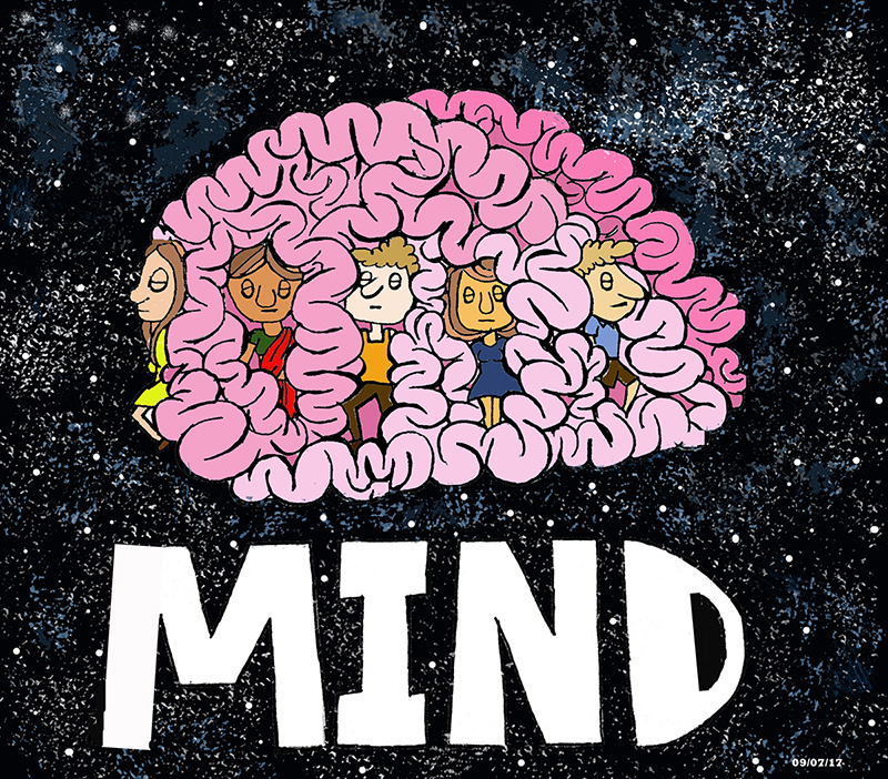
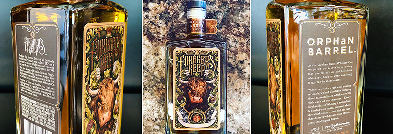
It’s time to break free from thick illustrations and give way to softer, lighter, finer ones in pretty pastel shades. The influence of botany and nature will be deeply felt in the illustrations this year. Like in this beautiful chocolate wrapper design-
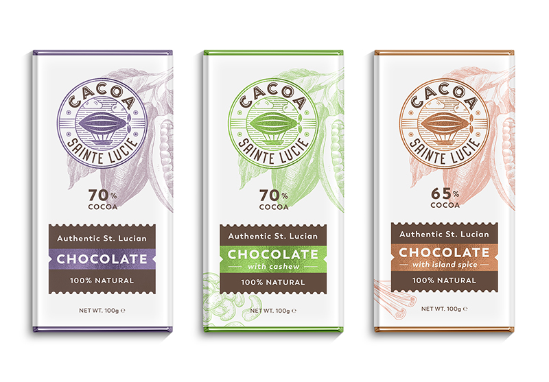
If you’re all about unique designs for your site and marketing campaigns, it’ll be a good idea to invest in getting hand-drawn illustrations for your brand. Nobody else would be able to replicate it exactly, which is a great bonus!
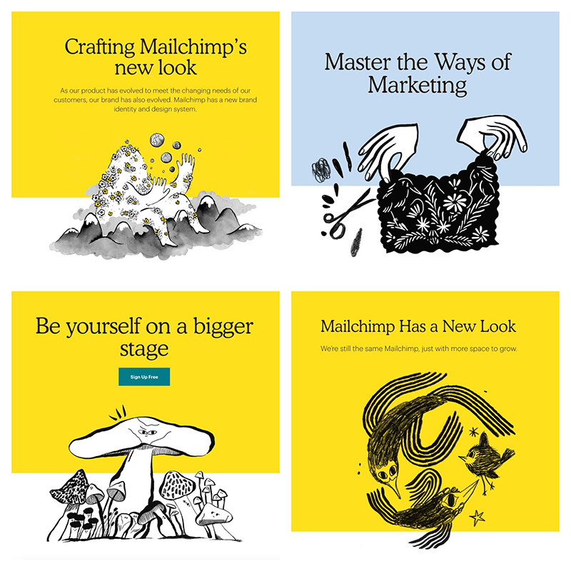
Although hand-drawn illustrations are a roll-over design element from last year, they’ve entered 2019 with a twist. Flat doodles are out. They’ve been done to death with. If you want to win hearts this year, you will have to take your illustrations to the next level.
If you want examples, we recommend you take inspiration from these-
Retro illustrations
Retro illustrations, human or non-human, have been big hits in the first half and will continue to be so in the second half of the year as well.
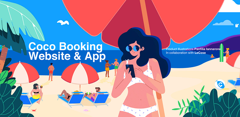
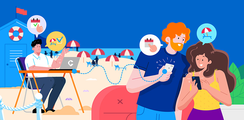
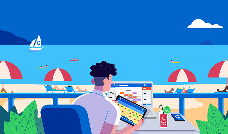
Since generic photos have caught on everybody’s nerves, it only makes sense to move to a more innovative way of making a point through visuals. Retro illustrations with their unreal colors and supersized proportions are a creative and engaging way to put your point across.
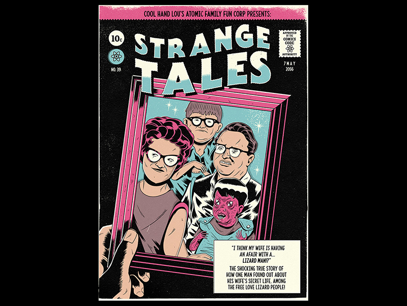
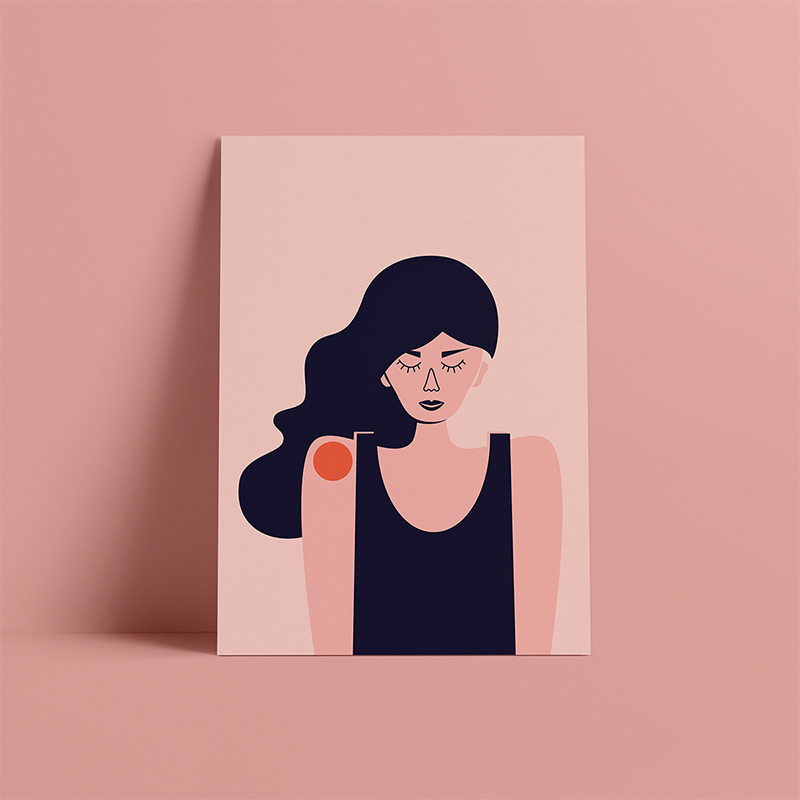
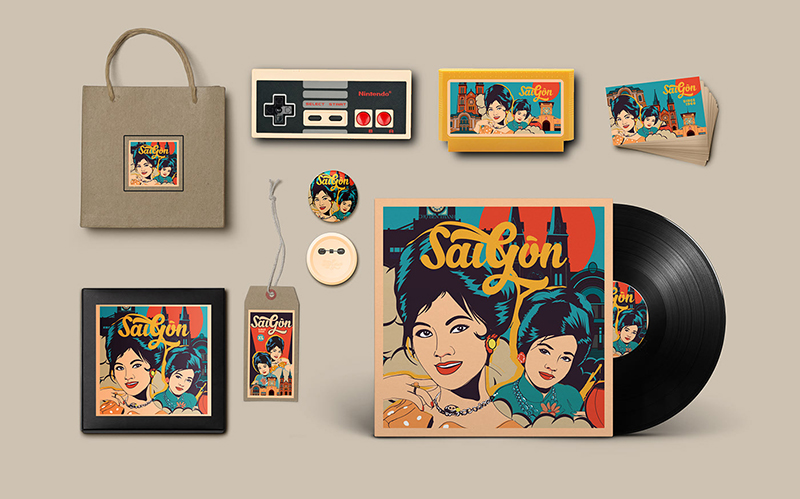
70s and 80s styled graphics will continue to inspire and bring out the best of designs we see this year! Big limb illustrations with small heads will rule as well, giving way to quirky, cutesy and awfully relatable characters.
Inked illustrations
No, not the tattoo ‘inked’. Although wouldn’t that be one heck of an influence on graphic designing? Maybe next year. At least that’s what we predict!
Anyway, coming back to the point, inked in this context refers to watercolors or brush strokes that have been hand painted. The USP of inked strokes are their inherent slight messiness. They’re not very clean or well-defined, and it actually adds to their charm rather than take away from it.
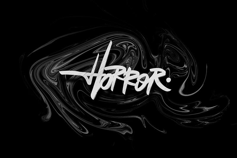
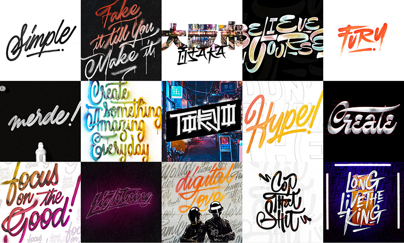
Most of the designs these days lack that human touch. You can bring that appeal to your design by opting for inked illustrations. These work well with fonts as well as photographs and add a sort of energy to them. Especially to static designs that otherwise seem dull and lifeless.
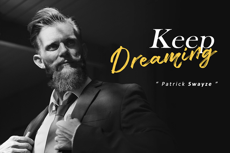
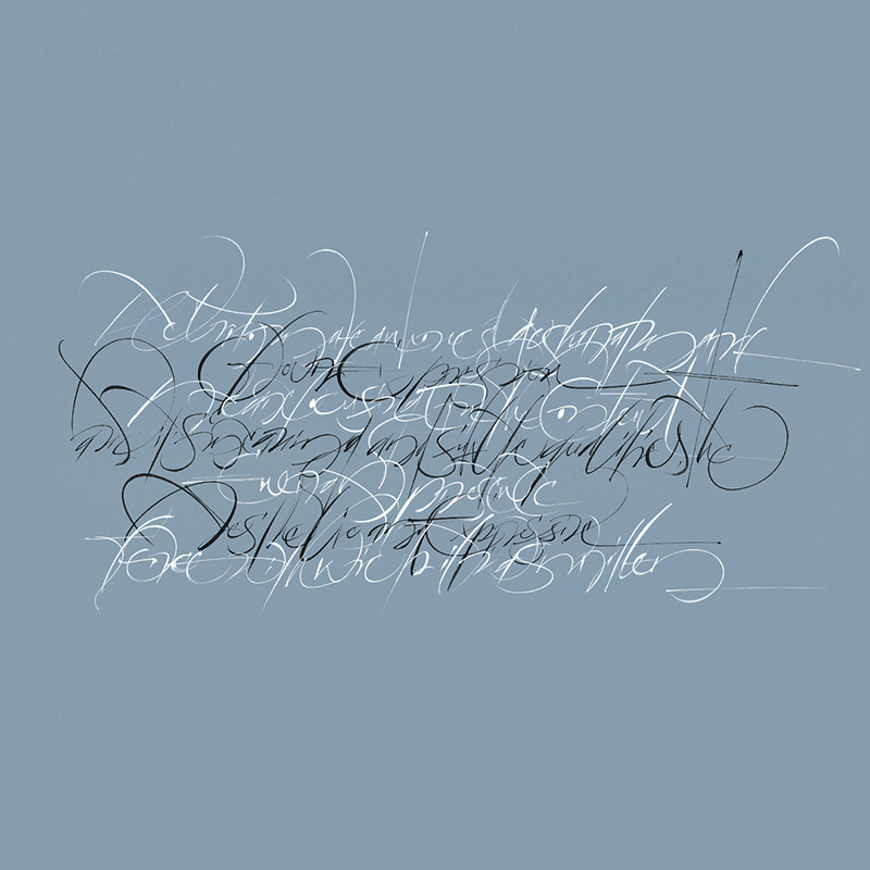
Think it might get boring? Don’t worry. You can play around with plenty of variations. Brushwork strokes can vary from painting to calligraphy and sloppy to childish. Just keep calm and experiment!
Moodboards are a great way to get cracking on creating the perfect illustrations! Learn how to use them in the designing process here.
Trends in Design
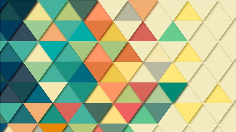
Let’s get started with the elephant in the room! Design. The core area of design has gone through a sea change from the previous year, with new trends emerging and taking over in a big way. This year’s design trends vary from the cool to the crazy, from the eclectic to the eccentric.
Want to know our top 10 pick of graphic design trends of 2019? Click here.
Realism coupled with flat design
Ever heard the saying, ‘opposites attract’? And when opposites get together, they create magic. That’s what happens realism is married to flat design elements! The combination gives birth to stunning designs, changing the way you view designs.
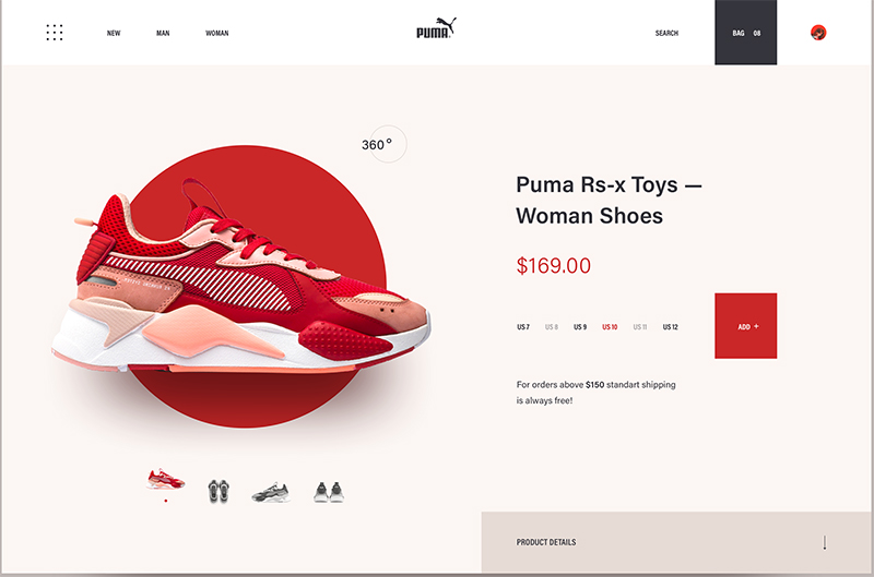
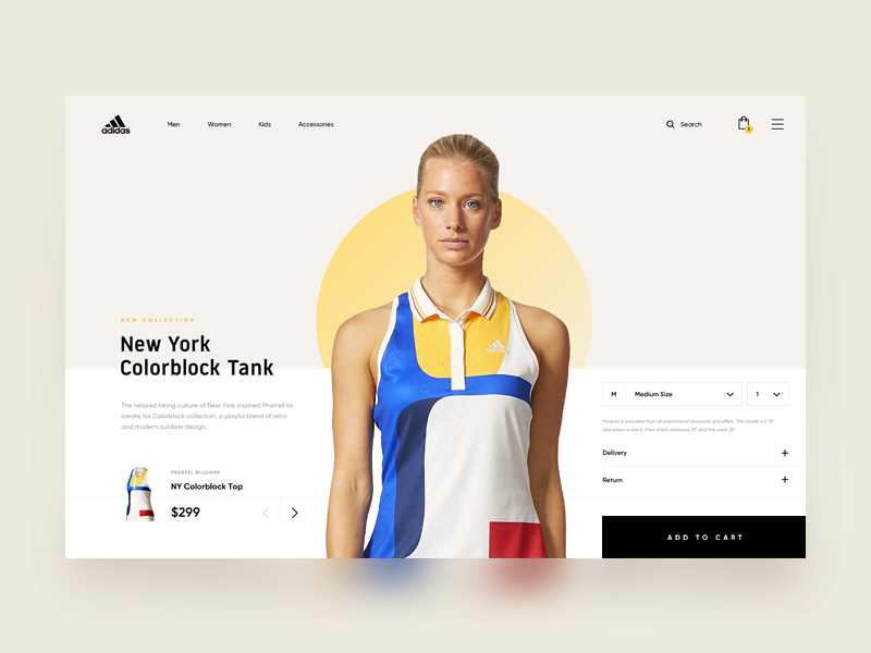
You might view it as a chaotic mix of confused elements, but if you see the end result, you’ll be stumped! The effect created would be very lifelike, almost 3D. You could also add floating or flying elements to create a dramatic effect.
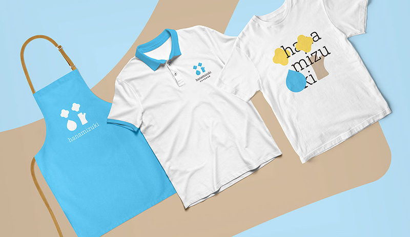
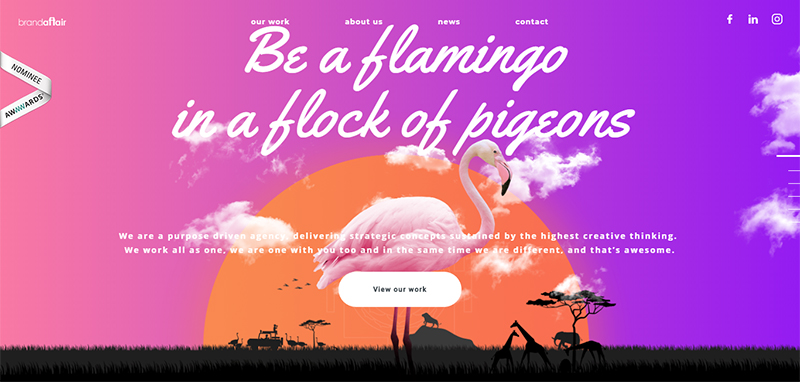
In any case, be bold this season and try mixing and matching these two very contrasting elements. You’ll be pleasantly surprised with the results you achieve!
Eclectic designs
Realism is the buzzword in design this year. With the world collectively pushing for transparency and authenticity in every sphere, the design world has come under its influence too. Ergo eclectic designs!
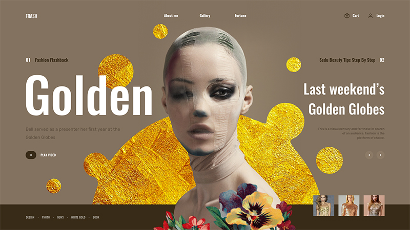
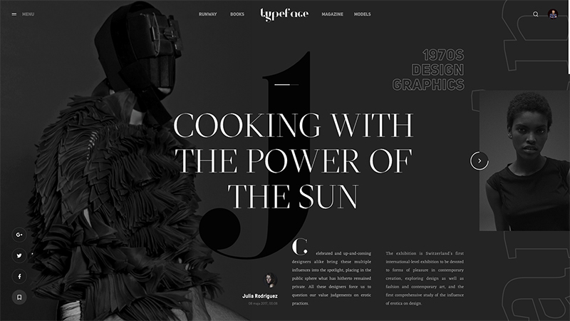
Imperfections are no longer meant to be discarded. They’re meant to be celebrated. If you check out the artwork of professional graphic designers these days, you’ll see a clearly marked shift from rigid lines to a sort of openness and asymmetry.
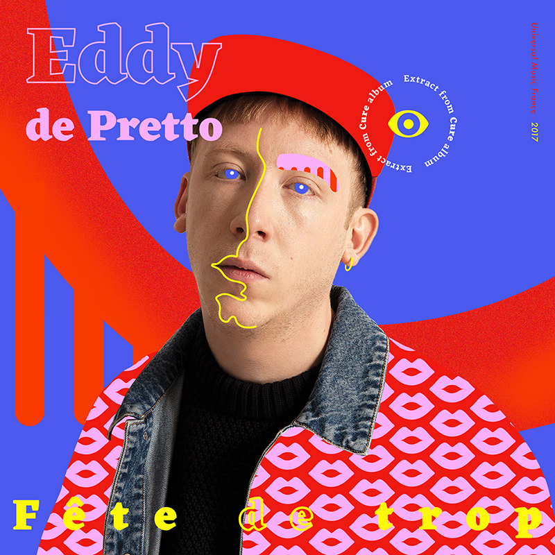
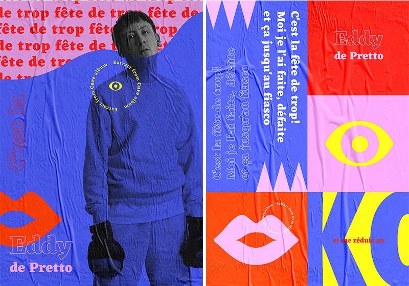
Confinement seems to be out. Grid layouts can no longer restrict the imagination of a designer. What you get, as a result, are compositions with a raw, kinetic nature that ooze with a lot of personality!
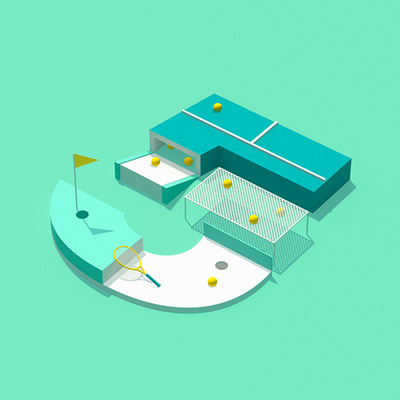
Honestly, don’t be deterred by the asymmetry of eclectic designs. It’s not about a lack of balance in the world of design! It’s about creating order out of chaos by defying traditions. Boldness at its finest!
Open compositions
If eclectic designs had a fun and imaginative first cousin, open compositions would be it! We say first cousin and not twin because both are quite different but yet closely connected. The common factor between both of them is that they break the traditions. In a good way.
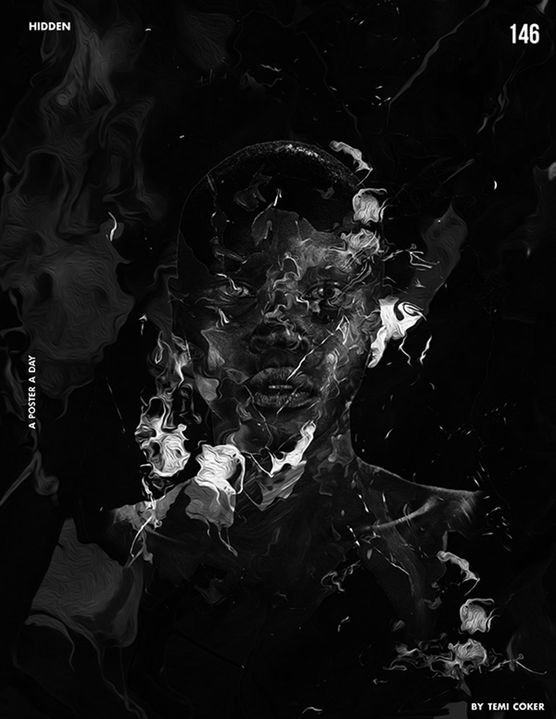
With open compositions ruling the year, you can bid adieu to closed frames. It’s the era of free flowing designs! An open composition gives your audience the idea that they’re looking at a part of a bigger, beautiful picture. Like so-
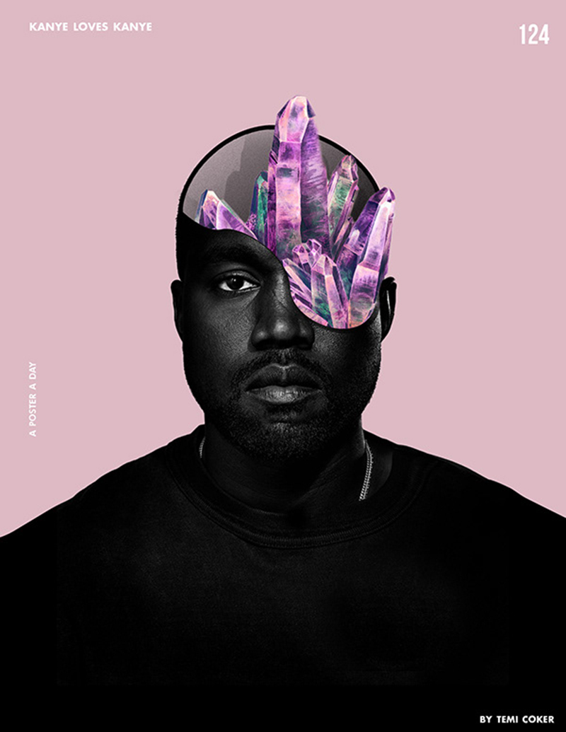
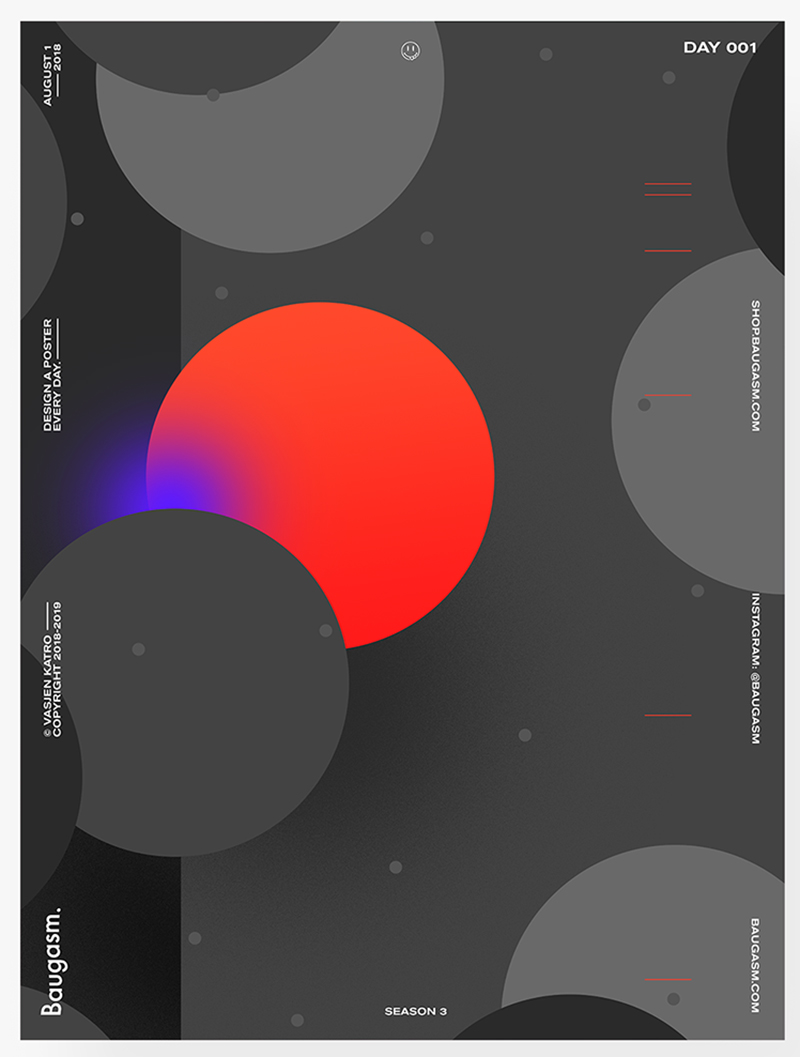
You can see that design elements are flowing off the edge of the page, creating a sense of infinity and beyond. That’s quite impressive isn’t it? We think so too!
If you want to rouse your audience’s imagination and make them curious about what’s coming next, open compositions are going to serve you best. It’ll tickle your audience’s brains and make them wonder what’s beyond the frame. Just as we did when we saw this beautiful web design-
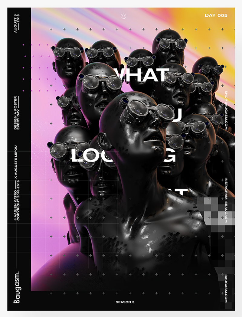
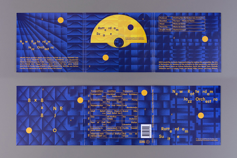
In fact, open compositions are quite extensively used in website designing due to their interactive nature. That is not to say you can’t use them elsewhere. Feel free to use them in print too if you want!
Asymmetrical designs
We briefly touched upon asymmetry in eclectic designs. So let’s talk about it in details now.
Asymmetry does not need be viewed as a disturbing lack of balance. It’s so much more than that! In 2019, asymmetrical designs can actually help you create a sense of harmony and balance by putting together wildly varying elements. Like so-
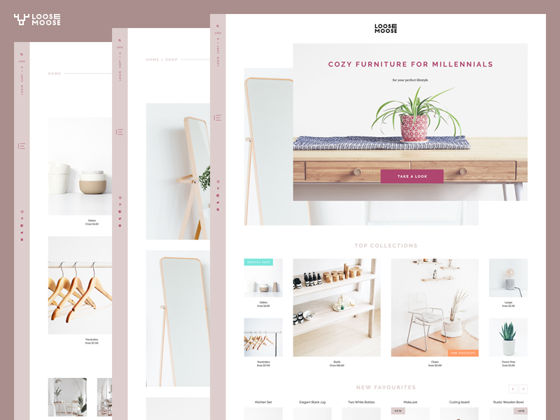
Traditional harmony may be broken by asymmetrical designs but the end result is almost always gorgeous and pleasing to the eye. You won’t find such uniqueness anywhere else. Just look at this!
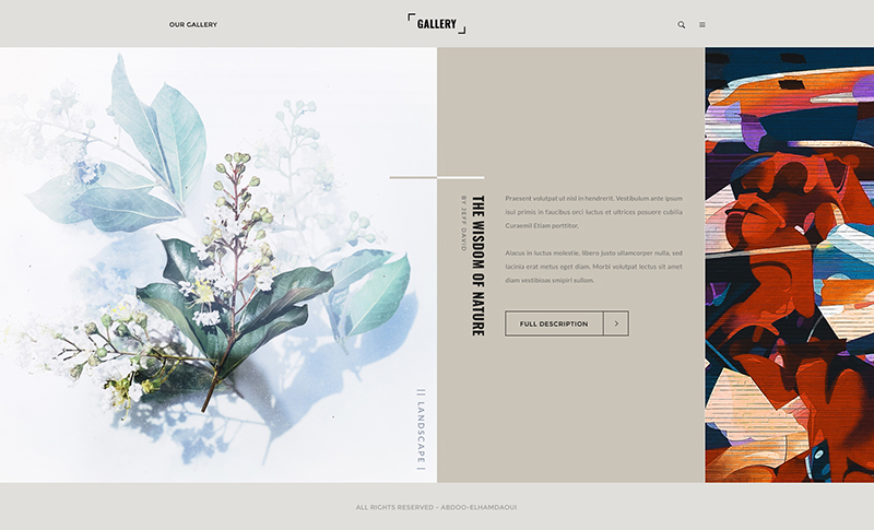
It’s breathtaking isn’t it?
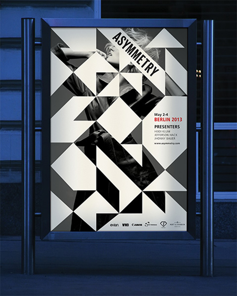
Asymmetrical designs give you the chance to play around with different elements such as fonts, 3D or geometric shapes to render a one of a kind design.
Digital Brutalism
Perfectionism in design is so passé. Imperfection is the new norm. Something that’s brilliantly reflected in digital brutalism.
With digital brutalism designs, you get stark reality. It’s unapologetic, brutal and beautiful. Like the elements in this design-
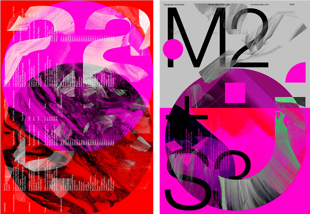
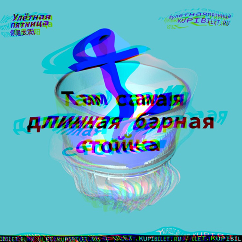
It might look a bit unbalanced and strange on the first glance. But once you look at it closely, you’ll be able to see the composition as one mesmerizing whole you can’t get your eyes off.
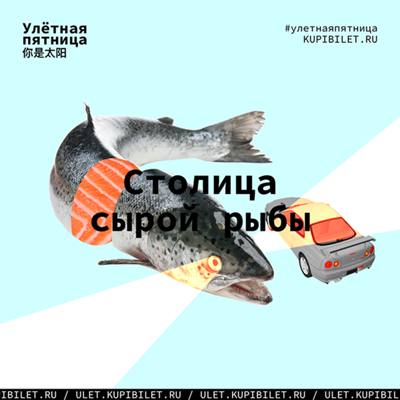
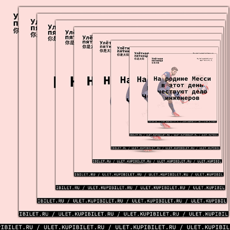
If bold is the language you speak, digital brutalism’s raw design will fit in with your brand image.
Broken grids
Even though breaking the grid is a 2019 graphic design trend, it is by no means the new kid on the block. It’s just that broken grids haven’t been explored yet. But that’s set to change this year!
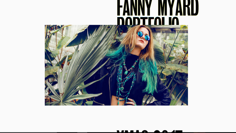
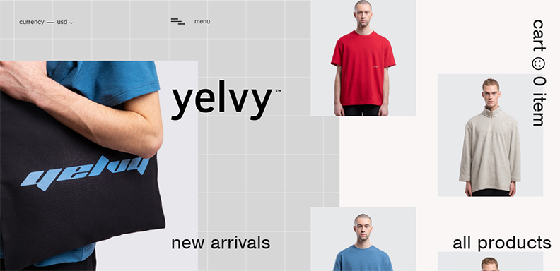
Broken grids are like the union of minimalism with thoughtful disarray, giving birth to a design that’s equal parts striking and equal parts sophisticated.
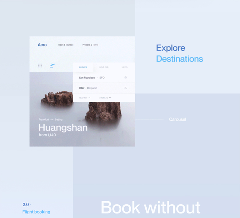
Broken grid compositions offer plenty of scope to experiment. Designers get the creative freedom to play around with key elements, thereby giving your brand a fresh and distinct identity.
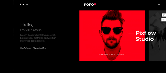
We simply love the Pofo WordPress Theme. It’s a brilliant example of how clean and interesting broken grids can look-
Also this one from Patrick Heng-
And this one from yelvy-
Optical illusion
It’s been around for centuries. It’s been used in paintings and architecture. It has impressed you before so you know it can again.
Optical illusion in the graphic design illustrations and trends is like old wine in a new bottle. It may have been done before, but in its digital avatar, it’s like a star is reborn.
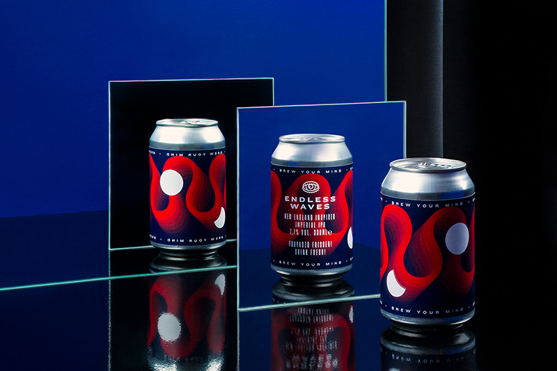
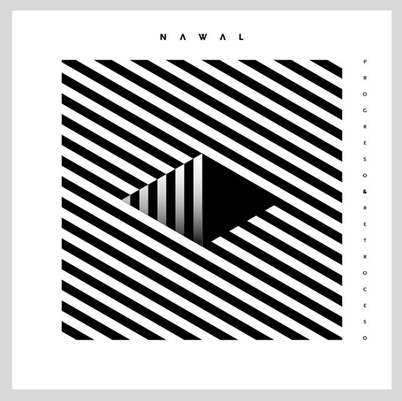
The benefit of using optical illusion-based designs is that you’ll get your audience to look longer at your webpages. That’s capturing their imagination like never before!
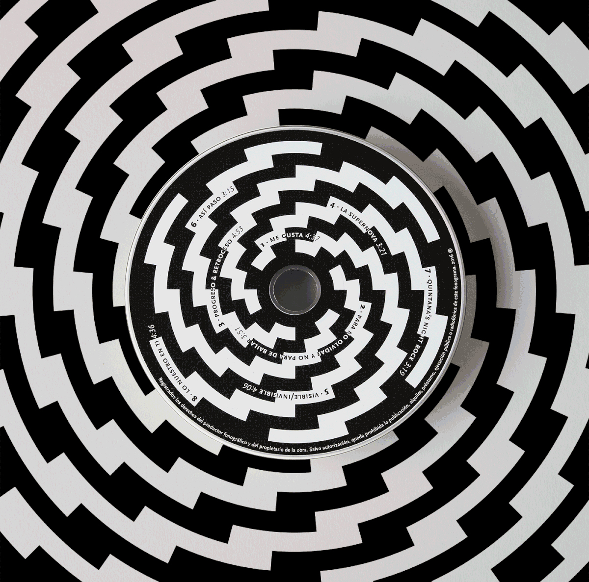
Besides if you’re a tech or science-centric website, psychedelic optical illusions can create the effect you desire on the minds of your audience without you even trying!
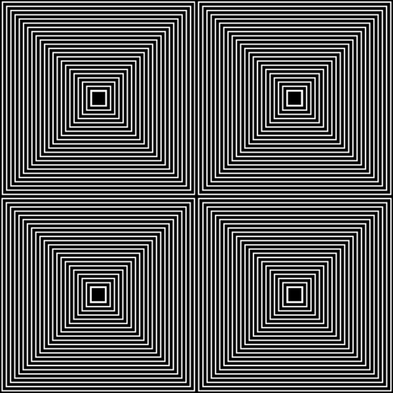
Besides there are so many variations to optical illusions that you’ll never get bored.
Busy with the creation of an outstanding catalogue? Here are design ideas that can help you out.
Art Influences
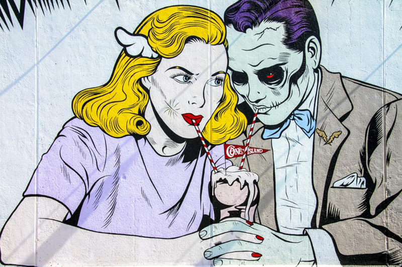
Art has deeply touched the lives of people. So it was only a matter of time before its effect was manifested in the digital realm as well. Particularly in that of graphic designs. Various art movements have inspired latest UI design trends throughout the years. However, this year seems to be about 3 major movements. Let’s find out-
Art Deco
Professional graphic design services seem very keen on imbibing Art Deco elements in their designs these days. This artistic movement that began after World War I is all ready to set the graphics design world on fire!
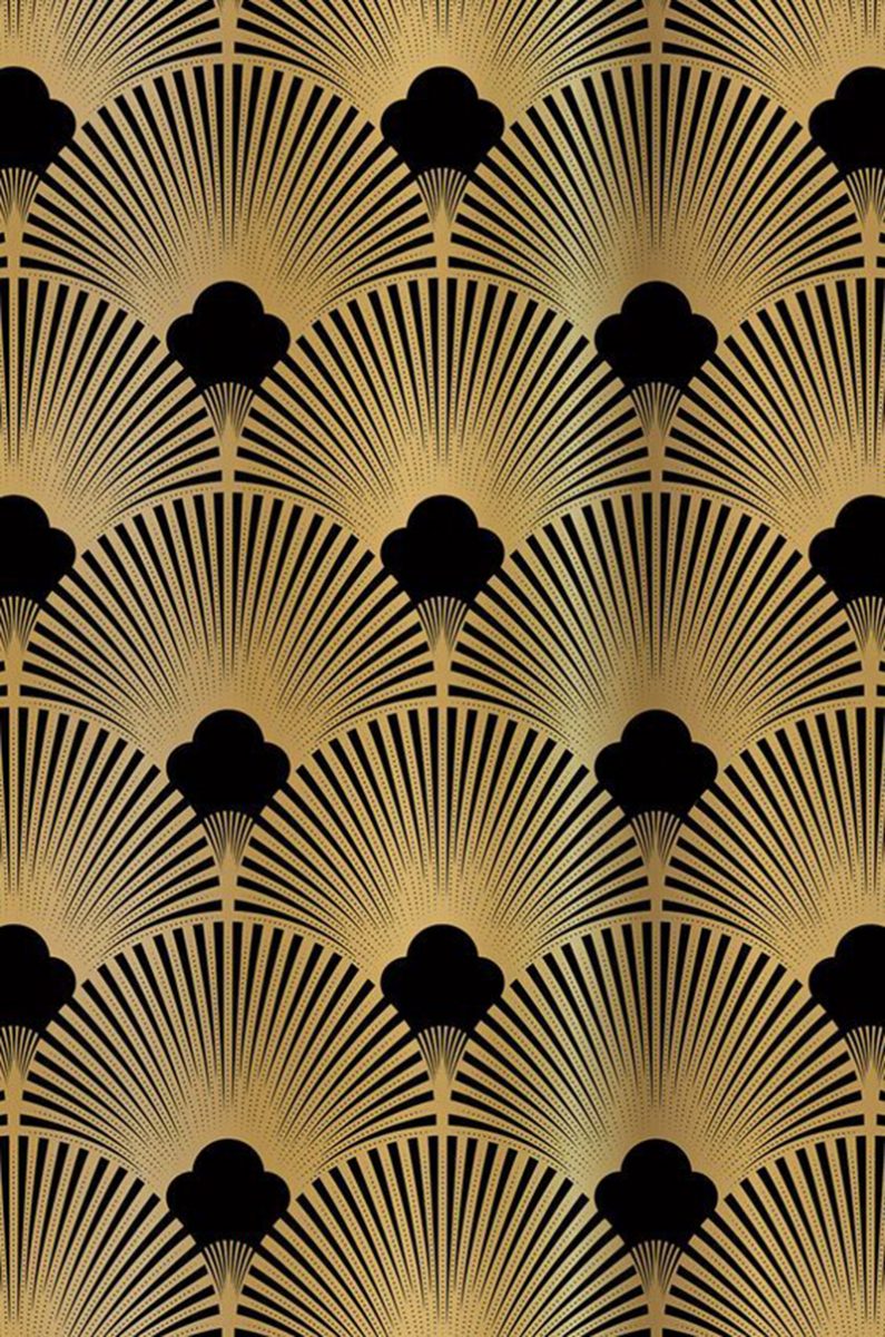
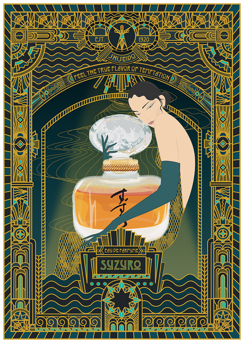
Characterized by larger than life, grandiose elements that can even put Jay Gatsby to shame, Art Deco inspired designs are perfect for your brand if it epitomizes luxury and indulgence.
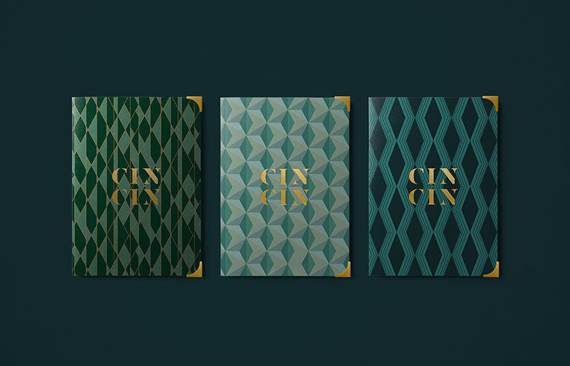
Think intense symmetry combined with metallic frames and typography. That’s what Art Deco designs are all about. As you can see from this wonderful sample-
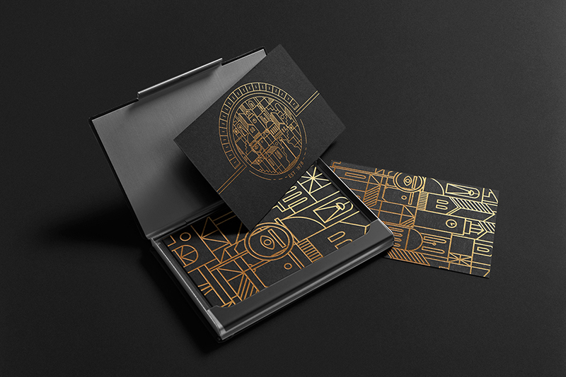
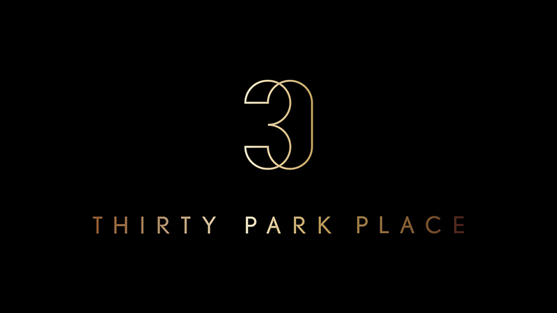
The influence of Art Deco will be specifically seen in the logo work of this year. Sharp metallic and complex lines will join hands to create logos and other design elements that’ll be simply unforgettable.
Need some inspiration for your brand logo? Check out the best logos of all time here to get ideas.
Mid-20th Century Modern
It seems as if 20th century art movements are set to have a major impact on the web development trends of the year. If Art Deco is too maximalist and grand for you, you’ll find Mid-20th Century Modern influences to your liking.
The Mid-20th Century Modern design ditches the flashiness of the Art Deco in favor of clean, organic and stripped down lines.
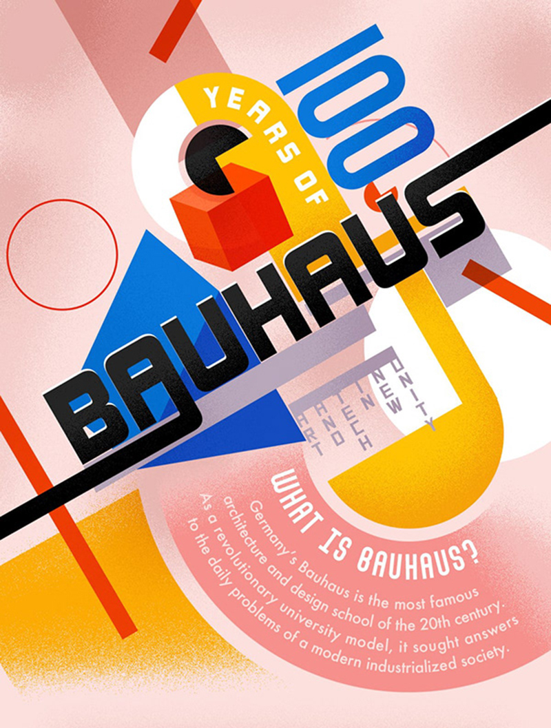
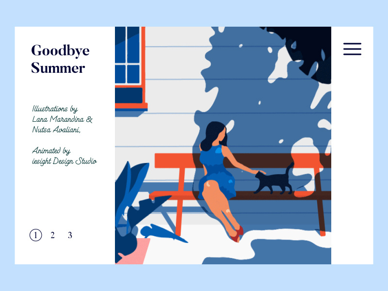
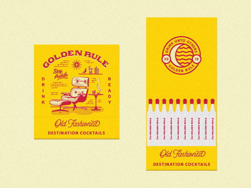
Although this modern design influence has made its presence felt in interior design, it’s only 2019 that you’ll find it making its way into graphic design.
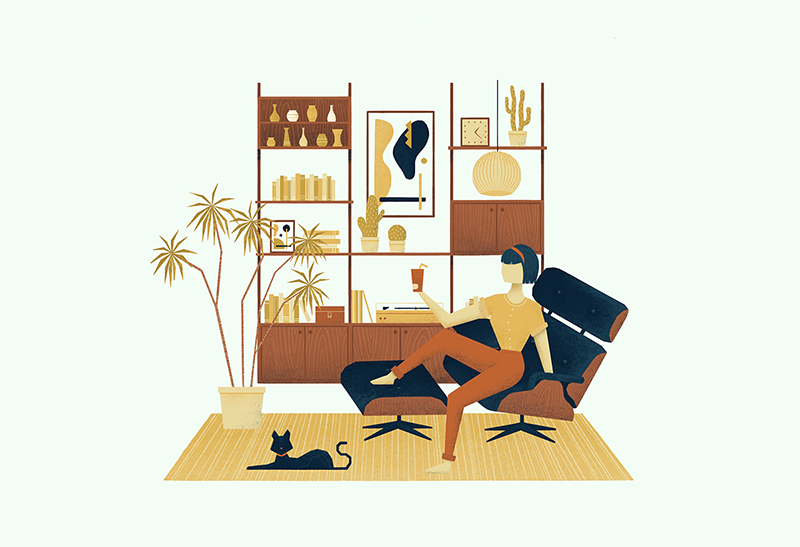
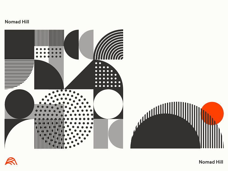
The highlight of Mid-20th Century Modern design is its post-War era like illustrations. Modern patterns come together with vintage color palettes to create dreamy designs that speak more than a thousand words.
Futuristic designs (abstract, glitches, holograms, geometric)
We’re living in the future aren’t we? Phones have lost all bezels to turn into glass slabs. Cars are automated and self-driving. Nuclear weapons are on the rise.
Okay that went a bit too dark quickly. Nonetheless, we live in the future. And obviously that shows in 2019’s latest design trends too.
This means a lot of abstract futuristic patterns, ideas and colors. Using this approach might help your brand to carve a unique identity for itself. Besides, it’s an easy and great way to rise above all the content noise on social media.
Take a look at BBC TWO’s marketing campaign for example to know how good futuristic designs can look.

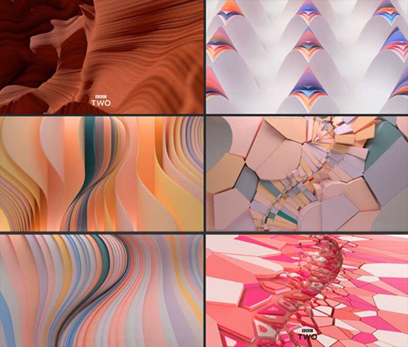
It’s nothing short of a work of art!
Apart from abstract designs, you can try out other futuristic elements too to bring out the best of your designs.
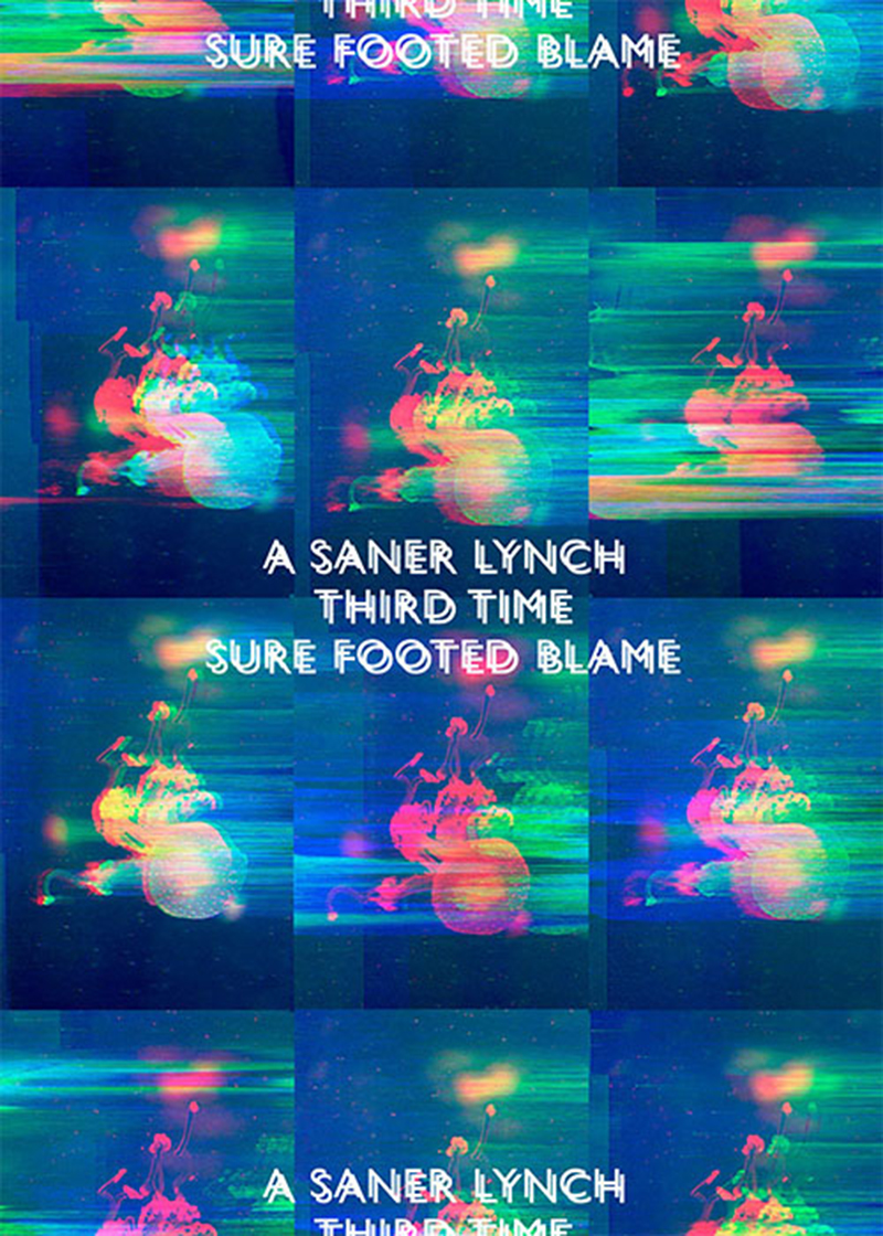
Glitches will your design that edgy look-
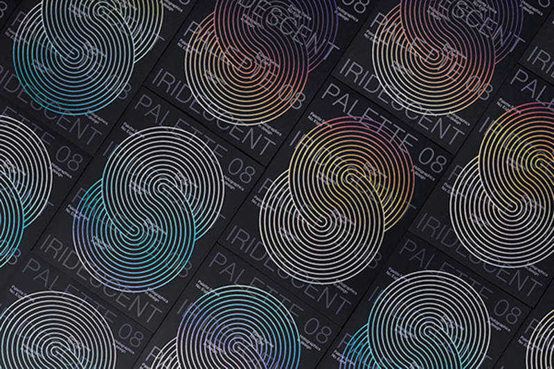
Holograms are the way to go if quirky yet classy is what you’re after-
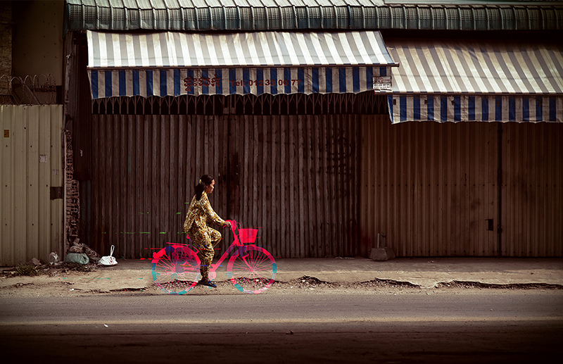
And geometrics are your best bet if you want to mix realism with a little bit of fantasy-
Great designs are not enough! You need to a great email marketing campaign as well. Here’s how you can design an outstanding one!
Trends in Images
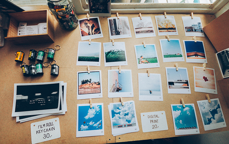
What is graphic design really? Is it just restricted to digital artistic renders? Well, not really. Images are much a part of graphic design as anything else that falls under its umbrella. And 2019 is going to witness a huge change in terms of the kind of images that are used on sites and promo materials. Realistic will be the buzzword this year as you’ll soon find out.
Warm, moody photos
You know Newton’s third law of motion, right? ‘For every action, there’s an equal and opposite reaction’. So if bright color palettes are very 2019, warm, moody images are too!
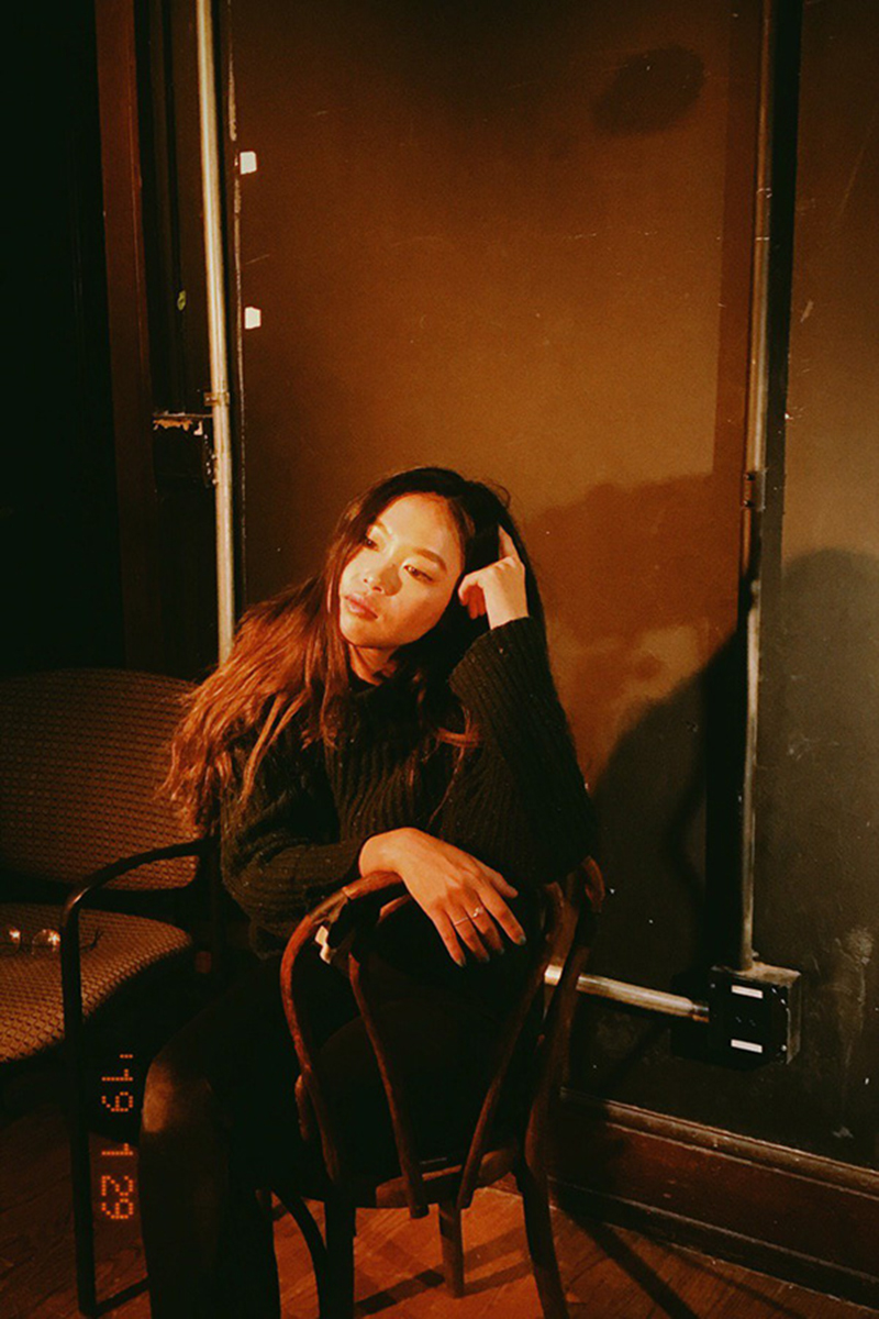
Think of it as a balance. The bright and bold shades of gradients mixed with the fuzzy color tones of the days when cameras weren’t quite able to capture very saturated hues. Creates quite a stunning contrast doesn’t it?
Warm, moody photos are a direct throwback to 70s, low-fi photography. Each picture has an amount of black in it along with shades of sepia as you can see-
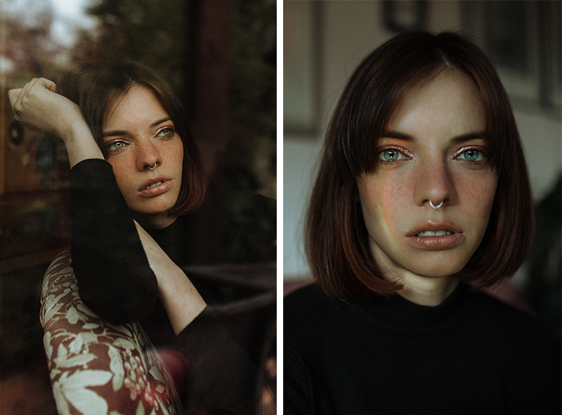
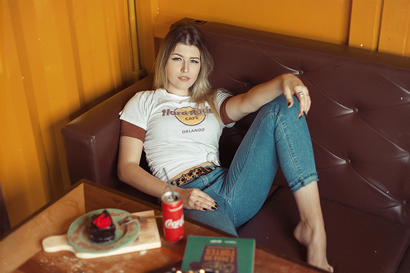
The reason why vintage pictures will be such a rage in 2019 is because of the element of realism they bring in. The wistful vibe they ooze can never be matched by anything else.
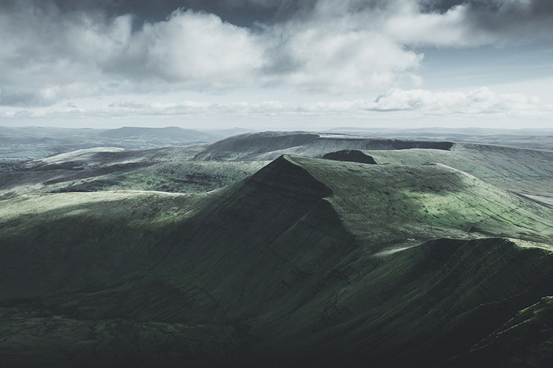
If you own a travel or lifestyle brand, using photos with warm, moody hues will really help your site and its visuals appear attractive and one of a kind.
Wondering how you should design your social media images? Find out here.
Authentic stock images
As we said before, ‘realistic’ is the buzzword! And the essence of this word is portrayed best in authentic stock images.
Gone are the days of carefully constructed stock photos. Brands and graphic design services alike are getting more and more creative these days, breaking free of the mold of stock photos to bravely take on unpolished and realistic images.
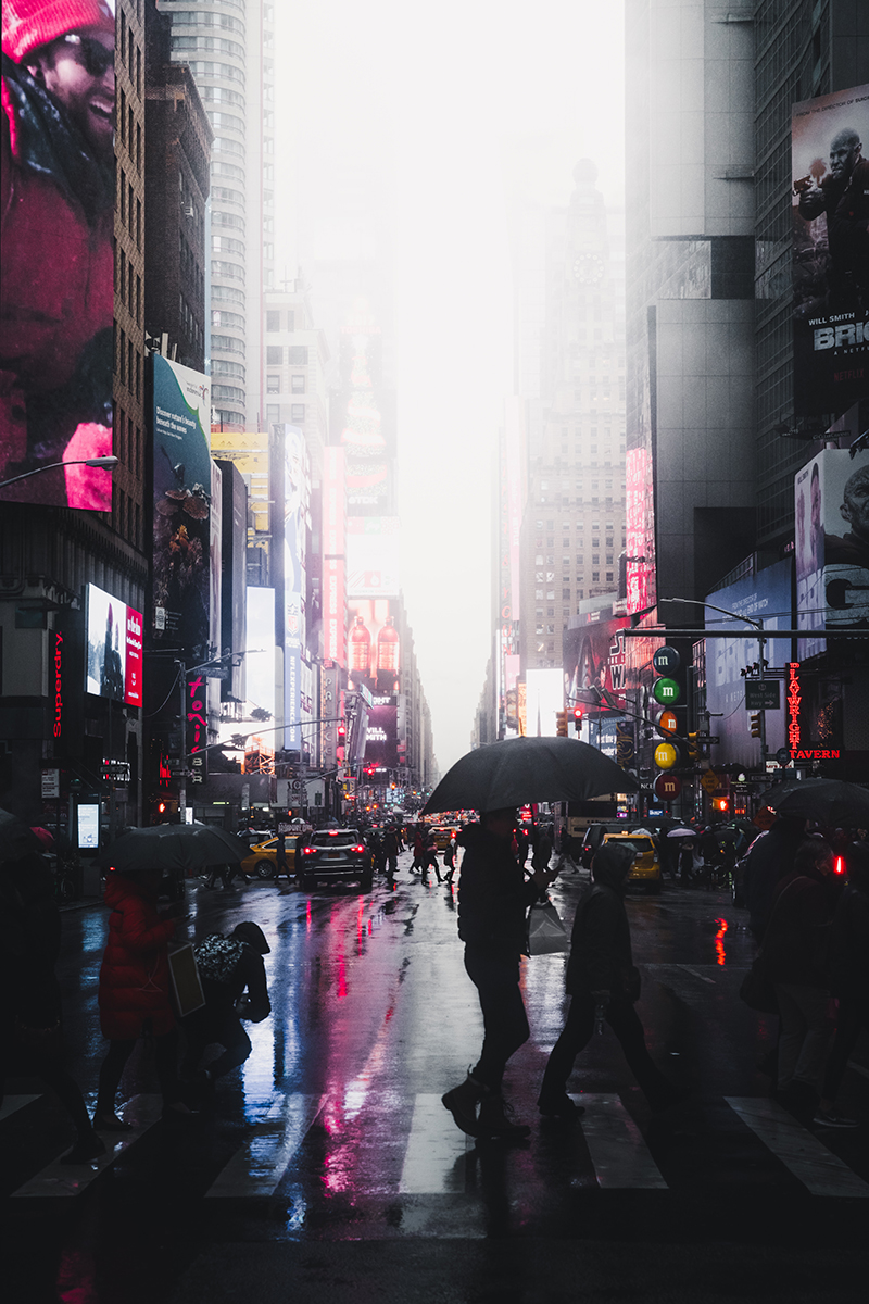
And it’s a good thing if you ask us, because honestly, those fist bump pictures make us cringe now! However, a picture like this has the opposite effect-
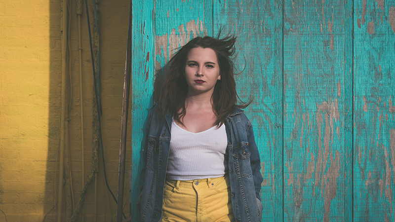
So don’t overly edit your pictures if you want your audience to stand up and take notice. Instead put up images that look they’ve been taken from a regular person’s camera. Kind of like these-
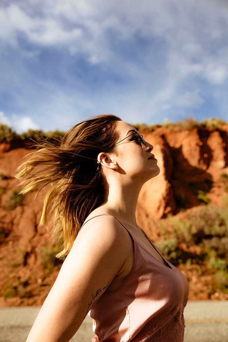
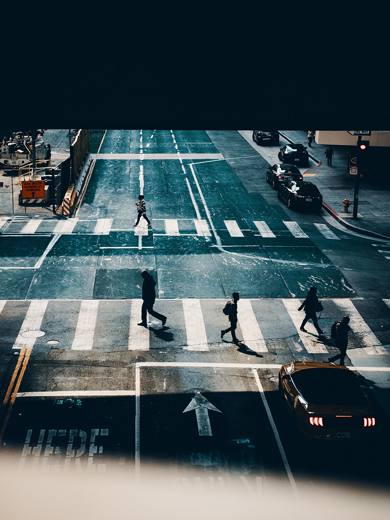
Abandon the stocky images in favor of authentic pictures that tell a visual story about your brand and then watch the difference in your site’s traffic and conversion rates!
Modern collage
Modern collages. Well, what do we say about them? Except that we love them! Their zany, quirky quality makes them one of our favorite graphic design trends of 2019!
What do modern collages look like? You’ll get a better idea if you take a look them for yourself below-
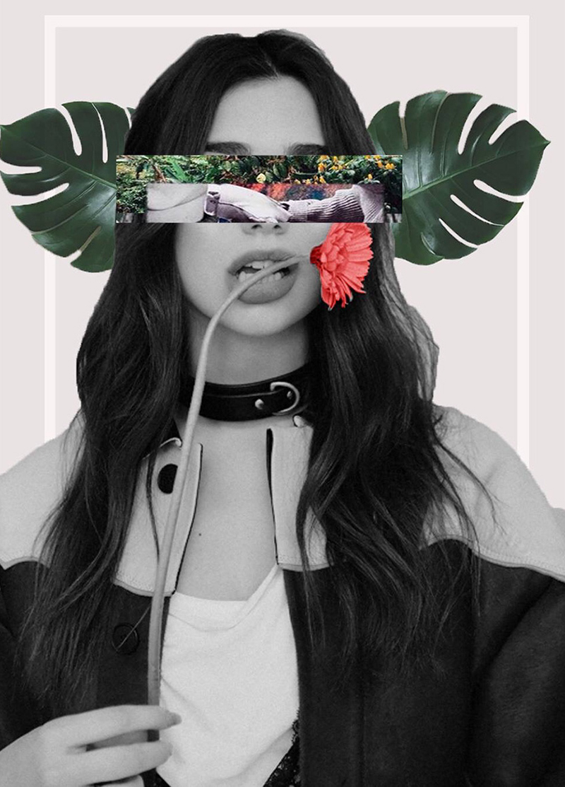
It’s crazy right? It’s like you expect to see a human head, but what you see instead is a beautiful assortment of flowers and leaves in its place.
Modern collages can create quite an impact, which makes them a very suitable for promo campaigns and other marketing materials.
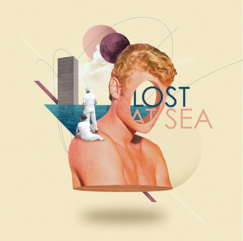
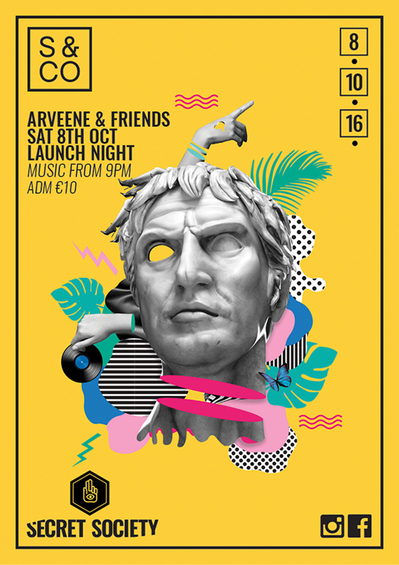
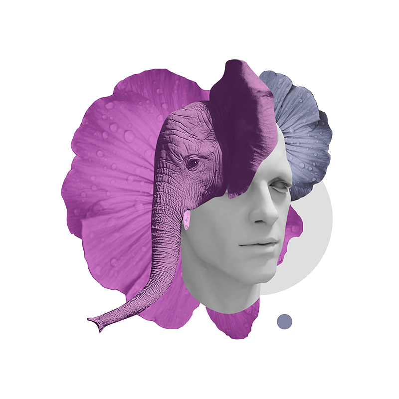
You can let your creativity run as wild as you want to with modern collages. As long as you combine vectors and photos to montages that never fail to impress, you’re good to go.
Using the right images can also boost your blog’s engagement rate! Find out how here.
Trends in Elements
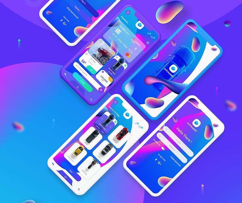
Graphic design is made up of several little elements that the untrained eye won’t even notice. Every stroke, line, and movement has a technique behind it. Obviously in 2019, there are going to be changes in this sphere as well and you’ll get to see a few elements showing their prominence over and above others.
Floating elements
Flying cars might not be real yet, but you know what is? Flying and floating elements! Well, at least as far as the latest design trends are concerned.
Animations, as you know, can instantly grab the attention of your site’s visitors. Floating and flying elements are basically elements that move around freely on your site’s interface to create the effect of free-falling. Somewhat like this-
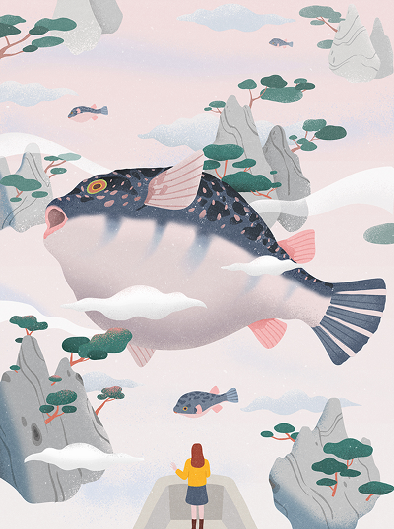
You see how free that looks? It’s like gravity is not even controlling these elements.
Floating elements go well with open compositions and actually take them to the next level, opening like a window to a brand new world. Perfect for your brand if its fashion or tech oriented.
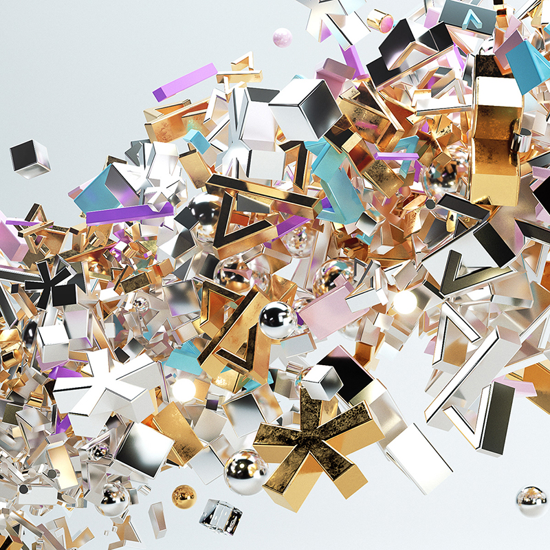
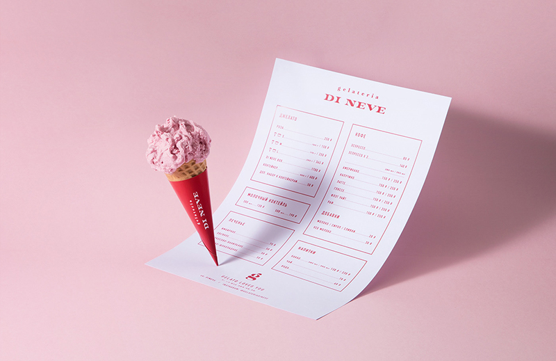
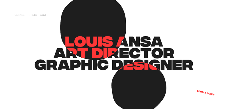
What makes floating elements more fun than most of the others on this list is that you can mix them up with 3D technique to come up with anti-gravity concepts with a touch of realism. Impressive isn’t it? And futuristic too.
Metallic elements
Shine bright like a diamond? Nah! Shine bright like gold! Or any other metal for that matter because graphic design predictions for this year are that metallic elements are going to rule.
Metallic elements are a classic making a comeback this year and how! They’re not just restricted to typography anymore. Although they can be used to create impressive fonts like so-
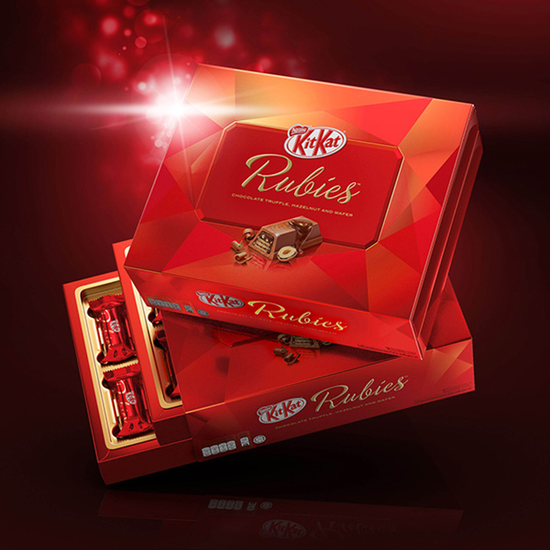
Nonetheless, this year, you’ll find rose gold, gold, silver and more making its ways to intricate 3D designs. Rich in spirit, design with metallic elements and accents will scream ‘look at me’ from the get-go!
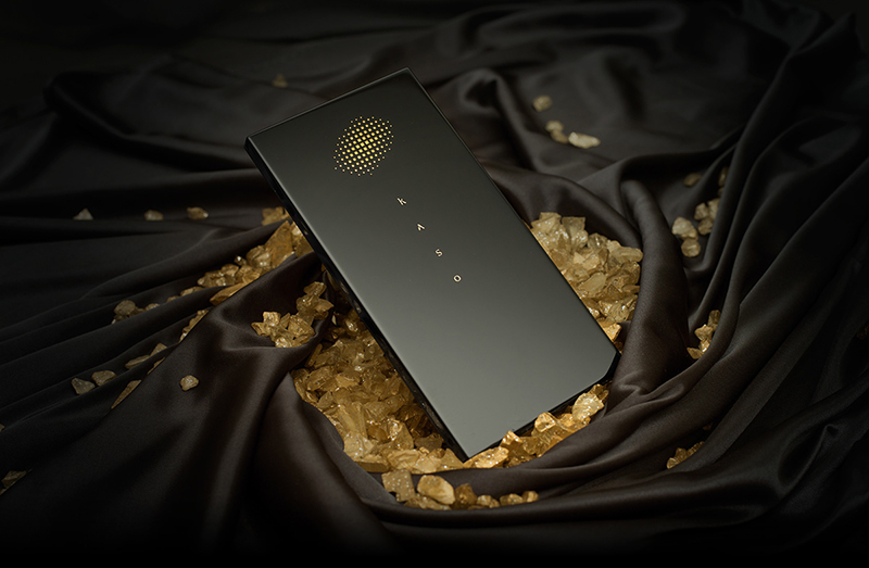
If you want to shun the luxurious feel of metallic and make it seem funky instead to suit your brand image, you can do that too!
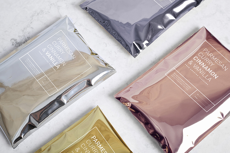
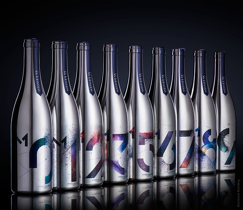
Metallic elements when combined with iridescent colors can give your designs a trendy, edgy look. Besides, they are mesmerizing. The way the lustrous colors react to different kinds of light makes them appear spellbinding!
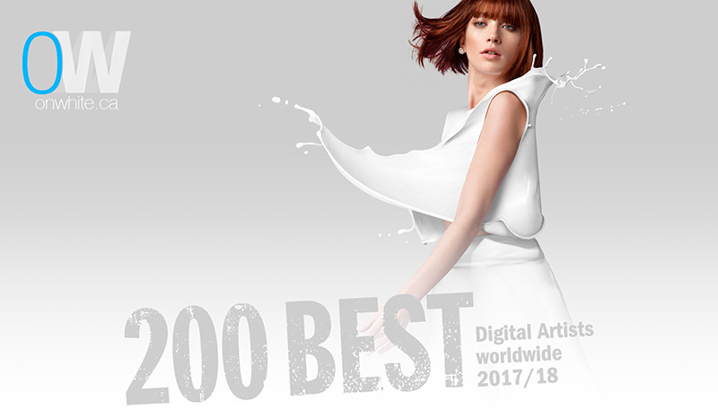
Fluid, liquid elements
Let it flow-ohhhhhh! Okay that bad rendition of the Elsa sung Frozen song aside, expect to see a lot of flowing design elements this year.
Can you picture a running stream of water? The waters softly flowing on a warm breezy day? That’s what the kind of movement you’re going to see in graphic design too. Water, oil, spirit – as long as it’s a fluid, its movement is going to be translated in to visual designs.
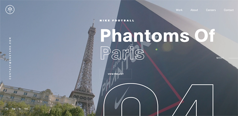
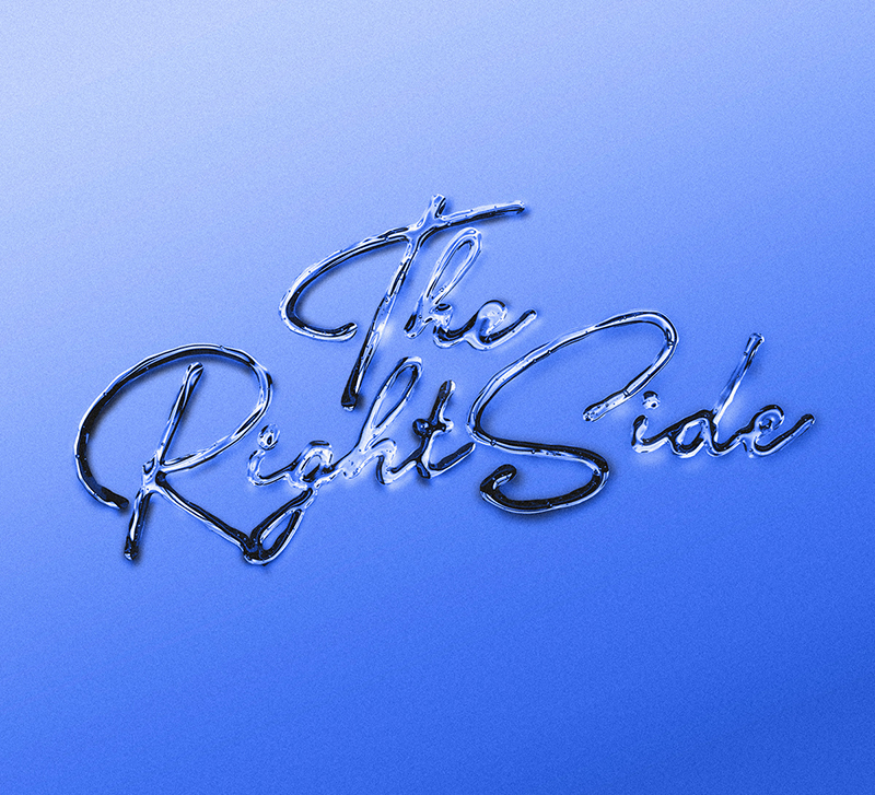
If you are tired of the same old typography, you should try giving it a liquid-y spin! Since every liquid has a different consistency and texture, you’ll get the chance toy around with several different effects – from the sublime to the slippery.
Compositions with unique liquid effects will definitely catch eyeballs. In fact fluid, liquid elements will be so popular in 2019 that you will be able web designs too!
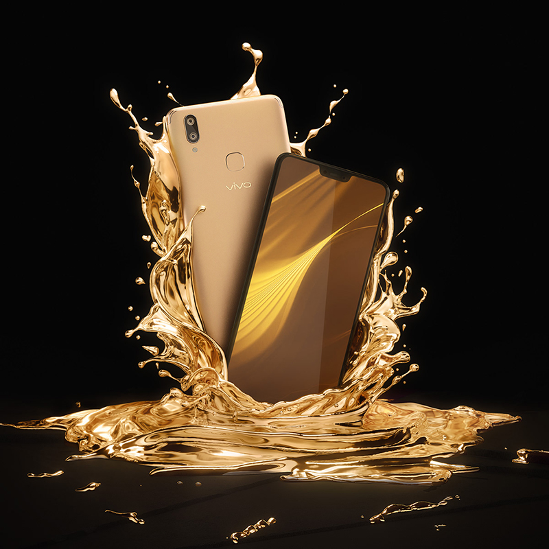
Combine them with open compositions and the resultant design will have a mystique and surreal feel to it. Quite enchanting if you ask us.
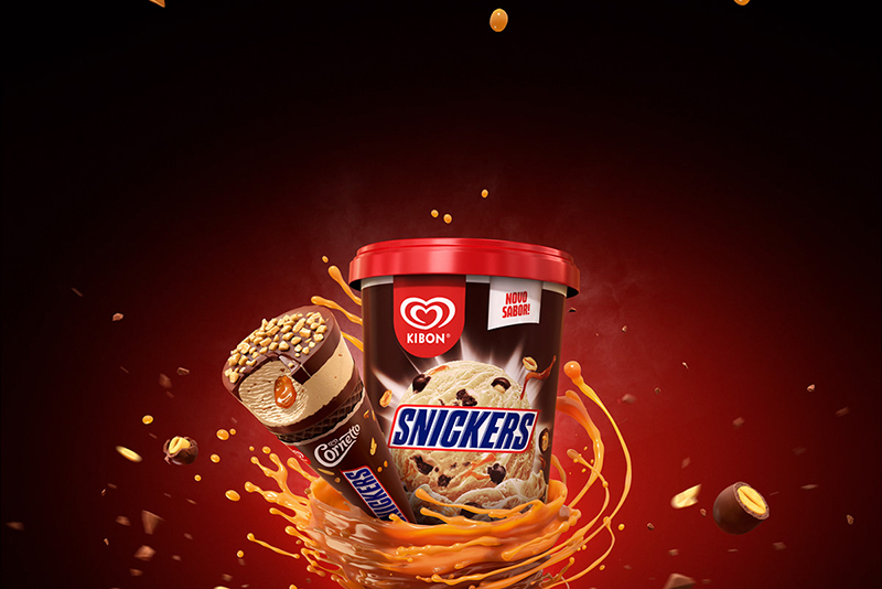
Patterns inspired by fluids will also make a dent in the design world this year.
Negative space
Negative space is one 2019 graphic design trend that seems to keep gaining more and more prominence with every passing year! You’ll see negative space being used in all design fields. But never as commonly as it is in the field of web and app design.
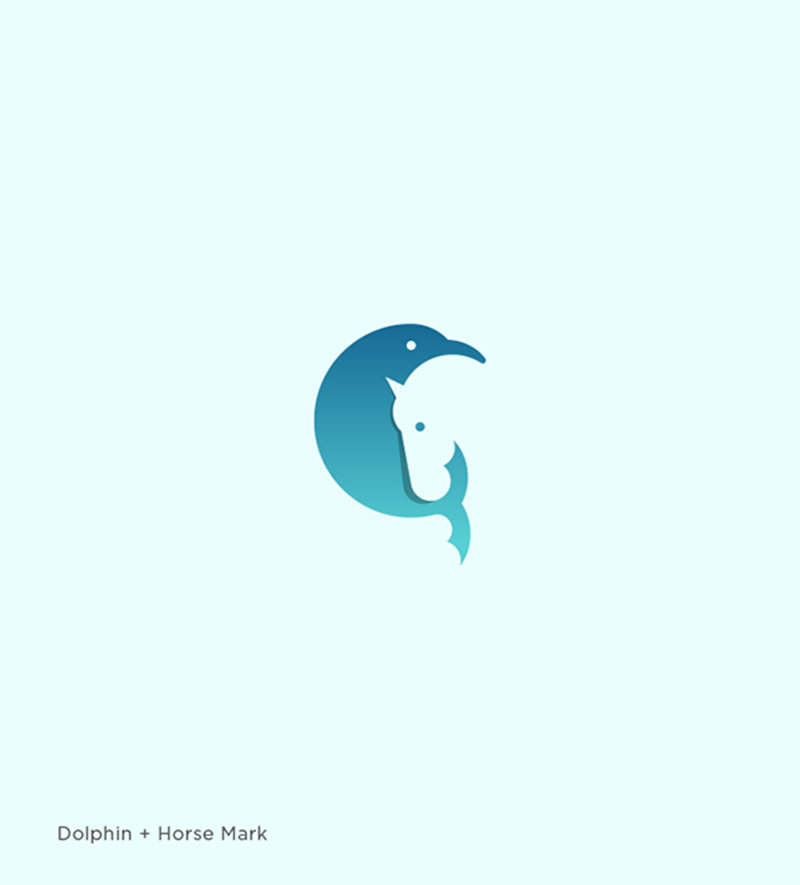
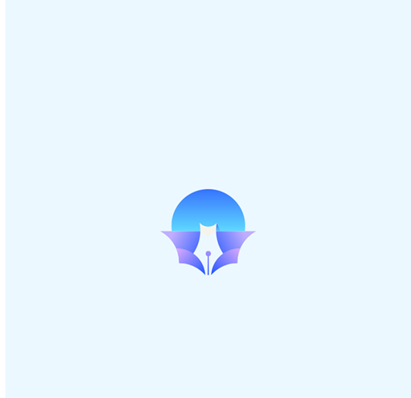
If you don’t know what negative space is, it is the space between, inside and around an object in a particular image. This space can be used to cleverly carve out different shapes, creating the effect of a jigsaw puzzle falling into place.
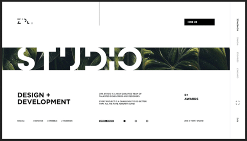
Of late, designers have been using negative space to their advantage, coming up with interesting and truly mind-boggling designs that’ll leave you spellbound! Take a look at the famous animated movie Frozen’s Broadway musical poster for example.
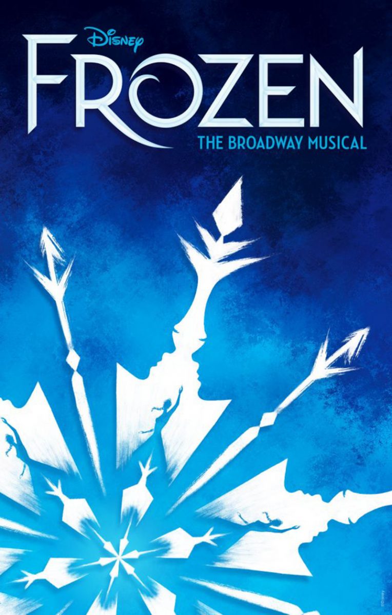
You can see a miniature silhouetted version of Elsa within the snowflake. That’s how you use negative space to drive home your point! Or at least to send out the message you want put across.
Strokes and stains
Clubbed under alternative art, strokes and stains (and even doodles and spots for that matter) are fast being incorporated into the realm of graphic design. Why? So that the designs created stand out! Simple as that.
However, we believe that this year elements such as strokes and stains will witness a lot of improvisation. You’ll get to see plenty of freestyle illustrations that have a fun personality. Same goes for doodles. Like so-
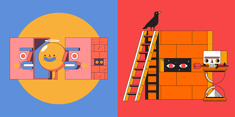
Now add some stokes and stains of different shades and you’ll get a design that’s artsy, offbeat and overall just wow.
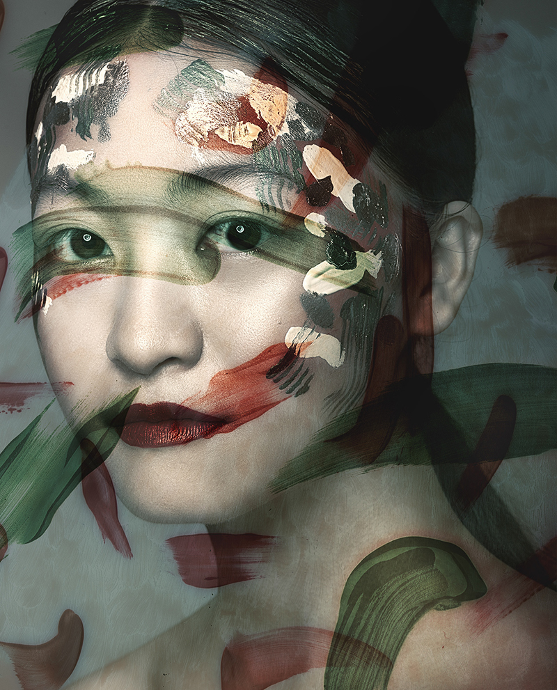
Observe and you’ll see that this trend has hit the package design field already, often in combination with other trends such as metallic effect. Pick a bunch of nice colors and the package you create is bound to be attractive.
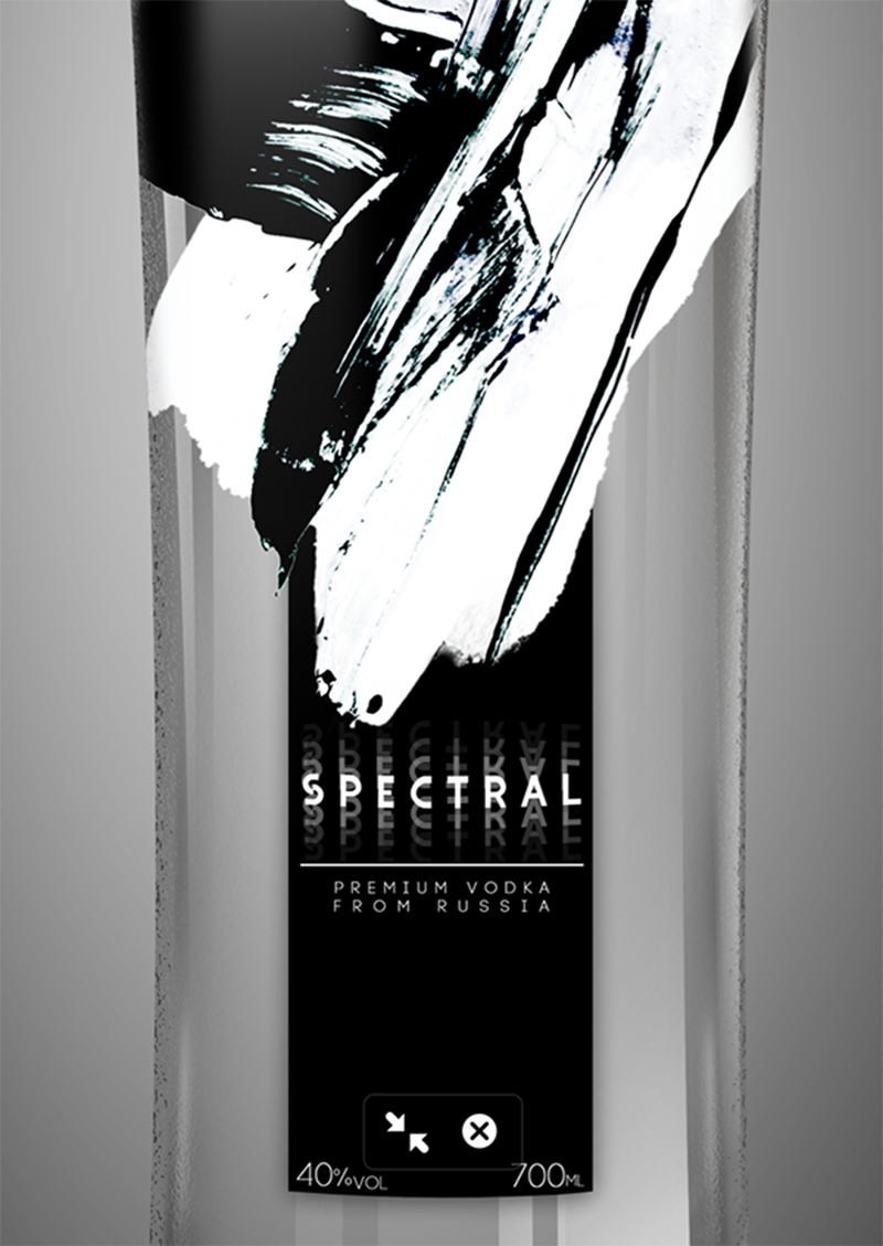
As for doodle illustrations, they’re going to move out of the mold of black and white and adopt colorful backgrounds without affecting the design’s overall simplicity.
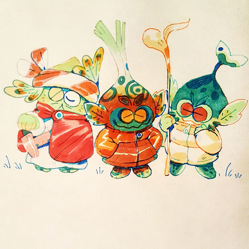
Doodle illustrations will be used in combination open compositions this year, creating a mind bending impact.
Grain effect
Remember old cartoons? The animation always looked a bit grainy. In hindsight, it added to the animation’s charm and beauty. You can add the same effect to your site’s graphics too with the underdog design trend of the year – the grain effect.
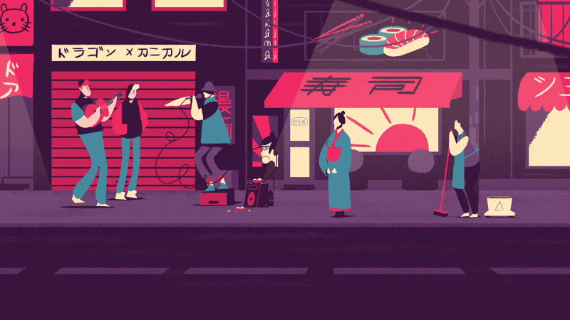
Though generally applied to 2D graphics, you can use them to create a soft, wistful, dreamy world by applying them to 3D graphics too.
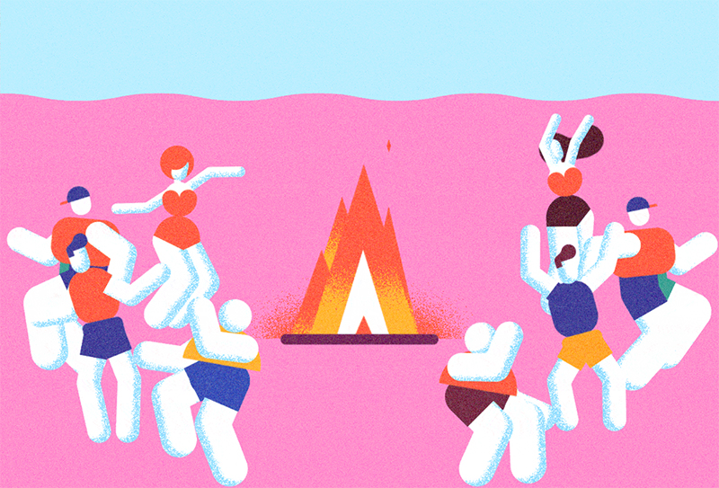
Although plenty of apps can help you create the same effect, you won’t get that finesse if you don’t hire a hire a professional graphic designer. See for yourself the magic a professional can create-
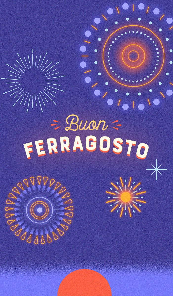
You can obviously adjust the granularity. We think the grain effect looks particularly good when done on moody, warm photos, which happen to be another major design trend of the year as we discussed above.
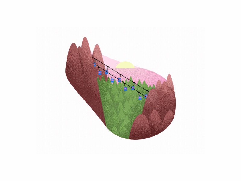
Grain effect will suit your brand image if you belong to the travel or photography niche.
Wave effect
In keeping with fluid, liquid elements, wave effect has become very popular this year. The wave effect is a welcome break from the carefully constructed perfection of images, giving them a distorted look that has a lot of character.
You can add the wave effect to any kind of image and make it appear truly unique. Like these for example-
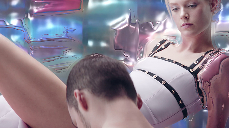
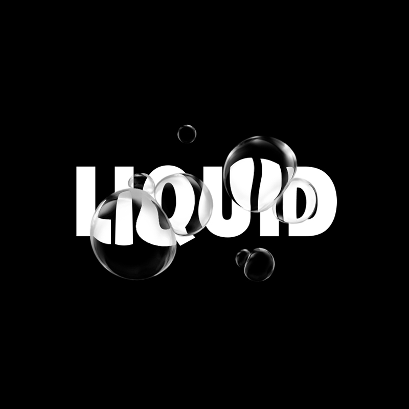
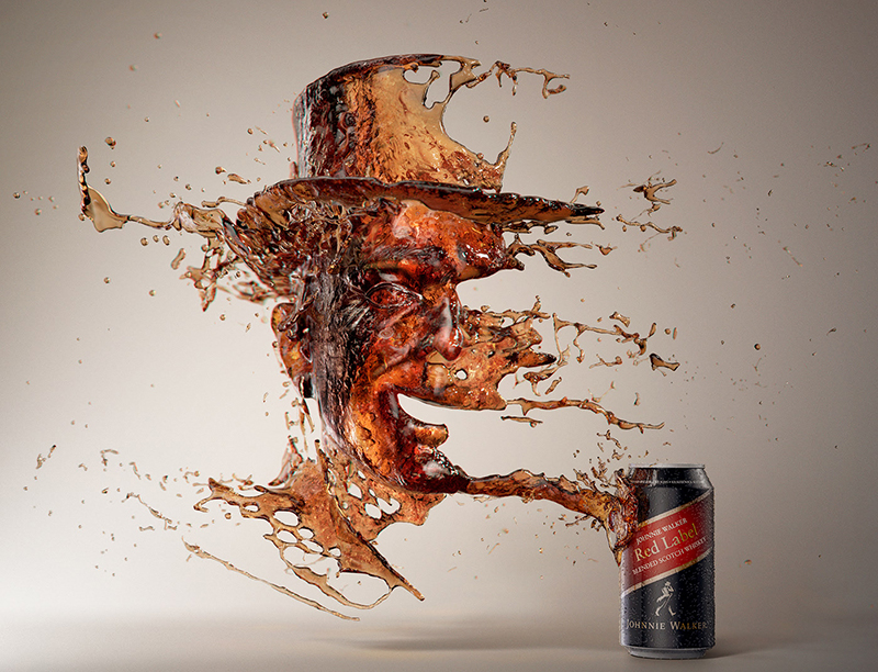
What wave effect does is give the images a fresh yet imperfect, messy look, which is very much the essence of several of the graphic design trends this year. Perfection is really out the door this year it seems!
Double light
Spotlight is supposed to hit the model from either top or the front. But what if it could hit one from both sides? Wouldn’t that make for a stunning picture? Enter the ‘double light’ design element.
With a thing or two in common with doubling, the double light element is not used to create a double image though. It’s meant to create a two-tone light or shadow background for the model in question.
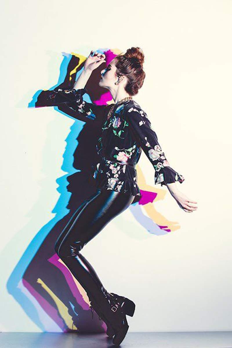
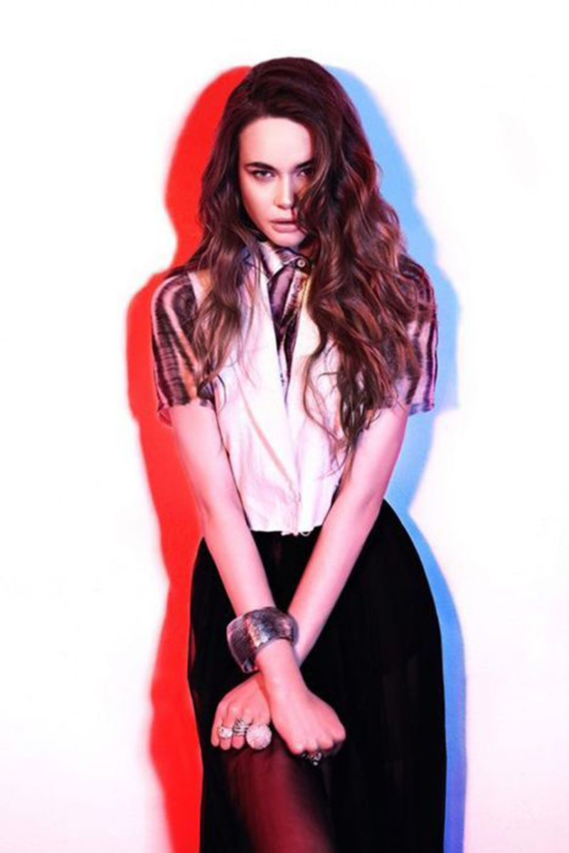
Try it out and even if all you have in the forefront is a product image, you’ll find it appearing sharper and more dynamic than ever before.
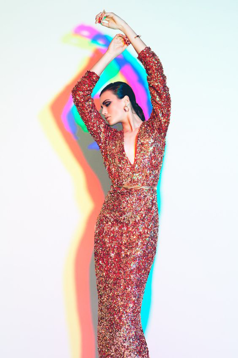
You can implement the double light element in two ways – you could either split the light channel or use two different light sources.
We love the fact that the double light element is so easy to achieve! A bit of basic light effects and Photoshop and you have yourself an amazing piece of visual.
Other noteworthy graphic design trends
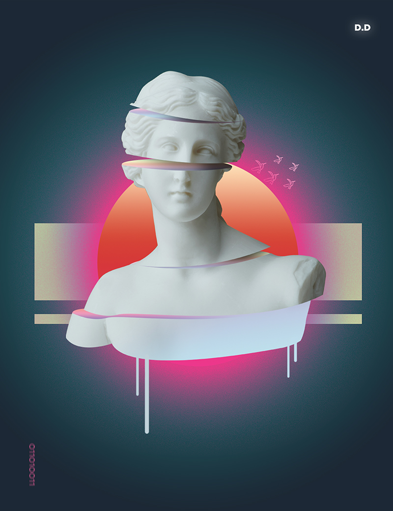
We’ve covered so many graphic design trends of 2019 in this blog that you might think this is the end! But it’s not. Plenty of other trends have made a mark this year and you need to know about them too. So without further ado, here’s a list of the other noteworthy graphic design trends you need to know about-
Soft, gradual motions
A motion graphic design trend that’s made a lot of noise this year is soft, gradual motions. Harsh transitions are out so if you’re creating an app or a website, ensure that the motion is subtle and easy on the eyes.
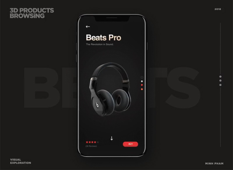
It’s all about micro-interactions to be honest. And you know that’s nothing new. It’s just that it took the year 2019 for the design industry to realize their true value.
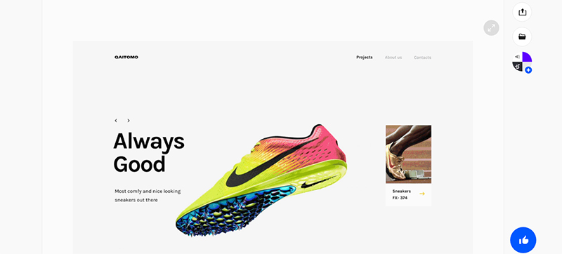
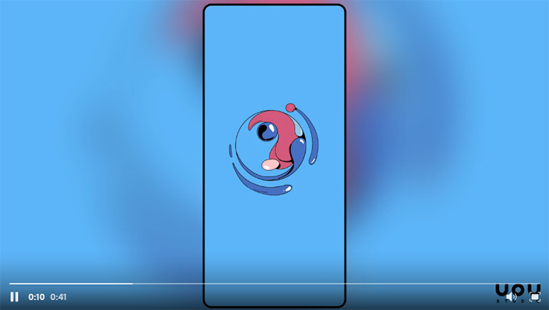
Use soft, gradual motions in your website to truly surprise and delight your audience.
Animations
A lot of website design trends will be discussed in this section. So be prepared for another one, which is animation!
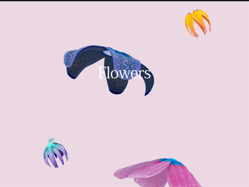
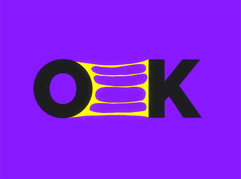
Small animations on your site or app can breathe new life into them. Look at this simple ‘OK’ for example. The way it’s been put into animated form, it’s the bland ‘OK’ seem so much more fun!
Animations don’t have to be restricted to web design though. You can make them a part of your ad campaigns and other materials as well and make them more interactive, engaging and fun.
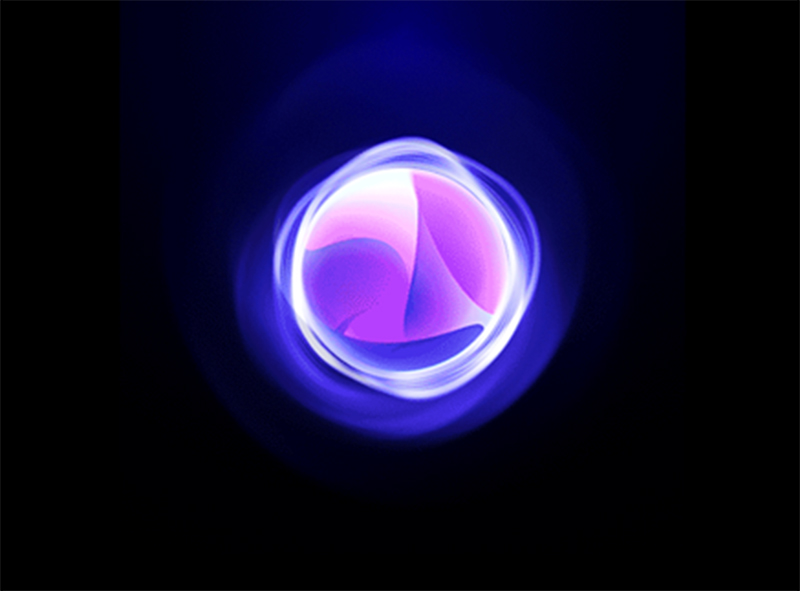
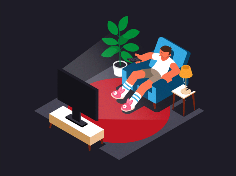
Lacking inspiration? Go through these to get ideas-
Augmented Reality
In 2019, augmented reality is all set to create massive waves in the world of graphic design. Especially when it comes to web and app designs. This year, you are going to see multiple apps make use of AR to offer its users a larger than life user experience.
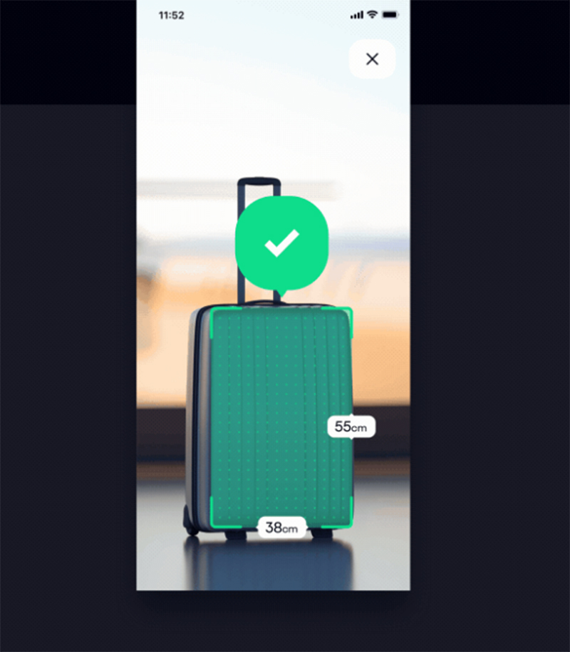
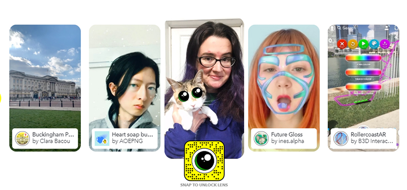
Yes, this Pokemon-esque feature might make its way into an app you use every day or even one you intend to create. Think of Snapchat. It’s probably the best example of how AR can be used to enhance user experience by adding several layers of special effects to pictures users take.
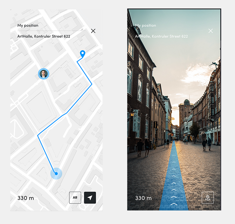
Augmented reality will be commonly used in e-commerce and travel sites and apps as well, offering users the chance to view products in real time. Like Ikea’s brilliant app for example that allows users to see say what a particular coffee table looks like in their room.
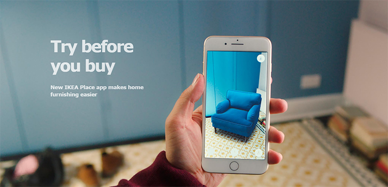
AR and AI (artificial intelligence) will be heavily used in the designing process as well. So their influence is not simply restricted to being a design element. Despite their dominance this year though, AI will never be able to replace real web designers.
Bottomline? From beauty and games to pictures and home furnishing, AR is graphic design trend that’s all set to reach its peak in 2019.
Learn more about the impact of augmented reality in the field of design here.
Video background
Video backgrounds are so cool aren’t they? It’s like instant engagement! Once you look, you simply cannot look away. We are big fans of video backgrounds and think of them as one of the coolest graphic design trends of 2019!
Take a look at this video background and we’re sure you’ll be as floored as we are –
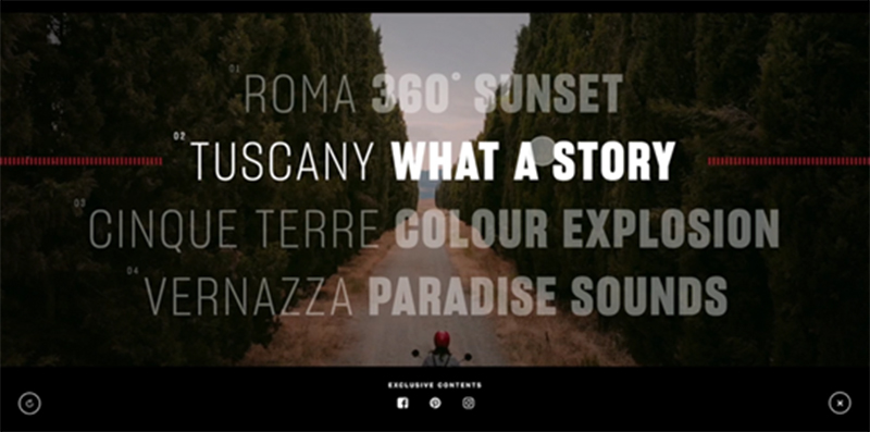
What’s so great about a video background? Well, you looked at it and you know that you were instantly hooked. So that’s one. Besides, with a video background, you can drive home the message you want to in an instant. Without even writing a single word!
Studies show that video backgrounds can increase conversion rates. This might be the best time to add a video background to your site. You can check these out for inspiration-
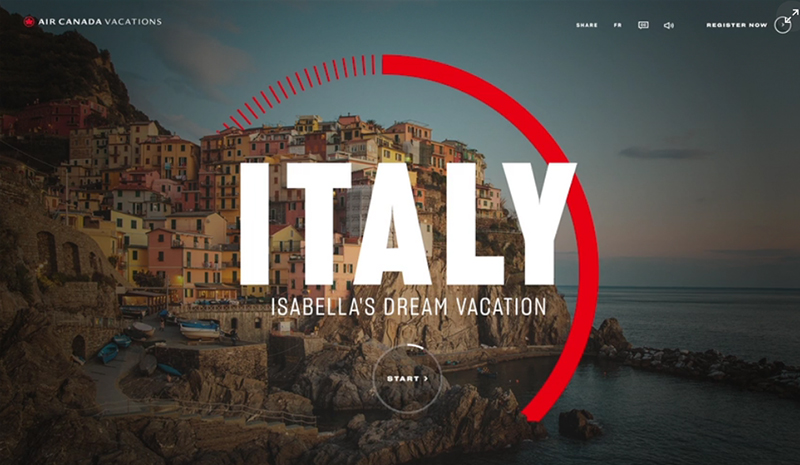
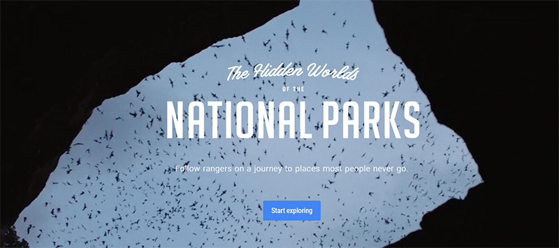
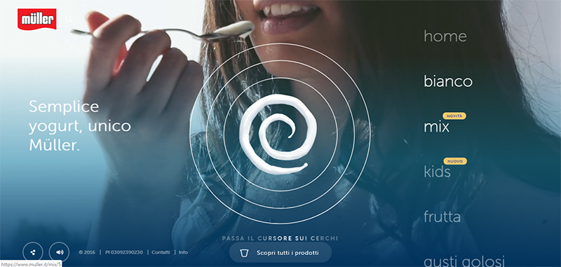
There you have it! These are 41 graphic design trends of 2019 that are going to be big this year. You can try any, all or even a hearty combination of them for your brand and watch your business soar to new heights. Staying up to date with the latest design trends and molding your brand’s visual and design campaigns accordingly will help you garner more leads, get higher conversions and increase brand awareness.
Want The Latest Graphic Designs For Your Brand? Get in Touch With Digital Polo
With so many new graphic design trends hitting the block this year, it’s time to ensure that your brand is in sync with these designs. You need a capable graphic design agency for that though and you’ll find one in Digital Polo. With some of the most talented designers on board, we can help create fresh designs and promo materials for your brand. That too at a very affordable price! If you want the quickest turnaround time possible coupled with the best designs, give us a call.
