6 Reasons You Should Hire a Graphic Designer Instead of DIYing – Digital Polo Inc
6 Reasons You Should Hire a Graphic Designer Instead of DIYing
With the advent of technological advancement, information is just a click away. Do you want to create a birdhouse? Google it. Would you like to create a graphic design by yourself? Watch a YouTube video.
As soon as DSLRs became easier to avail, we all became “photographers”.
There’s no doubt that an image created by you is priceless. It not only showcases your potential but it may also look good.
Now, let us ask you, why have you chosen graphic designing? Most of you would say, “To use it on the website”.
Answer honestly. Do your images serve the purpose of increasing sales? Let me assume. The answer would be NO. Even if the traffic is high, it may not result in increasing your sales graph.
Image courtesy: https://bit.ly/2FsB9ku
Actually, your website works just like a travel guide. When someone visits your website, he should be able to find what he is looking for. While beautiful images created by you may look interesting to you, they may not work as a certified guide for your potential customers.
It is not that nurturing your skills is bad or I am against it. The fact is that some things are better left on experts. You should know when to draw the line between doing all by yourself and hiring an accomplished designer.
Even though there are many templates available that you can use to create a design, it won’t provide a positive result for long.
So, let’s discuss why you would need to hire a specialized designer instead of doing it yourself.
- Rules that matter:
While you learn to create a design watching videos or reading a ‘How-to’ blog post, the specialists take a course to learn the rules. Joseph Kalinwoski, a graphic designer with 16 years of experience, says that he still follows the rules that he learned in college. While DIY artwork may include some of the features of professional graphic designing, the basic idea is always missing. He shares from his experience that your contents may get lost or may fail to instill interest among users if your design is not appealing enough.
To prove his point he has chosen one such artwork and applied his proficiency to recreate the design. Let’s take a look:
The following is a DIY design:
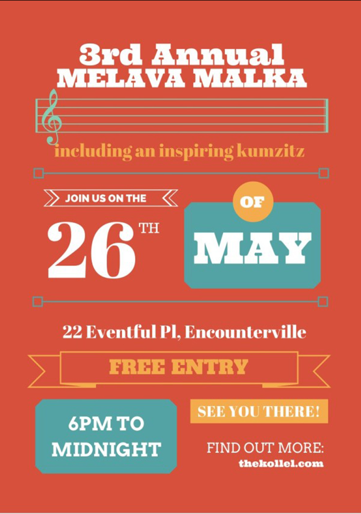
Image courtesy: https://bit.ly/2TT3Foc
Does the image look appealing to you? Check out what the expert has to say about it.
Joseph Kalinwoski made some modifications and the end result is:

Image courtesy: https://bit.ly/2FrkFro
The first massive difference is the use of colors. The DIY work included four colors that were used without any attachment. Even though the hue and saturation of the colors are good, they just don’t seem inviting to the reader.
Kalinwoski kept the background similar to the original and used the same color palette. On the contrary to the original one, he used the colors orange and green to attract the attention of the viewer.
Kalinwoski also highlighted the name of the event using large font-size instead of highlighting the date. Unlike the DIY project, it creates the perfect balance in the design and makes it easily understandable.
So, what is the takeaway?
Yes, you got it right.
Rules do matter.
It’s simply not possible for you to know the minute details of creating a perfectly balanced image that looks professional and provides information in the right way. So, it is always better to hire a pro for that purpose.
- Save time for better productivity:
I understand that as a business owner you need to manage your time tactfully. You may already have a lot on your plate. Why would you want to waste your time in creating designs that won’t prove to be fruitful in increasing your sales? And that too, using free designing software!

Image courtesy: https://bit.ly/2Jt6yHh
In contrast, if you hire a qualified designer, you’ll be able to invest your time in something more productive. Expert designers are trained to complete the task within a specific timespan. Besides, the end image looks more precise than what you could create using some free software.
Don’t forget that only one bad image can ruin the appearance of your website. You can even lose a potential customer. Use the images as tools to attract customers to your website and your business.
- Create credibility:
Do you know that your web design can create reliability among your users? As per the Stanford Web Credibility Research, 75% of the users are influenced by the design of your website to judge its credibility. You will be amazed to know that 94% of the users admitted that their first impression of your website is subjective to professional designs. Can you believe it? A whopping 94%!
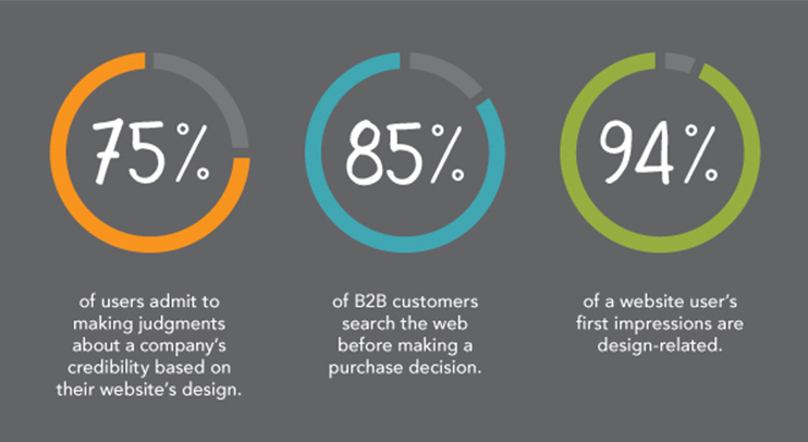
Image courtesy: https://bit.ly/2q9aiU4
Check out the website below. It is a design and travel magazine. Notice how beautiful yet simple the designs are. High quality, engaging images are used in the structural layout. The text doesn’t overlap the images. Rather the text balances the white space underneath the pictures.
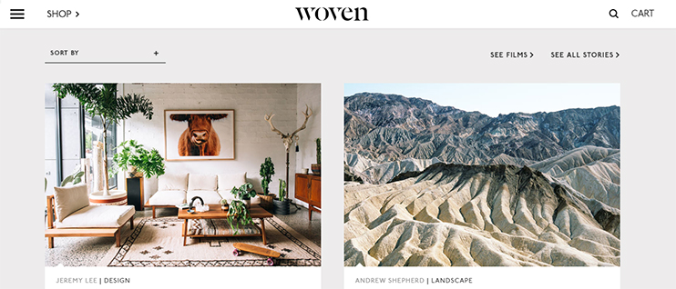
Do you notice that the rest of the page is also not cluttered with information? Doesn’t it look better than the websites with a lot of information or those who have numbers of ads scattered along the pages?
Take another look at the website below:
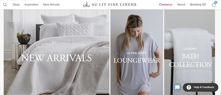
As you can already tell, Au Lit Fine Linens is a company that offers bedding sets. Notice the use of accent pieces in the images. The set up not only looks classy but the images also depict sophistication and taste.
There’s no brownie point for guessing that the images used in these websites are created by skilled designers. The tasteful layout, the use of the accent pieces, the blend of colors, the placement of selective content – everything gels together to create an attractive website.
Even the blank spaces used in these websites help the viewer to have a relaxing feeling. Note that it is easier to skim the necessary information when there is less content on the page.
- The marketing techniques are changing rapidly:
You must be thinking, “What do I care? I am all set with my high-quality content.”
If you have decent quality content, that’s actually very good. But I am really sorry to break the news to you that content alone can’t attract as many customers as it did in the past.
Only a few years ago, you needed to create a good blog post with some images to attract traffic on your website.
But as we all know, the algorithms of the search engine keep changing every now and then. Even the sharks of the marketing industry need to look for ways to make their content engaging enough.
Pleasing graphic design along with easily understandable content is the best bet for you.
Do you know that the bounce rate of your website can be above 40%? Even though the average session per user shows 5.86, the bounce rate can be quite severe for the profitability of your company.
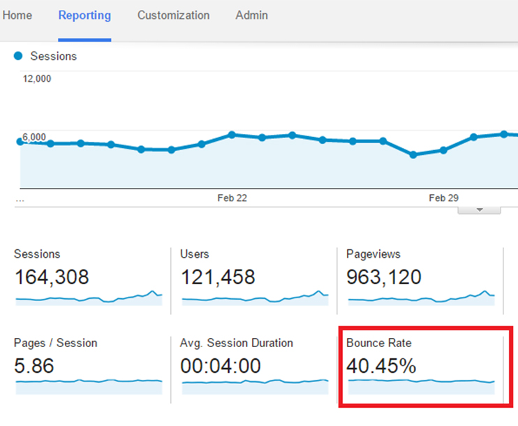
Image courtesy: https://bit.ly/2U8Geqo
Now, take a look at the website of Apple. In spite of being a tech giant, see how the company has used admirable design with less content on their home page.
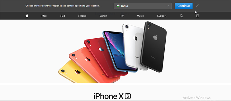
What do you observe?
Let me help you out here. The company has used an image that shows all the available colors of its newly launched product. The white backdrop is perfect to make sure that the colors look vivid and vibrant.
When it comes to the content of the page, Apple has used only the key features of the phone along with the model name just to create the right amount of curiosity among the viewers.
The company also uses a single font and plays with the size to create hierarchy on its page. And that makes it an outstanding website that unquestionably engages its customers.
Let’s check out another website

This is a website of a company, The Home Depot, which addresses the home improvement requirements of its customers. The image used by the company is not only realistic but it clearly conveys the message across the users.
The Home Depot shows that no matter what product you want to sell, a high-quality design can attract potential customers.
As many specialists say, using crisp content along with good images can make a huge difference for your website. The Home Depot has used only two colors and the font has also been kept simple. The content within the image doesn’t distract the viewer. Rather, it communicates the exact details required for tempting the visitor to scroll down and explore more.
What I have been trying to say so far is that if I was in your place, I would have changed my marketing tactics depending on the changing trend of the marketing techniques.
And currently, most of the largest corporations utilize simple yet professional graphic designs for their websites as an effective way to engage their customers.
- A sophisticated design is like the magazine cover for your website:
Would you purchase a magazine if the cover of the mag doesn’t look enticing? I know I won’t.
There are many magazines on the market. But only those with good covers have a better prospect. Look at this magazine below:

Image courtesy: https://bit.ly/2FuAejC
The cover of the magazine is quite simple. The content clearly states the main topic of the specific issue. The image of Elon Musk makes it all the more interesting to read on. However, the magazine used large font to spell his name to create the perfect balance. The rest of the cover is left almost untouched.
Notice how the background nearly merges with the color of the suit Elon Musk is wearing in this image. Why would anyone do that, right? Well, it makes the content and his face more prominent and grabs the attention of the viewers.
Let’s see another example:
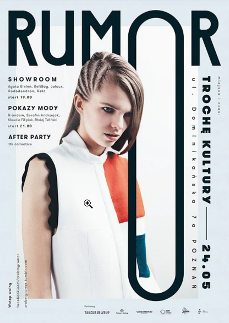
Image courtesy: https://bit.ly/2Jw0Ft6
It is the cover of the magazine Rumor. You can see that the ‘O’ of Rumor has stretched all the way to the bottom and then it looped back up. What it does is it connects the image with the header of the magazine. Besides, the length of this extended ‘O’ creates a straight line for the content to align with.
The rest of the design has been kept quite simple. Apparently, there are six colors or shades. But each of the color blends with the other and creates a flow that complements the design as a whole.
Now let’s take a look at some of the websites that reflect quality graphic designing.
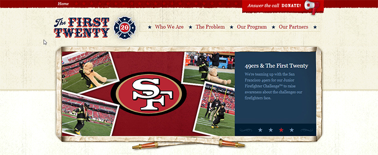
The graphics of the heading of the website is asymmetrically balanced. Can you guess how it is done? If yes, do leave a comment below.
However, the rest of the design has been kept symmetrical to maintain the balance of the page. Even though the design has many colors, there’s a pattern that the website has followed to make it appear captivating instead of looking gaudy.
I know that sometimes it’s easy to overdesign just to maintain the aesthetics. But, as a professional, I would say that an expert would not compromise with the goal just to make the design alluring.
Graphic design is more than how it looks. Your design must be well executed to be able to communicate with your users. Whenever a skilled graphic designer creates a design, he asks himself if the design emphasizes what the content says.
Look at the design below:
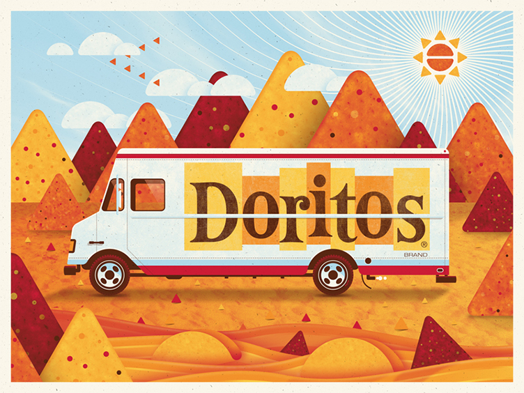
Image courtesy: https://bit.ly/2OlgpOa
The design is an illustration created by Doritos. As I mentioned before, your design should communicate your message effectively. And the illustration above is a beautiful example of communicating through design.
The color and the imagery are chosen very carefully to support the theme of this American chips brand. I’m sure that you have identified that the mountains look like Dorito chips. But have you noticed that even the sun and the birds are also triangular in shape and represent the chips?
Why do you think the designer has used multiple colors on the mountains? It is to depict the different available flavor of the chips. Isn’t it simply awesome?
- The correct ingredients for a tasty dish
When you are planning to create a tasty dish, do you compromise with the ingredients? I guess no.
Similarly, when you want to create an outstanding design for your website, will it be right to settle for DIYing? Even if you think it would not be an issue, I wouldn’t support you.
Let me explain why not.
Qualified designers across the world agree on one point. And that is to create a good and simple design to gain the attention of your customers. Now, no matter how beautiful you think your design is, the fact is that it may lack strategic implementation.
Though I emphasize the word ‘Simple’, it is not a piece of cake to achieve simplicity while creating an impact on the mass. Look at the design below:
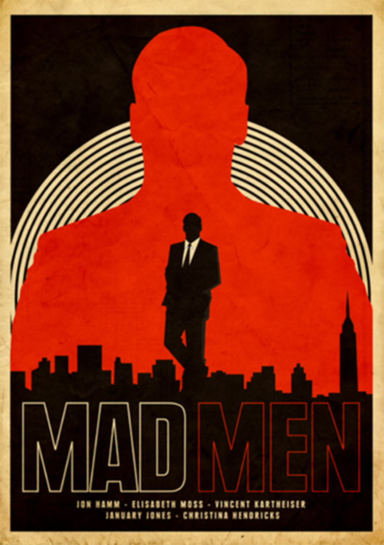
Image courtesy: https://bit.ly/2U1yE0x
Do you see that the design plays with the focal point of this image? The person standing in the middle or the large silhouette of a man in the background, which one is the focal point?
The design could easily be overdone and the balance could be compromised. The perfection of this design is how beautifully the fonts, colors, shapes and positioning married each other without ruining the totality of the picture.
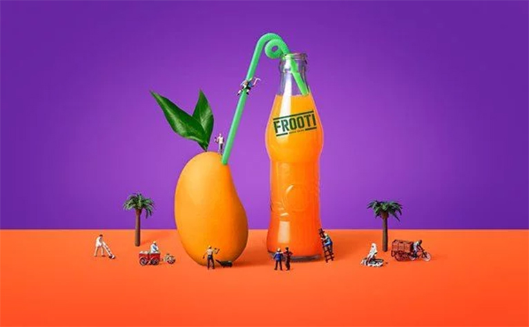
Image courtesy: https://bit.ly/2FsCGHg
The use of colors and fonts can be the deciding factors for the mood of your design. If you notice the design above, you’ll see that Frooti, which is an Indian refreshment drink, has created a playful and bold design.
The predominant orange color refers to the color of the drink while depicting a fresh mood.
Now, when it comes to understanding and mirroring the mood of your website, you would want to hire a specialist who knows how to combine the colors and the fonts.
Just as you would use the right ingredients to make a dish tasty, the graphic designers would use the right tools to make the design successful.
On the one hand, the designers will have clear technical knowledge. Hence, they will not mess with the fonts or the colors of your design.
On the other hand, they would know how to use the updated software for creating a design for your website. Images created with the right tools will be high in quality and will be easier to understand. Besides, you don’t want your customers to wait and get frustrated until the images load. A design made with correct tools will save the time of your clients and they will revisit your page.
Conclusion:
If your website has professionally designed images along with rich content that entices your customers to call for action, you will notice a significant growth in your sales.
Hiring a qualified as well as an experienced graphic designer is no doubt a much better option than doing it yourself. A skilled designer will be able to produce images that are eye-catching and unique.
As I mentioned before, choosing the wrong fonts and colors can spoil the appearance of your website. An adept designer will know the significance of the colors and use them wisely to portray what you want.
Last but not least, when you want to create an outstanding design, you must follow a creative brief. While you, being an amateur, may have a chance to go off the brief, a proficient designer will be able to follow it strictly. Hence, the final image that you’ll get will be of high quality and will represent exactly what you wish it to.
Additional tip:
When you decide to hire a professional graphic designer, be open towards different creative concepts. You may have an idea that seems to be perfect for you. But only an expert knows what works well. And that is the primary reason that you are hiring a graphic designer, right?
