8 Visual Merchandising Insights to Amp Up Your Retail Store – Digital Polo Inc
Even with the solid growth of the e-commerce industry, physical retail stores are still holding strong. However, as per assumptions, e-commerce websites will continue to leap forward. So, retail stores need to make some changes in their strategies. The owners have to incorporate visual merchandising ideas for retail stores so that they can regain the edge.
I know that you arrange your products in your retail shop in such a way that it highlights the best items that you have. No, there’s nothing wrong in doing so. However, sometimes the process you use is just not enough to influence the buyers. Hence, you have to make some changes and introduce some tweaks that may have ten times more impact on your customers.
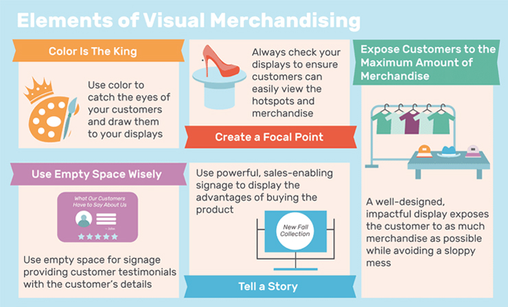
The idea is to generate maximum revenue by optimizing your store. That is when your customers will be enticed and they will more likely make a purchase. Let me tell you, it is not as easy as it sounds. You need to have aesthetic taste and understanding of how visualization works.
So, what are you planning? Do you now want to explore the science of visualization?
Wait, wait!
Why don’t you go through the points below and discover those 8 fail-proof visual merchandising methods that you can surely implement in your retail store? Let’s get into it then.
- Pay attention to the entrance
Entrance is the place where it all starts. The first thing that a customer will see is the display window of your store. So, when I say that you need to pay attention to the entrance, what I mean is that you must make some changes there. Make sure that your retail store is welcoming potential customers. Instead of stuffing the display window with unnecessary products, you need to make it clutter-free. According to a study by Russel R Mueller Retail Hardware Research Foundation, the display is a tool that can increase your sales by 540%. And if you choose a hot-spot (the most visible place that attracts the most traffic in your store) wisely, you can increase your sales by 229%. Aren’t the numbers alluring? I know.
Your display window is the place which you can use to show your fresh launches or the products that are on sale. If you can maintain regularity and consistency in visual merchandising your display window, the percentage of repeat customers will also increase.
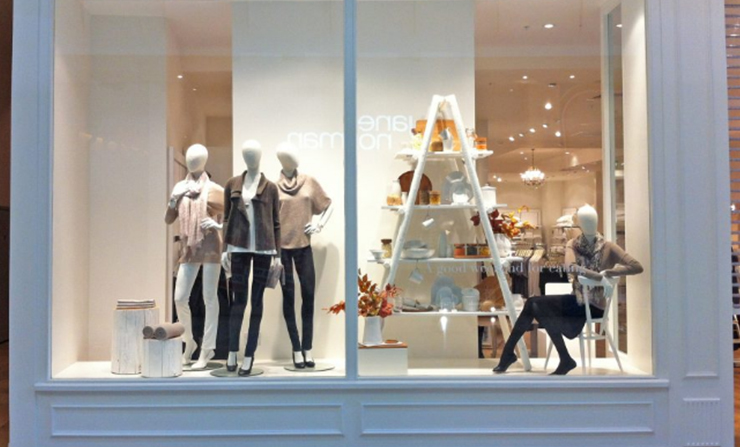
Check out how the company in the image has utilized its window display sensibly. The company has used similar elements but in a different style. The primary focus is on garments, which is obvious. However, without cluttering the space, the retail store has used other products to create a visual balance. Incorporating stools and shelves break the monotony of the space that would otherwise remain empty.
However, I must emphasize that you should revamp your display window at least once a month if not more frequent. It constantly engages your customers and they feel tempted to revisit your store to find out what’s new.
- Involve all the senses
While lighting is important for the visual merchandising retail store design, the involvement of all the senses shouldn’t be avoided either. Though the name suggests so, visual merchandising is not all about visual aesthetics.
When I visit a store as a customer, I would be enticed towards a retailer who has an understanding of sensory branding. When you engage all the senses of your customers, they are more likely to pay attention to the products you offer. Now, let’s take a look at how each of the senses works.
- Sight:
For now, I can say that playing around the visual cues is the best option to attract customers. Use of proper lighting, color, contrast, shapes etc. play a huge role in visual merchandising. Since we are discussing visual merchandising, I’ll discuss this in detail in the following points.
- Touch:
Don’t you love to touch and feel the product that you’re about to purchase? Even today, when shopping is synonymous to Amazon, 85% of the customers prefer to visit a retail store for shopping.
Why? The answer is what we buy is often determined by what we touch. Even if you’re aware of it, you may not remember it while shopping. And that’s why your customers should be able to touch and feel the products that you want to sell more.
- Sound:
When I say sound, what I mean is music. Do you know that you can change the customer experience with the help of music? Choose a playlist as per your target audience. It means you can play some country music if your target customers are between the age ranges of 30 and 50. You can choose top-40 pop music if you target female teenagers.
- Smell:
There are so many avenues of marketing, and smell is one of them. It’s unbelievable that 75% of emotions are influenced by smell. And all of us react to fragrances differently. We tend to remember many a thing based on scent. Therefore, if you can make sure that your store not only smells fresh but it has some fragrance, customers will associate with you on a higher scale. Now, don’t you use a strong scent that causes a headache! Don’t overdo basically.
- Taste:
Involving this particular sense won’t be possible if you don’t sell consumables. But if you do, you, my friend, are going to make some profit by letting people savor your best food items.
- Play with colors
Do you use the color red on the sale signs of your store? Have you ever thought about why you use red or do you just use it because everyone else does?
Color is associated with various human emotions. Color engages our attention like nothing else and we tend to remember things better if they are colorful.
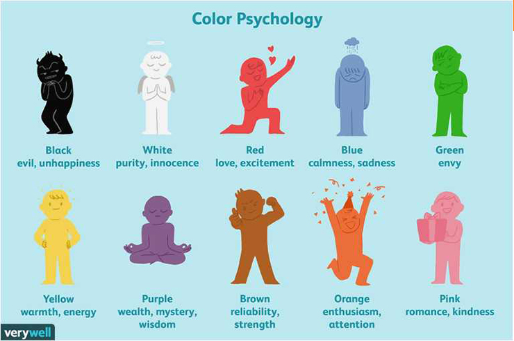
Color psychology and its use in marketing is a whole new topic to discuss. We’ll do that someday.
Coming back to our point, I can’t stress enough on the importance of using colors tactfully to attract your customers. You will be amazed to know that 93% of the customers make their purchase decisions depending on the visual appearance of the store. I can bombard you with statistics. But that’s not the point, right? Take a look at the info-graphic below and you’ll get a clearer idea.
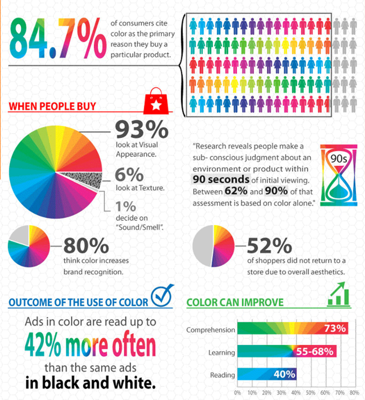
Now, the question is how you can use colors wisely so that your customers keep returning to your store. Using bold colors in the display window can draw your customers towards your store. However, avoid using Dark shades. Use of reds and oranges can shout out for attention.
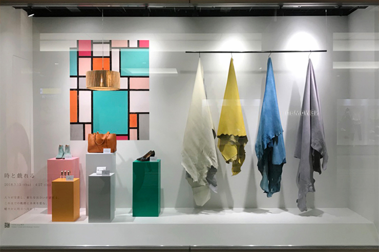
Check out the image above. The store owner has used different colors in its display window. But the backdrop is quite simple. It’s off-white in color with a little detailing on the left side.
- Light, light and more light
“And God said, “Let there be light: and there was light.”
You may think I’ve gone crazy as I am referring to a Biblical phrase suddenly! Actually, I’ve seen many retailers who don’t understand the importance of using ample light in their stores. But let me tell you that using the right light settings can change the entire game for your store.
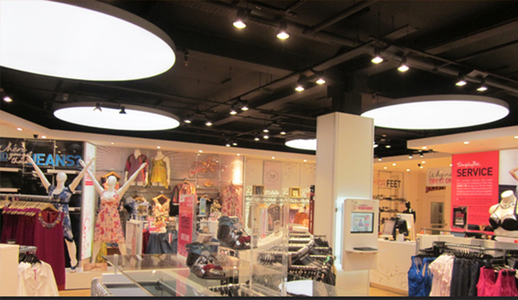
Image courtesy: https://bit.ly/2V8h8Iq
There are different types of lighting techniques that you can use in your retail store. No matter what your budget is, make sure to spend some of the amounts to light up your store. Use ambient lighting if you want it simple yet effective.
Proper light can create a welcoming ambience for your customers. Depending on how well you use lights, your customers will perceive your brand. You can make them feel at home by using soft and warm lights. On the other hand, you can use bright lights to light up every corner of your store so that the customers can have a look at each of your products on display.
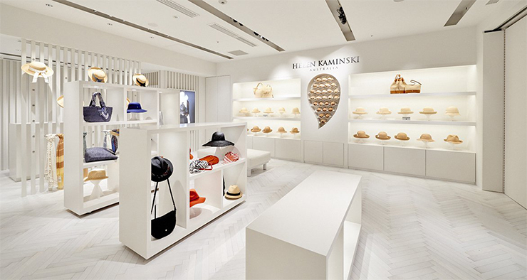
Image courtesy: https://bit.ly/2UK2c3M
In simple words, your aim should be to make a visual appearance that your customers fall in love with. This will also allow you to highlight some of the products that you want to sell as well as create a sense of awe among your customers.
- Signage at support
If you haven’t used signage to drive the customers in your store, you’ve been doing it wrong my friend. Signage is the easiest way to communicate about sales or new launch to your customers. There are different types of signs that you can use to grab the attention of the customers. The clearer the signage you use, the easier it gets to attract customers.
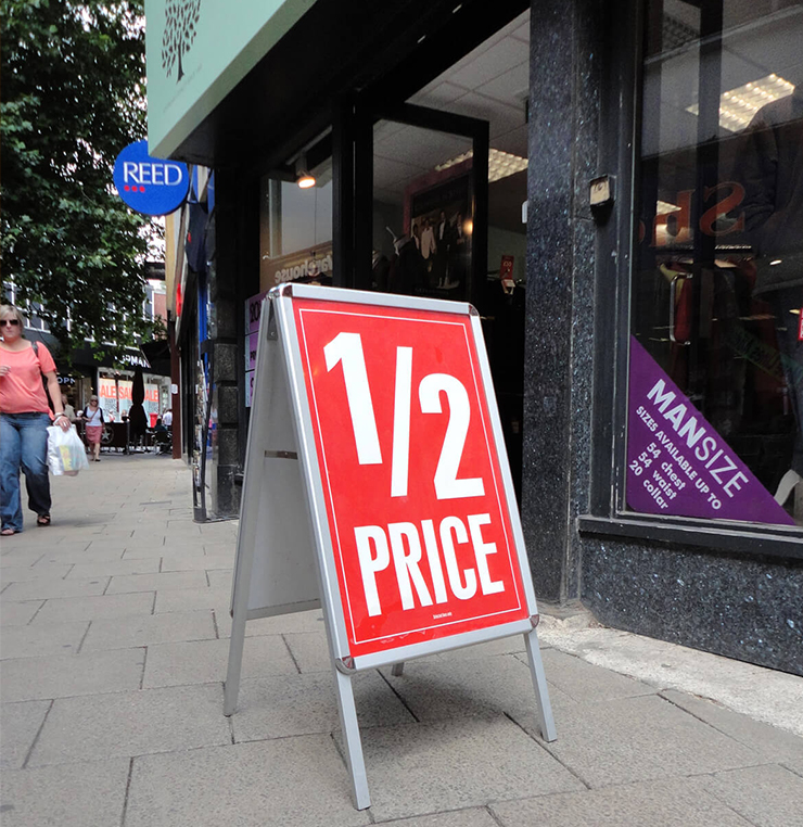
Image courtesy: https://bit.ly/2KIp0fM
In my opinion, outdoor signage is the most useful as your customers see this and decide whether they want to enter your store or not. Instead of saying who you are, coming straight to the point that matters to your customers is what I’d recommend doing. Placing outdoor signage at the entrance of your store will make the passersby take a second look at your store. And if it’s alluring enough, they won’t be able to control their urge to visit your store.
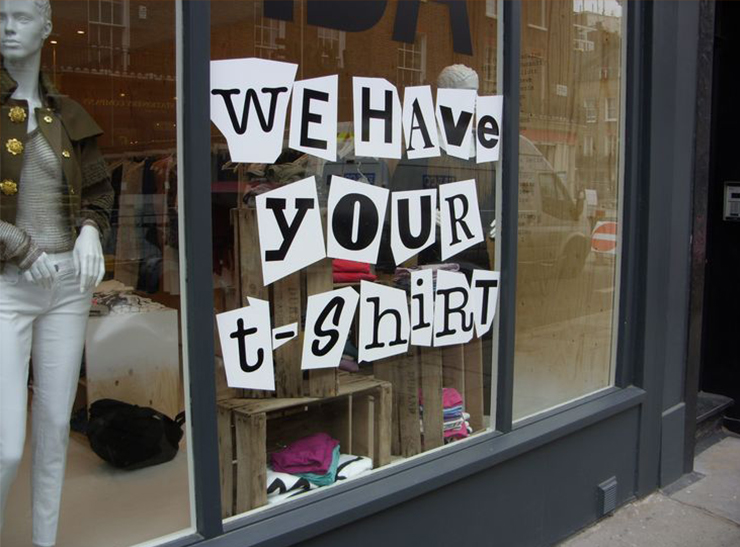
Image courtesy: https://bit.ly/2KN8Th8
Impress your customers with influential signage. The more unique and creative signage you can use, the more your target audience will be interested to try out your products. If you take a look at the image above, you’ll get exactly what I’m saying here. First, the store has used the signage in its window display. A few t-shirts are stacked right below where the signage ends. The content used for the signage itself speaks a lot. When people will read the text, they would be compelled to chuckle at the least. And as soon as the signage hits the right emotion, people will start exploring the store.
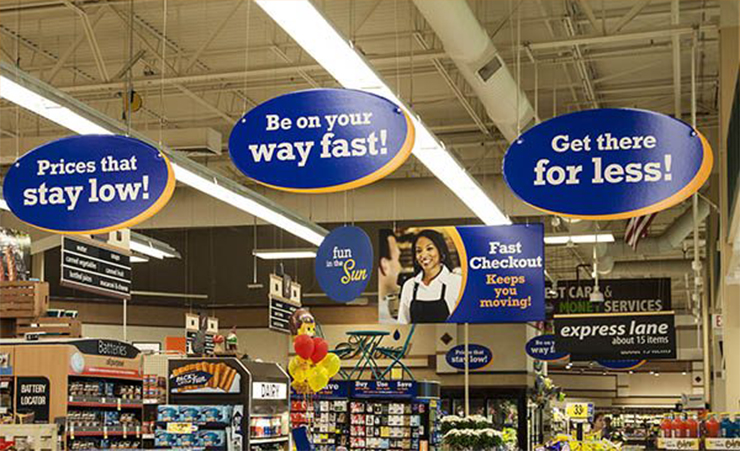
Image courtesy: https://bit.ly/2GkkX3X
Influential signage can convince your customers that they need a product. Using this kind of signage in front of the products that you want to sell is a simple way to instigate your customers to buy those. Using bold text is the best way to attract and create a sense of urgency among the customers.
Signage, if used wisely, can add a character to the identity of your retail store. Experiment with iconography, imagery, fonts, and colors to see what works best for you. You can hire a graphic designing company to come up with creative and unique signage. Graphic design companies have experienced and talented designers. Hiring such a company will ensure that you are using the right shapes, colors, and signs that can engage the customers and attract them.
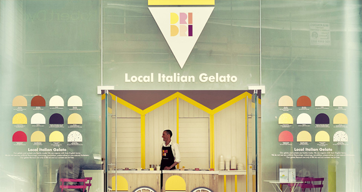
Image courtesy: https://bit.ly/2Zkycuc
I just couldn’t help but share this image. I’m mesmerized to see how well the store has used signage to inform people about their gelato flavors. Look at how colorful it is. And the use of bright yellow makes me feel so awake and energized at once. Now, that’s what I call a great piece of work.
- Cross-merchandising with product grouping
Many of you may already think, “I know what product grouping is!”
True, you do. You may know what product grouping is. But are you doing it right? What products are you grouping together? Are you thinking about the colors of those? Are you planning your grouping strategy depending on the categories?
Suppose you are selling merchandizes for the monsoon. What products would you group together? Will you keep an umbrella beside a waterproof jacket? The person who is looking for a waterproof jacket won’t buy an umbrella. On the contrary, you can keep waterproof boots, bags and similar things with either an umbrella or a raincoat.
If your target is to sell a winter jacket, group it with some winter boots, neck warmers, gloves, thick socks etc. Your aim is not only to sell the product that you want but you should also consider the ease of your customers. Make sure that they don’t have to look for matching items anywhere else.
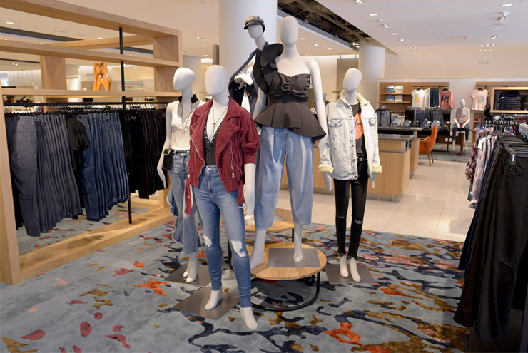
Image courtesy: https://bit.ly/2KM4uLl
Check out how the retail store has grouped different items from a similar category. The perfect mix of light and dark colors creates a balance as well. Cross-merchandising is somewhat similar to product grouping. However, both of these techniques differ slightly.
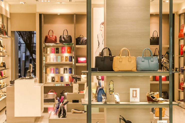
I know that sometimes I either don’t have time to browse through a store or I just don’t feel like walking around. This is a common buyer tendency nowadays. If you own a retail store, you can make a profit from this tendency as well.
How? Your answer is: through cross-merchandising.
Assume that you have an outstanding collection of bags in your store. Now, instead of displaying just the bags, pair them up with matching shoes, shades, jewelry pieces etc. You can also keep some awesome options for fragrances in this collection.
What will happen?
Customers who are looking for bags will find complementing shoes. As a result, they won’t have to look for it. First, it saves their time. Second, they get an idea about what goes well with the item.
I know that product grouping and cross-merchandising can be challenging. But it’s worth the extra effort. If done right, not only your sales will increase but you will create a better impact on your customers.
You can use the rule of three when you are grouping multiple products. It’s a method where the displayed items are kept in a set of three or any other odd number. You can utilize this rule in a different way. A picture is worth a thousand words they say. So, let the pictures explain what I mean to say.
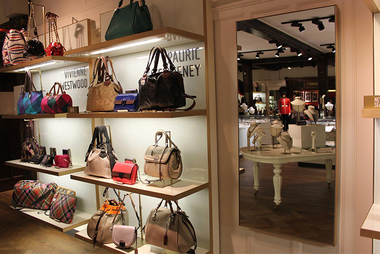
Image courtesy: https://bit.ly/2IFZkxV
Do you see how every rack has three bags?
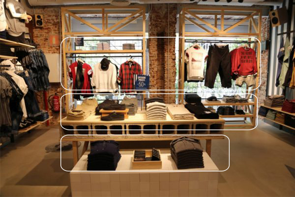
It doesn’t matter what your retail store offers, this theory is widely effective.
Why does it work?
Actually, when we see something asymmetrical, our eyes keep moving. So, the rule of three keeps your customers engaged for longer. The more you can incorporate this rule in visual merchandising, the better impact you’ll have on your customers.
- Creating hierarchy
Most of the retail stores limit themselves on the floor space. The height is often kept unutilized. As a result, the items that are in display lay flat. Customers either miss out some of the merchandizes or they get bored and leave. So, what can you do to make it change? You can use the empty space more wisely.
The ceiling is sometimes used to hang signage. But in the rest of the cases, the spaces remain empty. Now, to make a difference, you can use pyramid merchandising. This is the process that helps you create a hierarchy. Choose a point, which is higher than your normal shelves, and place a product there. Imagine that you are creating a pyramid and display the other products in a pyramid shape.
What does it do?
It creates a focal point for your customers. People will only buy a product if they can see it. And if all your products lay at the same height, no one will notice those. So, you have to make use of the length and angle.
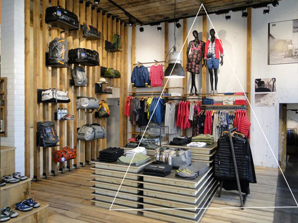
Image courtesy: https://bit.ly/2PiNQBr
See the image above. The triangle that I’ve drawn shows you exactly what I’m talking about. The store has utilized the height very well. You can see a number of items and it still doesn’t look cluttered. Check out how the bags are kept at a height and there’s ample space to avoid the messy appearance.
If your store is a small one and you don’t have enough items to display in different heights, you can still create a hierarchy. Instead of putting products on the top shelves, hang large lights as accent pieces.
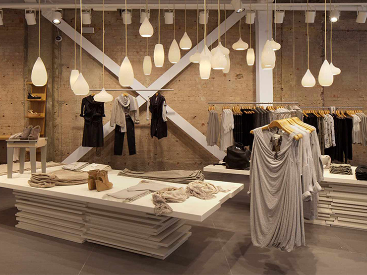
Image courtesy: https://bit.ly/2VMQbqV
If you don’t want to spend an additional amount to purchase accent lighting pieces, you can skip it. There are other ways that can be used as well. Take a look at the image below.
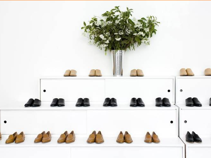
Instead of using a vertical shelf, the company has used a slanted shelf to display the shoes. It already makes it easier for us to skim through the collection. The plant at the top row is a simple yet operational way to create visual hierarchy.
Have I made myself clear? Creating a hierarchy in your store is not rocket science. Aesthetic sense with a creative mind is all you need.
- Tell a story
We like to visualize things even before they are available in reality. Suppose you’re building a home. Don’t you plan the interior decoration? Don’t you feel elated while painting the perfect picture of your home in your thoughts?
You have to utilize the same emotion when someone visits your store. You have to create a visual story that your customers will relate to. Suppose you’re selling kitchen items. Arrange the items in such a way that your customers get some idea about how they can utilize even small kitchen spaces. To sell an item, you don’t always need to pitch it. If you can add value to the lives of the customers, they’re more likely to purchase the products you wish to sell.
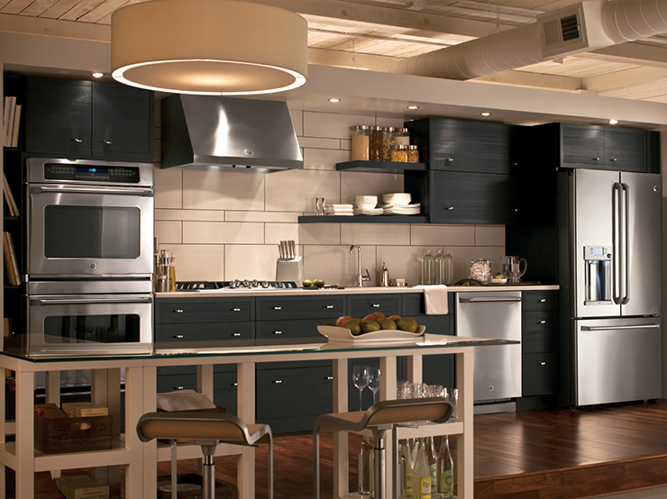
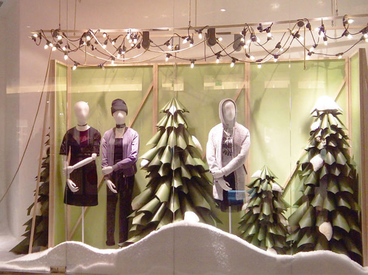
If you have an apparel store, you can take a clue from the image above. As you can see, it is a Christmas collection that the brand wants to showcase. Hence, it has used Christmas tree cut-outs with a snowy effect in the front and at the backdrop. The winter apparels, which are otherwise just winter clothes, suddenly become a part of the Christmas collection.
It’s not always about using the products that you want to sell. Sometimes using props can help you create a story that your customers can associate with. And that’s why many stores include this visual merchandising method in their marketing strategy.
Conclusion
There are multiple advantages of visual merchandising. It depends on how you incorporate the different ideas into your business to create a lasting impact. Using the tips that I’ve shared above will definitely help you in the long run. But don’t become stagnant for God’s sake. Stagnant is boring. So, make sure that you mix and match the visual merchandising ideas shared here. And don’t forget to keep changing them from time to time. Lastly, if you’re not confident enough to pull it off, get professional help instead of messing things up.
Have you used any visual merchandising methods that have bolstered your sales? Share your experience with me in the comments section below.
