How to Plan a Grid for Instagram Complete with Calculations and Steps – Digital Polo Inc

People see Instagram posts as singular images. What they don’t see is that each singular photograph is a small part of a bigger puzzle called an INSTAGRAM GRID.
The Instagram Grid.

A user’s Instagram feed is compared to a GALLERY or even portfolio. It has the power to make your audience go WOW and scroll further to discover more of your content.
The amount of photographic brilliance Instagram contains is favoured by these aesthetic looking grids.
Importance of Grids
An Instagram grid is nothing but the series of your posts in a 3 column pattern. Even though Instagram is thinking about changing it to a 4 column grid, users are already happy with the existing one.
Rather, they are confused and are collectively against the whole idea. They have perfect grids mapped out in their feed and they don’t want to mess it up.
For time being, let’s assume Instagram will take the hint and not drop this bomb on the users.
The aesthetical appeal of a grid is not the only thing that drives more and more people every day to maintain one.
Rather, it is the discipline that encourages users to build perfect looking grids on the app.
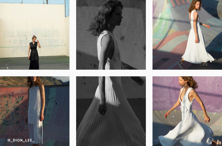
Some people like to tell stories through their grid, while others love to build their theme around colours.
Some like to change rules of geometry and there are others who solely have one theme colour and pattern for the whole grid.
While there are multiple ways to plan a grid according to the pattern, we will be discussing the most popular ones, rating from ‘Easiest to Create’ to ‘Tough Nuts to Crack’.
Lessons to Steal from Instagram Grid Pros
Let’s look at some big companies that are handling their Instagram Grid game like a pro.
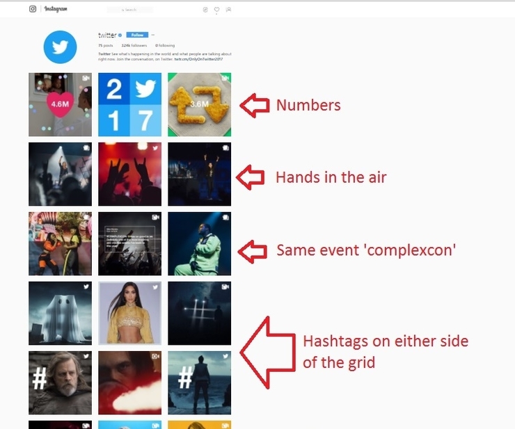
Twitter – When we are speaking of Top Instagram accounts that follow grid discipline, we cannot miss Twitter.
Twitter has a subtle grid. It is so subtly yet intellectually designed that one might miss it if they are in a hurry.
Twitter’s Instagram is maintained by rows. Each row in the grid has one theme. That basically means, they upload three images of the same theme and then move on.
Even if they don’t maintain the images, they continue the theme onto the upcoming row.
In a nutshell, there is a satisfying symmetry about their gallery.
When people see it, they find it amazingly pleasing to look at and scroll down even if they miss the reason that’s causing it i.e. the planning.
Example
Forbes – Forbes maintains a vertically dominated grid, unlike Twitter. But it is aesthetic to look at as well.
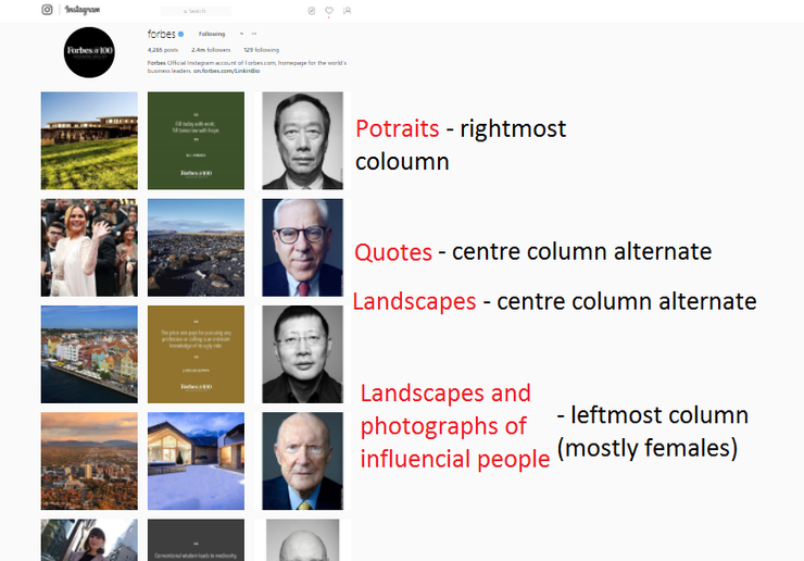
The rightmost column is solely dedicated to close – up portraits. Their posts are planned to be posted at intervals of 2 posts (unrelated to the sequence).
Their leftmost column is dedicated to mostly female celebs and influencers, while the centre is for solid quotes and landscapes.
Overall, it looks like a well-decorated desk, with all the elements placed beautifully.
Most Popular Patterns for Instagram Grids
The pattern Twitter’s Instagram uses is pretty common because of certain reasons.
• It is easy to maintain
• Does not require an intensive amount of planning.
The grid plans of some popular patterns are given below. Even though they look like a lot of math and calculations were behind them, they are surprisingly doable.
You will be surprised by the way your Instagram feed looks once you are onto the grid discipline.
Check to see if you get hold of your dream grid within our list.
Singular Colour Swatch

This is by far the easiest grid pattern.
It does not depend on posts, but the colours. And this is why it can also be maintained with other patterns.
If you have a colour theme and are focused on branding, then maintain those 3-4 primary colours in your feed can take you a long way.
A similar example can be seen here:
Checkered (Solid)

Grids like these basically look like chess squares. One photograph and one quote with a solid background can easily make it happen.
TO maintain a grid like this, you cannot post two consecutive photographs. Alternate content must always be ready with you.
Two themes or colours can also be used for a checkered pattern. The ultimate user guide says three words – Alternate the posts.
Rows (Singular Picture)

Horizontal – Best for panorama pictures and photos with width triple the size of their height.
Just cut the photo into three parts and upload them in reverse order of what you want your audience to see.
Instagram best size is said to be 1080px x 1080px. So your photograph needs to be 3240px(Height) X 1080px(width) before you attempt to cut it into three.
Simply cropping will be of help.
Once you have 3 photos, upload the one you want to be on the rightmost side first.
Then upload the second one and the left one goes last.
Numbering the images before uploading, helped us get through a lot of confusion.
Vertical –
Best for portraits or long photos (photos of a tall building, person or trees etc).
Cut the photos and upload them every two photos later. Instagram best size for a single image is said to be 1080px x 1080px.
So your photograph needs to be 1080px (height) X 3240px (width) before cutting.
The measurements are for 3 photos, if your photo is longer, the sizes may vary accordingly. The number of photos might also change.
Upload your images in such a sequence that the downmost part is uploaded first. Similar to Horizontal grids, numbering the photographs prior to uploading really helps.
Calculation
First post – First image (PART OF YOUR SEQUENCE)
Second post
Third Post
Fourth image (SECOND PART OF SEQUENCE)
Repeat.
Rows (Colour Themed)

Horizontal – Choose a colour and develop 3 posts that are of same colour.
Post them consequently.
Change the colour for the next three posts. As simple as that.
Numbering the photos won’t be necessary for this one.
Vertical – Choose a colour and develop as many posts as you like.
Post them every two photos.
The interval is important to maintain.
Numbering the photos might not be necessary.
Endless Photo

The most difficult one to maintain and takes a lot of time and planning. But the end result is worth a million bucks.
So far, we have only come across one such page that maintains their endless grid. @renoldskitchens has maintained their endless photo grid by planning each of their posts carefully.
It is still a mystery how an Instagram grid can be this perfect all the time. As soon as we figure it out, you will be seeing a brand new blog about the same.
Planning Our Grid
The grids mentioned above are mere ideas, and we tried them out for ourselves.
Our grid planning took 2 days of work and calculation. Since we had plans to check out all the types of patterns, we started with vertical rows and moved on to horizontal.
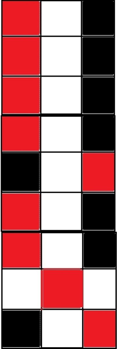
We pre-planned our colour scheme by drawing checkered boxes and filling those with colours at certain intervals. This gave a clear preview of how the Instagram might look after uploading an image.
We started with a pattern and changed it later, as it was not working that well for the feed. The horizontally aligned pattern worked best for us.
Before changing, our grid looked something like this –

After changing the pattern, the grid started looking like this-

Click here to see how it look like right now.
DISCLAIMER – Even though they look amazing, you cannot delete a previously posted photograph or quote. It may damage the whole grid.
