How to Design Social Media Images in 2019 With Examples – Digital Polo Inc
Do you belong to the era of Orkut?
Well, I am. Orkut was a part of my growing years.
But then, Google decided to shut the social network down in 2014. Even though Orkut was dissolved, the digital world was already undergoing a rapid change. Multiple social networking websites started to popularize.
On one hand, websites like Flickr, Photobucket allowed users to share photos using the internet. On the other hand, YouTube offered people the freedom to create videos and share them on a public platform.
Twitter, Facebook, Pinterest, Tumblr, etc. are some of the social networks that gained popularity in the early 2000s. Some of these sites are still extremely popular. You may have thought that social media is a new development. But let me tell you that the history of social networking goes a long way back.
However, what started as a medium to interact with friends and family, has now become one of the most promising and powerful marketing platforms. People even compare which of the social networking websites are best suited for their business. Do you know why it is so? 11 new people join one or the other social media platform every second. Now you do the math.
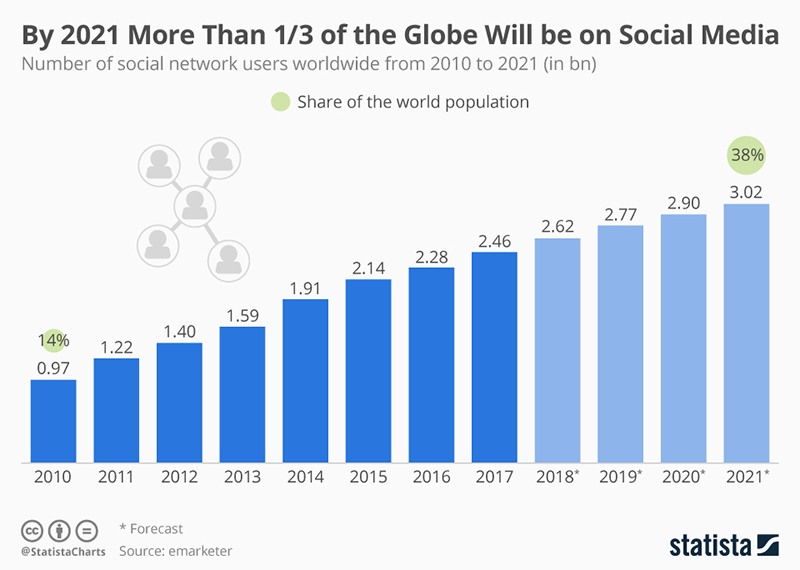
If you still don’t get an idea about the population of social media, try and imagine a population which is greater than the population of China and India together! The total number of social media users is over 3 billion in 2018. Now I’m talking some sense, right?
As more and more people are now connected through social networking sites, marketers can reach a wide audience through these platforms. 75% of the marketers admit that the traffic to their business pages has increased and 90% of marketers state that social marketing has improved their business exposure.
I’m sure you already have your social media business pages on different networks. But still, if you need a guide for choosing the appropriate social media network for your business in case you are just starting, you can go through the article here.
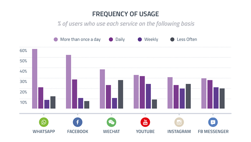
People keep checking their social media handles more than once every day. Have you heard the word Nomophobia? It’s the fear of not being able to use your phone! Yeah, I know. It’s illogical. But that’s what makes you realize how addicted people are to their smartphones and the social media apps in them.
If you’re a marketer, you’d know that images are the most important part of social media marketing. However, designing the images for your social media page can be a heck of a challenge. You constantly have to worry about whether the sizes of social media images are proper. And when I say images, I don’t mean only the image posts. Rather, the profile pictures, cover photos and even the images for link preview are included as well.
Why is the size so important?
The social networking sites keep changing the image sizes from time to time. If you keep yourself updated about the sizes of the images, designing those will be much easier. And you’ll also notice a better result.
I’ve divided the article into different sections while each of the segments reveals a different network.
Contents
If you’re uploading image posts, there’s more or less no restriction regarding the size of the image. However, when you’re trying to upload a cover photo, profile picture, even photos, etc. things get a little complicated.
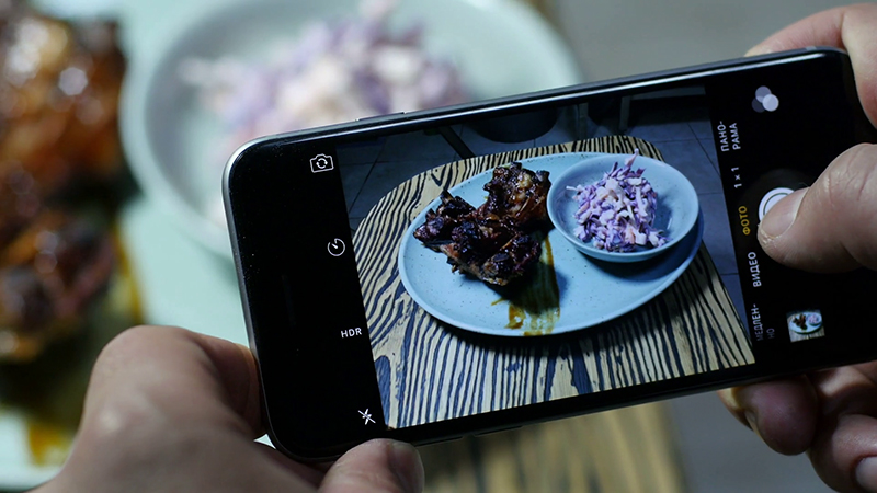
Image courtesy: https://bit.ly/2HayRqW
Even though Facebook offers a range of different sizes that you can upload your image in, you must pay attention to the design. Your target is to make sure that the pictures you upload look good on desktops or laptops, smartphones and even feature phones.
When it comes to the size of the pictures, Facebook informs that the profile pictures or the cover images display at different pixel sizes in different devices. Even with the varying sizes, you must maintain the quality of the images. Hence, I suggest that you upload a profile photo of a minimum 180×180 pixels. However, if you ask me what the ideal size of a profile image should be, I’d say 360×360 pixels.
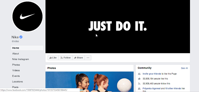
The profile picture of Nike is 400×400 pixels. Therefore, it’ll look good on different devices.
The profile picture of your Facebook page is quite important because it will appear in different places including your own posts, along with your comments, messages and in search results as well.
The next thing that appears when someone visits your Facebook page is your cover photo. Now, the cover photos appear in every device but feature phones. The cover photos display at the size of 820×312 pixels. Facebook recommends using a minimum resolution of 400×150 pixels while uploading images for cover photos.
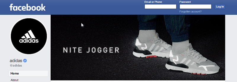
If you check out the cover image used by Adidas, you’ll see that they have uploaded an image of 520×198 pixels, which is more than the minimum recommended size. It’s better to upload images in the JPG form. However, if you want to add your logo or brand message in the image, you should consider uploading it in the PNG form.
When it comes to sharing images and sharing links, there’s not much of a difference in the size. Let’s take a look at a shared image:
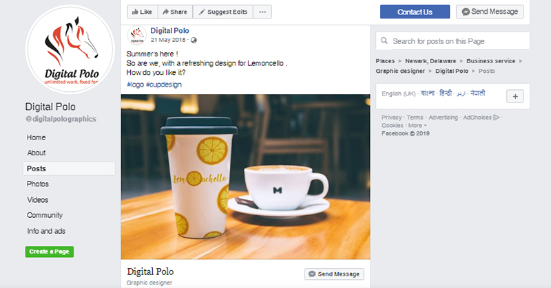
Although you can upload any size of images when you’re sharing images, the ideal size would be 1200×630 pixels. The image won’t get pixelated even when you see the image in a bigger screen. However, if you can’t adhere to the recommended resolution, you can still make it look good with an image size of 600×315 pixels. The shared images appear at a width of maximum 470 pixels on your feed and 507 pixels on your page.
In case of shared links, the link preview image size is similar to what you must follow in shared images. The preview of the link you share will appear at 470 pixels on desktop or laptop and at 560 pixels on smartphones.
Take a look at the screenshot below that shows a link preview:
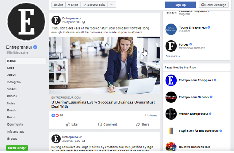
As you can see the link preview appears on a rectangular shape. The title appears at the top of the image and the description appears at the bottom. According to Facebook Help Team, if you upload an image that is smaller than 470 pixels, your image will not appear as rectangular. Rather, the size of the image will be a square. The description and the title will appear at the right side of the preview. Hence, you can understand that the image used in the picture above is either 470 pixels or more.
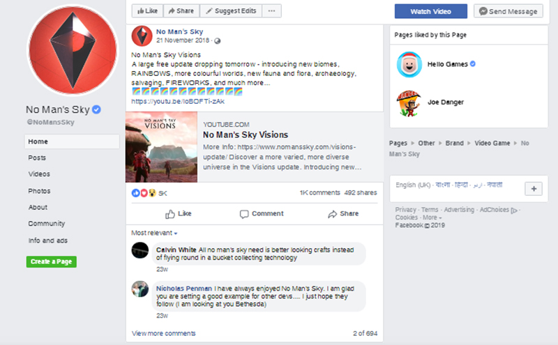
On the contrary, the image you see here is less than the ideal size. There’s no need to explain anything. You can already notice the difference.
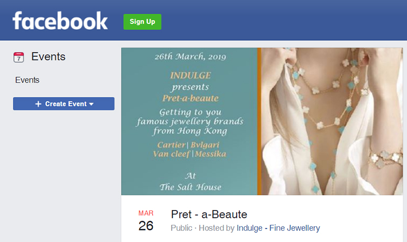
The same philosophy applies to the event images as well. I prefer using images that are of 1980×1080 pixels so that when Facebook scales the pictures down to 470 pixels, the quality isn’t compromised.
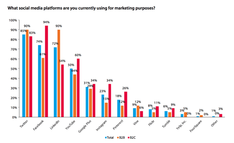
Instagram is the second most promising and used social media network that is used for marketing worldwide. As per the resources, Instagram acquired more than 1 billion MAUs or monthly active user as in June 2018.
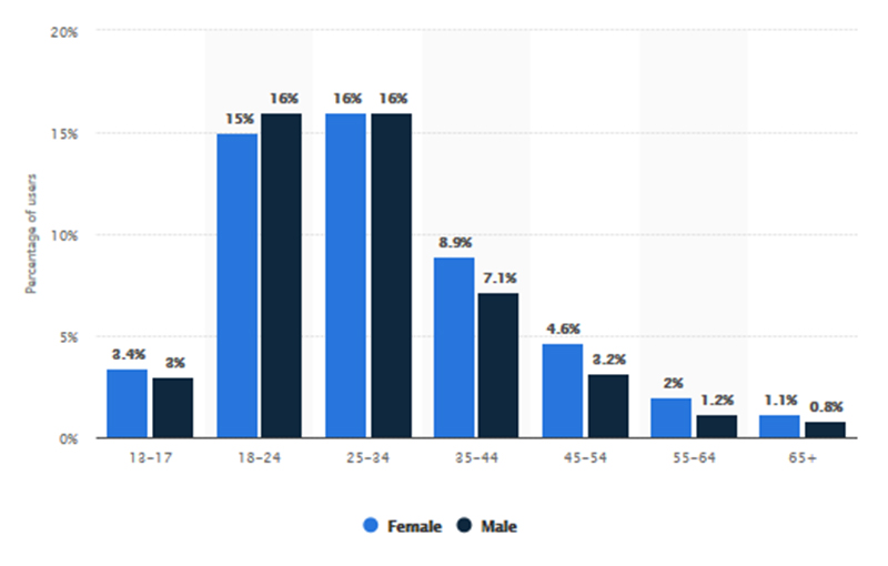
If you notice the image above, you’ll see that most of the users of Instagram belong in the age group of 18 to 34. In spite of the fact that Instagram is used more by the Millennials than Generation X, it offers a huge number of potential customers for marketers. Besides, Instagram is all about visual marketing. Even the grids can be planned for outreaching the maximum number of people. You can gain an insight into planning the grid from here.
There was a time when you could upload only square images on Instagram. However, things have changed. In 2019, you are now free to upload portrait and even landscape images. When I first came to know it, a grin adorned my face!
There are numerous Instagram users who don’t even care about the size of the images. But as a marketing manager, adhering to the image guidelines will present your content in a better way.
So, now, Instagram allows you to post images of three different sizes. The square one being the old format remains the same. However, you can now post horizontal or landscape and vertical or portrait images as well. What is the significance of these three different formats? You can bring versatility to your images. And being the powerful medium image is in Instagram, it will definitely give you more leverage.
When it comes to profile pictures on Instagram, the ideal size would be 110 x 110 pixels for smartphones. However, if views your Instagram page in desktop, they will see a little bigger image. Therefore, it is best to use a high-quality image that is the size of 180 x 180 pixels.
Take a look at the Microsoft logo on Instagram.
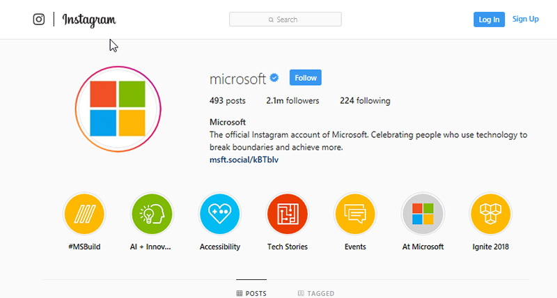
Image courtesy: https://bit.ly/29tZHuk
Microsoft logo is more than 110 x 110 pixels but is less than 180 x 180 pixels. The company uses a white background on which the logo has been placed. The logo is big enough so that each of the four squares can be seen properly no matter which device is used to visit the page. As a company, your logo should be in your profile picture. So, make sure that your logo is legible even though it is small in size.
Next, are the square size images. The resolution recommended is 1080 x 1080 pixels. Even when the image is seen on bigger screens, it will not appear pixelated. While square images are still the cult favorite of Instagram users, square format videos offer 80 to 100% more engagement.
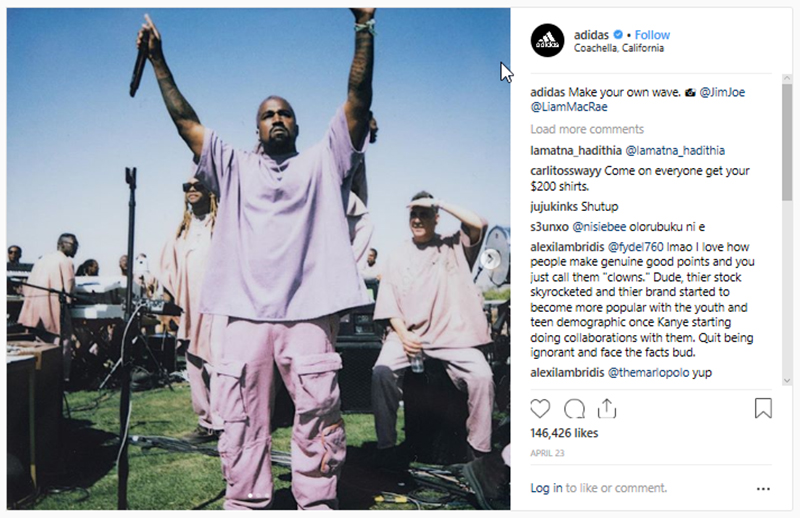
Image courtesy: https://bit.ly/2WtNgE0
This is another example of a square image used by Adidas on their official Instagram page.
The size of the landscape images that I have uploaded is of 1080 x 556 pixels. Even though the size of the images gets reduced by Instagram to 600 x 337 pixels, it is the best idea to use the recommended size of the images. You already know the reason.
However, if you ask me, I am not in favor of posting images in landscape form. If you are posting images on your personal profile, you can do whatever you want. But when you are using images for marketing, landscape size is not an ideal choice. People will scroll through the images without even noticing it. Then again, there are some images that look good in landscape mode only. And posting landscape images once in a while is completely fine.
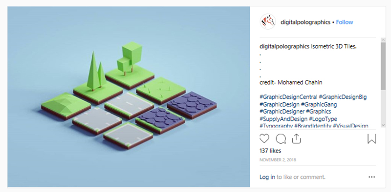
Image courtesy: https://bit.ly/2vPe5qg
As you can see, the image above is a horizontal image and the image won’t have looked good in any other format.
Have you faced problems while posting statistical images on Instagram? The problem used to take place because the vertical alignment did not show on the square photo. Since Instagram has allowed posting vertical images, posting portraits have become much easier.
The recommended size for vertical images is 1080 x 1350 pixels. The aspect ratio of portrait images should be 4:5. Vertical images are great for grabbing the attention of your target audience.
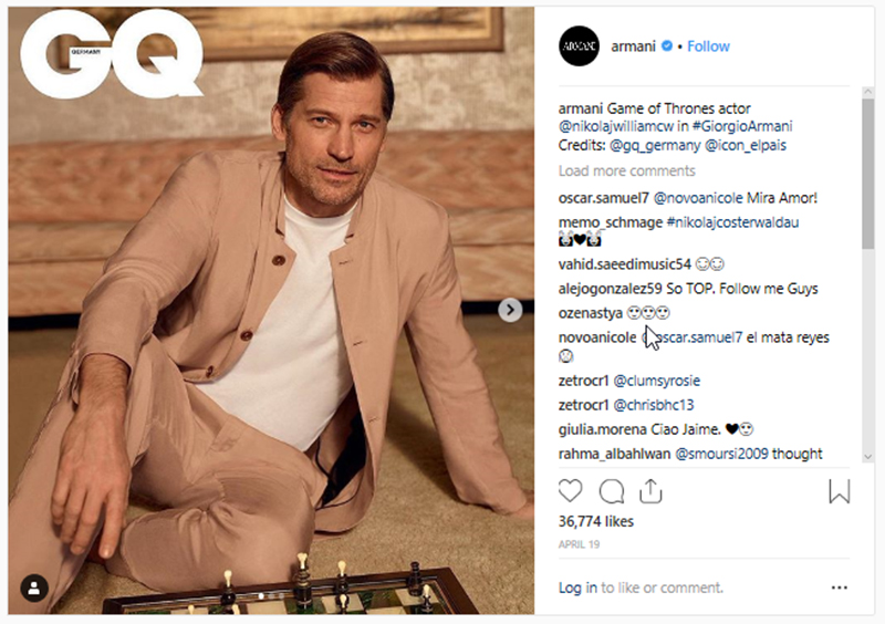
Image courtesy: https://bit.ly/2DYnwIy
This is a great example of using vertical images. The purpose of the photo would have been spoiled if the image would have been uploaded in landscape or even square version.
The Stories section of Instagram is not similar to the other three types of image formats. It allows you to use the full screen instead of using just a segment. The ideal dimension of images for the Stories section should be 1080 x 1920 pixels or 9:16 aspect ratio. No matter if you are uploading images or videos, try and maintain the aspect ratio for the best result.
Stories do not get shown on the news feed. People will have to click on your profile to see your Stories. It is a great opportunity for marketers. On the one hand, you know that people who are clicking on your profile to see your story do care about your brand. So, these people are your prospects. On the other hand, creating alluring and engaging Stories is easier because you can use the whole screen.
If you want to maximize the impact of your Instagram images, invest some time and come up with innovative ideas to engage your target audience.
As per the last available data, Twitter’s population was over 321 million in 2018. Even though the population of Twitter has reduced since 2016, it is still one of the most promising platforms for marketers.
I have already stressed enough about the importance of images for marketing. It is no different when it comes to Twitter as well. Apart from using branding hacks for a better marketing approach, you can use the optimum sized images.
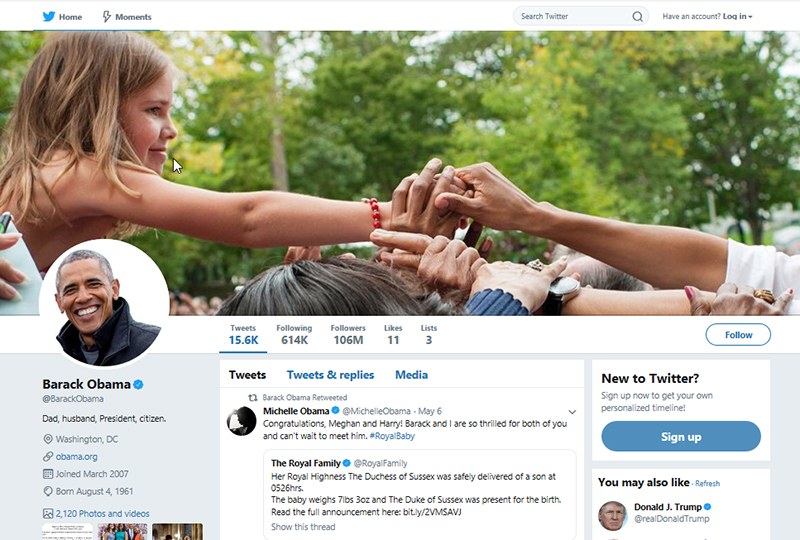
Image courtesy: https://bit.ly/1TKA4Wh
Twitter has copied Facebook in terms of both the profile picture and cover image. Although the profile picture on Twitter appears within a circle just like Facebook, the ratio of the image is 1:1. The ideal size for the profile picture is 400 x 400 pixels. Whenever you tweet, your profile picture will get displayed alongside your posts. If you are representing a company, you can use the logo instead of your own picture. Take a hint from the image below.
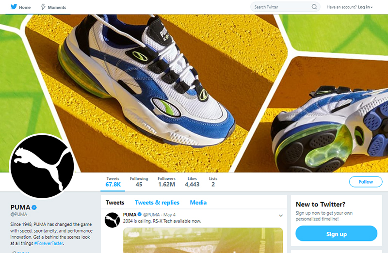
Image courtesy: https://bit.ly/1pbg3p4
It is best if you use the maximum permitted size for profile pictures. There are two reasons that I would like to focus on. First is that the images will become pixelated when you see them on the desktop. Secondly, if the image is of low quality, it won’t show up properly on smaller devices.
As I mentioned before, Twitter has copied Facebook in both cover images as well as profile pictures. However, the difference lies in the size of the images.
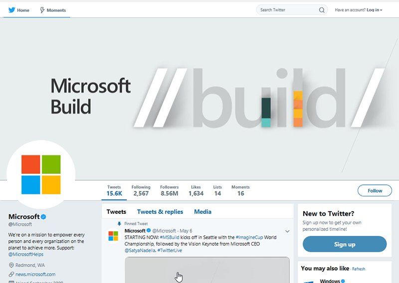
Image courtesy: https://bit.ly/1iu4f1R
While the cover image size of Facebook is 820 x 312 pixels, the dimension in the Twitter header image is 1500 x 500 pixels. While some businesses use their names, some use images of products. No matter what image you choose, avoid using images that may get distorted when viewed in responsive mode.
So, what is the next thing that comes to your mind? Posting images on Twitter, right? The perfect image size for uploading on Twitter is 1024 x 512 pixels. I won’t suggest you upload an image that is lower than the recommended size because anyway Twitter is going to reduce the size of the images.
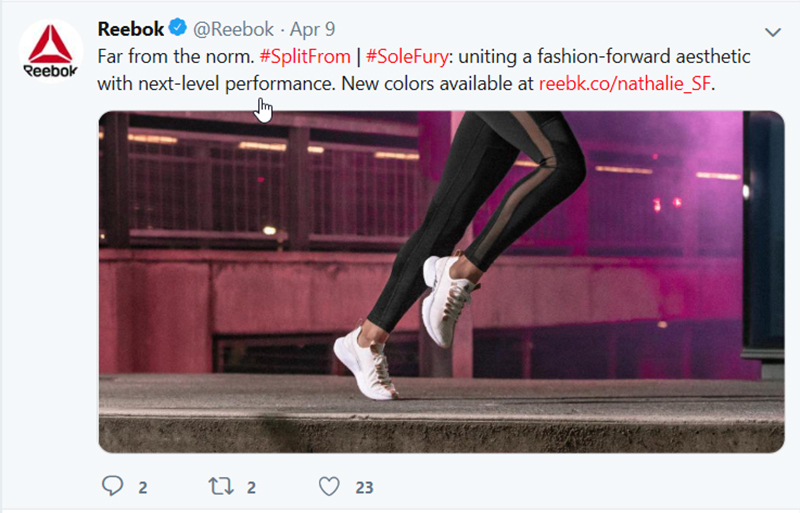
Image courtesy: https://bit.ly/1rKI8cg
Besides, when you adhere to the maximum suggested image size, the images appear equally well on every device. And who does not know that good images offer better customer engagement? Imagine coming across an image that would have looked good if it was available in high-quality. Would you retweet that image? I won’t, for sure.
So, being a marketer, your target should not only be restricted to make sure that people find your image interesting, but you should also ensure that the image quality is good. Just make sure that the image you use is not above 5 MB. And if you are using GIFs, make sure that the size is within 15 MB.
How can you miss the videos on Twitter? So, you can post videos that are within 2 minutes and 20 seconds. The maximum resolution for posting a video is 1900 x 1200 pixels. Yes, you can post videos that are of the lesser resolution, but I won’t suggest that.
LinkedIn:
LinkedIn is the Holy Grail platform for marketers, isn’t it? I like the platform because it has helped me connect with many of my prospects. You can check out the blog here to get your hands on some of the marketing strategies that you can follow on LinkedIn.
Like the other three social media platforms, your profile picture in LinkedIn also appears in a circular form. Take a cue from Twitter or Facebook and use an image that is of 400 x 400 pixels. However, as you know that LinkedIn is a professional social networking channel, avoid using your Facebook or Twitter profile picture. If you are using your own image, there are some guidelines that you should follow. If you are using the logo of your company as the profile picture, that is the best thing.
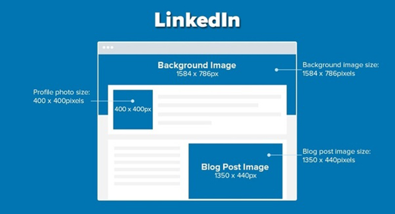
Image courtesy: https://bit.ly/2vMGflN
LinkedIn allows you a massive space in the background to upload a background image. Do not ignore the major space that you get. Many marketers ignore the space and you do not want to be one of them. Even though the space is quite thin, keeping it empty is not something I would suggest. And if you are planning to keep the part empty, make sure to use a solid color image.
LinkedIn is a great place to share your blog posts. Not only your prospects will read the blogs, but you can also inspire other marketers. The optimum size of the blog image that would appear on your LinkedIn profile should be 1350 x 440 pixels.
Conclusion:
So, now you know how you can use images in different social media platforms for marketing. Of course, there are many other channels apart from the four mentioned above. However, these four social media channels are not only the most used platforms, but these also cater more to professionals. Pinterest, Snapchat, etc. are also some of the social media networks that you can use for creating your brand presence. Choose the network depending on the audience you are targeting. I hope that the guide will help you in choosing images that are best suited for your social media channels. Do you want to read more such articles? Do let me know.

