35 Best Business Fonts for Logo Design – Digital Polo Inc
Designing a logo takes more than just creating a shape. A logo represents your business. Hence, the design, the font, the shapes, the colors, each and every detail should be considered carefully before designing a logo. If you are a graphic designer or you are a business owner who is looking for some inspiration for designing logo, you can visit some websites that have good logo designs. You can also check out the cricket world cup logos to draw inspiration from.
However, even if you get an idea about which shapes represent what and which colors you should choose, you may still get stuck when it comes to choosing fonts. Here I have chosen 35 typefaces that you can use to design different types of logos. Of course, there are other fonts that you can try out. Besides, I have not included each business that is present on this planet. Consider this article to be a guide that will show you the way. It will help you to kick-start your logo design journey.
Contents
1. Garamond
Garamond was designed by two French type designers Claude Garamond and Jean Jannon. It was released in the year 1989. Unlike many other fonts, Garamond is not a single font. It is rather a group of typefaces. The fonts that are included under Garamond are Stempel Garamond, ITC Garamond, Adobe Garamond, EB Garamond, and Sabon Next.
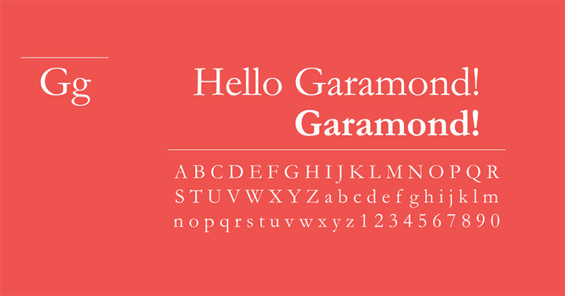
Image courtesy: https://bit.ly/32KFKIt
These typefaces are ideal for brochures, magazines, etc. Due to its exceptional readability and classy appearance the font is best suited for businesses that cater to the fashion industry.
2. Helvetica
Helvetica is like Nike in the world of fonts. Why? You cannot imagine how difficult it is to get original Helvetica on the web. If you search for the font, you will get tons of options. Most of these are pirated version of the original font. So, no wonder that every font looks different from each other.
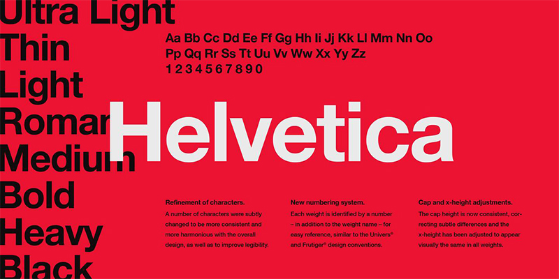
Image courtesy: https://bit.ly/30Z0Cdf
There is a reason that this font is so pirated. If you talk to any designer, you will find out that Helvetica is one of the favorite fonts of all professional designers. The font style is so versatile that you can use it for creating the logo of different sectors.
As an example, I can tell you that Apple, Xerox, and Adobe have used Helvetica font. If you use this font for your logo design, it will give your brand a posh finish. Helvetica is such an inclusive font that it goes well with different sectors. So, no matter whether you belong to the construction industry or medical industry or technology sector, you can use this professional font for your logo design.
3. Trajan
Trajan was designed in the year 1989 by Carol Twombly. It has since been used in many Hollywood movie posters. Trajan belongs to the old-style Serif typeface. If you take a look at the font style, you will see that it has a similarity with Roman square capital.
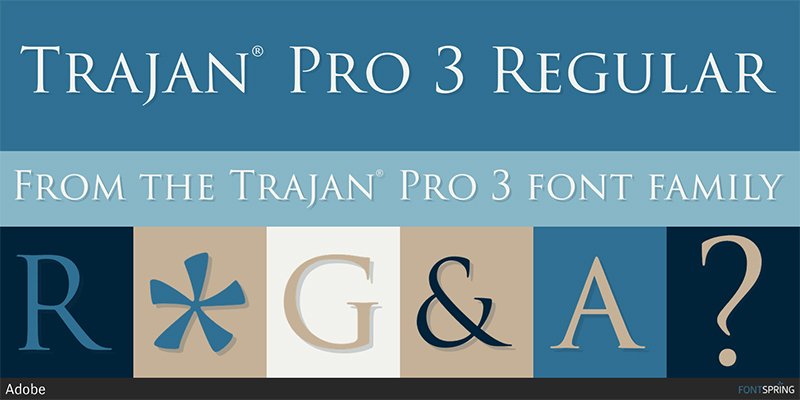
Image courtesy: https://bit.ly/2JYFNYz
Being a clean and clear font, Trajan is best suited for you if you own a restaurant or even a fast-food joint.
4. Futura
Futura is one of those fonts that have a geometric finish. The font is a combination of square, circle, and triangle. The font was designed by Paul Renner in 1927. As it belongs to the Sans Serif family, Futura has a very modern and sleek appearance.
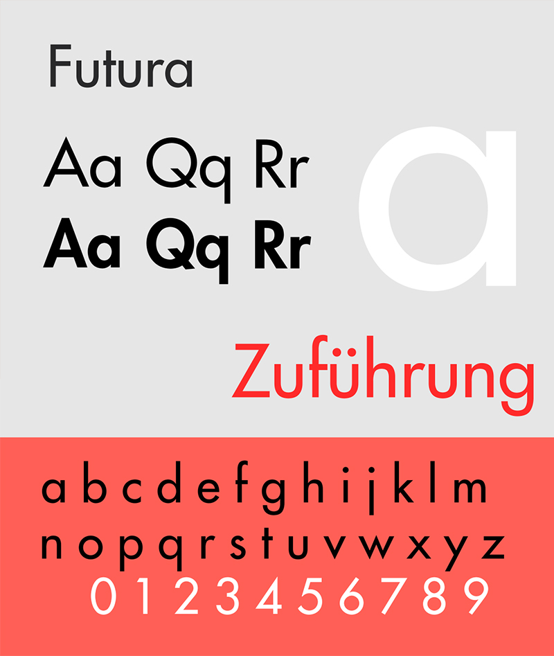
Image courtesy: https://bit.ly/2JNVRNM
Do you want to represent your business as an international brand? Well, create your logo design with Futura. It will not only give the modern look required for you but will also give that refined look that most international brands follow.
Futura is good for you if you offer shipping service such as FedEx or even if you belong to the medical industry.
5. Bodoni
Designed in the late 1700s, Bodoni is one of my favorite fonts. The amazing font has a combination of both thick and thin lines. While many designers had tried to create fonts using thick and thin lines, only Giambattista Bodoni from Italy had been successful. It is needless to say that this is a timeless font.
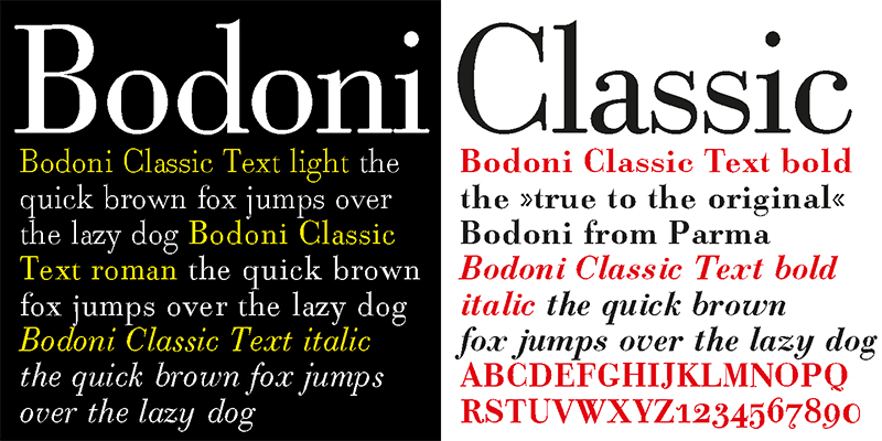
Image courtesy: https://bit.ly/2Z8XURV
The underlying structure of the font is quite narrow. Bodoni has a flat structure that looks like un-bracketed Serifs. It has a very prominent geometric shape that gives the font an edgy look.
Because of the modern and extraordinary style of the font, Bodoni is considered to be one of the best business fonts. This font is ideal for you if you are in the fashion industry.
6. Zorus Serif
Unlike many other font style designs, Zorus Serif has a French feel to it. The old-fashioned, clean font is great for logo designs. The font was designed by the Canadian typeface designer Jeremie Dupuis.
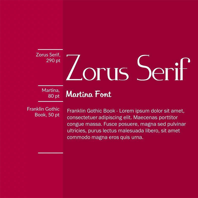
Image courtesy: https://bit.ly/2Yn1Scd
If you want to create a logo design in the italics version, Zorus Serif is the one that you would really like. The crisp of the font style gives your logo design a unique touch. This font is great if your business belongs to the fashion industry. It will also look good for the logo of a company that works in the construction sector.
7. Sabo
Sabo is a very retro font style. Philippe Moesch, the designer from Switzerland has come up with Sabo in the year 2014. The font has a cool vibe in it. It appears to be pixelated, unlike other fonts. The designer has created two different types of the same font. While one is inline, the other version is filled.
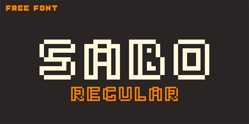
Image courtesy: https://bit.ly/312daAH
If you ask me, I like the inline version more. It has a modern look that is ideal for logos for businesses that cater to digital marketing or web design.
8. Bobber
If you are looking for a slab serif font, Bobber is what you need to consider. Inspired by Bobber motorcycles, the font is one of its kinds. The mixture of thin and double lines gives it a vintage yet modern look. It appears to be a grid font. Designed by two famous designers Dmitry Goloub and Lucas Almeida, Bobber is great for both commercial and personal logos.
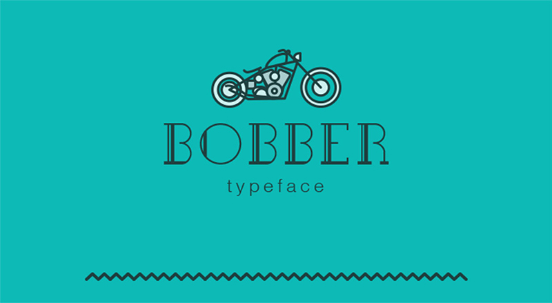
Image courtesy: https://bit.ly/2y5aDsQ
When it comes to logo design, the creative font Bobber is an ideal choice for tattoo artists, hairstylists, bike restoration shops, etc. This font has the edge that you require for your logo design.
9. Akura Popo
Yet another retro font is Akura Popo, which is designed by a typeface designing company, Twicolabs. However, unlike Sabo, Akura Popo is a very strong font that has sharp edges. The sharpness of the font gives it a tough and bold look. The font looks classic more than modern. However, its classic appearance makes it ideal for different types of logo designs.
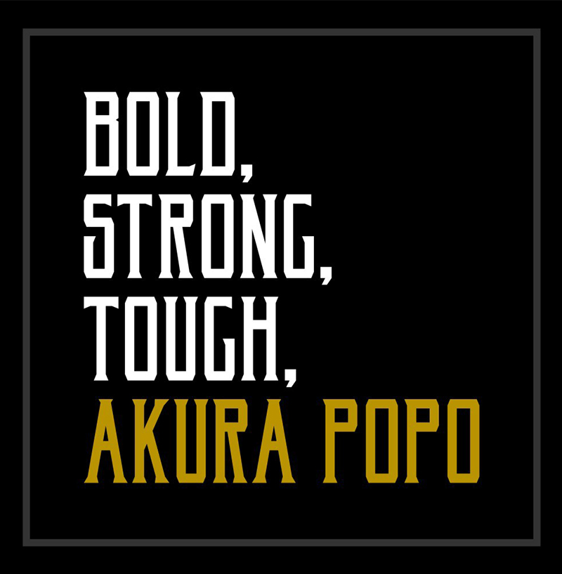
Image courtesy: https://bit.ly/30RuGXZ
While the classic font is great for t-shirt designs, it is also an ideal choice for businesses that cater to sports equipment. Besides, if you have a business of hardware, you can use Akura Popo for your logo design. The sharp edges and the boldness of the font are what you need after all.
10. Berlin
Berlin takes me back to a great show that I watched a few months back. There was a remarkable character that was named Berlin. However, we are not discussing shows, are we? So, let us come back to point.
Berlin, the font group is also one of the most amazing fonts. Why? It has a geometric style that many fonts miss. Berlin is not a single font but a group of typefaces. The Brazilian graphic designer Antonio Rodrigues Jr. introduced Berlin in the world of amazing fonts in the last century.
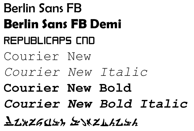
Image courtesy: https://bit.ly/2Z4OgzA
There are four versions of the font that you can choose from – Berlin, Uberlin, Berlina, and Slaberlin. Each of the typefaces has a geometric shape that is ideal for construction logo designs. As the font is available in regular, bold and even x-bold versions, you can use the font for creating logos for coffee shops, restaurants, fast food services, etc. as well.
11. Rockwell
If you take a look at Rockwell, you will find that the font style is very similar to the slab serif font style that was used in Hollywood movie posters. Rockwell is a font family that was redesigned in the 1920s by Morris Benton. Prior to that, it looked much like Litho Antique.
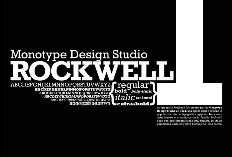
Image courtesy: https://bit.ly/32YhFxU
Having a steady and bold typeface, Rockwell is primarily used for headings. However, the nine variations that the font is available in, makes it one of the most suitable fonts for logo design as well.
If you cater to health-related requirements or if your company caters to luxurious spa and salon services, Rockwell is your choice of typeface for your logo. There are instances where agencies that take people to river rafting or paragliding have also used Rockwell for their logo design
12. ITC Bauhaus
Two Swiss designers Ed Benguiat and Victor Caruso designed ITC Bauhaus in 1975. The basic style followed in this design is sans serif. The font Universal is the inspiration behind ITC Bauhaus. However, if you take a look at both the fonts, you will see that the lowercase and the uppercase have been changed completely.
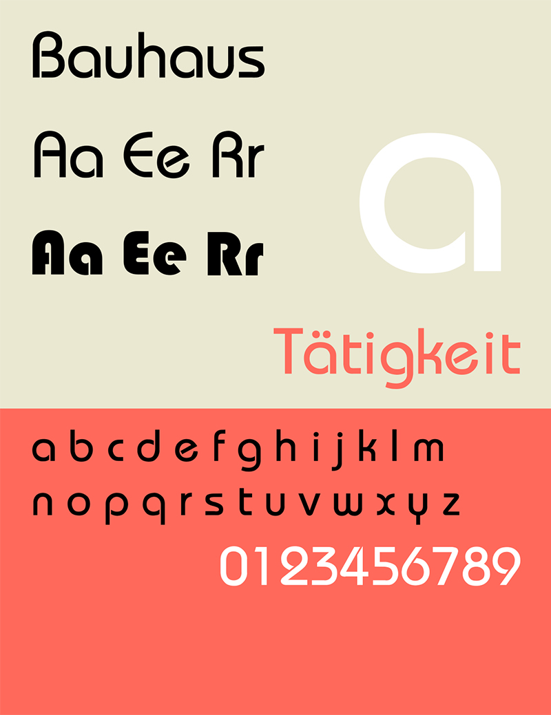
Image courtesy: https://bit.ly/2YlTZnG
Even though the font has evident geometric patterns that are symmetrical, the curves and the negative space gives it an unconventional finish. The font has the old school feel in it, which makes it the professional business font for logo design.
Do you deal with nostalgic feelings through your business? Is your business related to antiques? If yes, choose ITC Bauhaus for creating your logo.
13. FF Avance
An asymmetrical serif font that speaks of modern design with a twist is FF Avance. When you look at the font style, you will see that the ‘A’ is pointing to the right while the ‘V’ is pointing towards the left side. However, it is one of the best business fonts that you can try out.
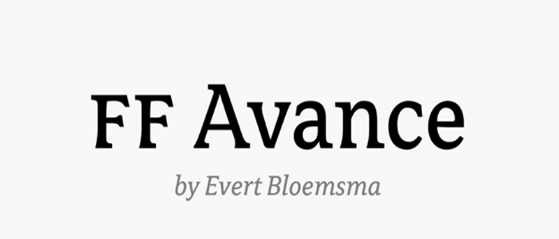
Image courtesy: https://bit.ly/2JMc99S
FF Avance is a font that appears to be in motion. Hence, if your business is related to automobile or sports or some other industry that is associated with motion, you should create your logo design with FF Avance.
14. FF Blur
Designed in 1922 by designer Neville Brody, FF Blur is an experimental font style. It is in the sans serif font family. The early 1900s was the time when people were transforming typography. More and more designers were experimenting with different typefaces.
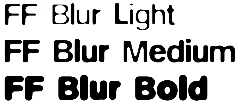
Image courtesy: https://bit.ly/32NWLRR
Neville Brody simply chose Akzidenz-Grotesk, an existing font, and used Adobe Photoshop to create the new font. He used the blur filter not once, not twice but thrice. The result? A blurry font that has an exciting look.
I agree that the font is not really readable. But it does have an exhilarating finish. So, if you want to bring excitement in your logo design, you can use FF Blur. On the other hand, If the name of your company is small or if you want to mix and match different professional business fonts, you can still try using FF Blur.
15. FF Din
Yet another sans serif typeface that was designed in the early 1990s is FF Din. Albert-Jan Pool designed the font in 1995. This font was designed to bring a change in sans serif style. Instead of using circular elements, the designer incorporated ovals. Thus, the letters are much crisper with slight curves.
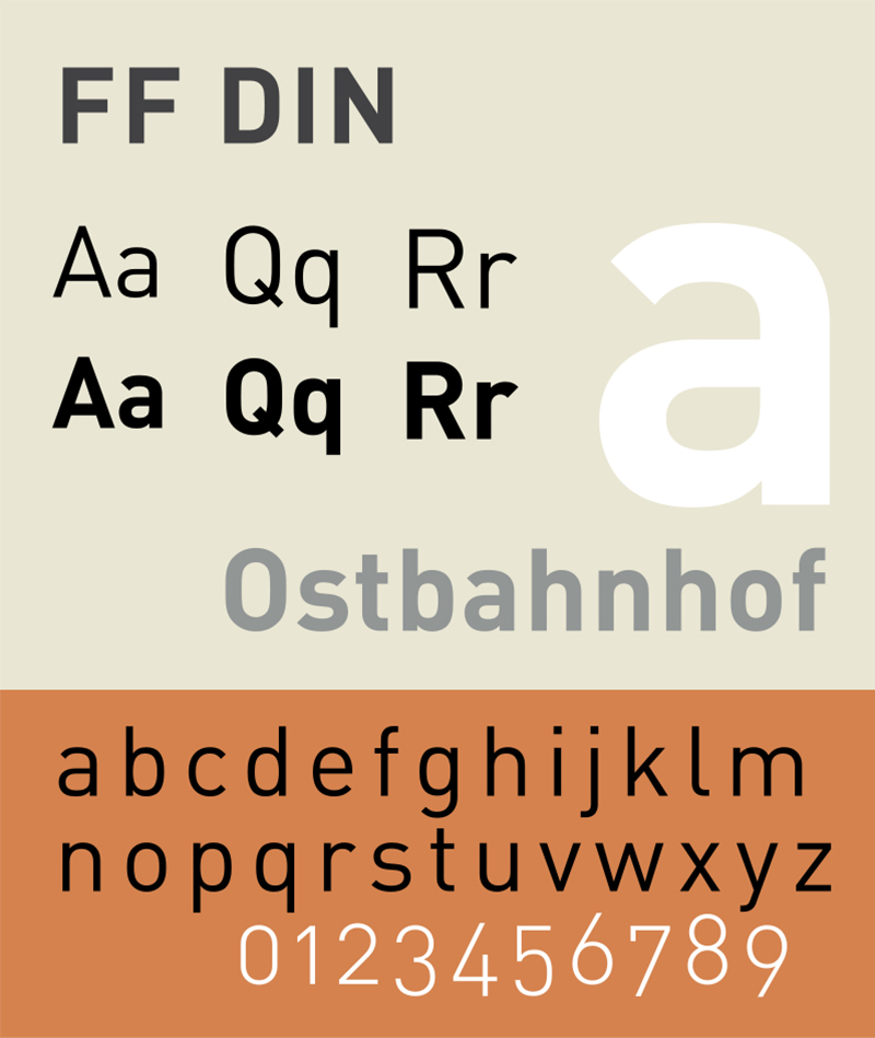
Image courtesy: https://bit.ly/2Z7Ztzj
Even though the curves are shorter than before, the font has not lost its warmth. Hence, like Helvetica, FF Din is also one of the welcoming fonts that you can see. Because of the slight curves, FF Din is the perfect font for companies that interact with the customers directly such as banks, smartphone companies, hospitals, etc.
16. FF Meta
FF Meta is one of my favorite fonts. As claimed by the designer Erik Spiekermann, FF Meta is the perfect opposite of Helvetica. What does that mean? While Helvetica is extremely rigid with straight lines and edges, FF Meta is more flexible with curves and bends. When you take a look at the font, you will notice a flow. The curves make the font appear to be rhythmic. Even the dot on the small ‘i’ is also spherical.
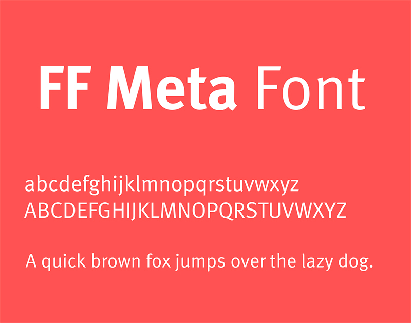
Image courtesy: https://bit.ly/30X5fEH
This is one such font that can make any logo design look good. So, no matter which business you are in, you can use FF Meta to create your logo design. However, if your business is associated with the fashion industry or beauty industry where you want to welcome people, you can go for FF Meta to create the logo design.
17. Baltica-2
Baltica-2 made into the world of slab serif fonts in 1998. Designers Isay Slutsker and Vera Chiminova are the ones who had created the stylish font. Baltica-2 is not very different from other slab serif fonts in terms of its appearance. The only difference is that the font appears to be stretched.
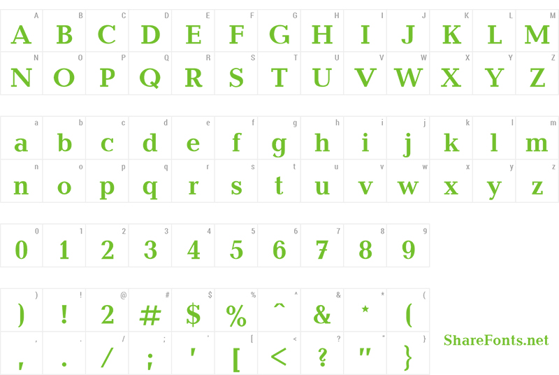
Image courtesy: https://bit.ly/2Yg8y7Y
Being a simple font, Baltica-2 is sometimes overused in magazines, posters or advertisements. Baltica-2 is a very good font for an airline, beer breweries, healthcare services, etc.
18. Foco
While the 1900s was the era of making blurry and illegible fonts, early 2000s was the time when there were designers who were creating clear and readable fonts. One of the readable fonts that were designed in 2006 by Fabio Haag and Veronika Burian was Foco. Foco primarily became famous among the designers because of its well-balanced appearance.
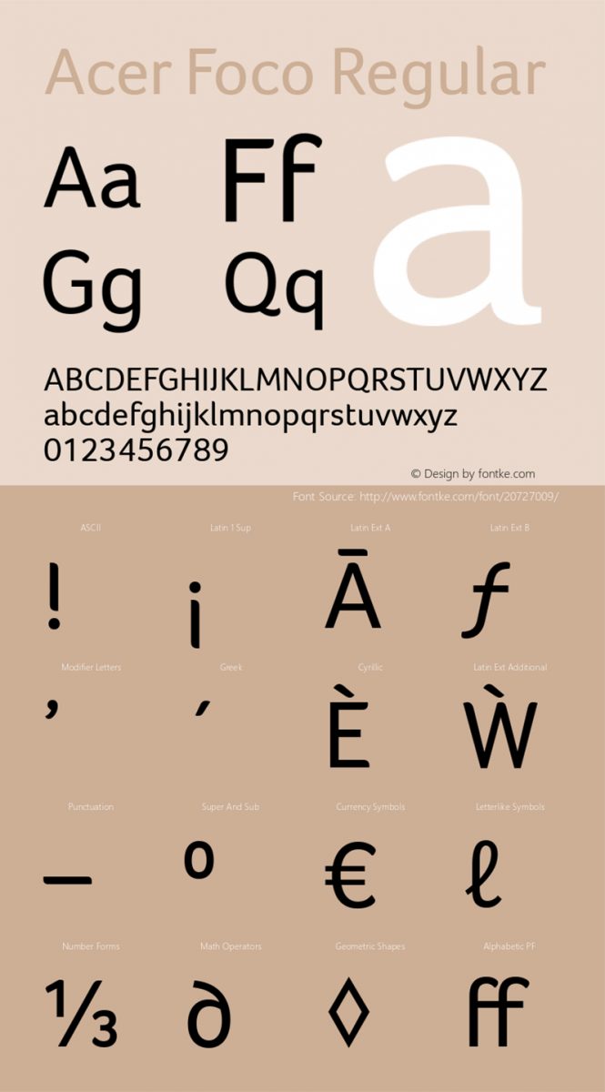
Image courtesy: https://bit.ly/2LCVqbh
The uniqueness of the typeface is found in its soft and slow corners. The font not only is creative but it also has personality. The spacing between each of the characters is planned properly to make sure that the readability of the font increases.
Because the font is so clean and clear and legible, it is great for medical services logos, childcare services logos, candy company logos, confectionary company logos, etc.
19. Museo Sans
Designed in 2008 by Dutch designer Jos Buivenga, Museo Sans is totally opposite to Museo. While Museo is a serif font, Museo Sans is sans serif. Museo Sans is a simple and unfussy font. The letters get enough space, thus, making the font clean and breathable.
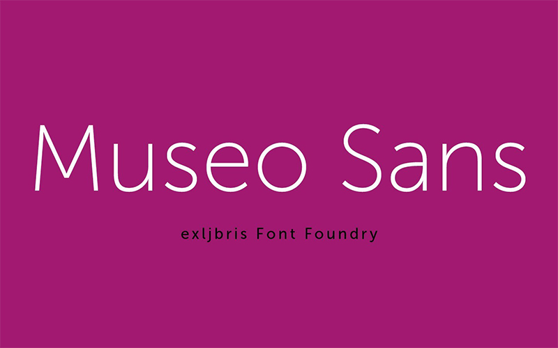
Image courtesy: https://bit.ly/2Sypo0R
The best part of this font is the letter ‘Q’. You cannot even make out where the letter merges with abstract shapes. The letter ‘Q’ is just a circle with a small line going through it. Museo Sans is a typography revolution.
It is amazing font for designing minimalist logo designs. So, if you own an e-commerce website or a travel guide website or even have a design-related website, you can use this font for creating a minimalist logo design.
20. Bodoni Egyptian Pro
One of the new style serif fonts is Bodoni Egyptian Pro. It is designed in 2010 by Canadian designer Nick Shinn. Bodoni Egyptian Pro is not like the other fonts. Why? The reason is that this font was created to reduce the weight of the strokes. Hence, making the font one of the sleekest creative fonts.
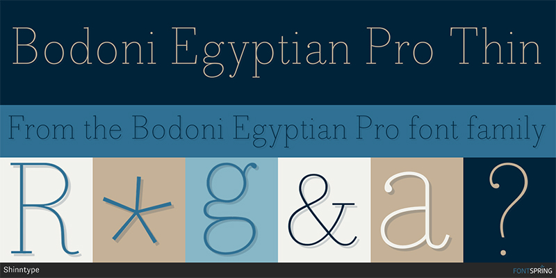
Image courtesy: https://bit.ly/2Y23t7X
The font itself has eight different weight versions including the lightest weight to the heaviest weight. The lightest weight is composed with the help of only one-pixel lines. Even the heaviest weight looks like it is created in a single stroke.
Because of the modern yet classic appearance of the font, it is great for a brand logo design for companies that are associated with music. So, if you sell musical instruments or if you release music albums, Bodoni Egyptian Pro is for you.
21. Aventura
The Argentinian designer Jimmy Kalman created the typeface Aventura in the mid-2000s. He took inspiration for the typeface from outdoors. Hence, his designed typeface consists of uppercase letters, numbers and some characters.
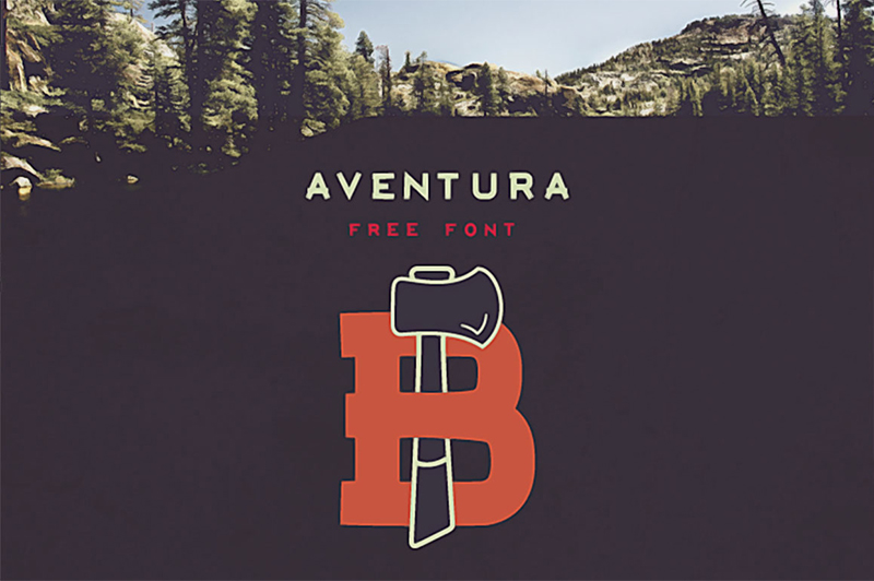
Image courtesy: https://bit.ly/2JOqByh
The font is ideal for creating logos for businesses that are related to nature or adventure. So, suppose you own a company that works in solar power generation. The font is ideal for creating your logo design.
22. Axis
The font Axis has a geometric feel to it. The curves and edges are very prominent owning to the geometric pattern. The designer Jean M Wojciechowski created this font being inspired by urban life. Axis has a friendly and happy approach in it.
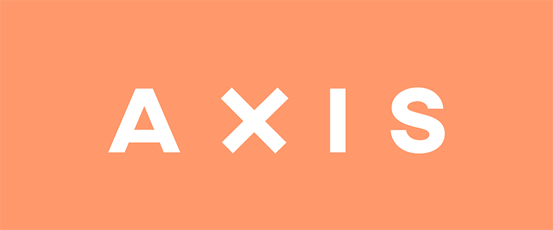
Image courtesy: https://bit.ly/2LF5y3k
Some supermarkets have used Axis to design their logos. If you want to come out as a brand that inspires happiness in people, Axis is the ideal choice for you.
23. Azedo
There are very few creative fonts that are really suitable for almost every kind of business logo designs. Azedo, designed by Portuguese designer Pedro Azedo, is a universal font that is not only good for logo designs but also for different kinds of graphic designs.
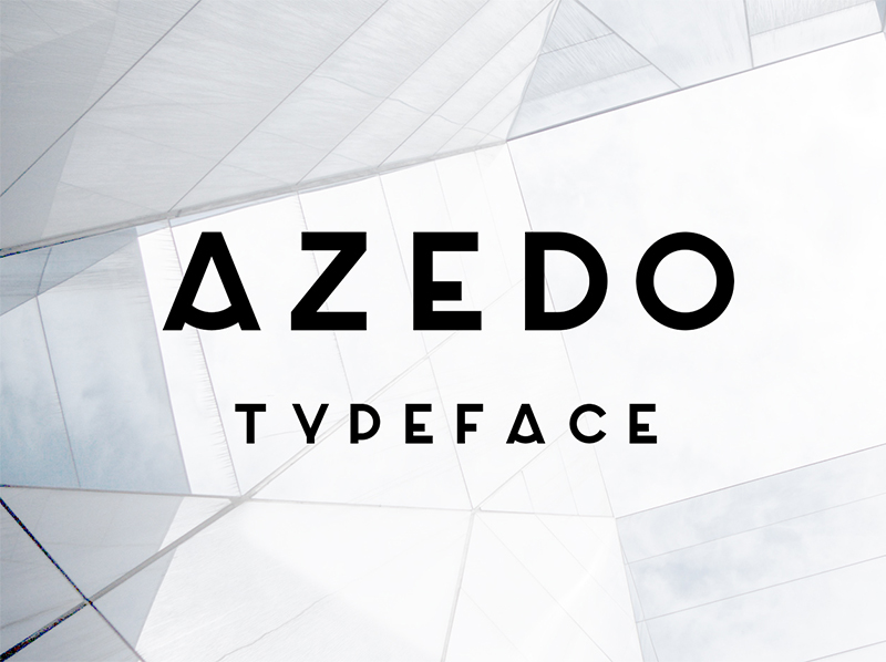
Image courtesy: https://bit.ly/2Syqhqd
Azedo has unique features. The lines are a mixture of curves and straights. This font will look good in headlines, t-shirts, brochures, websites, and obviously logo design.
24. Elegant Lux Pro3
Elegant Lux Pro3 is one of the new-age typefaces. Designed in 2015 by Schoener the font lives up to its name. The font is inspired by Grotesque that was designed between 1920 and 1930s. As the font design has rounded corners, it looks very elegant.
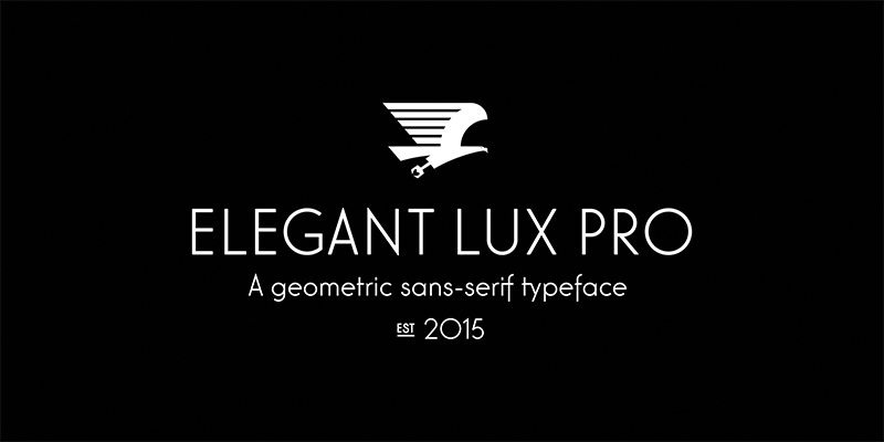
Image courtesy: https://bit.ly/2JNa3Xd
Elegant Lux Pro3, the sans-serif font is ideal for creating logo designs for boutiques, mobile phone manufacturers, design agencies, etc.
25. Futuracha
Have you seen those art deco fonts? Don’t they look gorgeous? Futuracha is inspired by the art deco style font. The font has Latin and Greek characters that make the font look amazing. Designer Odysseas Galinos Paparounis was experimenting with font designs and he came up with this outstanding font. Futuracha is an ideal font for logos especially for businesses that are related to designing, fashion, art, etc.
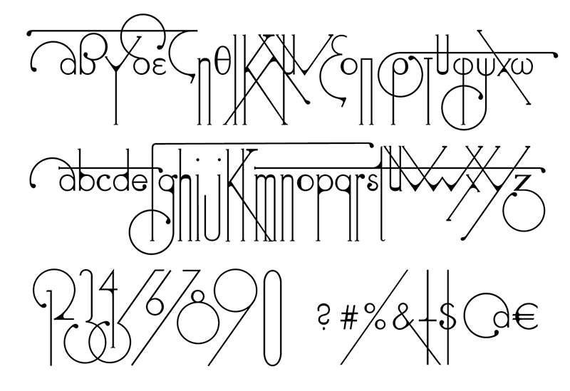
Image courtesy: https://bit.ly/2LDC5qh
26. Didot
Suppose you own a construction business or you enjoy supremacy in your business sector. You would like to have a strong visual impact. Hence, you want to have a logo design that will reflect exactly what you want.
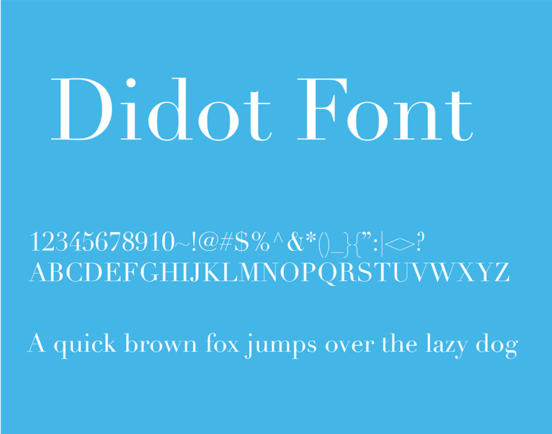
Image courtesy: https://bit.ly/2SEvlcG
So, what should be your ideal choice of fonts?
You are right. It should be Didot, the classic font. Designed by typeface designer Didot in the year 1799, it is one of the fonts that some famous brands such as Giorgio Armani have used. The font is made of contrasting colors that attract the attention of the viewers and creates a lasting impact on them.
27. Neue Swift
Some logo designs are word-based. It means you do not use images or illustrations in the logo. If you take a look at the logo of Yahoo or Subway, you will understand what I am saying. In 2009, Gerard Unger designed the font, Neue Swift. The font has a very distinct characteristic. Each of the letters is separated from each other and is very prominent. So, if you belong to the publishing industry where you need to have a prominent looking logo, Neue Swift should be your ideal choice.
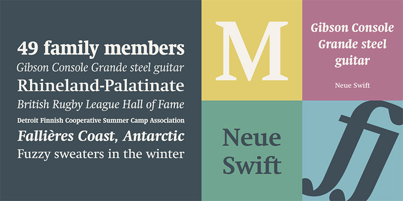
Image courtesy: https://bit.ly/2YdzBky
28. Big Caslon
William Caslon I designed the Serif typeface in the 1600s. The typeface became famous at that point. However, many years later, Matthew Carter redesigned the typeface and named it Big Caslon in 1994. The font is an apt example of digital typography. Big Caslon has a very distinct feature. A few letters are designed in a whole new way. ‘S’, ‘X’, ‘E’, ‘F’, etc. are some of the letters that look different. This should be your ideal choice of the font if you are into manufacturing hardware. You can come out as a strong brand yet is subtle about it.
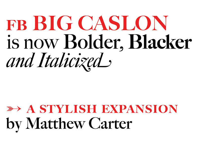
Image courtesy: https://bit.ly/2Z7G95b
29. Canilari
Canilari has been created in the year 2016 by the typeface designer Patricio Truenos from Chili. The font is Serif and has a post-modern feel to it. The distinctiveness of the font design makes it unique. Hence, I cannot really say that it fits into the history of typography. On one hand, that makes it harder to choose a particular genre where the font could be used to create a logo design. On the other hand, this is a creative font that can be marked as one of the best business fonts. It has an edge. The letters have a pointy geometric shape, which can make any logo design appear modern.
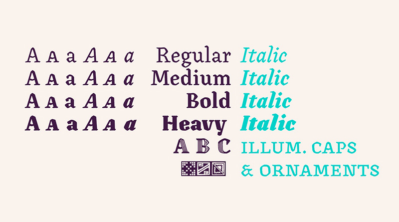
Image courtesy: https://bit.ly/2Z4PwTk
30. Modesto
During the 19th and 20th century, hand-painted typography was very famous. Jim Parkinson was inspired by this concept. So, he created Modesto in the year 2000. Even though the creative font did not have italic until 2014, it is one of the best fonts that can be used for any type of logo design. The clean lines and the spacing between each letter make it easily readable, which is why it is a good choice for your business logo design.
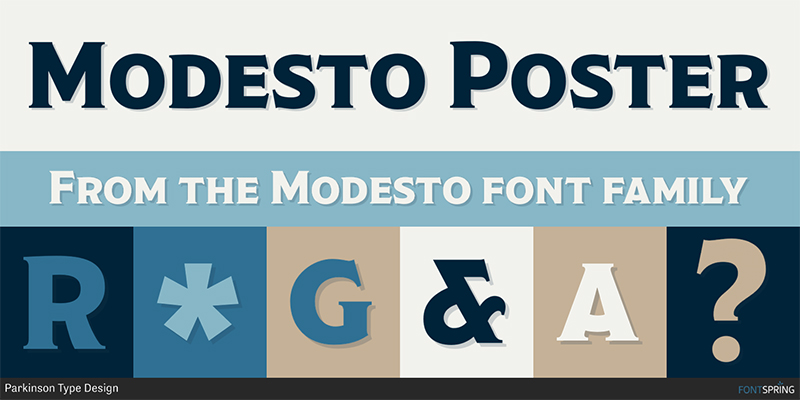
Image courtesy: https://bit.ly/2YhABnP
31. Rufina
Rufina is an amazing font that is designed by Martin Sommaruga in the year 2016. The font was inspired by stencil-serif typeface. However, thanks to the designer, the font does not look similar to stencil-serif. It looks more like an artistic puzzle. Because of its artistic style, you can use this font for your logo if your business is related to art or styling.
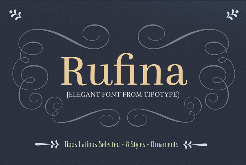
Image courtesy: https://bit.ly/2SAzbmM
32. Revista
If you ask me which of the fonts, I think, every designer should use, I would say Revista. Being a stencil typeface, Revista is a very stylish font. You can see amazing artwork going on within the font design. The designers Daniel Hernandez, Paula Nazal Selaive, and Marcelo Quiroz have done an outstanding job in creating this font.
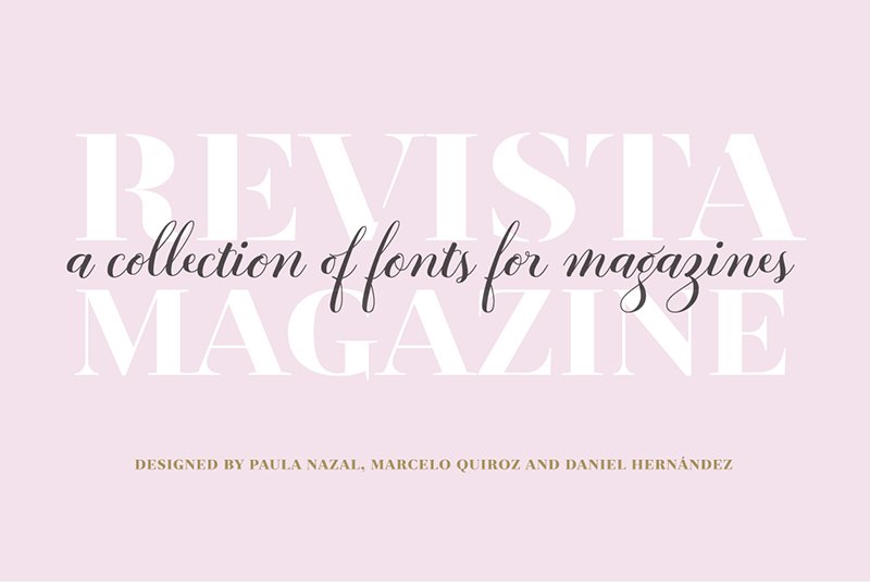
Image courtesy: https://bit.ly/2JOOJRp
While designing the font in 2015, the designers decided to create 2 sets of typography styles. While one style is as per the zodiac signs, the other one is depended on technological symbols.
33. Baltica
Russian designers Isay Slutsker and Vera Chiminova designed the slab serif font Baltica in 1998. The font looks quite similar to a sans-serif font. However, it has some distinct features that set it apart from any other fonts. The letters have a different width. The bracketed letters give this the slab-serif appearance. The classic look of this font is ideal if you want to establish yourself as a trusted brand. Hence, you can use this font in your logo design if you own a business that is associated with health. Suppose you are using mood boards in designing your logo. Baltica can be a choice of typeface for the logo.
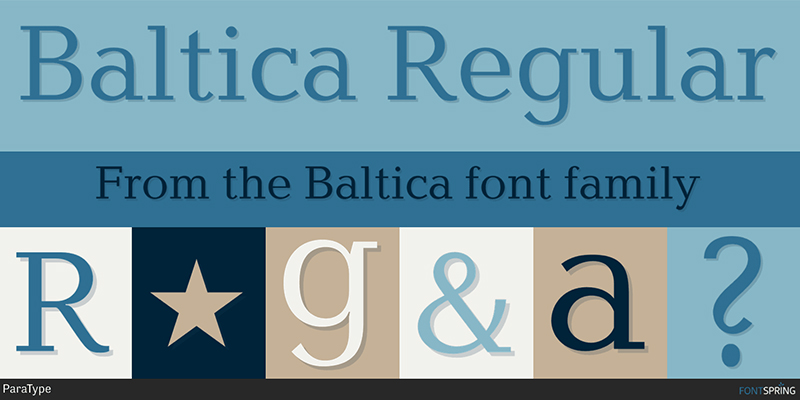
Image courtesy: https://bit.ly/32L3z2E
34. Grenale Slab
Grenale Slab has been designed in 2016 by Jeremy Dooley, an American designer. The designer has taken the freedom of creating a font that has whimsical curves in it. Besides, the bouncy rhythm in the font makes it stand out. As the font has a motion it is, it is good for businesses that do not have a serious tone in it. Hence, you can use it for designing baby care logo. This font is also a great choice for music companies.
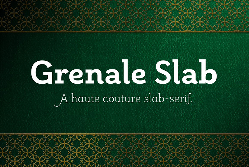
Image courtesy: https://bit.ly/2Y3jXgk
35. Bambusa Pro
The reason why people did not want to try out handwritten typeface for logo designs is that the handwritten letters are often illegible. We often do not understand where one letter ends and the next starts. However, Dutch designer Hanneke Classen designed Bambusa Pro. The typeface imitates handwritten letters.
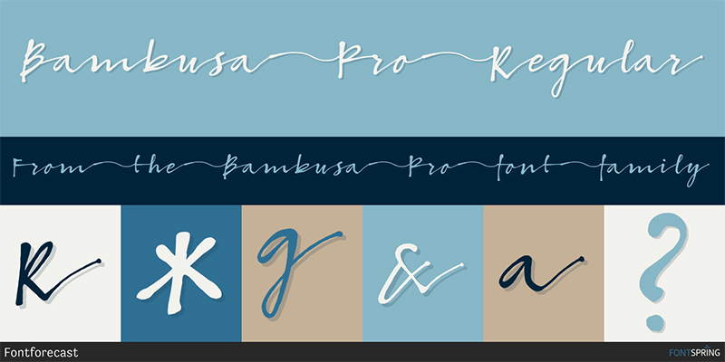
Image courtesy: https://bit.ly/2Go3Ui3
The font has a flying motion and each of the letters is connected in a word. Besides, the designer has followed a pattern where font sizes and gaps follow a certain proportion. This is an amazing font style that can be used to create a logo design where you want to show flow. If your business is connected to nature or beauty, you can try this font.
Conclusion:
There are many other fonts available online. However, not all typefaces are applicable for logo design. Now that you know which fonts are good for your business, you can get started with designing your logo. I have tried to mention which typeface is good for which type of businesses. However, if you do not find your business on the list, do not worry. You can always take professional help.
Digital Polo offers you professional logo design services and that too at an affordable price. We have skilled graphic designers who have years of experience in the field of designing logo and other graphic designs. We also offer our service within a particular timeframe. You can check out the different plans to see which one suits your need.
