Colors That Would Be Ruling the World of Logos in 2020 – Digital Polo Inc
A movie, which is ready for its release is not directly rolled out in cinemas for the public to watch. Firstly, it is introduced to the public through various posters and trailers to give them a brief about the content of the movie. These trailers or posters are made in such a way that it excites and induces people to watch that movie. Similar is the story with logos that are designed to give an introduction of the brand for which it has been designed.
Just like, posters and trailers are the first impression of a movie for the movie goers; logos are the first stage of impression for its target audience. It serves as the face for the brand it represents that speaks volume about its business objective, its core values and branding. A logo that is not only visually attractive, but which also demonstrates the message of the business without any verbal explanation is an example of a typical logo design.
Image courtesy:https://bit.ly/3a1icSd
Designing a logo is not a simple task of putting together a symbol and a tagline or a message. It involves a whole lot of research and imagination before finally sitting down to design the same. This research and imagination task includes selecting or designing a symbol that defines the brand, and then deciding the color, font, shape and message of the logo. When talking about these different parts of logo, color is one of the most important matter, which if not chosen accurately would make the brand sink the whole business. Colors are the first thing that a human eye first notice in anything, than reading any messages or texts that is written around it.
Colors alone have the potential to make anything look dull or bright if not used or mixed correctly. Applying the same logic in logo designing, colors used in the symbol, texts and in the background of the logo creates a huge impact on the viewers who sees it. Thus, understanding the importance of colors in a logo design and listing the ones that would command the logo world in 2020 is the purpose of this article.
Image courtesy:https://bit.ly/2TeO52W
What Makes Colors so Important in Logo Designing?
It has been established through a research that people subconsciously make a perception on their own about a product, people or anything they see around them within first 90 seconds of glance. Of which, 62 to 90 per cent is solely based on the color of the thing they have seen. Thus, these 90 seconds of initial viewing of the logo can either attract or distract your target audience based on its colors alone.
Image courtesy:https://bit.ly/2SXDAly
We humans have this tendency of judging colors, fonts, shape, etc. of a logo per our mindset without even understanding the reason behind its use. This (mostly) inaccurate judgment guides their purchasing decision for that particular brand. For example, people normally consider black color as inauspicious for business activities, but from the logo designing point of view it is the most attractive and suitable color. Keeping this behavior of their potential customers in mind, companies or designers have to use such combination of colors that would meet their business purpose as well as connect with their target audience. The main objective of a logo is to attract customers towards it and generate revenue for the business. So, a logo is said to be successfully designed if it is able to strike the right chord between fitting and standing out.
Understanding the Color Psychology
The study of different shades of colors and its impact on human mind is called color psychology. It acts as one of the important verticals of marketing and branding. The top 100 highly prized brands in the world use these common colors in their logos in descending order – blue, red, black or silver or grey, and gold or yellow. Keeping colors minimum yet effective is what majority of the top brands believe, as 95% of them use maximum two colors in their logos while the remaining 5% deploy three or more colors. Companies using single or two color combinations are Facebook, Deloitte, Levis, etc., and those using combination of three or more colors are Google, eBay, Microsoft, etc. The feelings and imaginations that the color combinations in a logo bring to our minds will be either positive or negative for the brand associated with it.
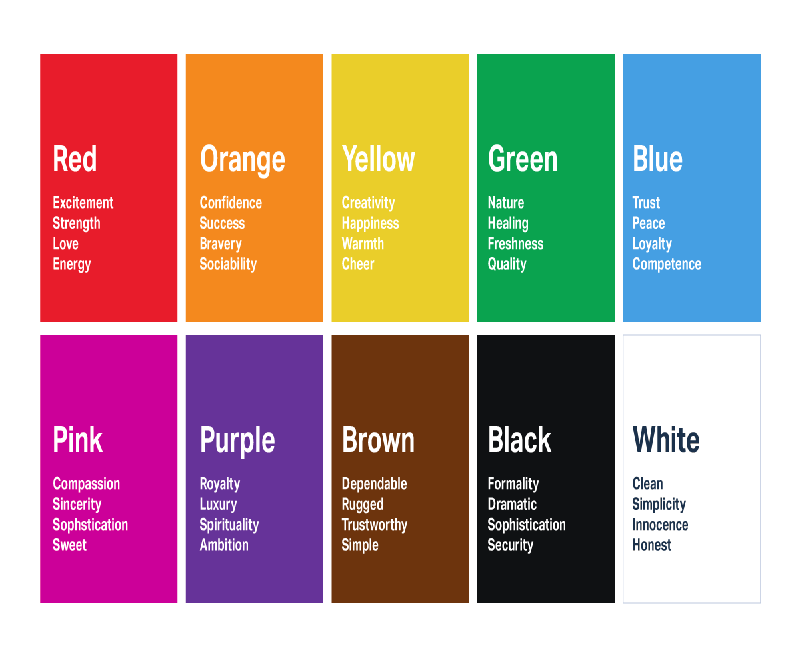
Image courtesy:https://bit.ly/2Vo3qB9
For instance, combination of multiple colors used in the logo of the popular detergent brand “Tide” is so refreshing and attractive that it will make people believe that its powder would also bring the same freshness and brightness to their clothes. The color palette for their logo comprises of white, orange, yellow, and blue that has been combined in the right proportion. Another concept that a designer must be aware of while designing a logo is different cultural meaning associated with different colors in different countries. A color that is considered as dark in one country may be considered as favorable in some another country. Hence, if your business is spread in multiple countries or has any such expansion plans, should implement such colors in the logo that would associate with people all around the world.
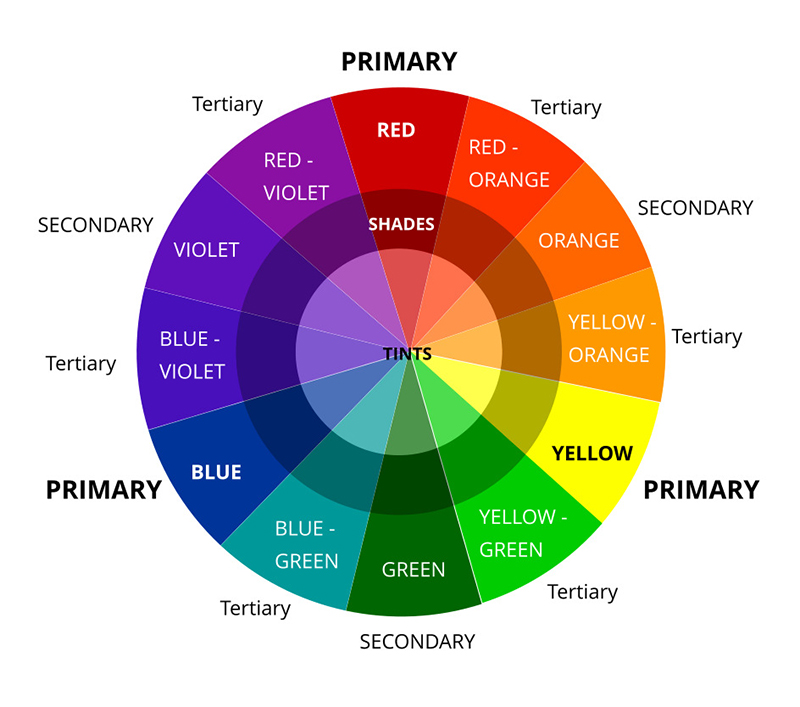
Image courtesy:https://bit.ly/2HUEEAq
The Concept of Color Wheel
The graphic designing world has a general rule of using a maximum of three colors in logo designing, which if not followed would make the logo ineffective. Colors give rise to consistency and this consistency may get hampered due to discordant color composition. Thus, to avoid such failures, designers strictly follow a concept called color wheel to create a right balance of color palette for their logos. This color wheel establishes the relationship that different colors share with one another and also what type of color combination would be most appropriate for the logo.
The color wheel is divided into three parts, termed as:
- Primary Colors- Yellow, Red and Blue.
- Secondary Colors- Green, Orange and Violet that is obtained by mixing two primary colors.
- Tertiary Colors- Yellow-Orange, Red-Orange, Blue-Green, Blue-Violet, Red-Violet and Yellow-Green that is obtained by mixing one primary color and one secondary color.
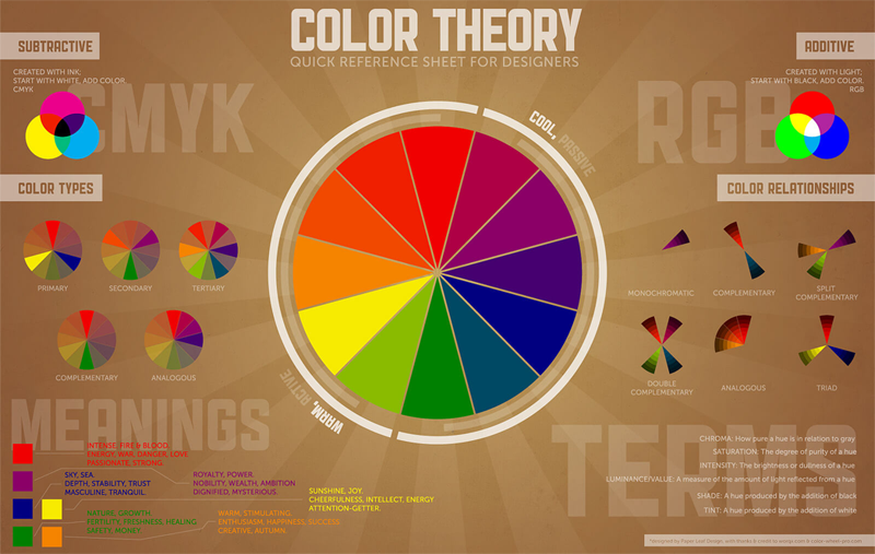
Image courtesy:https://bit.ly/3a549Lt
Colors to be used in 2020 for Logo Designing
- Blue: Color blue, associated with calmness, stability, logic, peacefulness and serenity is the color of ocean and sky, which gives a feeling of both quietness and security. It’s a fact that those who work in blue rooms or space has the maximum productivity. The color blue makes a person feel content and complete and that both men and women love this color. In respect of logo designing, blue color makes your brand look professional and logical, helping you gain customer’s trust. So, if you use blue in your logo it is sure to attract eyes of all the people across the globe, making it popular and easily recognizable. But, this color is not ideal for restaurant business or any other type of food business. Names of few renowned brands that have used blue color in their logo are American Express, DELL, General Electric, Ford, Twitter, etc.
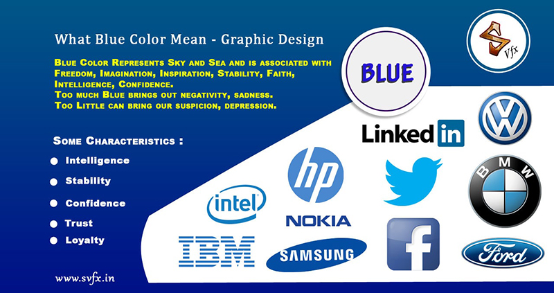
Image courtesy:https://bit.ly/2PpAdlw
- Orange: Enthusiasm, playfulness, warmth, creativity, etc., are some of the features that define orange color. This color is believed to ignite human minds and turn on its activity mode. The perfect blend of excitement and mental awakening characteristics in the orange color forces consumers to take favorable action. For logo designing, orange color would mean that your brand is cheerful and jovial. Business houses who want to establish themselves as a light-hearted yet confident brand can use orange color to their advantage. Names of few renowned brands that have used orange color in their logo are Gulf, Miranda, Harley Davidson, Payless, Mozilla Firefox, etc.
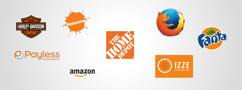
Image courtesy:https://bit.ly/2PokpPI
- Green: Green color that is a sign for youthfulness and environment friendly resembles health, freshness and purity. It is seen as a mark of growth, instilling a feeling of self-healing and body relaxation. Also, being the color of almost all healthy fruits and vegetables, green reminds customers about the value and importance of Mother Nature. Talking in business terms, green color in your company’s logo would denote an environment friendly organization. Because of this, green color is popular among organic and vegan brands and also for industries that are working on environmental issues and ethical business practices. It also means money and wealth due to which it is used in the logos of financial companies indicating growth in money. Names of few renowned brands that have used green color in their logo are Android, Starbucks, Tuborg, Tropicana, Woodlands, etc.

Image courtesy:https://bit.ly/3a6k8c3
- Red: Color red, which means power and passion, indicates confidence, intensity and energy wherever it is used. Once red color meets viewers’ eyes, invokes strong emotional feeling in them. Worldwide, red is associated with two different meanings. First, with love and romance. And, secondly with emergency. Red color in a company’s logo means that your business is powerful and energetic. It can make a person’s heart beat go up because of a sudden emotional feeling on seeing it, compelling him to take an immediate action, just like women goes go mad on hearing the news of limited period clearance sale. Red is a good choice for organizations that runs a food business or a restaurant as it is believed to increase appetite in a human being. Names of few renowned brands that have used red color in their logo are Pinterest, Netflix, Kellogg’s, Coca-Cola, Burger King, etc.
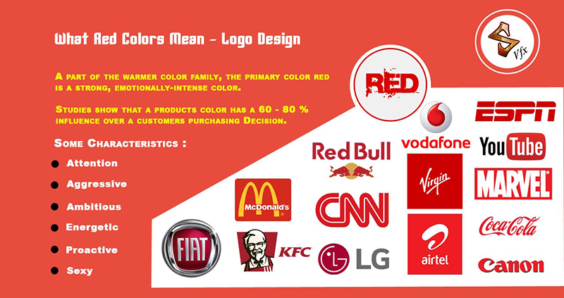
Image courtesy:https://bit.ly/2HQ1dpR
- Purple: The color purple portrays qualities, like wise and luxury, which implies success, royalty and wealth. It is a classic and most favorite color of Nobles and Kings. It is also a sign for mysterious, magical or fantasy things, which gives a feeling of wisdom and fires a sense of imagination in a person. That is why, purple color in different shades are widely used by beauty products manufacturers, especially by those who produces anti-aging beauty products. Purple color in a logo would give a luxurious, royal and vivid look to its brand. It would strongly please and attract those viewers who are rich or who have interest in mysterious or magical things. Names of few renowned brands that have used purple color in their logo are Monster.com, Wonka, FedEx, Cadbury, Hallmark, etc.
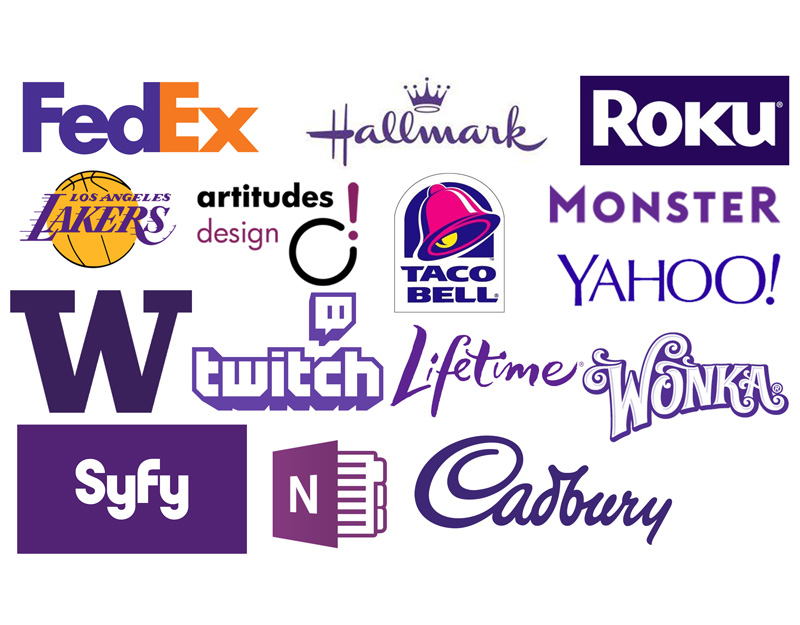
Image courtesy:https://bit.ly/32q3aD8
- Yellow: Another color that stands for features like fun and friendliness is yellow that means optimism, happiness and also as a caution sign. As we all have seen on almost all trending web chat applications that smiley face emoticons are yellow in color, happiness is sure to follow. Sun who eliminates darkness and spreads light around the world is also yellow in color. That’s why yellow is seen as a starting point of communication as it means warm and cheerful color. When incorporated in a logo, yellow color denotes a positive and enthusiastic brand that is sure to attract eyes of window shoppers. On the contrary, yellow is also used as a precaution sign to keep people away from danger. Just like the one on a meter board. It is recommended to use that shade of yellow that soothes the eye instead of straining them. Names of few renowned brands that have used yellow color in their logos are Nikon, Forever 21, Post-It, Lay’s, MC Donald’s, etc.
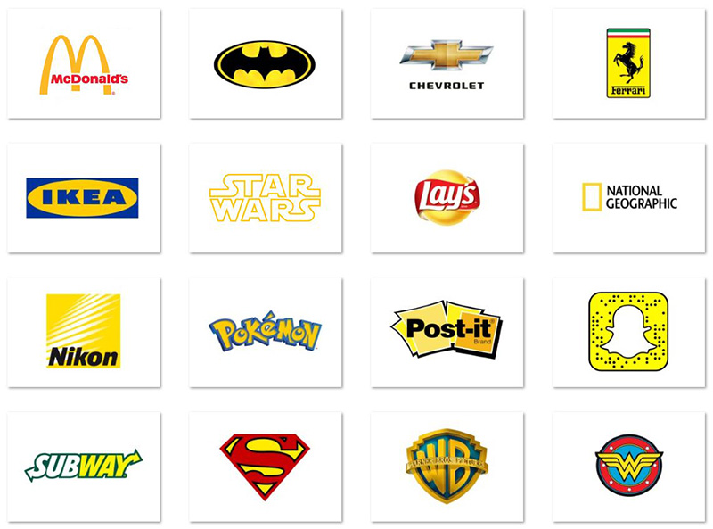
Image courtesy:https://bit.ly/32pNfEO
- Pink: A color that speaks about femininity, sweetness, positive energy, etc., is normally used in that brand’s logo that is specifically targeted at women. Since sweetness is also associated with pink color, it is widely used in designing logos of companies that sells sweet products, like ice cream, donuts, yoghurt, cakes, etc. For a business logo, a company can also add an image of a girl with pink color to hit at their targeted women audience more convincingly. It also means lively and playful nature because of which many baby products and toys manufacturing organizations have also used pink as a color in their logos. Names of few renowned brands that have used pink color in their logo are Barbie, Baskin Robbins, Taco Bell, LG, Dunkin’ Donuts, etc.
Image courtesy:https://bit.ly/2uohTlg
- White: The best characteristics i.e. innocence, peace, purity, hygiene, simplicity, classic and purity is indicated by one color that is white. White always mean something new and fresh, even for the person who sees it as they get inspired by it. In logos, white makes them more perceptible and vibrant. It also denotes sterility because of which many healthcare centers and hospitals use white color in their logos. In fact, white is also equivalent to luxury that has made many luxurious and jewelry designers base their logo on color white. Names of few renowned brands that have used white color in their logos are Swarovski, UBER, World Wide Fund, Vans, Nike, etc.

- Black: Black that signifies darkness, seriousness, elegance, sophistication and exclusivity is the most popular logo design color of all time. It has been used for logos of major luxury products to make it look glamorous and elegant. A brand that uses black color can also highlight that they are an exclusive brand that is meant for a specific class of people. A black colored or themed logo means that the company is sending a strong message about its high reputation, market share and secured establishment. Names of few renowned brands that have used black color in their logos are Chanel, Michael Kors, ABC Networks, Adidas, The New Your Times, etc.
Image courtesy:https://bit.ly/2wG8V3B
- Silver: Another color that strongly defines purity, virtues, grace, wealth and elegance is silver. Since it is associated with metal, it gives a very powerful yet rich feeling. Any company that uses silver color in their logo wants to say to the world that they are high quality product manufacturers, with state of the art facilities and possessions, like wealth and creativity. Silver is also the color of sharp, and bladed products, like knives, steel, etc., that is hard to break and hurtful as well if used wrongly. Names of few renowned brands that have used silver color in their logo are Mercedes, J W Marriot, Jaguar, Apple, Honda, etc.

Image courtesy:https://bit.ly/2HYjukR
For your knowledge, 85 per cent of customers consider color as the most important factor in deciding whether they want to buy that product or not. Logo plays an integral part in this as it has the ability to increase the brand recognition up to 80 per cent. Thus, to build a consistent brand name, a principal color must compliment the brand with right proportion of one or two more colors that would hit the right kind of audience and in the right manner.
