Can Your Facebook Cover Photo Increase Your Sales? – Digital Polo Inc

As you are reading this blog, I assume that you own a business already. And since you own a business, you might already have a social media presence as well. But the question lies in whether you are using your social media pages effectively. As we all know that one of the most common social media platforms is none other than Facebook. People have been using Facebook much before than they started using Instagram.
While Facebook is still the chosen platform for most marketers, some of us are yet to learn the effectiveness of Facebook cover photo. While many companies regularly update their Facebook cover image, some business owners don’t pay enough attention to the cover photo on Facebook.
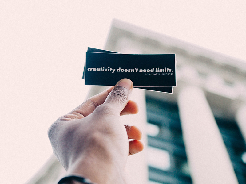
If you belong to the second lot, it is time that you change your point of view. You already might know by now that the cover image is the first thing that people notice when they land on your Facebook page. So, have you paid enough attention to creating a cover image that grabs the attention of the viewers? Do you make sure to change the cover image from time to time to maintain freshness? If not, this is where you can start. Let’s not waste time anymore and get started.
The size of your cover photo:
The first thing that you should remember is the size of the cover photo of your Facebook page. The ideal dimension of Facebook cover photo should be 820×312 pixels. However, as you can see from the image below, this is the part that you can see on desktop.
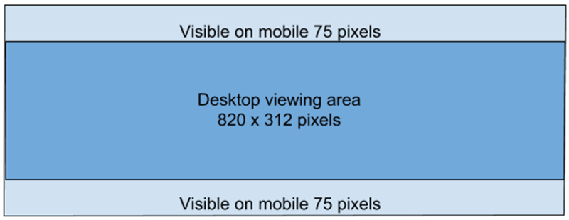
Image courtesy: https://bit.ly/2srq3Ze
If you want to make sure that your Facebook cover page looks good even on smartphones, you better use an image that is 820×461 pixels in size. When the page loads on desktop, it will adjust the size according to the given area. However, you must be careful in creating the design of your cover image. If you include important information in the light blue area, you miss the chance of getting seen on mobile.
Promote your brand:
The cover photo that you use should promote your brand. Whether you inform people about an upcoming event or you are about to have a sale, including the information inside the cover image is a good option. Now, there was a rule Facebook made and that was 20% text ratio. Your cover image was not supposed to have more than 20% text. Even though Facebook has removed the boundary, I would still ask you not to go overboard.
Using too much text may just make the cover design look cluttered. It may appear that you have tried too hard to convey all the information in one image only.

Image courtesy: https://bit.ly/2sqPuKt
As you can see in the image above, the text in the photo looks so untidy. Why is this image not ideal? First, there is too much information in the cover photo. Second, the background of the image is causing disruption as well. And third, the font that is used doesn’t look good at all.
Instead, if you need to add text, keep it as simple as possible. Strike balance between the text and the image used on the cover photo. The image below is an example of good cover photo.
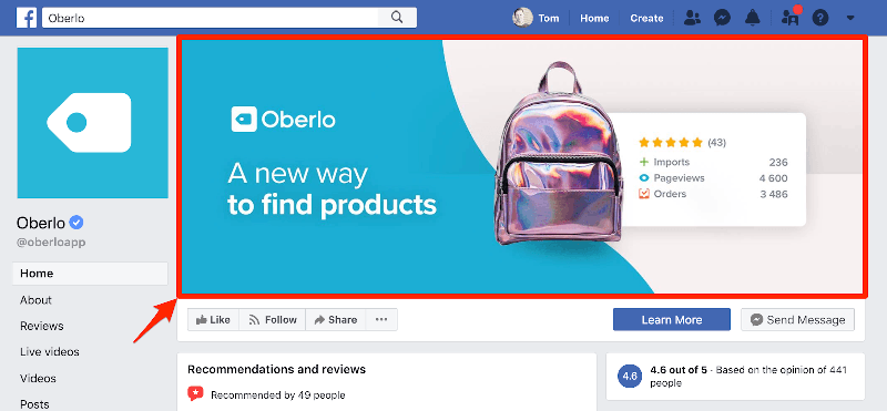
Image courtesy: https://bit.ly/34ZJPrX
As you can see, the cover image is clean and easy to understand. The chosen background colors also don’t make the image clumsy. Even though there is text used in the cover image, the text ratio is kept to minimum.
If it is necessary for you to add information, add text in the description of your cover photo. The cover photo is in your Facebook gallery and hence, it is clickable. Chances are people will click on the cover image to know more about the product or service that you are promoting.
Engage people right away:
Why I emphasize on the importance of Facebook cover photo? The answer is that this is the face of your social media page. If you are not able to engage people when they land on your website, they will immediately bounce off. So, you have to come up with images that can engage your target audience right away.
Check out the image below. Even though it is the old set up of Facebook cover photo and profile picture, this is a great example to take a look at. But as Facebook cover image and profile image set up has changed, it is better that you don’t create your cover image design like this.
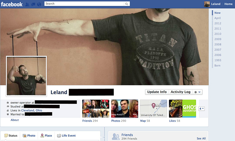
Image courtesy: https://bit.ly/2ZtUR7T
You can still create engaging images by incorporating innovation in your images. As I mentioned, you must grab the attention of the viewers by creating a cover design that is attractive.

Image courtesy: https://bit.ly/36402O1
Also, make sure to use the color scheme that goes with your brand. So, if your brand has blue and white in its logo or in your website, the same should also be followed on your Facebook cover image as well. Even if you can’t always use white and blue, try not to use colors that are too contrasting such as black and red or orange and yellow.
The importance of CTA button:
Call-to-action or CTA button is a very important part of marketing. No matter what your business is, the cover image should be accompanied by a CTA button at the bottom. Even though the CTA button is not part of the cover photo, it is just below the image. And that is the reason why it is necessary to pay attention to this.
Check out the image below that is the cover page of Amazon.com Facebook page. You can see that there is a call-to-action button right under the cover image. As Amazon is an online shopping website, the CTA button is “Shop Now”.

Image courtesy: https://bit.ly/39iCver
Now, check out the image below. You can see that the CTA button has changed depending on the type of business it is. Hence, the CTA button is “Sign Up” in this case.
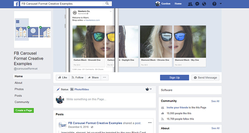
Image courtesy: https://bit.ly/36gaORm
You can also use different types of CTA buttons such as ‘Contact Us’, ‘Buy Now’, ‘Click Now’, ‘Register’, etc. The idea is to make people stay longer in your Facebook page with your cover image and make them click on the CTA button.
Right alignment can make your cover look more polished:
Your profile picture is one the left side of your Facebook page, right? So, if you add elements on the left side of your cover image, the entire weight of the image goes to left side.

Image courtesy: https://bit.ly/2t87cCA
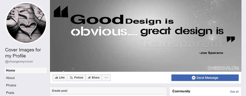
Image courtesy: https://bit.ly/37kbp4X
Obviously, the cover image looks amazing. However, this is not something that you would want to upload as a cover photo for your business. You don’t want that. What you need to create is a balanced cover photo that will look in sync with the profile picture. Take a look at the image below.

Image courtesy: https://bit.ly/2Quoz8J
Doesn’t the cover photo look polished? And it also looks more in sync with the profile set up. If you don’t want to go into the confusion of creating a left aligned or right aligned cover photo, you can upload a short video as well. Take a look at the example below.
https://www.facebook.com/DisneyFrozen/
Facebook allows you to upload a video that is between 20 seconds and 90 seconds. Use the pre-mentioned resolution to upload a video so that you don’t compromise with the quality of the image.
Create a page instead of creating a profile:
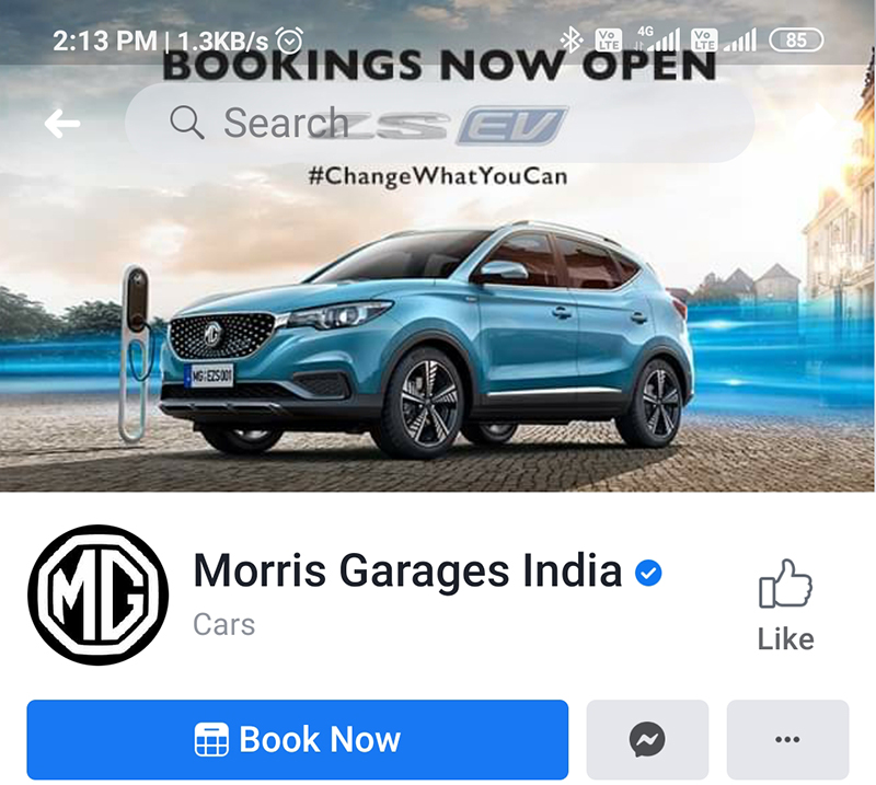
Not long ago, Facebook used to treat business pages and normal profiles equally. As a result, a large portion of the cover photo used to get covered by the profile picture when accessed from mobile. And who can deny the fact that 96% of the Facebook users access their profiles from their smartphones or tabs? The image below is the example of how the profile picture eats up the cover image when you access Facebook from mobile.

However, now the approach has changed. Now, the profile picture shows like this only if you upload the image on your personal profile. That is the reason why you should never create a business profile. Instead, create a page for your business as Facebook treats pages differently. The profile picture shows below the cover image when viewed on mobile devices.
Include a CTA in the image description:
Even though it is not applicable only for cover images, it is essential that you follow this for cover images especially. Cover images, like any other images, is clickable. When people click on your cover image, they get to see the description of the image on the right side of the screen (when viewed from desktop). If you include the link to your website or a link to your blogs, your target audience will be guided to your website. You can even increase the number of conversions on your website with the help of the Facebook cover image on your business page.
Most of the pages on Facebook do not really follow this process. Many a time you will see that a Facebook page has mentioned the website on the cover photo. But the administrators often forget to update the same information on the description. As a result, even if people see your website name, they won’t be able to click it.
Use hashtags:
Even though using hashtags on image won’t really count, it is really a good way to show what hashtags you are aiming for. Take a look at the image below. The company uses a cover image and a hashtag that convey what the company is targeted towards. But it is shown so beautifully and subtly that you won’t even feel that the company is trying hard to establish its place.
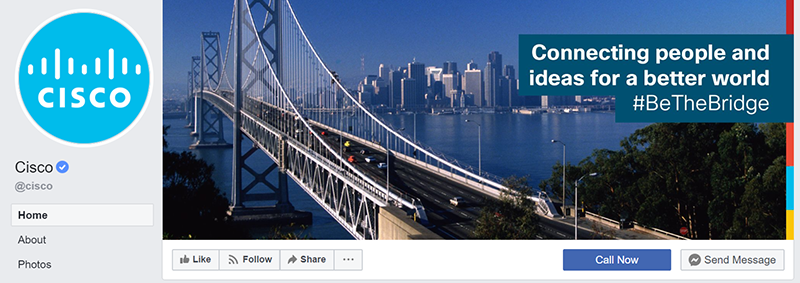
Image courtesy: https://bit.ly/2F0XfJG
You can also use the same hashtag in the description of your cover photo so that it gets a chance to get trending as well. Besides, as I mentioned before, it also helps you to insert a CTA button in the description part.
Engage the senses:
What is the best way to make people feel that they need to order pizza from you right now? Show them what they are missing by not placing the order yet. Take a clue from the page owned by Papa Johns.
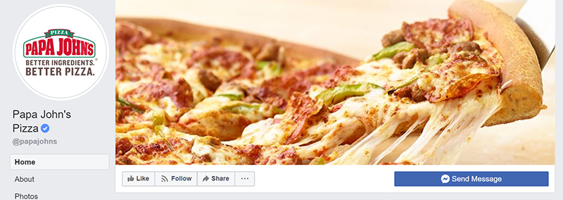
Image courtesy: https://bit.ly/2sjnxEu
Don’t you feel hungry already? It doesn’t matter what business you own, you can use images that are related to your industry. However, make sure to use images that make people awestruck. The cover image used by Burk Al Arab Jumeirah is yet another great example if you need ideas.

Image courtesy: https://bit.ly/355i3u4
You can be as creative as you want to grab the attention. However, make sure that you don’t lose the essence of your business while creating a creative cover design.
Conclusion:
Facebook has been used by companies to establish their social media identity for quite long. There are different tips and tricks that you can try out when you are looking for a cover image that can grab the attention of your target audience. There are many other small things that can improve your social media presence and increase your sales. However, if you are not sure about what types of designs to include, you must hire a company that is dedicated to do this.
Digital Polo is a graphic design company that has many designers working under the same roof. The designers have not only successfully created Facebook cover photo for many clients but they have also helped the businesses achieve their target. Collaborating with the company will ensure that you can create engaging Facebook cover photo for optimum results.
