ICC Cricket World Cup – The History Of Logo Design
Are you following the ICC Cricket World Cup 2019? Which team are you rooting for? Even though there are only 10 cricket world cup 2019 teams preparing for face-off this time, the viewership of matches and the craze is likely to be as big as ever before.
I remember the first World Cup which was held back in 1975. To be honest, the only glimpse of games I got was the running commentary on the radio. But my agenda here is not to reminisce about the then called Prudential World Cup. Being a modern marketer, my purpose of this blog is to bring out the difference about how the event was positioned and fed to sporting minds back then, and how things stand today in 2019. When I say positioning, contextually I would like to shed some light on Cricket World Cup logos.
Not only has the game changed over the years, it’s also how the game is marketed that has evolved alongside. Let’s look at –
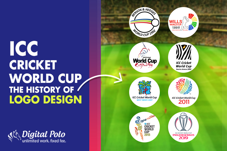
The evolution of ICC Cricket World Cup logos:
You may already know that the first Cricket World Cup logo was during the World Cup 1992. Before 1992, the World Cup used to be played in white uniforms only. However, colored uniforms made their debut in the 1992 World Cup and the trend is still going on.
The logos made marketing cricket in a more efficient way. Besides, the logo designs are generally influenced by the cultural trends of the hosting countries.
1992 – Benson & Hedges World Cup:
Do you remember what it used to be in 1992? People waited for ICC Cricket World Cup to begin. There were no social media to share the logo in. The designers who created the cricket team logo focused on making the logo simple so that it fits the TV screen properly.
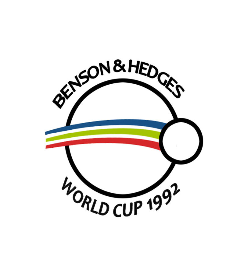
Image courtesy: https://bit.ly/2ReECra
What do you see when you look at the logo? Apart from being simple, the logo has a similarity with the tropical character of Oceania. Australia and New Zealand are the nations that hosted the 1992 Cricket World Cup.
However, the logo is one of my personal favorites and is one of the most praised logos. The reason is that it looked really cool when it was placed on the jerseys. It was one of the best examples of branding because of its’ mere simplicity.
1996 – Wills World Cup:
It is not only me but the entire world of cricket lovers who were really disappointed to see the ITC’s Wills World Cup logo design. Sri Lanka, India, and Pakistan were the three countries that hosted the 1996 Cricket World Cup.

Image courtesy: https://bit.ly/2IEssUo
From the perspective of a designer, I can tell you that the logo design actually looks very unprofessional to me. It seems like the design is completed in haste backed by very little plan. Besides, the cutouts are also not symmetrical. There is only one reason that you can understand that it is a cricket world cup logo. The reason is nothing but the batsman in the design.
1999 – ICC World Cup (England):
1999 The World Cup was hosted by England. This World Cup achieved another milestone. International Cricket Council or ICC has been organizing Cricket World Cup for the last six editions. But in the seventh edition ICC was officially included in the logo design.
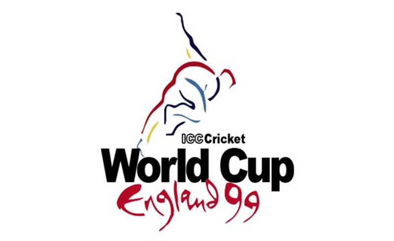
Image courtesy: https://bit.ly/2IzawKP
The logo is a complete opposite of what the previous World Cup logo was. So, the Cricket World Cup logo featured a bowler in contrast to the batsman figure that was there in the previous edition. Debashish Mohanty, an Indian bowler was taken as inspiration for the logo design because of his lanky and tall figure.
If you take a look at the logo, you will see that the bowler in the logo replicates the movement of a bowler who has just thrown the ball. I like the logo because of its simplicity. Yet the design has maintained its elegance. It is one of the stylish designs that always make people nostalgic about that Cricket World Cup.
However, a closer study shows that the color scheme is quite versatile in the logo. The different colors represent the different countries partaking in the World Cup. Besides, the best part about the logo was the message it delivers. Cricket is generally perceived to be a batsman’s game. This was about the time when bowlers started to be looked at in an equally significant way. The picture of the bowler on the logo instead that of a batsman just reinstated the fact around the world.
2003 – ICC World Cup (South Africa):
The 2003 ICC World Cup was hosted by three African nations – South Africa, Zimbabwe, and Kenya. The logo, hence, included the primary attraction of Africa, which is Zebra. Africa is known for its safaris.
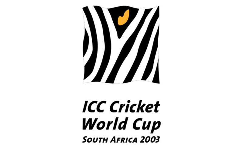
Image courtesy: https://bit.ly/2WJPaoh
Looking at the logo, you will see that it has a small patch of zebra print with a yellow eye in the middle. The rest of the design is also kept quite basic with the text written in black on a white background so that it goes well with the zebra print design.
This is yet another design that I like because of its fresh and unique appearance. You just need to take a look at the logo design. You will know that it represents the African continent.
2007 – ICC World Cup (West Indies):
What comes to your mind when you hear the name of the country West Indies? The Caribbean lifestyle is what comes to my mind. And that is why I like the logo of ICC World Cup 2007. As the World Cup was hosted by West Indies, the logo had that Caribbean vibe.
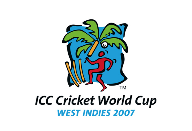
Image courtesy: https://bit.ly/2wO4AbF
Unlike the previous two editions, this time the logo has a cricketer holding a bat, hitting a ball. There are also three wickets. You will see a coconut tree in the background. The logo design includes eye-catching colors like blue, red, yellow, and green. I think that this is one of the best ICC World Cup logos because it has a personality that makes it different than the other logo designs. The logo reiterates the whole purpose of the fabulous game of Cricket – Fun and entertainment.
2011 – ICC World Cup (India, Bangladesh, and Sri Lanka):
Once again India and Sri Lanka were the two countries to host the Cricket World Cup. However, this year Bangladesh joined with these two countries for the first time. Apparently, the logo is a colorful cricket ball and nothing else.
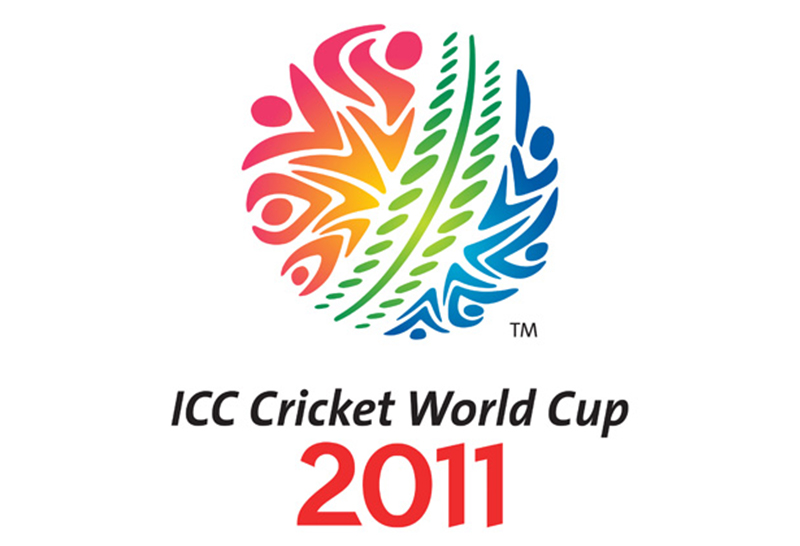
Image courtesy: https://bit.ly/2Wx1SSj
But the expertise of the Australian design company Witekite took the design to the next level. So, when you take a close look at the design, you will see that there are cricketers forming in the ball. It is once again a colorful logo design. Gradient makes the design look even more beautiful.
2015 – ICC World Cup (Australia and New Zealand):
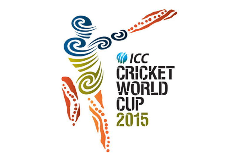
Image courtesy: https://bit.ly/2X3jbP3
While the 1995 World Cup Logo represented the tropical characteristic of Australia and New Zealand, the 2015 logo is more about the indigenous people of Australia and New Zealand. There is a batsman who has hit a masterstroke in the logo. The design includes the motifs that Maori originating in New Zealand and Aboriginals of Australia. This is also a colorful logo like the previous editions.
2019 – ICC World Cup (England and Wales):
So, the World Cup logo of 2019 is different from the previous editions. The logo is much simpler than the previous versions. You can see a winner’s cup with a ball on top of it. The cup appears to be placed inside a globe, which justifies the ‘World Cup’. The color scheme has been kept as minimal as possible. It has only two colors – primarily grey with a hint of red.
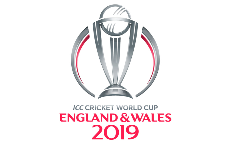
Image courtesy: https://bit.ly/2KJUiRU
I like the simplicity of the logo design. England is all about class, supremacy, and royalty. The colors grey and red represent royalty and supremacy. I find the design to be very modern in comparison to the previous editions.
Conclusion:
Cricket World Cup has evolved throughout the years. While it’s still early days in the ICC Cricket World cup 2019, apart from the Cricket that is played, what fans will also fondly remember is the logo. Have you ever seen a highlights package of a World Cup game from yesteryears? The build up to the show always depicts the logo for that edition. It instantly makes me travel back in time. Apart from all those Cricketing memories, what else amazes me is how these logos have changed over the years.
Here is looking ahead to a lot more World Cups and many logos. Coming back to the Cricket, I think England and India are front-runners for 2019.
