Learn The Secrets of Logo Color Schemes to Inspire Your Branding

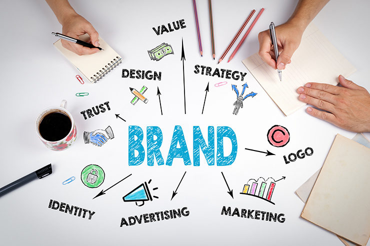
Branding in simple terms is the process of getting your brand recognized and remembered by the masses. Branding involves elements like an attractive logo with apt color, a catchy word/ title for your offerings, a theme that replicates your overall business, and much more. The psychology here is, the greater the number of people remembering your brand, the higher is the rate of a successful branding exercise.
The concept of branding has many elements like:
- Logo Designing,
- Color Combination to be used,
- Taglines to attract the masses,
- Collaborations to get into,
- Channels to be used for marketing the brand and much more.
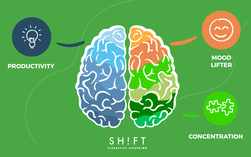
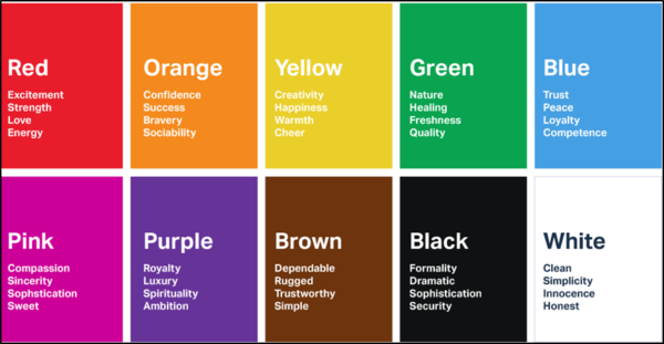
In this article, our focus will be on the use of color psychology, which the companies engage in while designing the logo. Colors have a strong impact on our minds. Different color combinations trigger different parts of our brain.
Marketers are using this natural reaction of our brain, to guide the focus on their brands. They are using in-depth research about color combinations and their possible effect on the human brain. The reports of these researches are then used to design customized logos in color schemes that persuade consumer behavior in a particular direction. In this article, we will try to explain how you as a consumer are indirectly getting influenced by the logo color schemes.
We have taken some of the popular single as well as multi-color combinations and the impact, which the marketers are trying to create with such combinations:
- Green: Green is the safest color in terms of its impact on the audience. It is the most relaxing color for the human eye and triggers comfort and freshness in the brain. The green color is used for sending out a message of harmony, peace, natural or organic, and all those, which are related to the sensation of calmness of the brain. Green is mostly used for brands that are associated with nature, food, or tech companies that are in the space of mood upliftment. Media company Animal Planet, Music Streaming Company Spotify, and Pharma major Lupin all have their logos in shades of green.
 Credit: foundr.com
 Credit: Spotify
Credit: India Global Business
Not just pure green combinations of color with green as the standout are also very trendy. Yellow and Green as in the case of SUBWAY.
Red, Black, and Green as in the logo of Heineken
Blue and Green as in the case of Crowd Shoes
Looking at these examples, it can be safely said that green is indeed the safest primary color to go with.
- Blue: Blue color is probably the second safest primary color. It signifies professionalism, confidence, clarity, trust, and reliability. The color triggers the basics of emotions, which deal with securing trust and confidence. It is the most popular color for electronic industries, cloud-based industries, service sectors, and payment-related services sectors. In short, all those sectors wherein the possibility of personalization is low and the deal has to be conducted based on trust, opt for blue logos and themes.
Companies like PayPal, Samsung, and Skype have an all-blue logo design.
Combinations with blue as the prominent color is also a hit in the marketing space.
Blue and Yellow for Walmart
Blue and Orange for Mozilla Firefox
Blue and Red for Pepsi
All these combinations also prove the versatility of the blue color. It can be combined with almost any other color to produce an optimum innovative logo design.
- Red: The color red is the strongest of the primary colors. The color is very volatile and different shades of it can depict emotions altogether differently. Firstly red can be the symbolization of love, attraction, seduction, energy, and power. Secondly, red can convey anger, danger, conflict of interests, war, and other negative feelings. Noticeably, all these emotions are very strong and unresisting.
Brands need to be very careful in designing the logos with red as their primary color. Different shades and different combinations of it can convey a meaning that is altogether alternate to the company’s intentions. Red Color is used in businesses wherein the aim is to attract more and more customers. It is surprisingly used in the food business as well, as the color red increases appetite as per research.
Combinations of Red are everywhere.
Classic Red and Black combination as in the case of Netflix and YouTube
Frequently used Red and Yellow as in McDonald’s
And, a strong bold red and red as in OnePlus
- Yellow and Gold: Yellow is considered the color of prosperity. It resembles the sun, the energy, the positivity, and the bright vibrance. It propagates, shines, and glows. The yellow color tickles the similarity with the shine of gold. It also triggers feelings of friendliness, happiness, socializing, and mood upliftment.
Social media companies like Snapchat and Bumble have their logos in yellow.
Similarly, luxury brands like Lamborghini have their logos in gold and a tinge of yellow.
It signals that the brand is as premium and limited as gold.
Combinations of the yellow color are also very common in the logo designing space.
Like, the common combination of Yellow and Red of Lays and Burger King.
Blue and Yellow, as in the case of IKEA
And, the evergreen combination of Yellow and Black, as for Nikon
- Pink: Although pink is not a primary color it has its own set of loyal followers. Pink is always associated with feminism, love, joyfulness, and creativity. The color has an overall vibe of positiveness and youthfulness. The color is popular in the fashion and the cosmetic industry. Dating apps like Tinder too have the color pink to emboss the feeling of joyfulness and love while dating.
Pink color arouses the feeling of togetherness and as such, many restaurant chains use this color for their logo. Baskin Robbins and Dunkin Donuts are examples of such companies.
- Gray: Gray is the color that signifies clarity, superiority, stability, and a clutter-free mind. It is the color of modernization and sophistication. Gray resembles diamonds and rarity. As such, most of the premium brands prefer grey as the color of choice while designing their logos. Brands like Apple and Mercedes Benz have their logos built-in gray.
- Black: Like red, the color Black is very strong. Black is considered the color that one gets after the mixing up of all primary colors. Black triggers two completely different sets of emotions. On one hand, it conveys the message of prestige, power, control, efficiency, and supremeness. While on the other side, it can trigger feelings of depression, loneliness, evil, and pessimism.
Both the aspects of the color black are very strong. You will notice that Black Logos are always accompanied by text or at least meaningful symbols. This is done so that people do not associate it with something bad or negative.
Premium Brands like Chanel and Gucci use Black for their logo.
Institutions like World Wildlife Fund (WWF) also use the color Black for their logo.
- Multicolor: Companies that have many verticals to operate use the multicolor concept. Multicolor signifies diversity, open-mindedness, growth, expansion, and joyfulness. When done right, it also signifies the importance of balancing emotions.
Big Multinational Corporations like Google and Microsoft have multicolored logos that signify the diversity of products that these companies are offering.
Media Company NBC uses a multicolored logo to propagate the diversity of news that it broadcasts from its media house.
After reading the article, you must have realized the role of colors in influencing the overall logo design of the company. Colors play a very important role in building the right image for your brand. Although there are numerous factors to consider while choosing a particular color, some of the best factors to consider are:
- The combination of color with text, assures that the meaning of the text replicates in the color.
- Markets in which the company wants to operate.
- Color Theory adopted by the completion if any.
- Perception of the brand, which the owner wants its customers to get.
Companies, especially the newer ones, must evaluate all the possible pros and cons of a particular color, before incorporating it into the final logo. Once a logo is designed and published it can become very tedious to change while the business is running. Therefore, you should think twice before finalizing your color palette.

