The Anatomy of a Great Email Marketing Design for Success in 2019
How many emails do you receive in a day? How many of those are promotional emails? There is simply no denying that email campaigns are one of the most promising and effective marketing tools. Even I have included email campaigns as a part of the marketing strategy of Digital Polo.
Hundreds of emails are sent and received by professionals every day. If there was simply no result, email marketing would not have survived. You would be amazed to know that email marketing still offers an astonishing 3800% ROI. Over 90% of marketers still use email marketing as one of the most effective content distribution channels.
However, there’s a catch here. Is your email marketing design apt for your business? Are you following the latest trends? If not, this is the right time for you to bring a change. I will discuss the anatomy of some of the great email marketing designs that will flourish in 2019.
Minimalist design at your aid:
People nowadays do not have much time to spare on a newsletter. So, your aim should be to create a minimalist design that is easy to scan through. Try and focus on using images intelligently so that the purpose of the email is clearly understood by your target audience. The less text-based the design is the more people will like it.
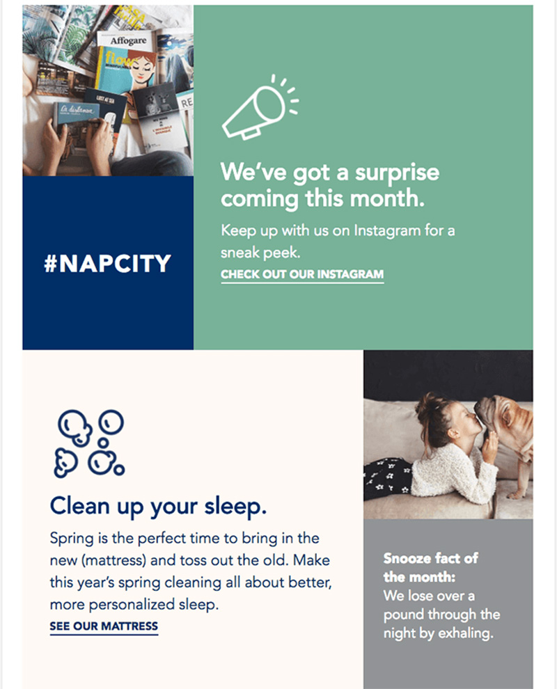
Image courtesy: https://bit.ly/2JHmzbh
The simple reason behind this is that humans interact better with images. So, when there is less text, your target audience can focus more on the images. Using relatable images is a great way to engage your prospects with a minimalist approach.
A distinct CTA button will help you:
Imagine getting an email that does not have a call-to-action button. Even if the email is good, you will not know what to do next. Do you want the same thing to happen with your target audience?
Take a look at the image below. Check out how simple the design of the newsletter of Uber is.

Image courtesy: https://bit.ly/2Vqe1rx
The simplistic design gets across the message pretty clearly. In addition to that, you just cannot miss the distinct CTA button that asks you to take the next conceivable step. While creating email marketing campaigns of Digital Polo, I try to keep it as simple as possible.
Play with the colors:
Once in a while, you will come across email newsletters that are so colorful and eye-catching that you simply cannot ignore it. Color psychology is something that goes hand in hand with marketing. Marketers all over the world have started to use colors to attract and influence customer behavior. The same theory can be applied while you are designing for email marketing as well.
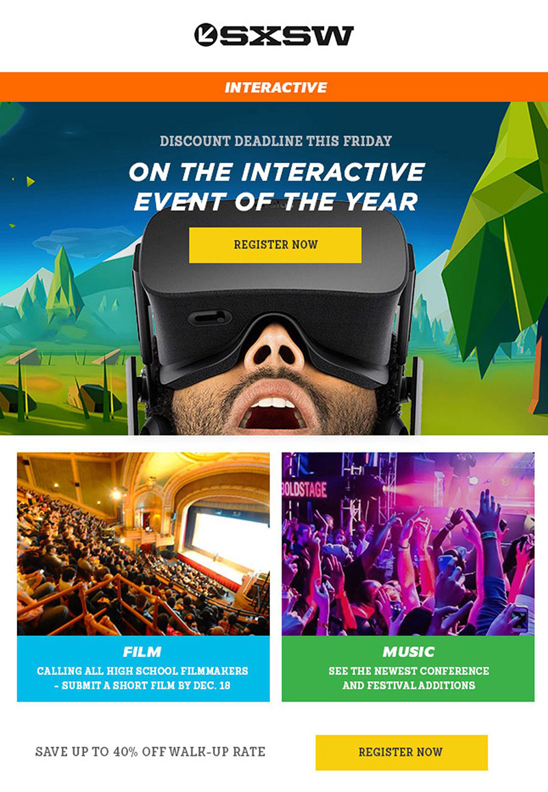
Image courtesy: https://bit.ly/2YwqJae
Do you notice how the colors are used in the newsletter above? The blue and green blocks, the orange panel, the purplish and yellowish tint, the yellow CTA button, and the white space, everything marries into each other to create a perfectly balanced email. Even with a lot of colors, the design does not lose its aesthetic properties.
Create a story:
The email designs that are well-crafted are much easily consumed by your prospects. One of the best ways to engage your customers is to create a story. I know that it is not always a plausible idea. Email campaigns vary depending on the business you own. Just, for example, I own a graphic design company, Digital Polo. So, if I want to create a story, it will be related to logo design, website design, brochure design, etc. If you can, you must try and use images that help you to create a story. People connect with stories much more than they connect with an ordinary image. Besides, creating stories with images also help you to show what types of products or services you offer.
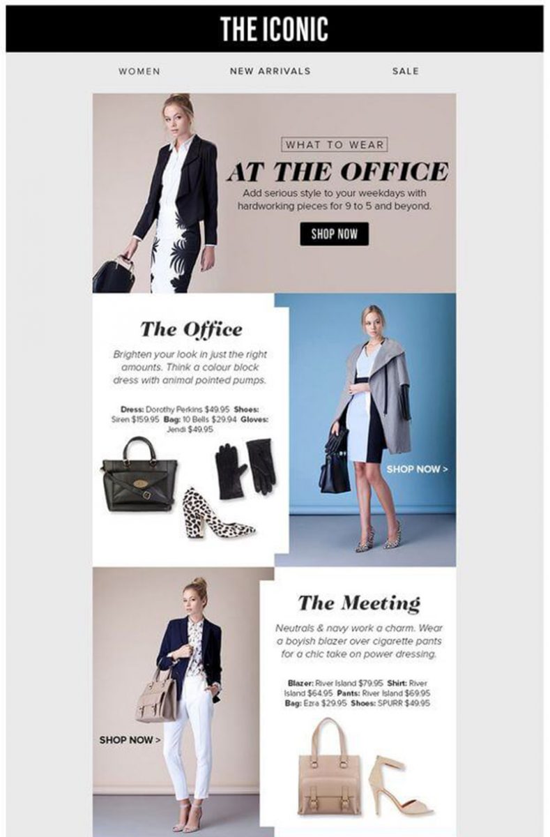
Image courtesy: https://bit.ly/2HwuHJ8
What do you see when you check out the image above? There is a card layout that is evident. The aim of the email campaign is to show the customers the various options available in the office-wear segment. The card layout creates a story of what outfits are suitable for which events at the workplace.
Division of the information:
Since the last two years, a design trend has been ruling the market. It will survive and thrive in 2019 as well. The trend is to divide the information into two parts. What does dividing the design mean?
Imagine a design where you have entered the CTA button in between your email campaign design. Using geometric patterns or angular grids in your design will allow you to break the design in multiple portions. However, when you are breaking the design in two or more parts, make sure to share important information in all the blocks of division.
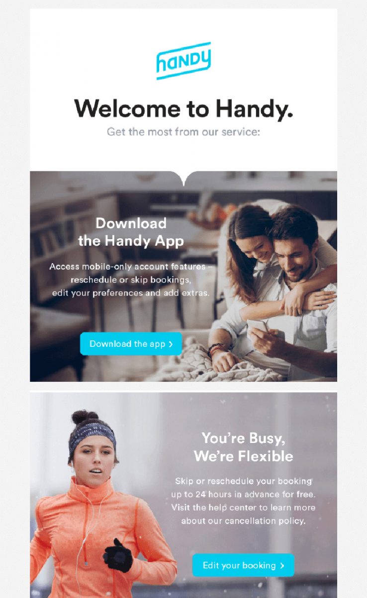
Image courtesy: https://bit.ly/2GqhjIz
If you take a look at the image above, you will see that the newsletter has been broken in two distinct parts. While the upper portion of the design asks the readers to download the app, the lower portion has a CTA button that asks to edit the booking information. Both parts of the design are of equal importance.
Why is this good design for email marketing?
As the owner of a design agency, Digital Polo, I can say that there are two reasons. Firstly, the design looks aesthetical. Secondly and more importantly, there are two CTA buttons. Two call-to-action buttons mean twice as much the chance of engaging your target audience.
Owning your mistakes:
You might be thinking what do mistakes have to do with email marketing designs? I will explain it to you.
Once in a while, we all make one mistake or the other. It may happen with you as well. Believe me when I say that even the designers of my company Digital Polo have made mistakes in the past. But what made a difference is that I have owned the mistake. I have accepted that my team has made a mistake and has apologized to the clients.
Now, the point is how to own your mistakes while creating a good email marketing design, right? Before explaining the point, let’s take a look at the image below.
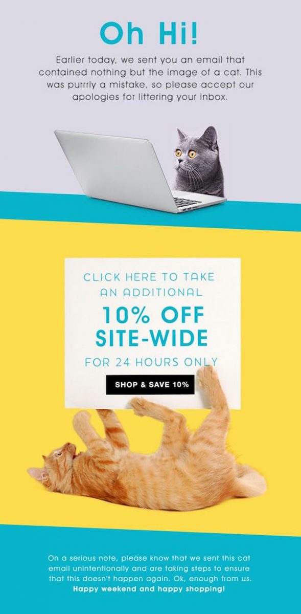
Image courtesy: https://bit.ly/2JH0n0S
This is an acceptance of a mistake. If you go through the copy of the image, you will see that the company was supposed to let its audience know about the discounts it is offering. However, it has sent an email that contained the image of a cat and not the text.
Instead of letting it go, the company came up with a really innovative idea. They have included the email campaign that was to be sent along with an apology email design. I think it is a brilliant idea when it comes to email campaigning. Just a simple design along with a ‘sorry’ note takes the email design to the next level altogether. So, even if it is an unconventional approach, I can feel that the trend will be successful this year.
Personalize your email campaigns:
Have you ever received an email from some company wishing you on your birthday? I have. And I can tell you that it feels nice. Even though I have not paid much attention to the previous emails sent by the company, the personalized email really got me there.
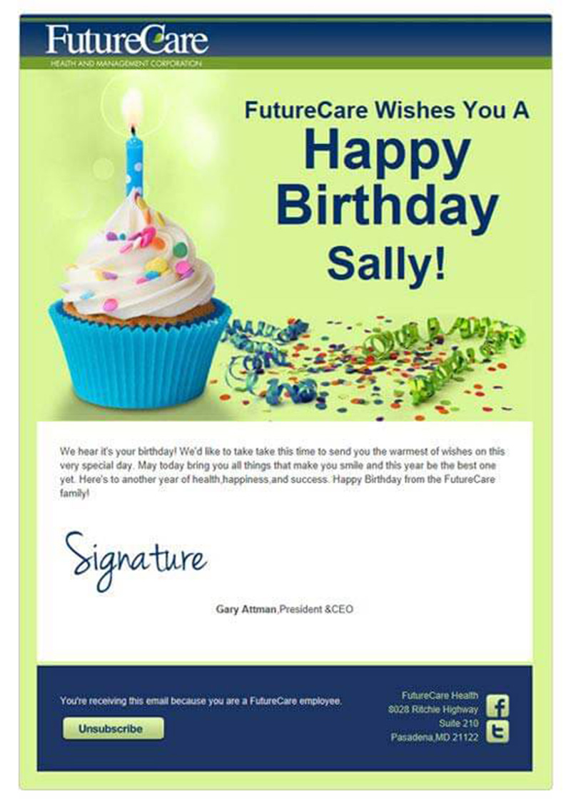
Image courtesy: https://bit.ly/2VZxi7y
So, what happens when you personalize your email campaigns? Your customers get to know that you care about them. You can collect the customer information and come up with an innovative approach to wish them. People get more attentive towards your brand and their chances to respond to your email increases.
I am definitely not saying that sending a birthday or an anniversary wish will be enough to grab the attention of your target audience. I am just trying to emphasize that you can use personalized emails as a part of your email marketing campaigns. Since I have been Digital Polo for quite a few years now, I can tell you that you do not even have to invest much time to create a personalized email campaign. If you want me to share my experience on how to create personalized email campaigns for the clients, let me know in the comments section.
Color blocking may save your day:
Yes, yes, I know I have already told you to create a colorful design to mesmerize the viewers. I am sure that as a designer, you are well aware of the term color blocking. You may have been doing this religiously for websites till now. I am suggesting you use the same concept for your email marketing designs as well.
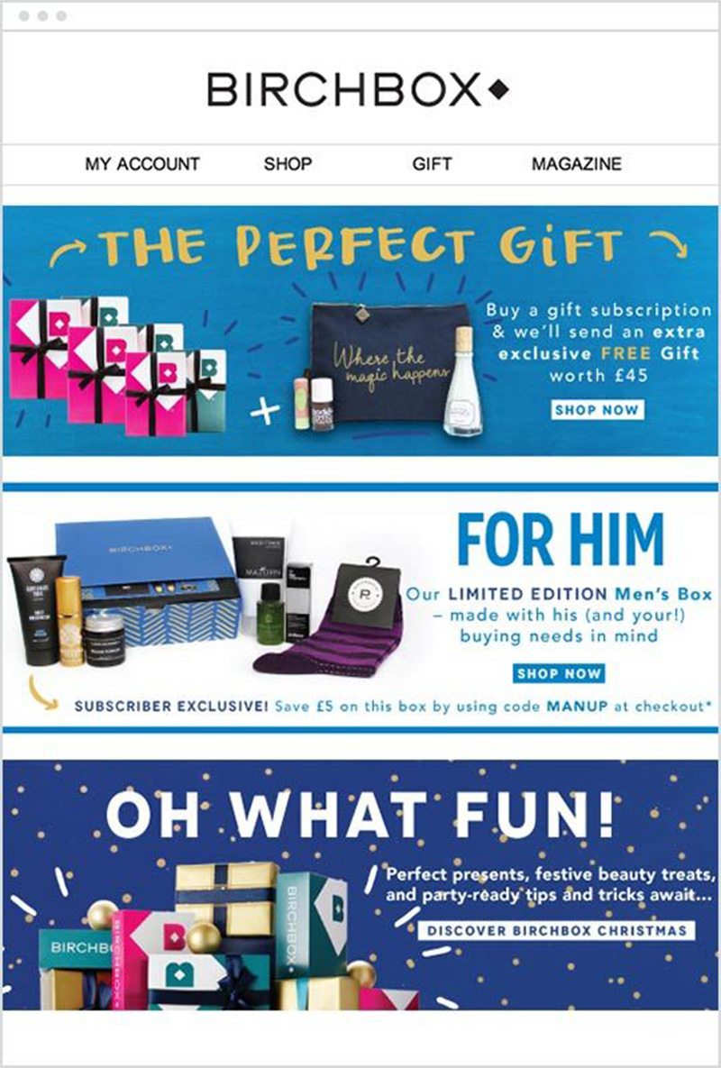
Image courtesy: https://bit.ly/2Igxlkm
Colors have a very important role to play in our decision making. I have already mentioned how you can captivate the audience with a perfectly balanced colorful design. Now, it is time to use color blocking pattern. Using contrasting colors in a design is a great way to influence your target audience.
If you take the above image as an example, you will see that the company has used blue as its basic color. Instead of using contrasting colors, it has used different shades and tints of blue. Beige, blue and white colors have been used respectively to make the copy pop up.
Make use of festivals or events:
Many marketers have a misconception that their email campaign will not work on or during festivals. Yes, it is true that the click-through rate gets reduced during festivals. Still, since 66% people read emails on their mobile phones, festivals do not affect the CTR that much. Rather festivals are great for marketers. People are joyous during this period. Hence, they can be convinced quite easily.
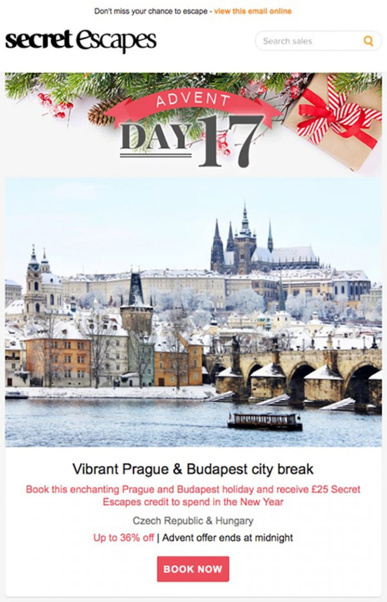
Image courtesy: https://bit.ly/2YwuTyy
Secret Escapes, the travel club comes up with this stunning email marketing design. While many marketers fail to leverage the Christmas leave (or similar leaves), Secret Escapes has a different point of view. The company comes up with some tempting travel deals during the 25 days of leave. The company keeps a limited period offer to make sure that its target audience is quick to act. An incredible approach I must say.
Deliver what you promise:
There have been times when an email with a promising subject has landed in my inbox. The moment I clicked on the email, I was taken to a page that has nothing to do with the subject mentioned. I bounced back from the page instantly. The company could not survive the competitive market and the increasing bounce rate. Eventually, it got shut down.
You do not want people to know your company to be one that has no connection between the email content and the headline. If your email marketing design says that clicking on the link will take the readers to a certain page, make sure that it is followed. Take a cue from Zapier.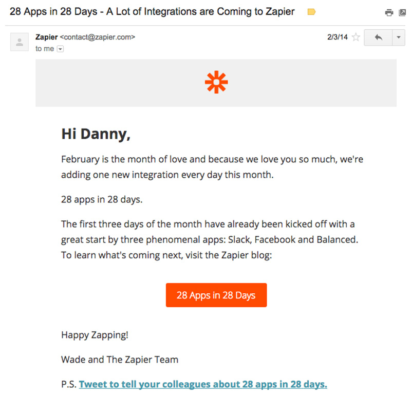
Image courtesy: https://bit.ly/30lcZR7
The company sends newsletters to its subscribers and delivers what it promises in the newsletters religiously. Once the readers get the hang of your emails, trust me, they will wait to receive your newsletters.
Good copy matters too:
If you are anything like me, you would love a good design that has an even better copy. Do not get me wrong. I am always encouraging the designers in Digital Polo to come up with innovative designs. But a good design might be worthless if the copy is not good enough to complement it.
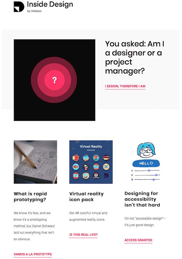
Image courtesy: https://bit.ly/2Ec2gz5
Do you notice how well written the copy of the design is? And do not forget to check out the call-to-action buttons. It is something that you don’t come across every day. It is an example of such unique content in such limited space. You do not have to be so creative, but you can churn out some ideas for sure.
Conclusion:
You do not want to invest time and money to come up with a design that does nothing but wows your customers. The aim of email marketing is to generate leads and to build a relationship with your customers. Follow the trends that are going to thrive in 2019 and grab their attention in such a way that they feel connected to your brand. Once there is a connection between your brand and your target audience, it becomes much easier to come up with a sales pitch eventually. So, which of these email marketing designs are you going to follow this year? Do you want to include anything else in the list?
